


php建立表单
今天,我们将使用CSS3和HTML5以及Dan Eden的 CSS动画来编写Orman Clark的“ 优雅登录表单” ,以美化体验。
本教程假定您对HTML / CSS有一定的了解; 我们将很快前进。 好了,走吧!
步骤1: HTML标记
我们首先链接到文档标题内的样式表。 我们有一个重置的样式表,将所有内容恢复为零, Dan Eden的 animate.css(我们将在稍后使用它进行一些有趣的动画),还有我们自己的styles.css,我们将在其中进行大部分工作。
<!doctype html>

<head>

	<!-- Basics -->

	<meta charset="utf-8">
	<meta http-equiv="X-UA-Compatible" content="IE=edge,chrome=1">

	<title>Login</title>

	<!-- CSS -->

	<link rel="stylesheet" href="css/reset.css">
	<link rel="stylesheet" href="css/animate.css">
	<link rel="stylesheet" href="css/styles.css">

</head>
HTML的内容包括一个容器,一个表单和一些输入。
<!-- Main HTML -->

<body>

	<!-- Begin Page Content -->

	<div id="container">

		<form>

			<label for="username">Username:</label>

			<input type="text" id="username" name="username">

			<label for="password">Password:</label>

			<p><a href="#">Forgot your password?</a></p>

			<input type="password" id="password" name="password">

			<div id="lower">

				<input type="checkbox"><label class="check" for="checkbox">Keep me logged in</label>

				<input type="submit" value="Login">

			</div><!--/ lower-->

		</form>

	</div><!--/ container-->


	<!-- End Page Content -->

</body>

</html>步骤3:放置元素
现在,我们已经编写了HTML标记,接下来可以进入CSS。 首先,我们将指定基础知识,将容器元素放置在页面中心。
/* Basics */

html, body {
	width: 100%;
	height: 100%;
	font-family: "Helvetica Neue", Helvetica, sans-serif;
	color: #444;
	-webkit-font-smoothing: antialiased;
	background: #f0f0f0;

}

#container {
	position: fixed;
	width: 340px;
	height: 280px;
	top: 50%;
	left: 50%;
	margin-top: -140px;
	margin-left: -170px;
}
现在,我们将一些结构样式添加到输入和其他元素中:
form {
	margin: 0 auto;
	margin-top: 20px;
}

label {
	color: #555;
	display: inline-block;
	margin-left: 18px;
	padding-top: 10px;
	font-size: 14px;
}

p a {
	font-size: 11px;
	color: #aaa;
	float: right;
	margin-top: -13px;
	margin-right: 20px;
}

p a:hover {
	color: #555;
}

input {
	font-family: "Helvetica Neue", Helvetica, sans-serif;
	font-size: 12px;
	outline: none;
}

input[type=text],
input[type=password] {
	color: #777;
	padding-left: 10px;
	margin: 10px;
	margin-top: 12px;
	margin-left: 18px;
	width: 290px;
	height: 35px;
}

#lower {
	background: #ecf2f5;
	width: 100%;
	height: 69px;
	margin-top: 20px;
}

input[type=checkbox] {
	margin-left: 20px;
	margin-top: 30px;
}

.check {
	margin-left: 3px;
}

input[type=submit] {
	float: right;
	margin-right: 20px;
	margin-top: 20px;
	width: 80px;
	height: 30px;
}
步骤4:样式化元素
元素定位完美。 现在是时候让它们看起来更漂亮了! 首先,我们将为容器设置样式,方法是将容器的圆角巧妙地加上深度的阴影。
#container {
	position: fixed;
	width: 340px;
	height: 280px;
	top: 50%;
	left: 50%;
	margin-top: -140px;
	margin-left: -170px;
	background: #fff;
	border-radius: 3px;
	border: 1px solid #ccc;
	box-shadow: 0 1px 2px rgba(0, 0, 0, .1);
}
然后,输入将得到类似的处理,但带有一些边界半径和阴影。 我们将为提交按钮提供渐变背景,并使用纯色background-color来适应IE9和更早的版本。 注意,我们使用css属性选择器分别针对每种输入类型。
form {
	margin: 0 auto;
	margin-top: 20px;
}

label {
	color: #555;
	display: inline-block;
	margin-left: 18px;
	padding-top: 10px;
	font-size: 14px;
}

p a {
	font-size: 11px;
	color: #aaa;
	float: right;
	margin-top: -13px;
	margin-right: 20px;
}

p a:hover {
	color: #555;
}

input {
	font-family: "Helvetica Neue", Helvetica, sans-serif;
	font-size: 12px;
	outline: none;
}

input[type=text],
input[type=password] {
	color: #777;
	padding-left: 10px;
	margin: 10px;
	margin-top: 12px;
	margin-left: 18px;
	width: 290px;
	height: 35px;
	border: 1px solid #c7d0d2;
	border-radius: 2px;
	box-shadow: inset 0 1.5px 3px rgba(190, 190, 190, .4), 0 0 0 5px #f5f7f8;
}

#lower {
	background: #ecf2f5;
	width: 100%;
	height: 69px;
	margin-top: 20px;
	box-shadow: inset 0 1px 1px #fff;
	border-top: 1px solid #ccc;
	border-bottom-right-radius: 3px;
	border-bottom-left-radius: 3px;
}

input[type=checkbox] {
	margin-left: 20px;
	margin-top: 30px;
}

.check {
	margin-left: 3px;
	font-size: 11px;
	color: #444;
	text-shadow: 0 1px 0 #fff;
}

input[type=submit] {
	float: right;
	margin-right: 20px;
	margin-top: 20px;
	width: 80px;
	height: 30px;
	font-size: 14px;
	font-weight: bold;
	color: #fff;
	background-color: #acd6ef; /*IE fallback*/
	background-image: -webkit-gradient(linear, left top, left bottom, from(#acd6ef), to(#6ec2e8));
	background-image: -moz-linear-gradient(top left 90deg, #acd6ef 0%, #6ec2e8 100%);
	background-image: linear-gradient(top left 90deg, #acd6ef 0%, #6ec2e8 100%);
	border-radius: 30px;
	border: 1px solid #66add6;
	box-shadow: 0 1px 2px rgba(0, 0, 0, .3), inset 0 1px 0 rgba(255, 255, 255, .5);
	cursor: pointer;
}
接下来,为了帮助用户提供反馈,我们可以使用一些悬停和活动状态:
form {
	margin: 0 auto;
	margin-top: 20px;
}

label {
	color: #555;
	display: inline-block;
	margin-left: 18px;
	padding-top: 10px;
	font-size: 14px;
}

p a {
	font-size: 11px;
	color: #aaa;
	float: right;
	margin-top: -13px;
	margin-right: 20px;
	-webkit-transition: all .4s ease;
	-moz-transition: all .4s ease;
	transition: all .4s ease;
}

p a:hover {
	color: #555;
}

input {
	font-family: "Helvetica Neue", Helvetica, sans-serif;
	font-size: 12px;
	outline: none;
}

input[type=text],
input[type=password] {
	color: #777;
	padding-left: 10px;
	margin: 10px;
	margin-top: 12px;
	margin-left: 18px;
	width: 290px;
	height: 35px;
	border: 1px solid #c7d0d2;
	border-radius: 2px;
	box-shadow: inset 0 1.5px 3px rgba(190, 190, 190, .4), 0 0 0 5px #f5f7f8;
	-webkit-transition: all .4s ease;
	-moz-transition: all .4s ease;
	transition: all .4s ease;
}

input[type=text]:hover,
input[type=password]:hover {
	border: 1px solid #b6bfc0;
	box-shadow: inset 0 1.5px 3px rgba(190, 190, 190, .7), 0 0 0 5px #f5f7f8;
}

input[type=text]:focus,
input[type=password]:focus {
	border: 1px solid #a8c9e4;
	box-shadow: inset 0 1.5px 3px rgba(190, 190, 190, .4), 0 0 0 5px #e6f2f9;
}

#lower {
	background: #ecf2f5;
	width: 100%;
	height: 69px;
	margin-top: 20px;
	box-shadow: inset 0 1px 1px #fff;
	border-top: 1px solid #ccc;
	border-bottom-right-radius: 3px;
	border-bottom-left-radius: 3px;
}

input[type=checkbox] {
	margin-left: 20px;
	margin-top: 30px;
}

.check {
	margin-left: 3px;
	font-size: 11px;
	color: #444;
	text-shadow: 0 1px 0 #fff;
}

input[type=submit] {
	float: right;
	margin-right: 20px;
	margin-top: 20px;
	width: 80px;
	height: 30px;
	font-size: 14px;
	font-weight: bold;
	color: #fff;
	background-color: #acd6ef; /*IE fallback*/
	background-image: -webkit-gradient(linear, left top, left bottom, from(#acd6ef), to(#6ec2e8));
	background-image: -moz-linear-gradient(top left 90deg, #acd6ef 0%, #6ec2e8 100%);
	background-image: linear-gradient(top left 90deg, #acd6ef 0%, #6ec2e8 100%);
	border-radius: 30px;
	border: 1px solid #66add6;
	box-shadow: 0 1px 2px rgba(0, 0, 0, .3), inset 0 1px 0 rgba(255, 255, 255, .5);
	cursor: pointer;
}

input[type=submit]:hover {
	background-image: -webkit-gradient(linear, left top, left bottom, from(#b6e2ff), to(#6ec2e8));
	background-image: -moz-linear-gradient(top left 90deg, #b6e2ff 0%, #6ec2e8 100%);
	background-image: linear-gradient(top left 90deg, #b6e2ff 0%, #6ec2e8 100%);
}

input[type=submit]:active {
	background-image: -webkit-gradient(linear, left top, left bottom, from(#6ec2e8), to(#b6e2ff));
	background-image: -moz-linear-gradient(top left 90deg, #6ec2e8 0%, #b6e2ff 100%);
	background-image: linear-gradient(top left 90deg, #6ec2e8 0%, #b6e2ff 100%);
}步骤5:画龙点睛
我们的登录表单看起来不错,但是让我们赶快加入并增加体验吧。 现在,我们将添加一些CSS动画和过渡效果以对其进行完善。 我们已经在脑子里引用了Dan Eden的animate.css-现在我们可以使用他预定义的动画类型,例如bounceIn以及适当的浏览器前缀。
一,容器动画:
#container {
	position: fixed;
	width: 340px;
	height: 280px;
	top: 50%;
	left: 50%;
	margin-top: -140px;
	margin-left: -170px;
	background: #fff;
	border-radius: 3px;
	border: 1px solid #ccc;
	box-shadow: 0 1px 2px rgba(0, 0, 0, .1);
	-webkit-animation-name: bounceIn;
	-webkit-animation-fill-mode: both;
	-webkit-animation-duration: 1s;
	-webkit-animation-iteration-count: 1;
	-webkit-animation-timing-function: linear;
	-moz-animation-name: bounceIn;
	-moz-animation-fill-mode: both;
	-moz-animation-duration: 1s;
	-moz-animation-iteration-count: 1;
	-moz-animation-timing-function: linear;
	animation-name: bounceIn;
	animation-fill-mode: both;
	animation-duration: 1s;
	animation-iteration-count: 1;
	animation-timing-function: linear;
}
接下来,转换交互式元素:
p a {
	font-size: 11px;
	color: #aaa;
	float: right;
	margin-top: -13px;
	margin-right: 20px;
	-webkit-transition: all .4s ease;
	-moz-transition: all .4s ease;
	transition: all .4s ease;
}

input[type=text],
input[type=password] {
	color: #777;
	padding-left: 10px;
	margin: 10px;
	margin-top: 12px;
	margin-left: 18px;
	width: 290px;
	height: 35px;
	border: 1px solid #c7d0d2;
	border-radius: 2px;
	box-shadow: inset 0 1.5px 3px rgba(190, 190, 190, .4), 0 0 0 5px #f5f7f8;
	-webkit-transition: all .4s ease;
	-moz-transition: all .4s ease;
	transition: all .4s ease;
}
步骤6:最终代码
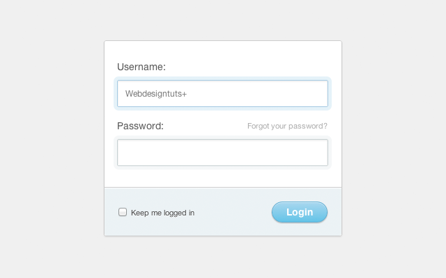
大功告成! 在下面,您将找到我们优雅登录表单的最终代码,该代码应该为您提供类似于以下内容的代码:
HTML:
<!doctype html>

   	<head>

   		<!-- Basics -->

   		<meta charset="utf-8">
   		<meta http-equiv="X-UA-Compatible" content="IE=edge,chrome=1">

   		<title>Login</title>

   		<!-- CSS -->

   		<link rel="stylesheet" href="css/reset.css">
   		<link rel="stylesheet" href="css/animate.css">
   		<link rel="stylesheet" href="css/styles.css">

   	</head>

   		<!-- Main HTML -->

   	<body>

   		<!-- Begin Page Content -->

		<div id="container">

			<form>

				<label for="username">Username:</label>

				<input type="text" id="username" name="username">

				<label for="password">Password:</label>

				<p><a href="#">Forgot your password?</a></p>

				<input type="password" id="password" name="password">

				<div id="lower">

					<input type="checkbox"><label class="check" for="checkbox">Keep me logged in</label>

					<input type="submit" value="Login">

				</div><!--/ lower-->

			</form>

		</div><!--/ container-->


   		<!-- End Page Content -->

   	</body>

   	</html>
CSS:
/* Basics */

   html, body {
   	width: 100%;
   	height: 100%;
   	font-family: "Helvetica Neue", Helvetica, sans-serif;
   	color: #444;
   	-webkit-font-smoothing: antialiased;
   	background: #f0f0f0;

   }

   #container {
   	position: fixed;
   	width: 340px;
   	height: 280px;
   	top: 50%;
   	left: 50%;
   	margin-top: -140px;
   	margin-left: -170px;
   	background: #fff;
   	border-radius: 3px;
   	border: 1px solid #ccc;
   	box-shadow: 0 1px 2px rgba(0, 0, 0, .1);
   	-webkit-animation-name: bounceIn;
   	-webkit-animation-fill-mode: both;
   	-webkit-animation-duration: 1s;
   	-webkit-animation-iteration-count: 1;
   	-webkit-animation-timing-function: linear;
   	-moz-animation-name: bounceIn;
   	-moz-animation-fill-mode: both;
   	-moz-animation-duration: 1s;
   	-moz-animation-iteration-count: 1;
   	-moz-animation-timing-function: linear;
   	animation-name: bounceIn;
   	animation-fill-mode: both;
   	animation-duration: 1s;
   	animation-iteration-count: 1;
   	animation-timing-function: linear;
   }

   form {
   	margin: 0 auto;
   	margin-top: 20px;
   }

   label {
   	color: #555;
   	display: inline-block;
   	margin-left: 18px;
   	padding-top: 10px;
   	font-size: 14px;
   }

   p a {
   	font-size: 11px;
   	color: #aaa;
   	float: right;
   	margin-top: -13px;
   	margin-right: 20px;
   	-webkit-transition: all .4s ease;
   	-moz-transition: all .4s ease;
   	transition: all .4s ease;
   }

   p a:hover {
   	color: #555;
   }

   input {
   	font-family: "Helvetica Neue", Helvetica, sans-serif;
   	font-size: 12px;
   	outline: none;
   }

   input[type=text],
   input[type=password] {
   	color: #777;
   	padding-left: 10px;
   	margin: 10px;
   	margin-top: 12px;
   	margin-left: 18px;
   	width: 290px;
   	height: 35px;
   	border: 1px solid #c7d0d2;
   	border-radius: 2px;
   	box-shadow: inset 0 1.5px 3px rgba(190, 190, 190, .4), 0 0 0 5px #f5f7f8;
   	-webkit-transition: all .4s ease;
   	-moz-transition: all .4s ease;
   	transition: all .4s ease;
   }

   input[type=text]:hover,
   input[type=password]:hover {
   	border: 1px solid #b6bfc0;
   	box-shadow: inset 0 1.5px 3px rgba(190, 190, 190, .7), 0 0 0 5px #f5f7f8;
   }

   input[type=text]:focus,
   input[type=password]:focus {
   	border: 1px solid #a8c9e4;
   	box-shadow: inset 0 1.5px 3px rgba(190, 190, 190, .4), 0 0 0 5px #e6f2f9;
   }

   #lower {
   	background: #ecf2f5;
   	width: 100%;
   	height: 69px;
   	margin-top: 20px;
   	box-shadow: inset 0 1px 1px #fff;
   	border-top: 1px solid #ccc;
   	border-bottom-right-radius: 3px;
   	border-bottom-left-radius: 3px;
   }

   input[type=checkbox] {
   	margin-left: 20px;
   	margin-top: 30px;
   }

   .check {
   	margin-left: 3px;
   	font-size: 11px;
   	color: #444;
   	text-shadow: 0 1px 0 #fff;
   }

   input[type=submit] {
   	float: right;
   	margin-right: 20px;
   	margin-top: 20px;
   	width: 80px;
   	height: 30px;
   	font-size: 14px;
   	font-weight: bold;
   	color: #fff;
	background-color: #acd6ef; /*IE fallback*/
   	background-image: -webkit-gradient(linear, left top, left bottom, from(#acd6ef), to(#6ec2e8));
   	background-image: -moz-linear-gradient(top left 90deg, #acd6ef 0%, #6ec2e8 100%);
   	background-image: linear-gradient(top left 90deg, #acd6ef 0%, #6ec2e8 100%);
   	border-radius: 30px;
   	border: 1px solid #66add6;
   	box-shadow: 0 1px 2px rgba(0, 0, 0, .3), inset 0 1px 0 rgba(255, 255, 255, .5);
   	cursor: pointer;
   }

   input[type=submit]:hover {
   	background-image: -webkit-gradient(linear, left top, left bottom, from(#b6e2ff), to(#6ec2e8));
   	background-image: -moz-linear-gradient(top left 90deg, #b6e2ff 0%, #6ec2e8 100%);
   	background-image: linear-gradient(top left 90deg, #b6e2ff 0%, #6ec2e8 100%);
   }

   input[type=submit]:active {
   	background-image: -webkit-gradient(linear, left top, left bottom, from(#6ec2e8), to(#b6e2ff));
   	background-image: -moz-linear-gradient(top left 90deg, #6ec2e8 0%, #b6e2ff 100%);
   	background-image: linear-gradient(top left 90deg, #6ec2e8 0%, #b6e2ff 100%);
   }
结论
我希望您在我们创建新的东西的过程中喜欢它,不仅看起来不错,而且功能漂亮,并且没有什么多余的“东西”。 谢谢阅读!
翻译自: https://webdesign.tutsplus.com/articles/build-a-quick-and-elegant-login-form--webdesign-6716
php建立表单


 扫一扫
扫一扫
 8万+
8万+

 被折叠的 条评论
为什么被折叠?
被折叠的 条评论
为什么被折叠?
 到【灌水乐园】发言


