


大约在半年前,我写了几篇介绍Silverlight Toolkit的文章,对里面的一些可能会用
到的控件做了介绍,文章链接如下:
使用Silverlight Toolkit绘制图表(上)--柱状图
使用Silverlight Toolkit绘制图表(下)--饼图,折线图,散点图
使用Silverlight Toolkit TreeView树形控件
使用Silverlight Toolkit中的主题(Theme)
Silverlight AutoCompleteBox(自动完成输入框控件)使用方法
前两天,当再次拜访其官方链接之后,发现其版本已升级到了3.0,其中又新增了不少
有意思的控件,我将会用四篇文章来简要介绍一下:)
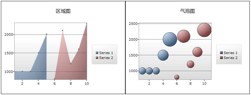
首先就是其图表控件集合中新增了两种类型,分别为:Area,Bubble(区域图和冒泡图)。
下面就是其演示效果:
首先,我们要创建一个SL应用,并在项目中加载对下面DLL文件的引用(来自下载的源
码包):
然后在相应的XAML文件中添加对控件的声明,如下:
xmlns ="http://schemas.microsoft.com/winfx/2006/xaml/presentation"
xmlns:x ="http://schemas.microsoft.com/winfx/2006/xaml"
<!--引用声明-- >
xmlns:controlsToolkit="clr-namespace:System.Windows.Controls;assembly=System.Windows.Controls.Toolkit"
xmlns:chartingToolkit="clr-namespace:System.Windows.Controls.DataVisualization.Charting;assembly=System.Windows.Controls.DataVisualization.Toolkit"
Width="800" Height="300">
< Grid x:Name ="LayoutRoot" Background ="White" >
< Grid.ColumnDefinitions >
< ColumnDefinition Width ="400" />
< ColumnDefinition Width ="400" />
</ Grid.ColumnDefinitions >
<!-- 控件定义 -->
< chartingToolkit:Chart x:Name ="AreaEmployeeList" Grid.Row ="0" Grid.Column ="0" Title ="区域图" />
< chartingToolkit:Chart x:Name ="BubbleEmployeeList" Grid.Row ="0" Grid.Column ="1" Title ="气泡图" />
</ Grid >
</ UserControl >
因为要显示数据,所以我直接将数据对象集合“硬编码”到CS文件中,如下:
{
List < EmployeeInfo > employeeList = new List < EmployeeInfo > ();
employeeList.Add( new EmployeeInfo { EmployeeID = 1 , EmployeeName = " 大林 " , Salary = 1000 , City = " 合肥 " });
employeeList.Add( new EmployeeInfo { EmployeeID = 2 , EmployeeName = " 小林 " , Salary = 1000 , City = " 合肥 " });
employeeList.Add( new EmployeeInfo { EmployeeID = 3 , EmployeeName = " 张三 " , Salary = 1000 , City = " 合肥 " });
employeeList.Add( new EmployeeInfo { EmployeeID = 4 , EmployeeName = " 李四 " , Salary = 1500 , City = " 天津 " });
employeeList.Add( new EmployeeInfo { EmployeeID = 5 , EmployeeName = " 王五 " , Salary = 2000 , City = " 上海 " });
return employeeList;
}
public List < EmployeeInfo > GetOtherEmployeeList()
{
List < EmployeeInfo > employeeList = new List < EmployeeInfo > ();
employeeList.Add( new EmployeeInfo { EmployeeID = 6 , EmployeeName = " 赵六 " , Salary = 800 , City = " 北京 " });
employeeList.Add( new EmployeeInfo { EmployeeID = 7 , EmployeeName = " 尤七 " , Salary = 2100 , City = " 武汉 " });
employeeList.Add( new EmployeeInfo { EmployeeID = 8 , EmployeeName = " 马八 " , Salary = 1209 , City = " 海口 " });
employeeList.Add( new EmployeeInfo { EmployeeID = 9 , EmployeeName = " 许九 " , Salary = 1600 , City = " 海口 " });
employeeList.Add( new EmployeeInfo { EmployeeID = 10 , EmployeeName = " 代十 " , Salary = 2300 , City = " 海口 " });
return employeeList;
}
public class EmployeeInfo
{
public int EmployeeID { set ; get ; }
public string EmployeeName { set ; get ; }
public int Salary { set ; get ; }
public int [] Cost { get ; set ; }
public string City { set ; get ; }
}
因为这两个控件都支持多数据源绑定,所以我用了两个方法分别获取对象集合,分别是:
GetEmployeeList();
GetOtherEmployeeList();
接着,就要对相应的图表控件进行初始化和数据绑定操作了,首先是“区域图表控件”,其
代码如下:
AreaSeries areaSeries1 = new AreaSeries();
areaSeries1.ItemsSource = GetEmployeeList();
areaSeries1.IndependentValueBinding = new System.Windows.Data.Binding( " EmployeeID " );
areaSeries1.DependentValueBinding = new System.Windows.Data.Binding( " Salary " );
AreaEmployeeList.Series.Add(areaSeries1);
AreaSeries areaSeries2 = new AreaSeries();
areaSeries2.ItemsSource = GetOtherEmployeeList();
areaSeries2.IndependentValueBinding = new System.Windows.Data.Binding( " EmployeeID " );
areaSeries2.DependentValueBinding = new System.Windows.Data.Binding( " Salary " );
areaSeries2.Foreground = new SolidColorBrush(Colors.Red);
AreaEmployeeList.Series.Add(areaSeries2);
#endregion
上面代码依次声明了两个AreaSeries实例用于绑定两个数据源, 同时对第二个AreaSeries实
例指定了红色背景来加以区别。当然对于AreaSeries的声明也可以放在XAML中进行定义,形如:
< chartingToolkit:Chart.Series >
< chartingToolkit:AreaSeries
Title ="Particulate Levels"
IndependentValueBinding =" {Binding EmployeeID} "
DependentValueBinding =" {Binding Salary} " />
</ chartingToolkit:Chart.Series >
</ chartingToolkit:Chart >
注:我这样写只是想演示如何使用代码方式来初始化控件和绑定数据。
上面是关于Area图,下面再看一下Bubble图的初始化方法,其实因为ToolKit中的图表设计使用
了统一的接口,因此不同的图表在具体实现时有些相似,下面的代码与上面的Area代码相差无几:
BubbleSeries bubbleSeries1 = new BubbleSeries();
bubbleSeries1.ItemsSource = GetEmployeeList();
bubbleSeries1.IndependentValueBinding = new System.Windows.Data.Binding( " EmployeeID " );
bubbleSeries1.DependentValueBinding = new System.Windows.Data.Binding( " Salary " );
bubbleSeries1.AnimationSequence = AnimationSequence.LastToFirst;
BubbleEmployeeList.Series.Add(bubbleSeries1);
BubbleSeries bubbleSeries2 = new BubbleSeries();
bubbleSeries2.ItemsSource = GetOtherEmployeeList();
bubbleSeries2.IndependentValueBinding = new System.Windows.Data.Binding( " EmployeeID " );
bubbleSeries2.DependentValueBinding = new System.Windows.Data.Binding( " Salary " );
BubbleEmployeeList.Series.Add(bubbleSeries2);
bubbleSeries1.AnimationSequence = AnimationSequence.FirstToLast;
#endregion
大家看到了吧,唯一的区别就在BubbleSeries上,而不是Area图表的AreaSeries。
最后补充一下,因为当前版本与之前我写的文章使用的版本不同,导致如果想向图表的X,Y轴
添加‘标题属性’所使用的类不同,在3.0里可用如下代码向X,Y轴绑定标题名称:
{
DisplayAxis dateAxis = new CategoryAxis { Orientation = AxisOrientation.X, Title = " 雇员ID " , FontStyle = FontStyles.Italic, ShowGridLines = true , FontSize = 14f };
AreaEmployeeList.Axes.Add(dateAxis);
DisplayAxis valueAxis = new CategoryAxis { Orientation = AxisOrientation.Y, Title = " 薪水 " , FontStyle = FontStyles.Normal, ShowGridLines = true };
AreaEmployeeList.Axes.Add(valueAxis);
};
chartModifier(AreaEmployeeList);
这样,其显示效果就会变成如下图所示(注:Y轴单位数值会从左侧变到右侧):
好的,今天的内容就先到这里了,感兴趣的朋友可以亲自本文的源码或去SilverlightToolKit
官方下载一试便知。
源码下载:http://files.cnblogs.com/daizhj/Silverlight_ToolKit3.rar
原文链接: http://www.cnblogs.com/daizhj/archive/2009/07/23/1529320.html
作者: daizhj, 代震军
Tags: silverlight,AreaSeries,BubbleSeries,chart,图表
网址: http://daizhj.cnblogs.com/


 1050
1050

 被折叠的 条评论
为什么被折叠?
被折叠的 条评论
为什么被折叠?
 到【灌水乐园】发言


