


Toolbar
Toolbar是什么?大概说一下它的官方介绍。Toolbar是应用的内容的标准工具栏,可以说是Actionbar的升级版,两者不是独立关系,要使用Toolbar还是得跟ActionBar扯上关系的。相比Actionbar Toolbar最明显的一点就是变得很自由,可随处放置,因为它是作为一个ViewGroup来定义使用的,所以单纯使用ActionBar已经稍显过时了,它的一些方法已被标注过时。
那么它怎么使用呢,首先我们一样要用到v7的支持包,然后定义程序的主题样式,在style里得先把Actionbar去掉,有点像欲想练功,必先自宫的感觉啊。如下:
/res/values/styles.xml
|
1
2
3
4
5
6
7
8
9
10
11
12
13
14
15
16
17
18
19
20
21
22
23
24
25
26
27
28
29
30
31
32
33
|
<
resources
xmlns:android
=
"http://schemas.android.com/apk/res/android"
>
<
style
name
=
"AppBaseTheme"
parent
=
"Theme.AppCompat.Light.NoActionBar"
>
<!-- toolbar(actionbar)颜色 -->
<
item
name
=
"colorPrimary"
>#4876FF</
item
>
<!-- 状态栏颜色 -->
<
item
name
=
"colorPrimaryDark"
>#3A5FCD</
item
>
<!-- 窗口的背景颜色 -->
<
item
name
=
"android:windowBackground"
>@android:color/white</
item
>
<!-- SearchView -->
<
item
name
=
"searchViewStyle"
>@style/MySearchViewStyle</
item
>
</
style
>
<
style
name
=
"AppTheme"
parent
=
"@style/AppBaseTheme"
></
style
>
<
style
name
=
"MySearchViewStyle"
parent
=
"Widget.AppCompat.SearchView"
>
<!--
Background for the search query section (e.g. EditText)
<item name="queryBackground">...</item>
Background for the actions section (e.g. voice, submit)
<item name="submitBackground">...</item>
Close button icon
<item name="closeIcon">...</item>
Search button icon
<item name="searchIcon">...</item>
Go/commit button icon
<item name="goIcon">...</item>
Voice search button icon
<item name="voiceIcon">...</item>
Commit icon shown in the query suggestion row
<item name="commitIcon">...</item>
Layout for query suggestion rows
<item name="suggestionRowLayout">...</item>
-->
</
style
>
</
resources
>
|
去除Actionbar最简单的方法就是直接继承NoActionBar的主题了。颜色的属性说明,还是下面这张图最清楚了:

另外,SearchView在AppCompat中提供了更强的可定制性和更多的样式可供设置,不过一般我们用默认的就行。
还有我们可以在values-v21给API21的系统版本设置默认的底部导航栏默认的颜色:
/res/values-v21/styles.xml
|
1
2
3
4
5
6
|
<
resources
xmlns:android
=
"http://schemas.android.com/apk/res/android"
>
<
style
name
=
"AppTheme"
parent
=
"@style/AppBaseTheme"
>
<!-- 底部导航栏颜色 -->
<
item
name
=
"android:navigationBarColor"
>#4876FF</
item
>
</
style
>
</
resources
>
|
设置好主题的下一步工作:
在xml的layout中定义一个Toolbar:
/layout/toolbar.xml
|
1
2
3
4
5
6
7
8
9
10
11
|
<?
xml
version
=
"1.0"
encoding
=
"utf-8"
?>
<
android.support.v7.widget.Toolbar
xmlns:android
=
"http://schemas.android.com/apk/res/android"
xmlns:app
=
"http://schemas.android.com/apk/res/com.example.toolbar"
android:id
=
"@+id/toolbar"
android:layout_width
=
"match_parent"
android:layout_height
=
"wrap_content"
android:background
=
"?attr/colorPrimary"
android:minHeight
=
"?attr/actionBarSize"
app:popupTheme
=
"@style/ThemeOverlay.AppCompat.Light"
app:theme
=
"@style/ThemeOverlay.AppCompat.ActionBar"
>
</
android.support.v7.widget.Toolbar
>
|
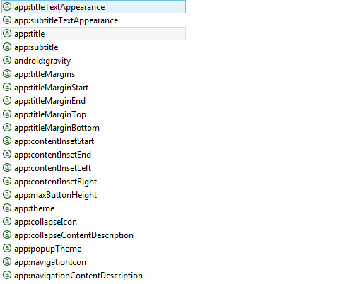
我们把toolbar作为一个独立的布局xml,方便在其他布局里include进去。可以看到我们在这里是可以设置Toolbar的属性的,初上面的外还有以下的属性,都是见名知意的就不一一说明了。
然后在activity的布局里把它include进去就行了,当然一般把它放到最上面了,有需要你是可以把它放到中间、底部或其它位置的,可见它的自由度是很高的。在下一步呢就到代码了,在onCreate中:
|
1
2
3
4
5
6
7
8
9
10
11
12
13
14
15
16
17
18
19
20
21
22
23
24
25
26
|
mToolbar = (Toolbar) findViewById(R.id.toolbar);
// toolbar.setLogo(R.drawable.ic_launcher);
mToolbar.setTitle(
"Rocko"
);
// 标题的文字需在setSupportActionBar之前,不然会无效
// toolbar.setSubtitle("副标题");
setSupportActionBar(mToolbar);
/* 这些通过ActionBar来设置也是一样的,注意要在setSupportActionBar(toolbar);之后,不然就报错了 */
// getSupportActionBar().setTitle("标题");
// getSupportActionBar().setSubtitle("副标题");
// getSupportActionBar().setLogo(R.drawable.ic_launcher);
/* 菜单的监听可以在toolbar里设置,也可以像ActionBar那样,通过Activity的onOptionsItemSelected回调方法来处理 */
mToolbar.setOnMenuItemClickListener(
new
Toolbar.OnMenuItemClickListener() {
@Override
public
boolean
onMenuItemClick(MenuItem item) {
switch
(item.getItemId()) {
case
R.id.action_settings:
Toast.makeText(MainActivity.
this
,
"action_settings"
,
0
).show();
break
;
case
R.id.action_share:
Toast.makeText(MainActivity.
this
,
"action_share"
,
0
).show();
break
;
default
:
break
;
}
return
true
;
}
});
|
上面关键的一点就是setSupportActionBar(mToolbar);把Toolbar当做ActionBar给设置了。menu还是可以像ActionBar一样用和处理的:
res/menu/main.xml
|
1
2
3
4
5
6
7
8
9
10
11
12
13
14
15
16
17
18
19
20
21
22
|
<
menu
xmlns:android
=
"http://schemas.android.com/apk/res/android"
xmlns:app
=
"http://schemas.android.com/apk/res-auto"
xmlns:tools
=
"http://schemas.android.com/tools"
tools:context
=
".MainActivity"
>
<
item
android:id
=
"@+id/ab_search"
android:orderInCategory
=
"80"
android:title
=
"action_search"
app:actionViewClass
=
"android.support.v7.widget.SearchView"
app:showAsAction
=
"ifRoom"
/>
<
item
android:id
=
"@+id/action_share"
android:orderInCategory
=
"90"
android:title
=
"action_share"
app:actionProviderClass
=
"android.support.v7.widget.ShareActionProvider"
app:showAsAction
=
"ifRoom"
/>
<
item
android:id
=
"@+id/action_settings"
android:orderInCategory
=
"100"
android:title
=
"action_settings"
app:showAsAction
=
"never"
/>
</
menu
>
|
这一步时候程序的样子:
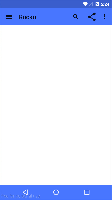 PS. Genymotion可以用5.0的模拟器了
可以感觉到这样是不是和ActionBar没什么区别呢。诶,左边的菜单图标怎么出来的呢,其实上面还没处理到,他就是Navigation drawer了,使用新版本的v4、v7库的drawer明显的一点是它带了一个酷酷的交互动画(请看最后的gif图)。那么使用Toolbar之后又怎么去在Toolbar中使用drawer呢。下面当然也是跟着代码来.
/layout/activity_main.xml
|
1
2
3
4
5
6
7
8
9
10
11
12
13
14
15
16
17
18
19
20
21
22
23
24
25
26
27
28
29
30
31
32
33
34
35
36
37
38
39
40
41
42
|
<
LinearLayout
xmlns:android
=
"http://schemas.android.com/apk/res/android"
xmlns:tools
=
"http://schemas.android.com/tools"
android:layout_width
=
"match_parent"
android:layout_height
=
"match_parent"
android:orientation
=
"vertical"
tools:context
=
"com.example.toolbar.MainActivity"
>
<
include
layout
=
"@layout/toolbar"
/>
<
android.support.v4.widget.DrawerLayout
android:id
=
"@+id/drawer"
android:layout_width
=
"match_parent"
android:layout_height
=
"match_parent"
>
<!-- 内容界面 -->
<
LinearLayout
android:layout_width
=
"match_parent"
android:layout_height
=
"match_parent"
android:orientation
=
"vertical"
>
<
com.example.toolbar.widget.PagerSlidingTabStrip
android:id
=
"@+id/tabs"
android:layout_width
=
"match_parent"
android:layout_height
=
"48dip"
>
</
com.example.toolbar.widget.PagerSlidingTabStrip
>
<
android.support.v4.view.ViewPager
android:id
=
"@+id/pager"
android:layout_width
=
"match_parent"
android:layout_height
=
"match_parent"
>
</
android.support.v4.view.ViewPager
>
</
LinearLayout
>
<!-- 侧滑菜单内容 -->
<
LinearLayout
android:id
=
"@+id/drawer_view"
android:layout_width
=
"match_parent"
android:layout_height
=
"match_parent"
android:layout_gravity
=
"start"
android:background
=
"@drawable/drawer"
android:orientation
=
"vertical"
android:padding
=
"8dp"
>
<
TextView
android:layout_width
=
"match_parent"
android:layout_height
=
"match_parent"
/>
</
LinearLayout
>
</
android.support.v4.widget.DrawerLayout
>
</
LinearLayout
>
|
Pager的东西可以先忽略,后面会说到。侧滑菜单的内容为简单起见直接先用图片来演示了。可以看到布局的设置大同小异,不同点在代码中:
|
1
2
3
4
5
6
|
getSupportActionBar().setDisplayHomeAsUpEnabled(true);
mDrawerLayout = (DrawerLayout) findViewById(R.id.drawer);
mDrawerToggle = new ActionBarDrawerToggle(this, mDrawerLayout, mToolbar, R.string.drawer_open,
R.string.drawer_close);
mDrawerToggle.syncState();
mDrawerLayout.setDrawerListener(mDrawerToggle);
|
先把图标设置显示出来,然后把ActionBarDrawerToggle作为DrawerLayout的监听器设置进去,还是比较简单的,效果:

要是需要把drawer覆盖toolbar怎么办呢?需要稍微调整一下界面的布局位置就行了,效果就不贴上来了(脑补,或者改下源码的setContentView运行):
|
1
2
3
4
5
6
7
8
9
10
11
12
13
14
15
16
17
18
19
20
21
22
23
24
25
26
27
28
29
30
31
32
33
34
35
36
37
38
39
40
41
42
43
44
45
46
47
|
<
android.support.v4.widget.DrawerLayout
xmlns:android
=
"http://schemas.android.com/apk/res/android"
xmlns:tools
=
"http://schemas.android.com/tools"
android:id
=
"@+id/drawer"
android:layout_width
=
"match_parent"
android:layout_height
=
"match_parent"
android:fitsSystemWindows
=
"true"
>
<
LinearLayout
android:layout_width
=
"match_parent"
android:layout_height
=
"match_parent"
android:orientation
=
"vertical"
tools:context
=
"com.example.toolbar.MainActivity"
>
<
include
layout
=
"@layout/toolbar"
/>
<!-- 内容界面 -->
<
LinearLayout
android:layout_width
=
"match_parent"
android:layout_height
=
"match_parent"
android:background
=
"@drawable/content"
android:orientation
=
"vertical"
>
<
com.example.toolbar.widget.PagerSlidingTabStrip
android:id
=
"@+id/tabs"
android:layout_width
=
"match_parent"
android:layout_height
=
"48dip"
android:visibility
=
"invisible"
>
</
com.example.toolbar.widget.PagerSlidingTabStrip
>
<
android.support.v4.view.ViewPager
android:id
=
"@+id/pager"
android:layout_width
=
"match_parent"
android:layout_height
=
"match_parent"
android:visibility
=
"invisible"
>
</
android.support.v4.view.ViewPager
>
</
LinearLayout
>
</
LinearLayout
>
<!-- 侧滑菜单内容 -->
<
LinearLayout
android:id
=
"@+id/drawer_view"
android:layout_width
=
"match_parent"
android:layout_height
=
"match_parent"
android:layout_gravity
=
"start"
android:background
=
"@drawable/drawer"
android:orientation
=
"vertical"
android:clickable
=
"true"
android:padding
=
"8dp"
>
<
TextView
android:layout_width
=
"match_parent"
android:layout_height
=
"match_parent"
/>
</
LinearLayout
>
</
android.support.v4.widget.DrawerLayout
>
|
Demo源码下载地址:http://download.csdn.net/detail/bbld_/8191251
依赖库android-support-v7-appcompat.rar with Palette : http://download.csdn.net/detail/bbld_/8382913


 被折叠的 条评论
为什么被折叠?
被折叠的 条评论
为什么被折叠?
 到【灌水乐园】发言


