


在Clojure中(主要)绘制内存和CPU使用率数据的最佳方法是什么? 我将比较gnuplot,带有JFreeChart的Incanter和vega-lite(通过Oz)。 (剧透:我最喜欢Oz / vega-lite,但仍然使用Incanter来准备数据。)
数据如下所示:
;; sec.ns | memory | CPU %
1541052937.882172509 59m 0.0
1541052981.122419892 78m 58.0
1541052981.625876498 199m 85.9
1541053011.489811184 1.2g 101.8数据已由monitor-usage.sh生成 。
工具
Gnuplot 5
Gnuplot是最简单的,开箱即用。 但这也有些陈旧,缺乏灵活性。
这是代码:
#!/usr/bin/env gnuplot --persist -c
# Plot memory and CPU usage over time. Usage:
# usage-plot.gp <input file> [<output .png file>]
# where the input file has the columns `<unix time> <memory, with m/g suffix> <% cpu>`
# To create the input file, see https://gist.github.com/jakubholynet/931a3441982c833f5f8fcdcf54d05c91
# Arguments:
infile=ARG1
outfile=ARG2
set term x11
set title 'Memory, CPU usage from' . infile
set xdata time
set timefmt "%s"
set xlabel "Time [[hh:]mm:ss]"
set ylabel "Memory usage"
set format y '%.1s%cB'
set y2label 'CPU usage'
set format y2 '%.0s%%'
set y2tics nomirror
set tics out
set autoscale y
set autoscale y2
# Credit: Christoph @ https://stackoverflow.com/a/52822256/204205
resolveUnit(s)=(pos=strstrt("kmgtp",s[strlen(s):*]), real(s)*(1024**pos))
if (exists("outfile") && strlen(outfile) > 0) {
print "Outputting to the file ", outfile
set term png # 640,480
set output outfile
}
# Styling
set style line 1 linewidth 2 linecolor 'blue'
set style line 2 linecolor 'light-green'
#set xtics font ", 10"
set tics font ", 10"
set xtics rotate 60 # put label every 60s, make vertical so they don't clash in .png if too many
plot infile u 1:3 with lp axes x1y2 title "cpu" linestyle 2, \
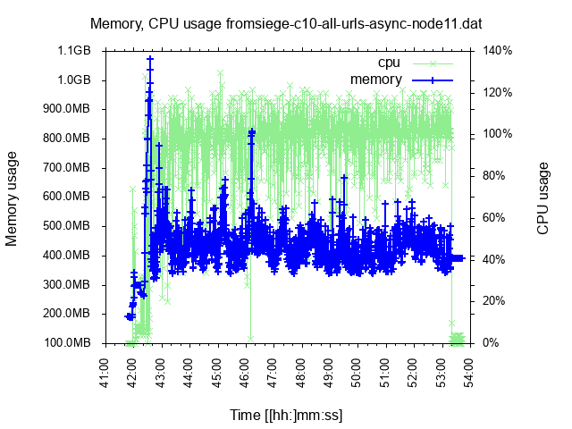
infile using 1:(resolveUnit(stringcolumn(2))) with linespoints title "memory" linestyle 1这是一个示例输出:
优点:功能丰富(支持字节轴,两个Y轴,读取数据)。
缺点:古老的语言,不太灵活; 当我有较长时间的数据时,无法阻止彼此绘制X标签。
咒语(JFreeChart)
Incanter是(曾经是)Clojure中用于数据分析的工具,它包括用于图表的Java库JFreeChart。 最近有了一些发展(集成clojure.core.matrix),但其他方面却停滞了。 这就是为什么社区做出了新的努力的原因。
这是代码的第一部分,它准备要绘制图表的数据(也用于Oz):
(ns clj-charting.usage-chart-preparation
  (:require
    [incanter.core :refer :all]
    [incanter.stats :as s]
    [incanter.io :as io]))

(defn- resolve-unit-suffix
  "Replace values such as 333k, 800m, 1.2g with the corresponding value in bytes"
  [val-suffixed]
  (if-let [[_ val unit] (and
                          (string? val-suffixed)
                          (re-find #"(\d+)([kmg])" val-suffixed))]
    (let [order (case unit
                  "k" 1
                  "m" 2
                  "g" 3)
          scale (apply * (take order (repeat 1024)))]
      (* (Integer/parseInt val) scale))))

(defn read-usage-data
  "Read usage data in the form `sec.ns memory_with_scale_suffix CPU_percentage` into a dataset with
   `ms memory_in_bytes CPU_percentage`"
  [file]
  (let [data (io/read-dataset
               file
               :delim \space)]
    (-> data
        ;; Memory: from 300m or 1g to a number:
        (transform-col
          :col1
          resolve-unit-suffix)
        ;; CPU: From <sec>.<nano> to <ms>:
        (transform-col
          :col0
          #(long (* 1000 %))))))

(defn moving-window-means
  "Given very scattered data, produce a similar sequence of 'moving window mean' where we
   replace each point by the mean of it and the preceding/following `radius` points.
   "
  [radius col]
  (let [x' (concat (repeat radius nil) col)
        parts (drop-last radius (partition (inc (* 2 radius)) 1 x'))
        means (map #(-> (remove nil? %) s/mean long)
                   parts)]
    means))
这是格式化图表的代码(最困难的部分是以一种不错的方式在轴上显示kB / MB / GB值;我真的很想念Gnuplot的现成支持):
(ns clj-charting.incanter
(:require
[incanter.core :refer :all]
[incanter.charts :refer :all]
[clj-charting.usage-chart-preparation :refer [read-usage-data moving-window-means]])
(:import
[org.jfree.chart JFreeChart]
[org.jfree.chart.plot XYPlot]
(org.jfree.chart.axis ValueAxis NumberAxis NumberTickUnit TickUnitSource TickUnit)
(java.text NumberFormat DecimalFormat FieldPosition)))
(defn merge-y-axis
"Merge the Y axis of two line / time series charts. The former chart will have
the left Y axis, and the latter will have the right. Incanter does not support 2 Y
axes out of the box.
Source: https://matthewdowney.github.io/clojure-incanter-plot-multiple-y-axis.html"
[^JFreeChart chart ^JFreeChart chart-to-merge]
(let [^XYPlot plot (.getPlot chart-to-merge)]
(doto ^XYPlot (.getPlot chart)
(.setRangeAxis 1 (.getRangeAxis plot))
(.setDataset 1 (.getDataset plot))
(.mapDatasetToRangeAxis 1 1)
(.setRenderer 1 (.getRenderer plot)))
(-> (.getPlot chart)
(.getLegendItems)
(.addAll (.getLegendItems plot)))
chart))
(defn byte-scale
"For the given number [in bytes] return [scale, scale suffix] so that we can divide it
by the scale and display with the corresponding suffix.
Example: 2333 -> [1024 \"kB\"]"
[num]
(let [k 1024
m (int (Math/pow 1024 2))
g (int (Math/pow 1024 3))]
(condp <= num
g [g "GB"]
m [m "MB"]
k [k "kB"]
[1 ""])))
(defn format-bytes
"For the given number [in bytes] return [the number scaled down, the scale suffix such as \"kB\"].
Example: 2333 -> [2.278 \"kB\"]"
[num]
(let [[scale unit] (byte-scale num)]
[(/ num scale) unit]))
;; Instance of NumberFormat that displays a byte number scaled down and with the scale suffix
;; Example: 2333 -> \"2.3kB\"]"
(def byteFmt (let [dec-fmt (java.text.DecimalFormat. "#.#")]
(proxy [java.text.NumberFormat] []
(format [^double number, ^StringBuffer toAppendTo, ^FieldPosition pos]
(let [[n u] (format-bytes number)]
(.append
(.format dec-fmt n toAppendTo pos)
u))))))
(defn nearest-byte-tick
"For the given byte number, find out what tick to show on the axis;
e.g. we would rather see a tick such as '800MB' than '783.5MB' on it."
([^double size tick-fn]
(let [[scale] (byte-scale size)]
(NumberTickUnit.
(* scale
;; FIXME if size = 1000 upgrade to 1024
(.getSize
(tick-fn
(NumberTickUnit. (/ size scale)))))
byteFmt))))
(def byte-tick-source
"TickUnitSource suitable for byte values spanning multiple of kB - MB - GB"
;; TODO Instead of reusing IntegerTickUnits, reimplement it to support powers of 2
(let [int-tick-units (NumberAxis/createIntegerTickUnits)]
(reify
TickUnitSource
(^TickUnit getLargerTickUnit [_ ^TickUnit unit]
(nearest-byte-tick
(.getSize unit)
#(.getLargerTickUnit int-tick-units %)))
(^TickUnit getCeilingTickUnit [me ^TickUnit unit]
(.getCeilingTickUnit me (.getSize unit)))
(^TickUnit getCeilingTickUnit [_ ^double size]
(nearest-byte-tick
size
#(.getCeilingTickUnit int-tick-units %))))))
(defn set-bytes-tick-unit [^JFreeChart chart]
(let [^XYPlot plot (.getPlot chart)
^NumberAxis axis (.getRangeAxis plot)]
(.setStandardTickUnits axis byte-tick-source)
chart))
(defn plot-usage [file]
(let [data (read-usage-data file)
time (sel data :cols 0)
mem (sel data :cols 1)
cpu (sel data :cols 2)]
(->
(time-series-plot time cpu :title file :y-label "cpu [%]" :legend true)
(add-lines time (moving-window-means 60 cpu) :series-label "cpu (mean)")
(merge-y-axis
(set-bytes-tick-unit
(time-series-plot time mem :series-label "Memory")))
(view))))
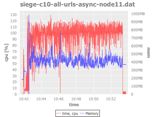
(plot-usage "siege-c10-all-urls-async-node11.dat")那是相当疯狂的工作,对吧? 结果:
Voz-lite via Oz
Vega和Vega-lite可视化语法:Vega是用于创建,保存和共享可视化设计的声明性格式。 使用Vega,可视化内容以JSON描述,并使用HTML5 Canvas或SVG生成交互式视图。
Vega-lite(和Vega )是新手。 它从D3和R的ggplot2学到了很多东西,旨在用于数据探索,交互式图表,并使在同一页面上合并多个图表成为可能,同时使之尽可能简单。 它基于图形语法,因此事先经过深思熟虑。
Oz是围绕vega / vega-lite的薄包装,它使得可以与Clojure REPL中的Clojure数据与浏览器进行交互。
(注意:Oz当前使用VL v2.6,而最新的VL是v3rc8,这修复了v2中的某些限制。)
如上所述,我们使用与pure-Incanter示例相同的use -chart-preparation.clj来准备图表数据。 然后,绘制它们:
(ns clj-charting.oz
  (:require
    [oz.core :as oz]
    [incanter.core :refer :all]
    [clj-charting.usage-chart-preparation :refer [read-usage-data moving-window-means]]))

(defn dataset->map-list
  "Incanter dataset into a list of maps like
   {\"0\" 1541065398391, \"1\" 446693376, \"2\" 99.9, \"cpu_mean\" 89}"
  [ds]
  (let [rows (to-list ds)
        means (moving-window-means 60 (sel ds :cols 2))]
    (map
      #(assoc
         (zipmap (map str (range)) %1)
         "cpu_mean" %2)
      rows
      means)))

;;;;;;;;;;;;;;;;;;;;;;;;;;;;;;;;;;;;;;;;;;;;;;;;;;;;;;;;;;;;;;;;;;;;;;;;;;;;;;;;;;;;;;;;;;;;;;;;;;;;;;;;;;;;;;;;

(def gb4 (* 3 1024 1024 1024))

;; TODO Display legend - IMPOSSIBLE :-( until Datum
(def line-plot
  (let [data (dataset->map-list (read-usage-data "siege-c10-all-urls-async-node11.dat"))
        x-enc {:field "0"
               :type "temporal"
               :timeUnit "hoursminutesseconds" ; :aggregate "mean" l <- this kills points with same value
               :axis {:title "Time"}
               :scale {:zero false}}]
    {:width 700
     :data {:values data}

     ;;; ?? requires VL v3 until then we have to compute cpu_mean using Incanter
     ;:transform [{:window [{:op "mean"
     ;                       :field "1"
     ;                       :as "cpu_mean"}]
     ;             :frame [-10, 10]}]
     ; TODO VLv3: use this ?? instead of repeating the X on each plot
     ;:encoding {:x x-enc}
     :layer [{:mark {:type "line"
                     :clip true
                     :color "red"}
              :encoding {:x x-enc
                         :y {:field "1"
                             :type "quantitative"
                             :axis {:format ".1s" :title "Memory" :labelColor "red" #_"required VL 3"}
                             :scale {:domain [0 gb4]}}}}
             {:layer [
                      {:mark {:type "point"
                              :clip true}
                       :encoding {:x x-enc
                                  :y {:field "2"
                                      :type "quantitative"
                                      :axis {:title "CPU [%]" :labelColor "blue"}}}}
                      {:mark {:type "line"
                              :clip true
                              :color "blue"}
                       :encoding {:x x-enc
                                  :y {:field "cpu_mean"
                                      :type "quantitative"
                                      :title nil
                                      :axis nil}}}]}]
     :resolve {:scale {:y "independent"}}}))

(oz/start-plot-server!)
(oz/v! line-plot)
它比Gnuplot中的工作量更大,但它提供了更多的价值,并且功能更强大。
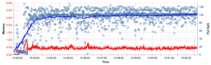
这是输出(使用VL v3生成,因此标签与行的颜色相同):
令人敬畏的是,可以将图表和数据编码为URL,以便您可以在在线Vega编辑器中打开并使用它 。
优点:良好而强大的设计,现代,互动,有前途。
缺点:社区很小,因此很难获得帮助,但社区还不那么成熟(例如,不可能在我的多层图表中添加图例)。 您必须将数据转换为JSON,因此它可能不适合大量数据。
其他选择
Clojurewerkz / envision是“一个小型,易于使用的Clojure库,用于数据处理,清理和可视化。 [..]该库的主要思想是使探索性分析更具交互性和可视性,尽管以程序员的方式。” ClojureWerkz以其对项目质量和维护的承诺而闻名,这是一件好事,另一方面,最近的代码更改是2年前。
在Clojure之外,我希望Python具有一些非常好的图表库。
结论
没有什么是最优的,但是vega-lite很有前途,我将继续使用它-我还将仍然使用Incanter来处理和准备数据。
翻译自: https://www.javacodegeeks.com/2018/11/clojure-comparison-gnuplot-plottingdata.html


 116
116


 被折叠的 条评论
为什么被折叠?
被折叠的 条评论
为什么被折叠?
 到【灌水乐园】发言


