


最近经常用highcharts开发报表,现在将本人知道的一些知识点贡献出来,希望对大家有帮助!
<%@ page language="java" contentType="text/html; charset=UTF-8"
    pageEncoding="UTF-8"%>
<!DOCTYPE html PUBLIC "-//W3C//DTD HTML 4.01 Transitional//EN" "http://www.w3.org/TR/html4/loose.dtd">
<html>
<head>
<meta http-equiv="Content-Type" content="text/html; charset=UTF-8">
<title>Highcharts Demo</title>
<script type="text/javascript" src="js/jquery.min.js"></script>
<script type="text/javascript" src="js/highcharts.js"></script>
<script type="text/javascript" src="js/excanvas.compiled.js"></script>
<script type="text/javascript">
var chart;
$(document).ready(function() {
	chart = new Highcharts.Chart({
		chart: {
			renderTo: 'container',//设置显示图表的容器
			type: 'line',//设置图表样式,可以为line,spline, scatter, splinearea bar,pie,area,column
//			defaultSeriesType: 'column', //图表的默认样式
//			margin:[21, 23, 24, 54],//整个图表的位置(上下左右的空隙)
			marginRight: 200,//右边间距
			marginBottom: 25//底部间距/空隙
//	    	inverted: false,//可选,控制显示方式,默认上下正向显示
//          shadow:true,//外框阴影
//          backgroundColor:"#FFF",
//          animation:true,
//          borderColor:"#888",
//          borderRadius:5,
//          borderWidth:1,
//          ignoreHiddenSeries:true,
//          reflow:true,
//          plotBorderWidth:1,
//          alignTicks:true
		},
		labels:{//在报表上显示的一些文本
            items:[{
                html:'本图表数据有误,仅用于说明相应的属性',
                style:{left:'100px',top:'60px'}
            }, {
                html:'http://www.highcharts.com/demo',
                style:{left:'100px',top:'100px'}
            }]
        },
        credits:{//右下角的文本
            enabled: true,
            position: {//位置设置
                align: 'right',
                x: -10,
                y: -10
            },
            href: "http://www.highcharts.com",//点击文本时的链接
            style: {
                color:'blue'
            },
            text: "Highcharts Demo"//显示的内容
        },
//        plotOptions:{//绘图线条控制
//            spline:{
//                allowPointSelect :true,//是否允许选中点
//                animation:true,//是否在显示图表的时候使用动画
//                cursor:'pointer',//鼠标移到图表上时鼠标的样式
//                dataLabels:{
//                   enabled :true,//是否在点的旁边显示数据
//                    rotation:0
//                },
//                enableMouseTracking:true,//鼠标移到图表上时是否显示提示框
//                events:{//监听点的鼠标事件
//                    click: function() {
//                    }
//                },
//                marker:{
//                    enabled:true,//是否显示点
//                   radius:3,//点的半径
//                      fillColor:"#888"
//                    lineColor:"#000"
//                    symbol: 'url(http://highcharts.com/demo/gfx/sun.png)',//设置点用图片来显示
//                    states:{
//                        hover:{
//                            enabled:true//鼠标放上去点是否放大
//                                                    },
//                        select:{
//                            enabled:false//控制鼠标选中点时候的状态
//                        }
//                    }
//               },
//                states:{
//                    hover:{
//                        enabled:true,//鼠标放上去线的状态控制
//                        lineWidth:3
//                    }
//                },
//                stickyTracking:true,//跟踪
//                visible:true,
//                lineWidth:2//线条粗细
//                pointStart:100,
//            }
//        },

		title: {
			text: 'Monthly Average Temperature',//标题
			x: -20 //center设置标题的位置
		},
		subtitle: {
			text: 'Source: WorldClimate.com',//副标题
			x: -20//副标题位置
		},
		xAxis: {//横轴的数据
			categories: ['Jan', 'Feb', 'Mar', 'Apr', 'May', 'Jun',
				'Jul', 'Aug', 'Sep', 'Oct', 'Nov', 'Dec']
//			lineWidth:1,//纵轴一直为空所对应的轴,即X轴
//			plotLines: [{//一条竖线
//	             color: '#FF0000',
//	             width: 2,
//	             value: 5.5
//	         }]
//			labels: {//设置横轴坐标的显示样式
//				rotation: -45,//倾斜度
//				align: 'right',
//				style: {
//					 font: 'normal 13px Verdana, sans-serif'
//					 color: 'white'
//				}
//			}

		},
		yAxis: {
//			tickInterval: 200,	//自定义刻度
//			max:1000,//纵轴的最大值
//			min: 0,//纵轴的最小值
			title: {//纵轴标题
				text: '百分数'
			},
			labels : {
			    formatter : function() {//设置纵坐标值的样式
			     return this.value + '%';
			    }
			   },
			plotLines: [{
				value: 0,
				width: 1,
				color: '#808080'
			}]
		},
		tooltip: {//鼠标移到图形上时显示的提示框
			formatter: function() {
					return '<b>'+ this.series.name +'</b><br/>'+
					this.x +': '+ this.y +'°C';
			}
//			crosshairs:[{//控制十字线
//	            width:1,
//	            color:"#CCC",
//	            dashStyle:"longdash"
//	        }

		},
		legend: {//方框所在的位置(不知道怎么表达)
			layout: 'vertical',
			align: 'right',
			verticalAlign: 'top',
			x: -10,
			y: 100,
			borderWidth: 0
		},
		series: [{//以下为纵轴数据
			name: 'Tokyo',
			data: [7.0, 6.9, 9.5, 14.5, 18.2, 21.5, 25.2, 26.5, 23.3, 18.3, 13.9, 9.6]
		}, {
			name: 'New York',
			data: [-0.2, 0.8, 5.7, 11.3, 17.0, 22.0, 24.8, 24.1, 20.1, 14.1, 8.6, 2.5]
		}, {
			name: 'Berlin',
			data: [-0.9, 0.6, 3.5, 8.4, 13.5, 17.0, 18.6, 17.9, 14.3, 9.0, 3.9, 1.0]
		}, {
			name: 'London',
			data: [3.9, 4.2, 5.7, 8.5, 11.9, 15.2, 17.0, 16.6, 14.2, 10.3, 6.6, 4.8]
		}]
	});
});
</script>
</head>
<body>
<div id="container" ></div>
</body>
</html>
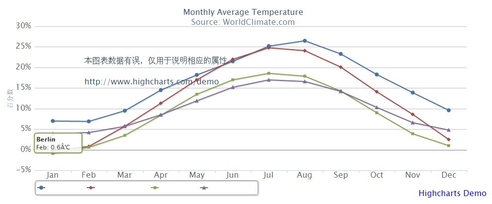
效果图类似于如下:
本人水平有限,也很少写博客,若文中有不对之处,请大家不吝指出,在此不胜感激


 343
343


 被折叠的 条评论
为什么被折叠?
被折叠的 条评论
为什么被折叠?
 到【灌水乐园】发言


