


前言
最近研究了一下css3的3D效果,写了几个demo,写篇博客总结一下实现的经过。PS:如果对transform-origin/perspective/transform-style这些概念还不了解,可以先看看张鑫旭大神写的这篇通俗易懂的文章:好吧,CSS3 3D transform变换,不过如此!。不过就是里面大神配的图片有点污,不适合在办公室看(手动捂脸)。
效果图
先来看看实际的效果图:
翻书
旋转方块

翻书效果实现过程
html结构如下:
<div class="perspective">
<div class="book-wrap">
<div class="page book-content">end</div>
<div class="page book-content book-content1">第三页</div>
<div class="page book-content book-content2">第二页</div>
<div class="page book-content book-content3">第一页</div>
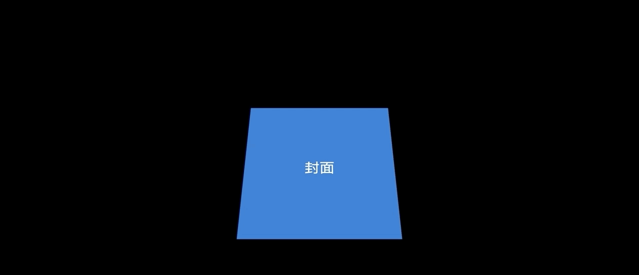
<div class="page book-cover">封面</div>
</div>
</div>首先在最外层设置一个perspective和transform-style,设置子元素为3D透视,并且设置眼睛距离屏幕的距离为800px。
.perspective {
    margin-top: 100px;
    perspective: 800px;
    transform-style: preserve-3d;
}
接下来是book-wrap,设置width和height都为300px,并且X轴旋转30deg,这样看着更有立体感,设置子元素为3D透视。
.book-wrap {
    width: 300px;
    height: 300px;
    position: relative;
    margin: 0 auto;
    transform: rotateX(30deg);
    transform-style: preserve-3d;
}然后是page,设置绝对定位并且left和top为0,将所有的page重叠起来.元素旋转的基准位置为left,transform-origin: left
.page {
    width: 100%;
    height: 100%;
    position: absolute;
    left: 0;
    top: 0;
    font-size: 30px;
    display: flex;
    justify-content: center;
    align-items: center;
    transform-origin: left;
    border: 1px solid #1976D2;
}接下来就是使用animation实现动画效果了,我们这里的实现思路是封面页先开始旋转,然后过一秒后是第一页开始旋转,再过一秒是第二页开始旋转,最后是第三页。一个周期设置为6秒,注意每页的延迟时间 + 旋转时间 === 6s
.book-content {
    background-color: #fff;
    color: #33363C;
}
.book-cover {
    background-color: #1976D2;
    color: #ffffff;
    animation: roll 6s ease 0s 2 alternate;
}
.book-content1{
    animation: roll 3s ease 3s 2 alternate;
}
.book-content2 {
    animation: roll 4s ease 2s 2 alternate;
}
.book-content3 {
    animation: roll 5s ease 1s 2 alternate;
}这样就使用纯css实现了一个完整的翻书效果,源码地址https://github.com/heavenYJJ/css3/blob/master/translate-book.html
旋转方块
路过webpack官网的时候看见他的logo,觉得很好看,然后就照着他的样子撸了一个出来。使用css3画正方体网上有很多文章,这里我们就不具体描述了,直接贴出源码地址https://github.com/heavenYJJ/css3/blob/master/cube.html。


 2717
2717


 被折叠的 条评论
为什么被折叠?
被折叠的 条评论
为什么被折叠?
 到【灌水乐园】发言


