


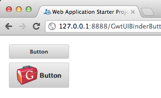
这是一个有关如何在GWT上使用UIBinder创建自定义按钮的示例。


public class GwtUIBinderButton implements EntryPoint {

 public void onModuleLoad() {
  Button button = new Button();
  button.setText("Button");
  button.addClickHandler(new ClickHandler(){
   @Override
   public void onClick(ClickEvent event) {
    Window.alert("Button clicked");
   }
  });
  RootPanel.get("container").add(button);
 }
}
public class Button extends Composite implements HasText, HasClickHandlers, ClickHandler{
private static ButtonUiBinder uiBinder = GWT.create(ButtonUiBinder.class);
interface ButtonUiBinder extends UiBinder<Widget, Button> {
}
@UiField(provided=true)
FocusPanel pane = new FocusPanel();
@UiField(provided=true)
Label label = new Label();
public Button() {
pane.addClickHandler(this);
initWidget(uiBinder.createAndBindUi(this));
}
@Override
public HandlerRegistration addClickHandler(ClickHandler handler) {
return addHandler(handler, ClickEvent.getType());
}
@Override
public void onClick(ClickEvent event) {
this.fireEvent(event);
}
@Override
public String getText() {
return label.getText();
}
@Override
public void setText(String text) {
label.setText(text);
}
}<!DOCTYPE ui:UiBinder SYSTEM "http://dl.google.com/gwt/DTD/xhtml.ent">
<ui:UiBinder xmlns:ui="urn:ui:com.google.gwt.uibinder"
xmlns:g="urn:import:com.google.gwt.user.client.ui">
<ui:style>
.button{
background-color: #eeeeee;
background-image: -webkit-gradient(linear, left top, left bottom, color-stop(0%, #eeeeee), color-stop(100%, #cccccc));
background-image: -webkit-linear-gradient(top, #eeeeee, #cccccc);
background-image: -moz-linear-gradient(top, #eeeeee, #cccccc);
background-image: -ms-linear-gradient(top, #eeeeee, #cccccc);
background-image: -o-linear-gradient(top, #eeeeee, #cccccc);
background-image: linear-gradient(top, #eeeeee, #cccccc);
border: 1px solid #ccc;
border-bottom: 1px solid #bbb;
-webkit-border-radius: 3px;
-moz-border-radius: 3px;
-ms-border-radius: 3px;
-o-border-radius: 3px;
border-radius: 3px;
color: #333;
font: bold 11px "Lucida Grande", "Lucida Sans Unicode", "Lucida Sans", Geneva, Verdana, sans-serif;
line-height: 1;
padding: 0px 0;
text-align: center;
text-shadow: 0 1px 0 #eee;
width: 120px;
}
.button:hover{
background-color: #dddddd;
background-image: -webkit-gradient(linear, left top, left bottom, color-stop(0%, #dddddd), color-stop(100%, #bbbbbb));
background-image: -webkit-linear-gradient(top, #dddddd, #bbbbbb);
background-image: -moz-linear-gradient(top, #dddddd, #bbbbbb);
background-image: -ms-linear-gradient(top, #dddddd, #bbbbbb);
background-image: -o-linear-gradient(top, #dddddd, #bbbbbb);
background-image: linear-gradient(top, #dddddd, #bbbbbb);
border: 1px solid #bbb;
border-bottom: 1px solid #999;
cursor: pointer;
text-shadow: 0 1px 0 #ddd;
}
.button:active{
border: 1px solid #aaa;
border-bottom: 1px solid #888;
-webkit-box-shadow: inset 0 0 5px 2px #aaaaaa, 0 1px 0 0 #eeeeee;
-moz-box-shadow: inset 0 0 5px 2px #aaaaaa, 0 1px 0 0 #eeeeee;
box-shadow: inset 0 0 5px 2px #aaaaaa, 0 1px 0 0 #eeeeee;
}
.pane{
text-align: center;
}
</ui:style>
<g:SimplePanel ui:field="pane" styleName="{style.button}">
<g:Label ui:field="label"></g:Label>
</g:SimplePanel>
</ui:UiBinder>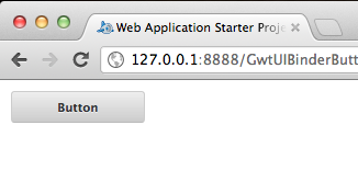
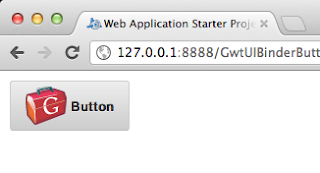
添加图像:
<g:SimplePanel ui:field="pane" styleName="{style.button}">
  <g:HTMLPanel>
   <table align="center">
    <tr>
     <td>
      <g:Image styleName="{style.pane}" url="gwt-logo-42x42.png"></g:Image>
     </td>
     <td>
      <g:Label ui:field="label"></g:Label>
     </td>
    </tr>
   </table>
  </g:HTMLPanel>
 </g:SimplePanel>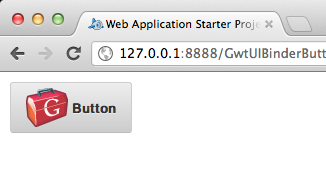

参考:来自GlyphSoft博客的JCG合作伙伴 Mark Andro Silva 使用UIBinder的GWT自定义按钮 。
翻译自: https://www.javacodegeeks.com/2012/03/gwt-custom-button-using-uibinder.html


 5807
5807

 被折叠的 条评论
为什么被折叠?
被折叠的 条评论
为什么被折叠?
 到【灌水乐园】发言


