


自己在react-native第三方组件库基础之上再次封装的一些组件集,供日常开发使用,大大提高开发效率。
初步形成规模,组件不复杂,易于使用,暴露的属性很少,便于顺利嵌入后期公司编写的自动化生成代码中。代码结构优雅,符合react组件化思想,是本人心血结晶。
使用typescript编写,嵌入第三方组件库,进行再开发,有兴趣可移步至:
https://github.com/HY88883/react-native-usefulapp
后期会进行维护更新,进行hook重构,往函数式编程方向发展。
- 头像
- 按钮
- 轮播图
- 环形进度条
- 分割线
- 列表分页
- 图片展示
- 多选按钮
- 折叠面板
- 日期选择器
- 本地文件选择器
- 宫格
- 选择图片上传
- 对话框
- 下拉选择框
- 选择器
- 悬浮气泡
- 单选按钮
- 搜索输入框
- 滑动输入条
- 星级评分
- 步骤条
- 表格
- 标签
- 树形控件
- 条形进度条
- 可点击组件
- 模态对话框
- 选择框
- 上传组件
等等。。。

未完。。。。后续会更新更加强大的组件。
下面是demo代码:
import React, {Component} from 'react';
import {Alert, Image, ScrollView, StyleSheet, Text, View,} from 'react-native';
import {Provider} from '@ant-design/react-native';
import MyDocumentPicker from '@/components/MyDocumentPicker';
import Upload from '@/components/Upload';
import Touchable from '@/components/Touchable';
import ImagePickerComponent from '@/components/MyImagePicker';
import {scaleSizeH, scaleSizeW, setSpText, wp} from '@/utils/index';
import MyGrid from '@/components/MyGrid';
import * as Yup from 'yup';
import Data from '../../Data';
import TreeData from '../../treeData';
import {
Avatar,
Button,
Carrousel,
CircularProgress,
Divider,
ModalDialog,
MyAlbumView,
MyDatePicker,
MyModal,
MyModalDropdown,
MyPicker,
MyPopover,
MyRadio,
MySearchInput,
MySelect,
MySlider,
MyStarRating,
MyStepIndicator,
MyTable,
MyTag,
MyTreeSelect,
ProgressBarDialog,
} from '@/components/index';
class Demo extends Component {
state = {
fill: 100,
visible: false,
albumVisible: false,
progressModalVisible: false,
ModalVisible: false,
};
private BackAndroid: any;
componentDidUpdate(
prevProps: Readonly<P>,
prevState: Readonly<S>,
snapshot?: SS,
): void {
if (this.state.visible) {
setTimeout(() => {
this.setState({visible: false});
}, 2000);
}
}
render() {
const {
visible,
albumVisible,
progressModalVisible,
ModalVisible,
fill
} = this.state;
return (
<Provider>
<ScrollView style={{flex: 1}} contentContainerStyle={{}}>
<Text style={styles.text}>头像:</Text>
<Avatar
type={'image'}
uri={'https://t7.baidu.com/it/u=1819248061,230866778&fm=193&f=GIF'}
/>
<Text style={styles.text}>按钮:</Text>
<Button text={'登录'} loading buttonStyle={{width: wp(20)}} />
{<Text>{'\n'}</Text>}
<Button
type={'icon'}
text={'点击'}
buttonStyle={{width: wp(20)}}
icon={
<Image
source={require('@/assets/image/home/fangshui.png')}
style={{width: 12, height: 12, marginRight: 4}}
/>
}
/>
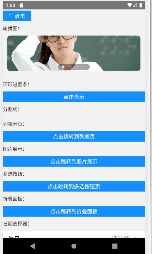
<Text style={styles.text}>轮播图:</Text>
<Carrousel
data={[
'https://t7.baidu.com/it/u=1289999949,1171310040&fm=193&f=GIF',
'https://t7.baidu.com/it/u=3856305042,3534148316&fm=193&f=GIF',
'https://t7.baidu.com/it/u=618936275,430993586&fm=193&f=GIF',
'https://t7.baidu.com/it/u=458768340,2511869234&fm=193&f=GIF',
]}
dotsLength={4}
/>
<Text style={styles.text}>环形进度条:</Text>
<Button
text="点击显示"
onPress={() => this.setState({visible: !this.state.visible})}
/>
<CircularProgress visible={visible} content={'下载'} fill={fill} />
<Text style={styles.text}>分割线:</Text>
<Divider />
<Text style={styles.text}>列表分页:</Text>
{/*ListPage*/}
<Button
text="点击跳转到列表页"
onPress={() => this.props.navigation.navigate('ListPage')}
/>
<Text style={styles.text}>图片展示:</Text>
<Button
text="点击跳转到图片展示"
onPress={() => this.setState({albumVisible: true})}
/>
<MyAlbumView
albumVisible={albumVisible}
imaeDataUrl={[
'https://t7.baidu.com/it/u=1289999949,1171310040&fm=193&f=GIF',
'https://t7.baidu.com/it/u=3856305042,3534148316&fm=193&f=GIF',
'https://t7.baidu.com/it/u=618936275,430993586&fm=193&f=GIF',
'https://t7.baidu.com/it/u=458768340,2511869234&fm=193&f=GIF',
]}
curentImage={0}
cancel={() => {
this.setState({albumVisible: false});
}}
/>
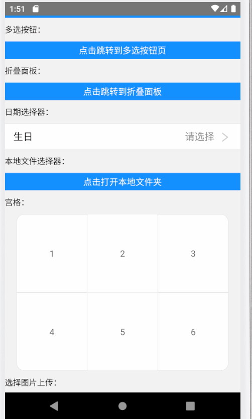
<Text style={styles.text}>多选按钮:</Text>
<Button
text="点击跳转到多选按钮页"
onPress={() => this.props.navigation.navigate('CheckboxDemo')}
/>
<Text style={styles.text}>折叠面板:</Text>
<Button
text="点击跳转到折叠面板"
onPress={() => this.props.navigation.navigate('CollapsibleDemo')}
/>
{/*MyDatePicker*/}
<Text style={styles.text}>日期选择器:</Text>
<MyDatePicker
title={'生日'}
extra={'请选择'}
onChange={value => {
console.log(value);
}}
mode={'time'}
/>
{/*本地文件选择器*/}
<Text style={styles.text}>本地文件选择器:</Text>
<Button
text="点击打开本地文件夹"
onPress={() => {
MyDocumentPicker.pickerSingleFile(
value => {
console.log(value);
},
error => {
console.log(error);
},
);
}}
/>
{/*宫格*/}
<Text style={styles.text}>宫格:</Text>
<MyGrid
data={[
{text: 1},
{text: 2},
{text: 3},
{text: 4},
{text: 5},
{text: 6},
]}
/>
<Text style={styles.text}>选择图片上传:</Text>
<ImagePickerComponent type={'photo'} callback={value=>{
console.log(value)
}}/>
<Text style={styles.text}>拍摄图片上传:</Text>
<ImagePickerComponent type={'shoot'} maxCount={4} layout={'row'} />
{<Text>{'\n'}</Text>}
<ImagePickerComponent type={'shoot'} maxCount={4} layout={'column'}/>
<Text style={styles.text}>对话框:</Text>
<Button
text="点击显示对话框"
onPress={() =>
MyModal.alert('测试', '你好!', data1 => {
console.log(data1);
})
}
/>
<Text style={styles.text}>下拉选择框:</Text>
<MyModalDropdown
options={['测试', '程序', '案例', 'react', 'javascript', 'java']}
onSelect={(index, value) => {
console.log(index, value);
}}>
<Text style={styles.text}>请点击选择</Text>
</MyModalDropdown>
<Text style={styles.text}>选择器:</Text>
<View style={{paddingHorizontal: scaleSizeW(12)}}>
<MyPicker
data={Data}
cols={3}
title={'省市区'}
extra={'请选择'}
onChange={data => {
console.log(data);
}}
/>
</View>
<Text style={styles.text}>悬浮气泡:</Text>
<MyPopover arrow={'topLeft'} children={<Text>你好</Text>} />
<Text style={styles.text}>单选按钮:</Text>
<MyRadio
list={[
{titleIndex: 'item1', keyIndex: 1},
{titleIndex: 'item2', keyIndex: 2},
{titleIndex: 'item3', keyIndex: 3},
{titleIndex: 'item4', keyIndex: 4},
]}
keyProp={'keyIndex'}
titleProp={'titleIndex'}
defaultIndex={1}
onChange={((checked, item, index) => {
console.log(checked, item, index)
})}
/>
{/*搜索输入框*/}
<Text style={styles.text}>搜索输入框:</Text>
<MySearchInput
/*onChangeText={text => {
console.log(text);
}}*/
onSubmitEditing={e=>{
console.log(e.nativeEvent.text)
}}
/>
{/*MySlider*/}
<Text style={styles.text}>滑动输入条:</Text>
<MySlider />
<Text style={styles.text}>星级评分:</Text>
<MyStarRating />
<Text style={styles.text}>步骤条:</Text>
<MyStepIndicator stepCount={4} labels={['1', '2', '3', '4']} />
{/*MyTable*/}
<Text style={styles.text}>表格:</Text>
<MyTable
optionsChange={{
tableHead: ['1', '2'],
tableData: [
['java', 'javascript'],
['node', 'php'],
],
}}
flexArr={[1, 1]}
/>
{/*MyTag*/}
<Text style={styles.text}>标签:</Text>
<MyTag text={'java'} style={{marginLeft:10,width: scaleSizeW(60)}} />
<MyTag text={'java'} style={{marginLeft:10,width: scaleSizeW(60)}} checkable/>
{/*MyTreeSelect*/}
<Text style={styles.text}>树形控件:</Text>
<MyTreeSelect
data={TreeData}
onClickLeaf={({item, routes}) => {
console.log(item, routes);
}}
/>
{/*进度条*/}
<Text style={styles.text}>条形进度条:</Text>
<Button
text="点击显示条形进度条"
onPress={() => this.setState({progressModalVisible: true})}
/>
<ProgressBarDialog
progressModalVisible={progressModalVisible}
title={'热更新'}
progress={90}
canclePress={() => {
this.setState({progressModalVisible: false});
}}
/>
<Text style={styles.text}>可点击组件:</Text>
<Touchable
onPress={() => {
Alert.alert('提示', '你好');
}}>
<Text>请点击我</Text>
</Touchable>
<Text style={styles.text}>模态对话框:</Text>
<Button
text="点击显示模态对话框"
onPress={() => this.setState({ModalVisible: true})}
/>
<ModalDialog
_dialogContent={<Text>这是一个模态对话框</Text>}
_dialogVisible={ModalVisible}
_dialogLeftBtnAction={() => this.setState({ModalVisible: false})}
_dialogRightBtnAction={() => this.setState({ModalVisible: false})}
/>
<Text style={styles.text}>选择框:</Text>
<MySelect
items={[
{
text: 'Long long long long long long long',
value: 1,
},
{
text: 'Short',
value: 2,
},
]}
pickerTitle={'选择器'}
getItemText={item => item.text}
getItemValue={item => item.value}
onSelected={(item, index) => {
console.log(item, index);
}}
value={1}
/>
<Text style={styles.text}>上传组件:</Text>
<Upload
maxCount={4}
onChange={list => {
console.log(list);
}}
listType={'picture-card'}
download
remove
/>
<Upload
maxCount={4}
onChange={list => {
console.log(list);
}}
listType={'file'}
download
/>
</ScrollView>
</Provider>
);
}
}
const styles = StyleSheet.create({
text: {
marginVertical: scaleSizeH(10),
},
button: {
zIndex: 1000,
},
});
export default Demo;


 2744
2744


 被折叠的 条评论
为什么被折叠?
被折叠的 条评论
为什么被折叠?
 到【灌水乐园】发言


