


46.标签群组通配等选择器
标签选择器(TAG选择器)
- 去掉某些标签的默认样式时
- 复杂的选择器中,如 层次选择器
标签选择器 CSS:div{}
html:
群组选择器(分组选择器) CSS:div,p,span{} 可以通过逗号的方式,给多个不同的选择器添加统一的css样式,来达到代码的复用。
<style>
    div{ background:red;}
    #text{ background:red;}
    .title{ background:red;}
</style>
<!-- 这两种效果一样,但下面更简洁。 -->
<style>
    div ,#text ,.title{ background:red;}
</style>

<div>这是一个块</div>
<p id="text">这是一个段落</p>
<h2 class="title">这是一个标题</h2>
通配选择器 *{ }->div,ul,li,p,h1,h2 给所有的标签都添加样式。
47.层次选择器
后代:M N
<title>Document</title>
    <style>
    #list li{ border:1px solid; }  /* 在ul下寻找li */
    </style>
</head>
<body>
    <ul id="#list">
        <li>
            <ul>
                <li></li>
                <li></li>
                <li></li>
            </ul>
        </li>
        <li></li>
        <li></li>
    </ul>
    <ol>
        <li></li>
        <li></li>
        <li></li>
    </ol>
</body>
</html>
父子:M > N
 <title>Document</title>
    <style>
    #list > li{ border:1px solid; }  /* 在ul下寻找li */
    </style>
</head>
<body>
    <ul id="#list">
        <li>
            <ul>
                <li></li>
                <li></li>
                <li></li>
            </ul>
        </li>
        <li></li>
        <li></li>
    </ul>
    <ol>
        <li></li>
        <li></li>
        <li></li>
    </ol>
</body>
</html>
兄弟:M ~ N(当前M下面所有的兄弟N标签)
相邻:M + N(当前M相邻下面的N标签)
48.属性选择器
M[attar] {}
= : 完全匹配
* = :部分匹配
^= :起始匹配
¥= :结束匹配
[][][] :组合匹配
<style>
    /* div[class=box]{ background:red;} */
    /* div[class][id]{ background:red;}(两个中括号可以同时纳入筛选) */
    div[class*=box]{ background:red;} /* 加*号可以使带有box的都能被选中 */
    </style>
</head>
<body>
    <div>111</div>
    <div class="box">222</div>
    <div class="box-buttom">233</div>
    <div class="search">333</div>
</body>
</html>

49.hover等伪类选择器
CSS伪类用于向某些元素添加特殊的效果。一般用于初始样式添加不上的时候,用伪类来添加。
M :伪类{}
:link 访问前的样式(只能添加给a标签)
:visited 访问后的样式(只能添加给a标签))
:hover 鼠标移入时的样式(可以添加给所有标签)
:active 鼠标按下时的样式
注:
1.link visited只能给a标签加,hover和active可以给所有的标签加。
2.如果四个伪类都生效,一定要注意顺序:L V H A。
3.一般网站只这样去设置:a{}:hover{}。
例一:(鼠标)
 <title>Document</title>
    <style>
    div{ width:200px;height:200px;background:red;}
    div:hover{background:blue}
    div:active{background:green}
    </style>
例二:(访问)
 <style>
    a:link{ color:red ;}
    a:visited{ color:blue ;}
    a:hover{ color:green ;}
    a:active{ color: yellow;}
    </style>
</head>
<body>
    <a href="#">一个连接</a>
</body>
</html>
注:
一般网站都只设置
a{} ( link visited active ) a:hover{}
50.after等伪类选择器
after、:before 通过伪类方式给元素添加一段文本内容,使用content属性
    <style>
	div:after{content:"world";color:red;}
    </style>
</head>
<body>   <!-- 方便文本分开进行上色 -->
    <div>hello</div>
</body>
</html>
checked、:disable、:focus 都是针对表单元素的
   <style>
	:disable{width:100px;height:100px;} /* 不选择时呈现的样子 */
	:focus{ background:red} /* 选中后表单的颜色 */
    </style>
</head>
<body>
    <input type="checkbox">
    <input type="checkbox" checked> <!-- 默认选中状态 -->
    <input type="checkbox">
</body>
</html>
51.结构伪类选择器
nth-of-type()、:nth-child()
(角标从1开始,1表示第一项;n值 表示从0开始到无穷)
:first-of-type、:first-child (第一行)
:last-of-type、 :last-child (最后一行)
:only-of-type、:only-child (只有一个)
type:类型
child:孩子
    <style>
    li:nth-of-type(3){background:red;}
    </style>
</head>
<body>
    <ul>
        <li></li>
        <div></div>
        <li></li>
        <li></li>
        <li></li>
    </ul>
</body>
</html>
*type只会在
- 中选择某一个。
*child会在全部里选某一个,但是不会有效果。 -
52.CSS样式的继承
文字相关的样式可以被继承(颜色,字形,大小等)
布局相关的样式不能被继承(边框,宽高等)(默认不能继承,但可以设置继承属性 inherit值)53.单一样式的优先级
相同样式优先级
当设置相同样式时,后面的优先级较高,但不建议出现重复设置样式的情况。内部样式与外部样式
内部样式与外部样式优先级相同,如果都设置了相同样式,那么后写的引入方式优先级高。单一样式优先级
style行间 > id > class > tag > * > 继承
例:(#elem > .box > div > * > 继承)
style行间 权重 1000
id 权重 100
class 权重10
tag 权重 154.important群组等优先级
!important
提升样式优先级,非规范方式,不建议使用。标签+类与单类
标签+类 > 单类div.box{color:blue;} /* 标签+类 */群组优先类
群组选择器与单一选择器的优先级相同,靠后写的优先级高。div,p{color:blue} /* 群组 */``` ## 55.层次的优先级 1. 权重比较 ul li .box p input{}(1+1+10+1+1)(数字为等级,不能越级) .hello span #elem{}(10+1+100) 2. 约分比较 ul li .box p input{} .hello span #elem{} (同种类型相约分,如.box和.hello约掉) ## 56.CSS盒子模型 组成 :content -> padding -> border -> margin 类比成 物品 填充物 包装 盒子与盒子之间距离 content :内容区域 width和height组成的 padding :内边距(内填充) 只写一个值 :30px 写两个值:30px 40px(上下、左右) 写四个值:30px 40px 50px 60px(上、右、下、左) 单一样式只能写一个值 padding-left padding-right padding-top padding-bottom margin :外边距(外填充) 只写一个值 :30px 写两个值:30px 40px(上下、左右) 写四个值:30px 40px 50px 60px(上、右、下、左) 单一样式只能写一个值 padding-left padding-right padding-top padding-bottom 注: 1.背景颜色会填充到margin以内的区域。 2.文字会在content区域。 3. padding不能出现负值,margin是可以出现负值。 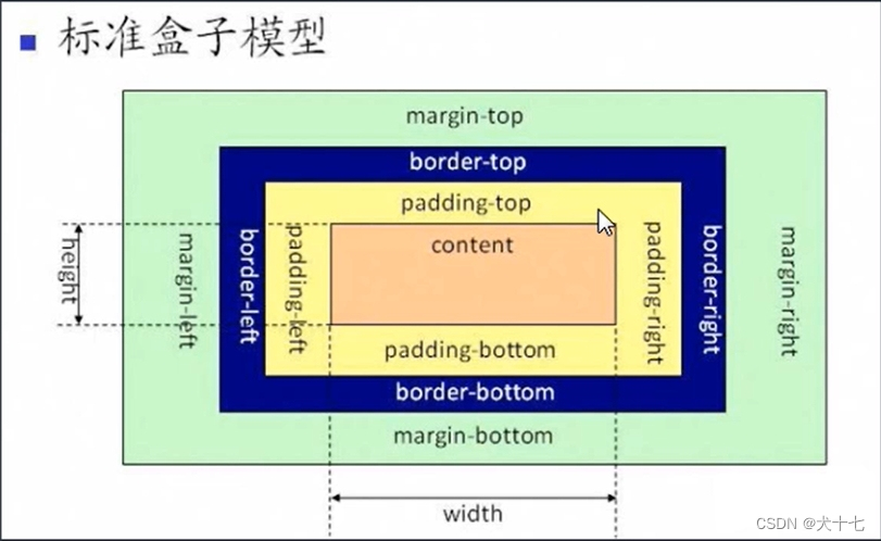<style> #box{ width:200px; height:200px; background:red; border:10px /* transparent solid */; padding : 30px 50px; margin: 10px; } #box2{ width:200px; height :200px; background:Oblack; color:white;} </style>盒子1盒子2``` ## 57.box-sizing改变盒模型 盒尺寸,可以改变盒子模型的展示形态。 默认值:content-box :width、 height -> content border-box : width、 height -> content padding border (宽高分配给三个类型)<style> #box{ width:200px; height:200px; background:red; border:10px blue solid; padding : 30px 50px; box-sizing: border-box; /* 省去计算 */ } input{ width:100%; padding: 30px;box-sizing: border-box;} </style> </head> <body> <div id="box1">盒子1</div> <input type="text"> </body> </html>使用的场景:
1.不用再去计算一些值
2.解决一些10B%的问题58.盒模型之margin叠加问题
当给两个盒子同时添加上下外边距的时候,就会出现叠加的问题。这个问题,只在上下有,左右是没有这个叠加问题的。
margin叠加问题,出现在上下margin同时存在的时候,会取上下中值较大的作为叠加的值。<style> #box1{width:200px; height:200px; background:red;margin-bottom: 30px;} #box2{width:200px; height:200px; background:blue;margin-top: 30px;} </style> <!-- 上下边距不会进行累加,而是叠加,谁大用谁的值 --> </head> <body> <div id="box1">盒子1</div> <div id="box2">盒子2</div> </body> </html>解决方案:
1.BFC规范
2.想办法只给一个元素添加间距。59.盒模型之margin传递问题
margin传递的问题只会出现在嵌套的结构中,且只有margin-top会有传递的问题,其它三个方向是没有传递问题的。
解决方案:
1.BFC规范
2.给父容器加边框。
3.margin换成padding。60.CSS盒子模型之扩展
1.margin自适应:
margin左右自适应是可以的,上下自适应则不行。
2.不设置content现象:
width、height不设置的情况下,对盒子模型的影响,会自动去计算容器的大小,省去部分代码。设置时:

不设置:
61.盒子模型的嵌套练习
    <style>
    #box1{width:350px; height:350px; border:1px black dashed;padding:27px;}
    #box2{border: 5px #d7effe solid;padding:20px;}
    #box3{background: #ffa0df;padding:40px;}
    #box4{border: 1px white dashed;padding:3px;}
    #box5{border: 1px white dashed;padding:49px;}
    #box6{width:100px; height:100px; background:#96ff38;border:#fcff00 5px solid;}
    </style>
<body>
    <div id="box1">
        <div id="box2">
            <div id="box3">
                <div id="box4">
                    <div id="box5">
                        <div id="box6"></div>
                    </div>
                </div>
            </div>
        </div>
    </div>
</body>
</html>
效果图:

62.按类型划分标签
block :div、p、ul、li、/h1 …
1、一个块独占一行
2、支持所有样式
3、不写宽的时候,跟父元素的宽一样
4、所占区域是一个矩形inline :span、a、em、strong、img …
1、挨在一起的(不独占一行)
2、有些样式不支持,例如:width、height、marign、padding
3、不写宽的时候,宽由内容决定
4、所占的区域不一定是矩形
5、内联标签之间有空隙,是换行原因引起的(可以将font-size:0放在body里来解决,后面样式再添加回字原来的大小font-size:xxx)inline-block :input、select …
1、挨在一起,且支持宽高注:布局一般用块标签,修饰文本一般用内联标签
63.按内容划分标签
Flcw :流内容
Metadata :元数据
Sectioning :分区
Heading :标题
Phrasing :措辞
Embedded:嵌入的
Interactive :互动的

64.按显示划分标签
替换元素:浏览器根据元素的标签和属性,来决定元素的具体显示内容。
img、input …
非替换元素:将内容直接告诉浏览器,将其显示出来。
div、h1、p …65display显示框类型
display:
block
inline
inline-block
none
(区别:dispaly:none 不占空间的隐藏)
( visibility:hidden 占空间的隐藏)66.标签嵌套规范
ul、li
di、dt、dd
table、tr、td
1、块能够嵌套内联<div> <span></span><a href="#"></a> </div>2、块嵌套块
<div>
	<div></div>
</div>
特殊;
(错误的写法)<p> <div></div> </p>3、内联是不能嵌套块
(错误的写法)<span> <div></div> </span>特殊:
(正确的写法)<a href="#"> <div></div> </a>(a里面不能再写a)
67.overflow溢出隐藏
visible :默认
hidden
scroll(一直显示滚动条)
auto(字多的时候显示滚动条)
x轴、y轴<style> div{width: 100px;height: 100px;border:1px black solid;overflow:hidden;} </style>68.透明度与手势
opacity:
opacity: 0(透明,占空间)~1(不透明)、0.5(半透明)
注:
占空间,所有的子内容也会透明rgba
rgba() : 0~1
注:
可以让指定的样式透明,而不影响其他样式cursor : 手势
default : 默认手势
要实现自定义手势:
准备图片: .cur 、.ico (ur(图片地址),auto;)69.最大最小宽高
min-width、min-height(扩)
max-width、max-height(缩)
注:强化对百分比的理解
%单位:换算 ->以父容器的大小进行换算的(一个容器怎么适应屏幕的高:肉鳍加height:100%; body%; html:100%)
70.CSS默认样式
有些标签有默认样式,有些标签没有默认样式。
没有默认样式:
div、span、…有默认样式:
body、h1…h6、p、ul、…body -> marign : 8px
h1 -> marign : 上下 21.440px
p -> marign : 上下 19px
ul -> marign : 上下 16px padding :左 40px
默认点:list-style : disc
a -> text-decoration: underline;71.CSS重置样式
简单的CSS reset :
*{ margin:0; padding:0; }
ul{ list-style:none; }
a{ text-decoration:none; color:#666; }
img{ display:block; }CSS reset :
margin:e; padding:e;}
优点:不用考虑哪些标签有默认的margin和padding
缺点:稍微的影响性能
body,p,h1,ul{ margin:0; padding:0; }1.ul{ list-style : none;}
2.a{ text-decoration: none; color:#999;}
3.img{ dispaly:block }
问题的现象:图片跟容器底部有一些空隙。
内联元素的对齐方式是按照文字基线对齐的,而不是文字底线对齐的。
vertical-align: baseline;基线对齐方式,默认值
img{ vertical-align:bottom;}解决方式是推荐的
常见的CSS reset

写具体页面的时候或一个布局效果的时候
1.写结构
2. css重置样式
3. 写具体样式78.float浮动概念及原理
文档流
文档流是文档中可显示对象在排列时所占用的位置。float特性
加浮动的元素,会脱离文档流,会延迟父容器靠左或靠右排列,如果之前已经有浮动的元素,会挨着浮动的元素进行排列。float取值
left
right
none(默认)<style> body{ border:1px black solid; } #box1{ width: 100px;height: 100px; background:yellow; float: left;} #box2{ width: 200px;height: 200px; background:red; float: left;} </style> <body> <div id="box1"></div> <div id="box2"></div> </body> </html>79.float注意点整理
- 只会影响后面的元素。
    <style>
    body{ border:1px black solid; }
    #box1{ width: 100px;height: 100px; background:yellow;}
    #box2{ width: 200px;height: 200px; background:red; float: left;}
    #box3{ width: 200px;height: 200px; background:blue;}
    </style>
    </style>
<body>
    <div id="box1"></div>
    <div id="box2"></div>
    <div id="box3"></div>
</body>
</html>
- 内容默认提升半层。(不被覆盖)
- 默认宽根据内容决定。(例如:文字长度)
- 换行排列。(浮动元素放不下会折行,第二行元素可能会被第一行元素挡住而不会顶到最左边)
- 主要给块元素添加,但也可以给内联元素添加。
80、81.清除float浮动
上下排列:
clear属性,表示清除浮动的,left、right、both(全部)<style> #box1{ width: 100px;height: 100px; background:yellow;float: left;} #box2{ width: 200px;height: 200px; background:red;clear: both;} </style> </style> <body> <div id="box1"></div> <div id="box2"></div> </body> </html>嵌套排列:
固定宽饰 : 不推荐,不能把高度固定死,不适合做自适应的效果。
父元素浮动 : 不推荐,因为父容器浮动也会影响到后面的元素。
overflow : hidden (BFC规范),如果有子元素想溢出,那么会受到影响。
display : inline-block (BFC规范),不推荐,父容器会影响到后面的元素。
设置空标签 : 不推荐,会多添加一个标签。
after伪类 : 推荐,是空标签的加强版,目前各大公司的做法。
(clear属性只会操作快标签,对内联标签不起作用)
(after伪类):<style> #box1{ width: 100px;border: 1px black solid} #box2{ width: 200px;height: 200px; background:red;float: left;} .clear::after{content:'';clear:both;display: block;} </style> </style> <body> <div id="box1" class="clear"> <div id="box2"></div> </div> </body> </html>82、83.float制作页面小结构

<!DOCTYPE html>
<html lang="en">
<head>
    <meta charset="UTF-8">
    <meta http-equiv="X-UA-Compatible" content="IE=edge">
    <meta name="viewport" content="width=device-width, initial-scale=1.0">
    <title>Document</title>
    <style>
    *{ margin: 0; padding: 0;}
    ul{list-style: none;}
    img{display: block;}
    a{ text-decoration: none;color: #666}
        h1,h2,h3{font-size: 160px};
    .l{float: left;}
    .r{float: right;}
    .clear :after{ content:"";display: block;clear: both;}

    #main{width: 366px;margin: 20px auto;}
    #main .title{height: 23px;line-height:23px ;font-size: 12px;font-weight: bold;padding: left 30px;
        background: url(图片地址1) no-repeat 6px 4px, url(图片地址2) repeat-x ;
    }                     /* 先写的在上面 */
    #main ul{ overflow: hidden;margin-top: 13px; }
    #main li{ margin-bottom: 22px; }
    #main .pic{ width: 100px; border:1px soled #c8c4d3; margin-left: 5px;}
    #main .pic img{ margin:2px; }
    #main .content{ width: 240px; font-size: 12px; line-height: 20px;}
    #main .content h2{ font-size: 12px; line-height: 24px; }
    #main .content p{ font-size: 12px; line-height: 20px; }
    </style>
    </style>
<body>
    <div id="main">
        <h2>外媒评论精选</h2>
        <ul>
            <li>
                <div class="1 pic">
                    <a href="#">
                        <img src="图片地址1" alt="">
                    </a>
                </div>
                <div class="1 content">
                    <h2>测试标题</h2>
                    <p>
                        测试段落测试段落测试段落测试段落。。。。。。
                        <a href="#">[详细]</a>
                    </p>
                </div>
            </li>
            <li>
                <div class="1 pic">
                    <a href="#">
                        <img src="图片地址2" alt="">
                    </a>
                </div>
                <div class="1 content">
                    <h2>测试标题</h2>
                    <p>
                        测试段落测试段落测试段落测试段落。。。。。。
                        <a href="#">[详细]</a>
                    </p>
                </div>
            </li>
            <li>
                <div class="1 pic">
                    <a href="#">
                        <img src="图片地址3" alt="">
                    </a>
                </div>
                <div class="1 content">
                    <h2>测试标题</h2>
                    <p>
                        测试段落测试段落测试段落测试段落。。。。。。
                        <a href="#">[详细]</a>
                    </p>
                </div>
            </li>
        </ul>
    </div>
</body>
</html>


 523
523

 被折叠的 条评论
为什么被折叠?
被折叠的 条评论
为什么被折叠?
 到【灌水乐园】发言


