


Toolbar是什么,不知道的可以去大神的博客瞻仰下
http://blog.csdn.net/lmj623565791/article/details/45303349
我当时也是看这篇学习的,但是怎么说,看完之后想在自己的项目中把Toolbar完全自定义的时候,博客中并没有讲解。这篇博客也只是一个记载,并没有很高深的技术,废话不多说。
一般大家在写Toolbar的布局一般在menu.xml中,默认是这样的
<menu xmlns:android="http://schemas.android.com/apk/res/android"
    xmlns:tools="http://schemas.android.com/tools"
    tools:context="com.example.fuckfragment.MainActivity" >

    <item
        android:id="@+id/action_settings"
        android:orderInCategory="100"
        android:showAsAction="never"
        android:title="@string/action_settings"/>

</menu>
所以,在显示的时候都会有三个点
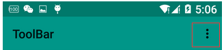
其实要想他消失也很简单,直接把上面的item注释掉就自然不见了,左边的文字如果不给title或者subtiltle设置值的话会默认显示项目名称,想要消失也很简单直接给titile设置个空格” “,直接空”“是不起作用的。
我自己项目中的样子
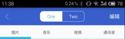
下面的布局里你就可以随便写你的Toolbar了。注意下面在设置title等属性的时候要用app命名空间,android打头的也有,但是可能设置不会显示
toolbar.xml
<?xml version="1.0" encoding="utf-8"?>
<android.support.v7.widget.Toolbar xmlns:android="http://schemas.android.com/apk/res/android"
    xmlns:app="http://schemas.android.com/apk/res-auto"
    xmlns:segmentedgroup="http://schemas.android.com/apk/res-auto"
    android:layout_width="match_parent"
    android:layout_height="wrap_content"
    android:background="?attr/colorPrimary"
    android:minHeight="?attr/actionBarSize"
    app:navigationIcon="@drawable/press_back"
    app:title=" " >
 <TextView
        android:id="@+id/toolbar_num"
        android:layout_width="wrap_content"
        android:layout_height="wrap_content"
        android:layout_gravity="left"
        android:layout_marginLeft="16dp"
        android:text="num"
        android:textColor="#fff"
        android:visibility="gone"
        android:textSize="16dp" />
    <com.hs.diskmanager.view.SegmentedGroup
        android:id="@+id/toolbar_segment"
        android:layout_width="wrap_content"
        android:layout_height="wrap_content"
        android:layout_gravity="center"
        android:layout_margin="10dp"
        android:orientation="horizontal"
        segmentedgroup:border_width="1dp"
        segmentedgroup:checked_text_color="#ff33b5e5"
        segmentedgroup:corner_radius="10dp"
        segmentedgroup:tint_color="@android:color/white" >

        <RadioButton
            android:id="@+id/toolbar_phone"
            style="@style/RadioButton"
            android:layout_width="0dp"
            android:layout_height="wrap_content"
            android:layout_weight="1"
            android:text="One" />

        <RadioButton
            android:id="@+id/toolbar_udisk"
            style="@style/RadioButton"
            android:layout_width="0dp"
            android:layout_height="wrap_content"
            android:layout_weight="1"
            android:text="Two" />
    </com.hs.diskmanager.view.SegmentedGroup>

    <TextView
        android:id="@+id/toolbar_edit"
        android:layout_width="wrap_content"
        android:layout_height="wrap_content"
        android:layout_gravity="right"
        android:layout_marginRight="16dp"
        android:text="编辑"
        android:textColor="#fff"
        android:textSize="16dp" />

</android.support.v7.widget.Toolbar>
对应布局引用
<RelativeLayout xmlns:android="http://schemas.android.com/apk/res/android"
    xmlns:tools="http://schemas.android.com/tools"
    android:layout_width="match_parent"
    android:layout_height="match_parent" >

    <include layout="@layout/toolbar"  android:id="@+id/id_toolbar"/>
    <FrameLayout
        android:id="@+id/fl_content"
        android:layout_width="match_parent"
        android:layout_height="match_parent"
        android:layout_below="@id/id_toolbar"
        >
    </FrameLayout>

</RelativeLayout>
可能有点人用完会发现自己下面的布局盖在Toolbar的布局上了,解决方法上面也有写到,就是below,其它不再多说。大家想怎么自定义就怎么自定义吧。


 1万+
1万+


 被折叠的 条评论
为什么被折叠?
被折叠的 条评论
为什么被折叠?
 到【灌水乐园】发言


