


转载请注明本文出自JFlex的博客http://blog.csdn.net/jflex/article/details/46492501,请尊重他人的辛勤劳动成果,谢谢!
Android UI之自定义——类似iOS的Tabbar
Tabbar最早出现在iOS,iOS中的TabBarController实现了这个功能,开发起来相当简单。现在的APP,大多数都会使用Tabbar来作为应用的功能导航,界面简单清晰。那么Android常见的实现是通过RadioGroup来实现,今天将带来自定义实现,补充RadioGroup实现的不足。
先看看常见的软件中的使用:
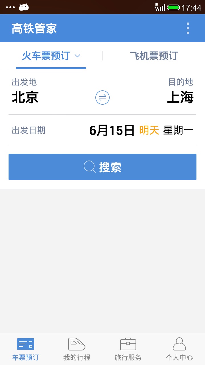
这个是高铁管家APP,大家应该非常熟悉。这个APP的首页底部就是一个类似iOS的Tabbar。这里就不多举例子了,接下来直接进入正题。
RadioGroup实现Tabbar
1、为什么用RadioGroup实现呢
熟悉RadioGroup的都知道,一个RadioGroup中只能选中一个RadioButton。而Tabbar刚好就是这么一个效果,所以用RadioGroup再好不过了。
2、实现代码
<RadioGroup
        android:id="@+id/rgHomeMenu"
        android:layout_width="match_parent"
        android:layout_height="60dp"
        android:orientation="horizontal" >

        <RadioButton
            android:layout_width="0dp"
            android:layout_height="match_parent"
            android:layout_weight="1"
            android:button="@null"
            android:checked="true"
            android:drawableTop="@drawable/icon_project_selector"
            android:gravity="center"
            android:paddingBottom="5dp"
            android:paddingTop="8dp"
            android:text="@string/project"
            android:textColor="@color/menu_txt_selector"
            android:textSize="12sp" />

        <RadioButton
            android:layout_width="0dp"
            android:layout_height="match_parent"
            android:layout_weight="1"
            android:button="@null"
            android:drawableTop="@drawable/icon_msg_selector"
            android:gravity="center"
            android:paddingBottom="5dp"
            android:paddingTop="8dp"
            android:text="@string/msg"
            android:textColor="@color/menu_txt_selector"
            android:textSize="12sp" />

        <RadioButton
            android:layout_width="0dp"
            android:layout_height="match_parent"
            android:layout_weight="1"
            android:button="@null"
            android:drawableTop="@drawable/icon_mine_selector"
            android:gravity="center"
            android:paddingBottom="5dp"
            android:paddingTop="8dp"
            android:text="@string/mine"
            android:textColor="@color/menu_txt_selector"
            android:textSize="12sp" />
    </RadioGroup>
- RadioGroup必须使用RadioButton作为子控件
- 由于Tabbar是上图片、下文字,所有需要将android:button设置空,去掉RadioButton的默认图。上图片设置android:drawableTop属性,文字设置android:text属性,其他属性按照实际需求调整即可。
- 实现起来很简单,代码页比较简洁。
3、优缺点
- 优点:代码简洁,容易实现
- 缺点:扩展性不足。因为每一个Item是RadioButton,所以只能使用这个空间的相关功能,如果需要扩展,就做不到了。
自定义Tabbar
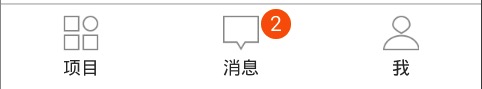
1、需求:比如现在需要在消息上添加类似iOS的badgeview的消息提示。
2、实现代码
TabGroup
这个类需要实现类似RadioGroup的作用,代码借鉴RadioGroup实现。package com.snicesoft.tabbar; import android.annotation.SuppressLint; import android.content.Context; import android.util.AttributeSet; import android.view.View; import android.view.ViewGroup; import android.widget.LinearLayout; @SuppressLint("NewApi") public class TabGroup extends LinearLayout { public TabGroup(Context context, AttributeSet attrs, int defStyleAttr, int defStyleRes) { super(context, attrs, defStyleAttr, defStyleRes); init(); } public TabGroup(Context context, AttributeSet attrs, int defStyleAttr) { super(context, attrs, defStyleAttr); init(); } public TabGroup(Context context, AttributeSet attrs) { super(context, attrs); init(); } public TabGroup(Context context) { super(context); init(); } private void init() { setOrientation(HORIZONTAL); } int mCheckedId = -1; OnTabGroupCheckedListener onTabGroupCheckedListener; public void setOnTabGroupCheckedListener( OnTabGroupCheckedListener onTabGroupCheckedListener) { this.onTabGroupCheckedListener = onTabGroupCheckedListener; } @Override public void addView(View child, int index, ViewGroup.LayoutParams params) { if (child instanceof TabItem) { final TabItem tab = (TabItem) child; if (tab.isChecked()) { check(tab.getId()); } } super.addView(child, index, params); } public void check(int checkId) { if (mCheckedId == checkId) { return; } setCheckedStateForView(mCheckedId, false); setCheckedId(checkId); mCheckedId = checkId; if (onTabGroupCheckedListener != null) onTabGroupCheckedListener.onChecked(checkId); } private void setCheckedId(int id) { View checkedView = findViewById(id); if (checkedView != null && checkedView instanceof TabItem) { ((TabItem) checkedView).setChecked(true); } } private void setCheckedStateForView(int viewId, boolean checked) { View checkedView = findViewById(viewId); if (checkedView != null && checkedView instanceof TabItem) { ((TabItem) checkedView).setChecked(checked); } } public interface OnTabGroupCheckedListener { public void onChecked(int checkedId); } }TabItem
TabItem需要集成RadioButton的功能,也需要扩展性更强。所以选择集成RelativeLayout,需要有check的状态操作,那么需要实现Checkable。package com.snicesoft.tabbar; import java.util.ArrayList; import java.util.HashMap; import android.annotation.SuppressLint; import android.content.Context; import android.graphics.drawable.Drawable; import android.graphics.drawable.StateListDrawable; import android.util.AttributeSet; import android.view.View; import android.view.ViewGroup; import android.widget.Checkable; import android.widget.RelativeLayout; @SuppressLint("NewApi") public class TabItem extends RelativeLayout implements Checkable { private ArrayList<Checkable> chechableList = new ArrayList<Checkable>(); private HashMap<View, StateListDrawable> stateListDrawableMap = new HashMap<View, StateListDrawable>(); private static final int[] CHECKED_STATE_SET = { android.R.attr.state_checked }; public TabItem(Context context, AttributeSet attrs, int defStyleAttr, int defStyleRes) { super(context, attrs, defStyleAttr, defStyleRes); init(); } public TabItem(Context context, AttributeSet attrs, int defStyleAttr) { super(context, attrs, defStyleAttr); init(); } public TabItem(Context context, AttributeSet attrs) { super(context, attrs); init(); } public TabItem(Context context) { super(context); init(); } private void init() { super.setOnClickListener(new OnClickListener() { @Override public void onClick(View v) { onChecked(); if (OnClickListener != null) OnClickListener.onClick(v); } }); } @Override public void addView(View child, int index, android.view.ViewGroup.LayoutParams params) { super.addView(child, index, params); setStates(child); } private void setStates(View child) { Drawable drawable = child.getBackground(); if (drawable != null && drawable instanceof StateListDrawable) { stateListDrawableMap.put(child, (StateListDrawable) drawable); } child.setClickable(false); if (child instanceof Checkable) { chechableList.add((Checkable) child); } if (child instanceof ViewGroup) { final ViewGroup group = (ViewGroup) child; if (group.getChildCount() > 0) { for (int i = 0; i < group.getChildCount(); i++) { setStates(group.getChildAt(i)); } } } } OnClickListener OnClickListener; @Override public void setOnClickListener(OnClickListener l) { OnClickListener = l; } boolean isChecked = false; @Override public void setChecked(boolean checked) { if (isChecked == checked) return; for (Checkable ca : chechableList) { ca.setChecked(checked); } if (checked) { for (View v : stateListDrawableMap.keySet()) { StateListDrawable drawable = stateListDrawableMap.get(v); drawable.setState(CHECKED_STATE_SET); v.setBackground(drawable.getCurrent()); } } else { for (View v : stateListDrawableMap.keySet()) { v.setBackground(stateListDrawableMap.get(v)); } } isChecked = checked; } private void onChecked() { if (getParent() instanceof TabGroup) { final TabGroup group = (TabGroup) getParent(); group.check(getId()); } } @Override public boolean isChecked() { return isChecked; } @Override public void setPressed(boolean pressed) { super.setPressed(pressed); if (!pressed) { setChecked(true); } } @Override public void toggle() { setChecked(!isChecked); } }RelativeLayout中的默认带有Pressed属性的组件,不如Button,会拦截onClick事件,所以TabItem中的所有组件都背设置不可点击。
- 为了让TabItem的兼容性达到RadioButton一样,所以在setChecked方法中将TabItem中包含的所有集成Checkable的View强制调用setChecked方法,能够达到同步效果(点击TabItem的时候,能够将check的状态传递到子控件中)
- 为了让TabItem中的组件能够使用selector,需要用到StateListDrawable来控制不同状态的背景显示。
3、优缺点
- 优点:使用方法和RadioGroup一致,扩展性强
- 缺点:layout代码比RadioGroup多,没有设置默认checked属性
总结
这种自定义控件,只是在原生控件的基础上改进,是比较初级的,只需要掌握改进原理,修改的方法很多种的。本人的修改只是一个简单的演示,希望大家有好的改进方法,不吝赐教。


 8866
8866


 被折叠的 条评论
为什么被折叠?
被折叠的 条评论
为什么被折叠?
 到【灌水乐园】发言


