


文章目录
相关知识点链接–点进 】
平面转换--------------------------------2D
一、平面转换属性之位移–transform:translate
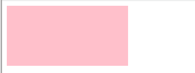
1.小开胃
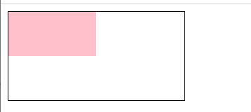
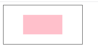
<!DOCTYPE html>
<html lang="en">
<head>
    <meta charset="UTF-8">
    <meta http-equiv="X-UA-Compatible" content="IE=edge">
    <meta name="viewport" content="width=device-width, initial-scale=1.0">
    <title>Document</title>
</head>
<style>
    .father{
        border: 1px solid black;
width: 200px;
height: 100px;
    }
    .son{
        width: 100px;
        height: 50px;
        background-color: pink;
        transition:all 1s;

    }
    .father:hover .son{
        transform:translate(50%,50%);
    }


</style>
<body>

    <div class="father">
        <div class="son"></div>
    </div>
</body>
</html>
2.双开门(使用到了精灵图)
图片奉上

 效果图 向两边打开

<!DOCTYPE html>
<html lang="en">
<head>
    <meta charset="UTF-8">
    <meta http-equiv="X-UA-Compatible" content="IE=edge">
    <meta name="viewport" content="width=device-width, initial-scale=1.0">
    <title>Document</title>
    <style>
        .father{
            width: 1360px;
            height: 600px;
            background:url(./images/bg.jpg);
            overflow: hidden;
            margin: auto;
        }

        .son1{
            float: left;
            width: 50%;
            height: 600px;
            background: url(./images/fm.jpg);
            transition: all 1s;
        }
        .son2{
            float: right;
            width: 50%;
            height: 600px;
            background: url(./images/fm.jpg) no-repeat -680px 0px;
            transition: all 1s;
        }
        .father:hover .son1{
            transform:translate(-680px) ;
        }
        .father:hover .son2{
            transform:translate(680px) ;
        }
    </style>
</head>
<body>
   <div class="father">
       <div class="son1">
<!-- <img src="./images/fm.jpg"> -->
       </div>
       <div class="son2">

    </div>
   </div>
</body>
</html>
二、平面转换属性之旋转–transform:rotate
小开胃
图片奉上

<!DOCTYPE html>
<html lang="en">
<head>
    <meta charset="UTF-8">
    <meta http-equiv="X-UA-Compatible" content="IE=edge">
    <meta name="viewport" content="width=device-width, initial-scale=1.0">
    <title>Document</title>
    <style>
        img{
            transition: all 1s;
        }
        img:hover{
            transform: rotate(180deg);
        }
    </style>
</head>
<body>
    <img src="./image/rotate.png" alt="">
</body>
</html>
提高-改变旋转原点transform-origin
取值:
方位名词(left、top、right、buttom、center)eg:left bottom; 左下角-常用
像素单位值
百分比(参照盒子自身尺寸计算)

<!DOCTYPE html>
<html lang="en">
<head>
    <meta charset="UTF-8">
    <meta http-equiv="X-UA-Compatible" content="IE=edge">
    <meta name="viewport" content="width=device-width, initial-scale=1.0">
    <title>Document</title>
    <style>
        img{
            width: 250px;
            border:1px solid #000;
            transition: all 1s;
            transform-origin:right bottom;
        }
        img:hover{
            transform: rotate(180deg);
        }
    </style>
</head>
<body>
    <img src="./image/rotate.png" alt="">
</body>
</html>
多重转换(位移加旋转) --轮胎移动
图片奉上

轮胎边旋转边移动


<!DOCTYPE html>
<html lang="en">
<head>
    <meta charset="UTF-8">
    <meta http-equiv="X-UA-Compatible" content="IE=edge">
    <meta name="viewport" content="width=device-width, initial-scale=1.0">
    <title>轮胎旋转</title>
    <style>
        .box{
         width: 800px;
         height: 200px;
         border: 1px solid black;
        }
        img{
            height: 200px;
            transition: all 2s;
        }
        img:hover{
            transform: translate(600px) rotate(360deg);
        }
    </style>
</head>
<body>
    <div class="box">
        <img src="image/tyre.png">

        </div>
    </div>
</body>
</html>
三、平面转换属性之缩放–transform:scale
图片奉上


<!DOCTYPE html>
<html lang="en">
<head>
    <meta charset="UTF-8">
    <meta http-equiv="X-UA-Compatible" content="IE=edge">
    <meta name="viewport" content="width=device-width, initial-scale=1.0">
    <title>轮胎旋转</title>
    <style>
        .box{
         width: 500px;
         height: 400px;
         border: 1px solid black;
         text-align: center;
        }
        img{
            height: 200px;
            transition: all 2s;
            margin-top: 100px;

        }
        img:hover{
            transform: scale(2);
        }
    </style>
</head>
<body>
    <div class="box">
        <img src="image/daji.jpg">

        </div>
    </div>
</body>
</html>
背景渐变-渐变案例


<!DOCTYPE html>
<html lang="en">
<head>
    <meta charset="UTF-8">
    <meta http-equiv="X-UA-Compatible" content="IE=edge">
    <meta name="viewport" content="width=device-width, initial-scale=1.0">
    <title>Document</title>
    <style>
        .box{
            float: left;
            position: relative;
            /* text-align: center; */
            /* width: 400px; */
            /* height: 400px; */
            /* background-image: linear-gradient(
               transparent,
               rgba(0,0,0,0.6)
            );     */

        }
        span{
            position: absolute;
            width: 538px;
            left: 118px;
            bottom: 36px;
            /* margin: auto; */
            /* text-align: center; */
            font-size: 45px;
            font-weight: bold;
            color: rgb(240, 239, 238);
        }
        .mask{
            position: absolute;
            left: 0px;
            top: 0px;
            float: left;
            width: 772px;
            height: 546px;
            opacity: 0;
            background-image: linear-gradient(
               transparent,
               rgba(0,0,0,0.6)
            );

        }
              .mask:hover{
                opacity: 1;
              }
    </style>
</head>
<body>
    <div class="box">
        <img src="./image/product.jpg" alt="">
        <span>
            OceanStor Pacific海量存储斩获2021Interop金奖
        </span>
    </div>
    <div class="mask"></div>
</body>
</html>
综合案例


 HTML
HTML
<!DOCTYPE html>
<html lang="en">
<head>
    <meta charset="UTF-8">
    <meta http-equiv="X-UA-Compatible" content="IE=edge">
    <meta name="viewport" content="width=device-width, initial-scale=1.0">
    <title>Document</title>
    <link rel="stylesheet" href="./css/demo1.css">
    <!-- <link rel="stylesheet" href="./css/demo.css"> -->
</head>
<body>
    <div class="box">
        <div class="one lf common">
            <div class="one1 common1">
            <p>
                产品
            </p>
            OceanStor Pacific 海量存储斩获 2021 Interop金奖

        </div>
        <h6>
            了解更多
        </h6>
        <div class="mask1 common"></div>
        </div>
        <div class="two lf common">
            <div class="two1 common1">
                <p>
                    行业洞察
                </p>
                迈向智能世界2030

            </div>
            <h6>
                了解更多
            </h6>
            <div class="mask1 common"></div>
        </div>
        <div class="three lf common">
            <div class="three1 common1">
                <p>
                    《ICT新视界》刊首语
                </p>
                笃行致远,共建具有获得感、幸福感、安全感的智慧城市

            </div>
            <h6>
                了解更多
            </h6>
            <div class="mask1 common"></div>
        </div>
    </div>
</body>
</html>
CSS
*{
    padding: 0px;
    margin: 0px;
}
.box{
    width: 1260px;
    height: 247px;
    margin: 0 auto;
    margin-top: 20px;
    /* background-color: red; */
}
.common{
    width: 350px;
    height: 247px;
    margin-right:60px;
    background-size: 350px 247px;
    position: relative;
}
.lf{
    float: left;
}
.one{
    /* position: relative; */
    background-image: url("../images/product.jpeg");

}
.mask1{
background-image: linear-gradient(
transparent,
rgba(0,0,0,0.6)
);
opacity: 0;
}
.one1{
 transition: all 0.5s;
}
.one:hover .one1{
    bottom:80px;
}
.one:hover .mask1{
    opacity: 1;
}
.one:hover h6{
    bottom: 20px;
}
/* opacity: 1; */
.two{
    background-image: url("../images/huawei1.jpeg");
}
.two1{
    transition: all 0.5s;
   }
   .two:hover .two1{
       bottom:80px;
   }
   .two:hover .mask1{
    opacity: 1;
}
.two:hover h6{
    bottom: 20px;
}
.three{
    background-image: url("../images/huawei2.jpeg");
}
.three1{
    transition: all 0.5s;
   }
   .three:hover .three1{
       bottom:80px;
   }
   .three:hover .three1{
    bottom:80px;
}
   .three:hover .mask1{
    opacity: 1;
}
.three:hover h6{
    bottom: 20px;
}
.common1{
position: absolute;
right: 0px;
bottom:26px;
width: 320px;
color: #fff;
font-size: 18px;
font-weight: bold;
margin: 0 auto;
z-index: 2;

}
p{
    font-size: 14px;
    font-weight: normal;
    margin-bottom: 15px;
    margin-top: 30px;
}
h6{
    position: absolute;
    bottom: -25px;
    left: 30px;
    color: #fff;
    font-size: 16px;
    font-weight:normal ;
      z-index: 2;
    transition: all 0.5s;
}
空间转换--------------------------------3D
一、 3D旋转
transfom:rotateX


<!DOCTYPE html>
<html lang="en">
<head>
    <meta charset="UTF-8">
    <meta http-equiv="X-UA-Compatible" content="IE=edge">
    <meta name="viewport" content="width=device-width, initial-scale=1.0">
    <title>Document</title>
    <style>
        .box{
            perspective: 800px;
        }
        img{
            transition: all 0.5s;
        }


        .box:hover img{
            transform:rotateX(30deg);
        }
    </style>
</head>
<body>
    <div class="box">
        <img src="./images/huawei2.jpeg">
    </div>
</body>
</html>
transfom:rotateY

<!DOCTYPE html>
<html lang="en">
<head>
    <meta charset="UTF-8">
    <meta http-equiv="X-UA-Compatible" content="IE=edge">
    <meta name="viewport" content="width=device-width, initial-scale=1.0">
    <title>Document</title>
    <style>
        .box{
            perspective: 800px;
        }
        img{
            transition: all 0.5s;
        }


        .box:hover img{
            transform:rotateX(30deg);
        }
    </style>
</head>
<body>
    <div class="box">
        <img src="./images/huawei2.jpeg">
    </div>
</body>
</html>
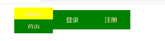
3D导航案例--------------------(3D旋转transform:rotateX/Y/Z+3D位移transform:translateX/Y/Z)

<!DOCTYPE html>
<html lang="en">
<head>
    <meta charset="UTF-8">
    <meta http-equiv="X-UA-Compatible" content="IE=edge">
    <meta name="viewport" content="width=device-width, initial-scale=1.0">
    <title>Document</title>
    <style>
        ul{
            list-style: none;
            text-align: center;
        }
        li{
            position: relative;
            float: left;
            width: 100px;
            height: 50px;
            /* background-color: green; */
            transition: all 0.5s;
            transform-style: preserve-3d;
             /* transform:scale3d(0.5,1.1,2);*/
        }

       li a{
            position:absolute;
            left: 0px;
            right: 0px;
           display: block;
            color: blanchedalmond;
            width: 100%;
            height: 100%;
            text-decoration: none;
            line-height: 50px;
            /* transform:rotateX(90deg); */

        }
        li a:first-child{
            background-color: green;
            transform:translateZ(25px);
        }
        li a:last-child{
            background-color:yellow;
            transform: rotateX(90deg) translateZ(20px);
        }
        li:hover{
           transform: rotateX(-90deg);

        }
    </style>
</head>
<body>
    <ul>
        <li><a herf="#">首页</a>
            <a herf="#">Index</a></li>
        <li><a href="#">登录</a><a herf="#">login</a></li>

        <li><a href="#">注册</a><a herf="#">Register</a></li>
    </ul>
</body>
</html>
二、3D缩放-transform:scale3d(0.5,1.1,2);
在3D导航案例中的li样式下添加
/* transform:scale3d(0.5,1.1,2);*/
实现3D缩放效果 可以f12调试一下这三个值 进行观察缩放效果
动画
小开胃
一刷新就会产生动画
<!DOCTYPE html>
<html lang="en">
<head>
    <meta charset="UTF-8">
    <meta http-equiv="X-UA-Compatible" content="IE=edge">
    <meta name="viewport" content="width=device-width, initial-scale=1.0">
    <title>Document</title>
<style>
    .box{
        width: 200px;
        height: 100px;
        background-color: pink;
        animation:change 0.5s;
    }
    @keyframes change{
        form{
            width: 200px;
        }
        to{
            width: 400px;
        }

    }

</style>
</head>
<body>
    <div class="box"></div>
</body>
</html>
小人一直跑动画案例
精灵图奉上

<!DOCTYPE html>
<html lang="en">
<head>
    <meta charset="UTF-8">
    <meta http-equiv="X-UA-Compatible" content="IE=edge">
    <meta name="viewport" content="width=device-width, initial-scale=1.0">
    <title>Document</title>
    <style>
        .box{
            width: 140px;
            height: 140px;
            background:url("./bg.png");
            animation: ren 1s steps(12) infinite;
        }
        @keyframes ren{
            from{background-position: 0 0;}
            to{
                background-position: -1680px 0;
                /* transform: translate(800px); */
            }
        }
    </style>
</head>
<body>
    <div class="box"></div>
</body>
</html>
走马灯动画
 图片奉上
图片奉上


<!DOCTYPE html>
<html lang="en">
<head>
    <meta charset="UTF-8">
    <meta http-equiv="X-UA-Compatible" content="IE=edge">
    <meta name="viewport" content="width=device-width, initial-scale=1.0">
    <title>Document</title>
<style>
    *{

        margin: 0;
        padding: 0;

    }

    .box{
        width: 600px;
        height: 111px;
        border: 2px solid rgb(114, 107, 107);
        margin: 0 auto;
       overflow: hidden;

    }
    img{
        width: 200px;


    }
    ul{
        list-style: none;
        width: 2000px;
        animation: zou 10s infinite;
    }
    li{

        float: left;
    }
    @keyframes zou {
        to{
            transform: translate(-1400px);
        }
    }
     ul:hover{
        animation-play-state: paused;
    }
</style>
</head>
<body>
    <div class="box">
        <ul>
            <li><img src="images/1.jpg"> </li>
            <li><img src="images/2.jpg"></li>
            <li><img src="images/3.jpg"></li>
            <li><img src="images/4.jpg"></li>
            <li><img src="images/5.jpg"></li>
            <li><img src="images/6.jpg"></li>
            <li><img src="images/7.jpg"></li>
            <li><img src="images/1.jpg"> </li>
            <li><img src="images/2.jpg"></li>
            <li><img src="images/3.jpg"></li>
        </ul>
    </div>
</body>
</html>
旅游背景动画

图片奉上


<!DOCTYPE html>
<html lang="en">
<head>
    <meta charset="UTF-8">
    <meta http-equiv="X-UA-Compatible" content="IE=edge">
    <meta name="viewport" content="width=device-width, initial-scale=1.0">
    <title>Document</title>
    <style>
        .box{
            position: relative;
            width: 1850px;
            height: 670px;
            background-image: url("f1_1.jpg");
        }
       .yun1{
           position:absolute;
           right: 600px;
           top: 50px;
           animation: move1 2s infinite;
       }
       .yun2{
           position:absolute;
           left: 650px;
           top: 25px;
           animation: move2 2s infinite;
       }
       .yun3{
           position:absolute;
           left: 570px;
           top: 100px;
           animation: move3 3s infinite;
       }
       .lu{
           position:absolute;
           /* background-image: url(./yun1.png); */
           left: 1000px;
           top: 100px;

       }
       .font{
           position:absolute;
           /* background-image: url(./yun1.png); */
           left: 720px;
           top: 250px;

       }
       .b1{
           position:absolute;
           /* background-image: url(./yun1.png); */
           left: 665px;
          bottom: 40px;
          animation: move4 2s  infinite;
       }

       .b2{
           position:absolute;
           /* background-image: url(./yun1.png); */
           left:815px;
          bottom: 40px;
          animation: move4 2s 0.5s infinite;

       }
       .b3{
        position:absolute;
           /* background-image: url(./yun1.png); */
        left: 995px;
        bottom: 40px;
        animation: move4 2s 1s infinite;
       }
       .b4{
           position:absolute;
           /* background-image: url(./yun1.png); */
           left: 1110px;
          bottom: 40px;
          animation: move4 2s 1.5s infinite;
       }
       .font img{
           height: 200px;
       }
       .b1 img{
           height: 100px;
       }
       .b2 img{
           height: 100px;
       }
       .b3 img{
           height: 100px;
       }
       .b4 img{
           height: 100px;
       }
       @keyframes move1{
           50%{
               right: 650px;
           }

       }
       @keyframes move2{
        50%{
               left: 700px;
           }

       }
       @keyframes move3{
        50%{
               left: 620px;
           }

       }
       @keyframes move4{
           50%{
               bottom:90px;
           }

       }
    </style>
</head>
<body>
    <div class="box">
    <div class="yun1"><img src="./yun1.png"></div>
    <div class="yun2"><img src="./yun2.png"></div>
    <div class="yun3"><img src="./yun3.png"></div>
    <div class="lu"><img src="./lu.png"></div>
    <div class="font"><img src="./font1.png"></div>
    <div class="yun3"><img src="./yun3.png"></div>
    <div class="b1"><img src="./1.png"></div>
    <div class="b2"><img src="./2.png"></div>
    <div class="b3"><img src="./3.png"></div>
    <div class="b4"><img src="./4.png"></div>

    </div>

</body>
</html>


 2340
2340


 被折叠的 条评论
为什么被折叠?
被折叠的 条评论
为什么被折叠?
 到【灌水乐园】发言


