


这篇文章主要记录一下我在日常开发中使用到且可提高效率的CSS样式
img 图片换色
svg 图片可以直接用 color来进行换色,但是像 png 这样的图片却不可以通过 color 来换色,而在日常开发过程中通常会遇到设计那边要求图片在 hover 时换色,那么怎么利用 CSS 来完成这个效果呢。
// 这里使用的是less嵌套规则
 &:hover {
   img {
     transform: translateY(-200px);
     filter: drop-shadow(#ffd283 0 200px);
   }
}
这里主要使用 filter和transform来完成这个效果,drop-shadow第一个参数是hover时的颜色,后两个参数分别是 X、Y 轴的偏移量。这里的原理就是让原本的 img 偏移处用户视图区域(偏移值可以更改),然后让新的图片偏移到原img的位置。
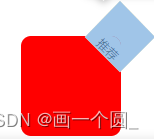
右上角三角形标签
很多时候,我们需要在一个容器的右上角展示一个三角形的标签,就像这样:

<template>
  <div class="box">
    <div class="tip">
      <span>推荐</span>
    </div>
  </div>
</template>

<style>
 body {
   height: 100vh;
   margin: auto;
   display: flex;
   justify-content: center;
   align-items: center;
 }
 .box {
   width: 100px;
   height: 100px;
   background-color: red;
   border-radius: 10px;
   overflow: hidden;
   position: relative;
 }
 .box .tip {
   position: absolute;
   height: 50px;
   width: 50px;
   right: -24px;
   top: -24px;
   transform: rotate(45deg);
   background-color: #fff;
   font-size: 12px;
 }
 span {
   top: 32px;
   left: 13px;
   color: #000;
   position: relative;
 }
</style>
实现原理也比较简单,就是只展示右上角的正方形的四分之一,然后将文字进行相对定位到其中即可。


 764
764

 被折叠的 条评论
为什么被折叠?
被折叠的 条评论
为什么被折叠?
 到【灌水乐园】发言


