


 本文介绍了HarmonyOS中的UIAbility组件中的Progress组件,包括其接口、ProgressType和ProgressStyle枚举说明,以及如何设置属性和提供示例代码展示了不同类型的进度条效果。
摘要
作者:红目香薰
团队:坚果派
团队介绍:坚果派由坚果创建,团队拥有12个华为HDE以及若干其他领域的三十余位万粉博主运营。
目录
HarmonyOS-UIAbitity-Progress
进度条组件,用于显示内容加载或操作处理等进度。
接口
Progress(options: {value: number, total?: number, style?: ProgressStyle, type?: ProgressType})
创建进度组件,用于显示内容加载或操作处理进度。
参数:
| 参数名 | 参数类型 | 必填 | 参数描述 |
|---|---|---|---|
| value | number | 是 | 指定当前进度值。 |
| total | number | 否 | 指定进度总长。 默认值:100 |
| type8+ | ProgressType | 否 | 指定进度条类型。 默认值:ProgressType.Linear |
| styledeprecated | ProgressStyle | 否 | 指定进度条类型。 该参数从API Version8开始废弃,建议使用type替代。 默认值:ProgressStyle.Linear |
ProgressType枚举说明
| 名称 | 描述 |
|---|---|
| Linear | 线性样式。 |
| Ring8+ | 环形无刻度样式,环形圆环逐渐显示至完全填充效果。 |
| Eclipse | 圆形样式,显示类似月圆月缺的进度展示效果,从月牙逐渐变化至满月。 |
| ScaleRing8+ | 环形有刻度样式,显示类似时钟刻度形式的进度展示效果。 |
| Capsule8+ | 胶囊样式,头尾两端圆弧处的进度展示效果与Eclipse相同;中段处的进度展示效果与Linear相同。 |
ProgressStyle枚举说明
| 名称 | 描述 |
|---|---|
| Linear | 线性样式。 |
| Ring | 环形无刻度样式,环形圆环逐渐显示至完全填充效果。 |
| Eclipse | 圆形样式,显示类似月圆月缺的进度展示效果,从月牙逐渐变化至满月。 |
| ScaleRing | 环形有刻度样式,显示类似时钟刻度形式的进度展示效果。 |
| Capsule | 胶囊样式,头尾两端圆弧处的进度展示效果与Eclipse相同;中段处的进度展示效果与Linear相同。 |
属性
| 名称 | 参数类型 | 描述 |
|---|---|---|
| value | number | 设置当前进度值。 |
| color | ResourceColor | 设置进度条前景色。 |
| style8+ | { strokeWidth?: Length, scaleCount?: number, scaleWidth?: Length } | 定义组件的样式。 strokeWidth: 设置进度条宽度。 scaleCount: 设置环形进度条总刻度数。 scaleWidth: 设置环形进度条刻度粗细。 刻度粗细大于进度条宽度时,刻度粗细为系统默认粗细。 |
示例代码
@Entry
@Component
struct Index {
build() {
Column({ space: 15 }) {
Text('Linear Progress').fontSize(9).fontColor(0xCCCCCC).width('90%')
Progress({ value: 10, type: ProgressType.Linear }).width(200)
Progress({ value: 20, total: 150, type: ProgressType.Linear }).color(Color.Grey).value(50).width(200)Text('Eclipse Progress').fontSize(9).fontColor(0xCCCCCC).width('90%')
Row({ space: 40 }) {
Progress({ value: 10, type: ProgressType.Eclipse }).width(100)
Progress({ value: 20, total: 150, type: ProgressType.Eclipse }).color(Color.Grey).value(50).width(100)
}Text('ScaleRing Progress').fontSize(9).fontColor(0xCCCCCC).width('90%')
Row({ space: 40 }) {
Progress({ value: 10, type: ProgressType.ScaleRing }).width(100)
Progress({ value: 20, total: 150, type: ProgressType.ScaleRing })
.color(Color.Grey).value(50).width(100)
.style({ strokeWidth: 15, scaleCount: 15, scaleWidth: 5 })
}// scaleCount和scaleWidth效果对比
Row({ space: 40 }) {
Progress({ value: 20, total: 150, type: ProgressType.ScaleRing })
.color(Color.Grey).value(50).width(100)
.style({ strokeWidth: 20, scaleCount: 20, scaleWidth: 5 })
Progress({ value: 20, total: 150, type: ProgressType.ScaleRing })
.color(Color.Grey).value(50).width(100)
.style({ strokeWidth: 20, scaleCount: 30, scaleWidth: 3 })
}Text('Ring Progress').fontSize(9).fontColor(0xCCCCCC).width('90%')
Row({ space: 40 }) {
Progress({ value: 10, type: ProgressType.Ring }).width(100)
Progress({ value: 20, total: 150, type: ProgressType.Ring })
.color(Color.Grey).value(50).width(100)
.style({ strokeWidth: 20, scaleCount: 30, scaleWidth: 20 })
}Text('Capsule Progress').fontSize(9).fontColor(0xCCCCCC).width('90%')
Row({ space: 40 }) {
Progress({ value: 10, type: ProgressType.Capsule }).width(100).height(50)
Progress({ value: 20, total: 150, type: ProgressType.Capsule })
.color(Color.Grey)
.value(50)
.width(100)
.height(50)
}
}.width('100%').margin({ top: 30 })
}
}
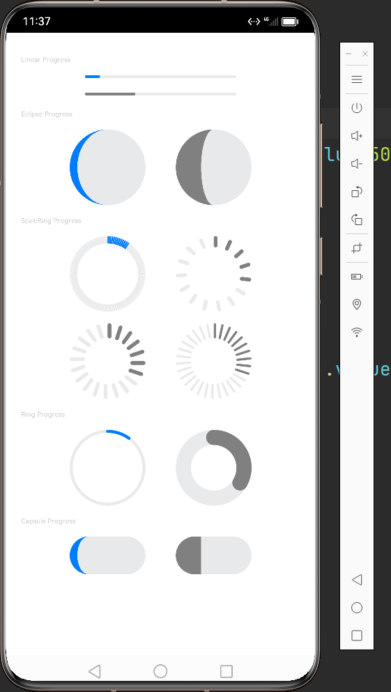
示例效果


 扫一扫
扫一扫


 被折叠的 条评论
为什么被折叠?
被折叠的 条评论
为什么被折叠?
 到【灌水乐园】发言


