


一.样式的定义
1.不显式定义key标记
当样式中没有定义key标记时,则对应的样式会指定应用到所有的目标对象上。如果要
使其不引用事先定义的样式,使用
Style
="
{x:Null}
"
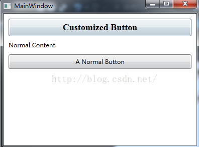
<Window x:Class="StyleDemo.StyleDefineAndUse"
        xmlns="http://schemas.microsoft.com/winfx/2006/xaml/presentation"
        xmlns:x="http://schemas.microsoft.com/winfx/2006/xaml"
        Title="MainWindow" Height="300" Width="400">
    <Window.Resources>
        <!--定义样式-->
        <Style TargetType="Button">
            <Setter Property="FontFamily" Value="Times New Roman" />
            <Setter Property="FontSize" Value="18" />
            <Setter Property="FontWeight" Value="Bold" />
        </Style>
    </Window.Resources>
    <StackPanel Margin="5">
        <!--由于前面定义的样式没有定义key标记,如果没有显示指定Style为null,这按钮将指定引用事先定义的样式-->
        <Button Padding="5" Margin="5">Customized Button</Button>
        <TextBlock Margin="5">Normal Content.</TextBlock>
        <!--使其不引用事先定义的样式-->
        <Button Padding="5" Margin="5" Style="{x:Null}">A Normal Button</Button>
    </StackPanel>
</Window>
具体的运行效果如下图所示:
2.显式定义key
如果显式为样式定义了key标记的话,则必须显式指定样式Key的方式,对应的样式才会被应用到目标对象上
<Window x:Class="StyleDemo.ReuseFontWithStyles"
        xmlns="http://schemas.microsoft.com/winfx/2006/xaml/presentation"
        xmlns:x="http://schemas.microsoft.com/winfx/2006/xaml"
        Title="ReuseFontWithStyles" Height="300" Width="300">
    <Window.Resources>
        <!--带有key标签的样式-->
        <Style TargetType="Button" x:Key="BigButtonStyle">
            <Setter Property="FontFamily" Value="Times New Roman" />
            <Setter Property="FontSize" Value="18" />
            <Setter Property="FontWeight" Value="Bold" />
        </Style>
    </Window.Resources>
    <StackPanel Margin="5">
        <!--如果不显式指定样式key将不会应用样式-->
        <Button Padding="5" Margin="5">Normal Button</Button>
        <Button Padding="5" Margin="5" Style="{StaticResource BigButtonStyle}">Big Button</Button>
        <TextBlock Margin="5">Normal Content.</TextBlock>
        <!--使其不引用事先定义的样式-->
        <Button Padding="5" Margin="5" Style="{x:Null}">A Normal Button</Button>
    </StackPanel>
</Window>
具体的运行效果如下图所示:

3.BasedOn属性:通过设置BasedOn属性,可以继承某个样式
- <Window.Resources>
- <!--定义按钮公共样式-->
- <Style x:Key="gBut" TargetType="{x:Type Button}">
- <!--手型-->
- <Setter Property="Cursor" Value="Hand"/>
- <!--宽度-->
- <Setter Property="Width" Value="150"/>
- <!--长度-->
- <Setter Property="Height" Value="80"/>
- </Style>
- <!--定义按钮样式1-->
- <Style x:Key="cBtn1" TargetType="{x:Type Button}" BasedOn="{StaticResource gBut}">
- <!--背景色-->
- <Setter Property="Background" Value="Black"/>
- <!--字号-->
- <Setter Property="FontSize" Value="24"/>
- <!--字颜色-->
- <Setter Property="Foreground" Value="Blue"/>
- <!--字间距-->
- <Setter Property="Margin" Value="20"/>
- </Style>
- <!--定义按钮样式2-->
- <Style x:Key="cBtn2" TargetType="{x:Type Button}" BasedOn="{StaticResource gBut}">
- <!--背景色-->
- <Setter Property="Background" Value="White"/>
- <!--字号-->
- <Setter Property="FontSize" Value="24"/>
- <!--字颜色-->
- <Setter Property="Foreground" Value="Red"/>
- <!--字间距-->
- <Setter Property="Margin" Value="10"/>
- </Style>
- </Window.Resources>
二.样式触发器
1.属性触发器
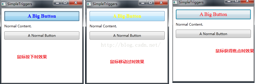
WPF样式还支持触发器,在样式中定义的触发器,只有在该属性或事件发生时才会被触发,下面具体看看简单的样式触发器是如何定义和使用的,具体的XAML代码如下所示:
<Window x:Class="StyleDemo.SimpleTriggers"
        xmlns="http://schemas.microsoft.com/winfx/2006/xaml/presentation"
        xmlns:x="http://schemas.microsoft.com/winfx/2006/xaml"
        Title="SimpleTriggers" Height="300" Width="300">
    <Window.Resources>
        <Style x:Key="BigFontButton">
            <Style.Setters>
                <Setter Property="Control.FontFamily" Value="Times New Roman" />
                <Setter Property="Control.FontSize" Value="18" />

            </Style.Setters>
            <!--样式触发器-->
            <Style.Triggers>
                <!--获得焦点时触发-->
                <Trigger Property="Control.IsFocused" Value="True">
                    <Setter Property="Control.Foreground" Value="Red" />
                </Trigger>
                <!--鼠标移过时触发-->
                <Trigger Property="Control.IsMouseOver" Value="True">
                    <Setter Property="Control.Foreground" Value="Yellow" />
                    <Setter Property="Control.FontWeight" Value="Bold" />
                </Trigger>
                <!--按钮按下时触发-->
                <Trigger Property="Button.IsPressed" Value="True">
                    <Setter Property="Control.Foreground" Value="Blue" />
                </Trigger>
            </Style.Triggers>
        </Style>
    </Window.Resources>

    <StackPanel Margin="5">
        <Button Padding="5" Margin="5"
            Style="{StaticResource BigFontButton}"
              >A Big Button</Button>
        <TextBlock Margin="5">Normal Content.</TextBlock>
        <Button Padding="5" Margin="5"
            >A Normal Button</Button>
    </StackPanel>
</Window>
此时的运行效果如下图所示:
2.事件触发器
上面定义的触发器都是在某个属性发生变化时触发的,也可以定义当某个事件激活时的触发器,我们也把这样的触发器称为事件触发器,下面示例定义的事件触发器是等待MouseEnter事件,一旦触发MouseEnter事件,则动态改变按钮的FontSize属性来形成动画效果,具体的XAML代码如下所示:
<Window x:Class="StyleDemo.EventTrigger"
        xmlns="http://schemas.microsoft.com/winfx/2006/xaml/presentation"
        xmlns:x="http://schemas.microsoft.com/winfx/2006/xaml"
        Title="EventTrigger" Height="300" Width="300">
    <Window.Resources>
        <Style x:Key="BigFontButton">
            <Style.Setters>
                <Setter Property="Control.FontFamily" Value="Times New Roman" />
                <Setter Property="Control.FontSize" Value="18" />
                <Setter Property="Control.FontWeight" Value="Bold" />
            </Style.Setters>
            <Style.Triggers>
                <!--定义事件触发器-->
                <EventTrigger RoutedEvent="Mouse.MouseEnter">
                    <!--事件触发时只需的操作-->
                    <EventTrigger.Actions>
                        <!--把动画放在动画面板中-->
                        <BeginStoryboard>
                            <!--在0.2秒的时间内将字体放大到22单位-->
                            <Storyboard>
                                <DoubleAnimation
                  Duration="0:0:0.2"
                  Storyboard.TargetProperty="FontSize"
                  To="22"  />
                            </Storyboard>
                        </BeginStoryboard>
                    </EventTrigger.Actions>
                </EventTrigger>
                <!--鼠标移开触发的事件-->
                <EventTrigger RoutedEvent="Mouse.MouseLeave">
                    <EventTrigger.Actions>
                        <BeginStoryboard>
                            <!--在1秒的时间内将字体尺寸缩小到原来的大小-->
                            <!--如果目标字体尺寸没有明确指定,则WPF将默认使用第一次动画之前按钮的字体尺寸-->
                            <Storyboard>
                                <DoubleAnimation
                  Duration="0:0:1"
                  Storyboard.TargetProperty="FontSize"  />
                            </Storyboard>
                        </BeginStoryboard>
                    </EventTrigger.Actions>
                </EventTrigger>
            </Style.Triggers>
        </Style>
    </Window.Resources>
    <StackPanel Margin="5">
        <Button Padding="5" Margin="5"
            Style="{StaticResource BigFontButton}"
              >A Big Button</Button>
        <TextBlock Margin="5">Normal Content.</TextBlock>
        <Button Padding="5" Margin="5"
            >A Normal Button</Button>
    </StackPanel>
</Window>
此时的运行效果如下图所示:

3.MultiTrigger
MultiTrigger是个容易让人误解的名字,会让人以为是多个Trigger集成在一起,实际上叫MultiConditionTrigger更合适,因为必须多个条件同时成立时才会触发。MultiTrigger比Trigger多了一个Conditions属性,需要同时成立的条件就储存在这个集合中。
- <Window.Resources>
- <Style TargetType="CheckBox">
- <Style.Triggers>
- <MultiTrigger>
- <MultiTrigger.Conditions>
- <Condition Property="IsChecked" Value="true"/>
- <Condition Property="Content" Value="正如我悄悄的来"/>
- </MultiTrigger.Conditions>
- <MultiTrigger.Setters>
- <Setter Property="FontSize" Value="20"/>
- <Setter Property="Foreground" Value="Orange"/>
- </MultiTrigger.Setters>
- </MultiTrigger>
- </Style.Triggers>
- </Style>
- </Window.Resources>
- <StackPanel>
- <CheckBox Content="悄悄的我走了" Margin="5"/>
- <CheckBox Content="正如我悄悄的来" Margin="5,0"/>
- <CheckBox Content="我挥一挥衣袖" Margin="5"/>
- <CheckBox Content="不带走一片云彩" Margin="5,0"/>
- </StackPanel>
4.由数据触发的DataTrigger
程序中经常会遇到基于数据执行某些判断情况,遇到这种情况时我们可以考虑使用DataTrigger。DataTrigger对象的Binding属性会把数据源不断送过来,一旦送了的值与Value属性一致,DataTrigger即被触发。
下面例子中,当TextBox的Text长度小于7个字符时其Border会保持红色。XAML代码如下:
- <Window x:Class="WpfApplication1.MainWindow"
- xmlns="http://schemas.microsoft.com/winfx/2006/xaml/presentation"
- xmlns:x="http://schemas.microsoft.com/winfx/2006/xaml"
- xmlns:local="clr-namespace:WpfApplication1"
- Title="WPF样式的使用" Height="500" Width="800" WindowStartupLocation="CenterScreen">
- <Window.Resources>
- <local:L2BConverter x:Key="cvtr" />
- <Style TargetType="TextBox">
- <Style.Triggers>
- <DataTrigger Binding="{Binding RelativeSource={x:Static RelativeSource.Self},Path=Text.Length,Converter={StaticResource cvtr}}" Value="false">
- <Setter Property="BorderBrush" Value="Red"/>
- <Setter Property="BorderThickness" Value="1"/>
- </DataTrigger>
- </Style.Triggers>
- </Style>
- </Window.Resources>
- <StackPanel>
- <TextBox Margin="5"/>
- <TextBox Margin="5,0"/>
- <TextBox Margin="5"/>
- </StackPanel>
- </Window>
- using System;
- using System.Windows.Data;
- namespace WpfApplication1
- {
- public class L2BConverter : IValueConverter
- {
- public object Convert(object value, Type targetType, object parameter, System.Globalization.CultureInfo culture)
- {
- int textLength = (int)value;
- return textLength > 6 ? true : false;
- }
- public object ConvertBack(object value, Type targetType, object parameter, System.Globalization.CultureInfo culture)
- {
- throw new NotImplementedException();
- }
- }
- }
5.多条件触发的MultiDataTrigger
有时候我们会遇到要求多个数据条件同时满足时才能触发变化的需求,此时可以考虑使用MultiDataTrigger。比如有这样一个需求:用户界面使用ListBox显示了一列Student数据,当Student对象同时满足ID为2、Name为Tom的时候,条目就高亮显示,XAML代码如下:
- <Window x:Class="WpfApplication1.MainWindow"
- xmlns="http://schemas.microsoft.com/winfx/2006/xaml/presentation"
- xmlns:x="http://schemas.microsoft.com/winfx/2006/xaml"
- xmlns:local="clr-namespace:WpfApplication1"
- Title="WPF样式的使用" Height="500" Width="800" WindowStartupLocation="CenterScreen">
- <Window.Resources>
- <Style TargetType="ListBoxItem">
- <!--使用Style设置DataTemplate-->
- <Setter Property="ContentTemplate">
- <Setter.Value>
- <DataTemplate>
- <StackPanel Orientation="Horizontal">
- <TextBlock Text="{Binding ID}" Width="60"/>
- <TextBlock Text="{Binding Name}" Width="120"/>
- <TextBlock Text="{Binding Age}" Width="60"/>
- </StackPanel>
- </DataTemplate>
- </Setter.Value>
- </Setter>
- <!--MultiDataTrigger-->
- <Style.Triggers>
- <MultiDataTrigger>
- <MultiDataTrigger.Conditions>
- <Condition Binding="{Binding Path=ID}" Value="2"/>
- <Condition Binding="{Binding Path=Name}" Value="Tom"/>
- </MultiDataTrigger.Conditions>
- <MultiDataTrigger.Setters>
- <Setter Property="Background" Value="Orange"/>
- </MultiDataTrigger.Setters>
- </MultiDataTrigger>
- </Style.Triggers>
- </Style>
- </Window.Resources>
- <StackPanel>
- <ListBox x:Name="listBoxStudent" Margin="5"/>
- </StackPanel>
- </Window>
- /// <summary>
- /// MainWindow.xaml 的交互逻辑
- /// </summary>
- public partial class MainWindow : Window
- {
- public MainWindow()
- {
- InitializeComponent();
- List<Student> stuList = new List<Student>(){
- new Student(){ID="1",Name="Peter",Age=25},
- new Student(){ID="2",Name="Tom",Age=27},
- new Student(){ID="3",Name="Ben",Age=20}
- };
- this.listBoxStudent.ItemsSource = stuList;
- }
- }
- /// <summary>
- /// 学生类
- /// </summary>
- public class Student{
- public string ID{get;set;}
- public string Name { get; set; }
- public int Age { get; set; }
- }


 223
223


 被折叠的 条评论
为什么被折叠?
被折叠的 条评论
为什么被折叠?
 到【灌水乐园】发言


