


在PPT自带图表不能满足自身需求的情况下,作为一名IT人士,采用前端的一些库来画图是一个非常不错的选择,我此次选择的是 echarts 这个库,涉及知识点记录如下,方便后续快速查阅:
- 设置数据标签
- 设置字体大小
- 设置轴线留白
- 设置面积图渐变色
代码
代码如下,快速画图地址
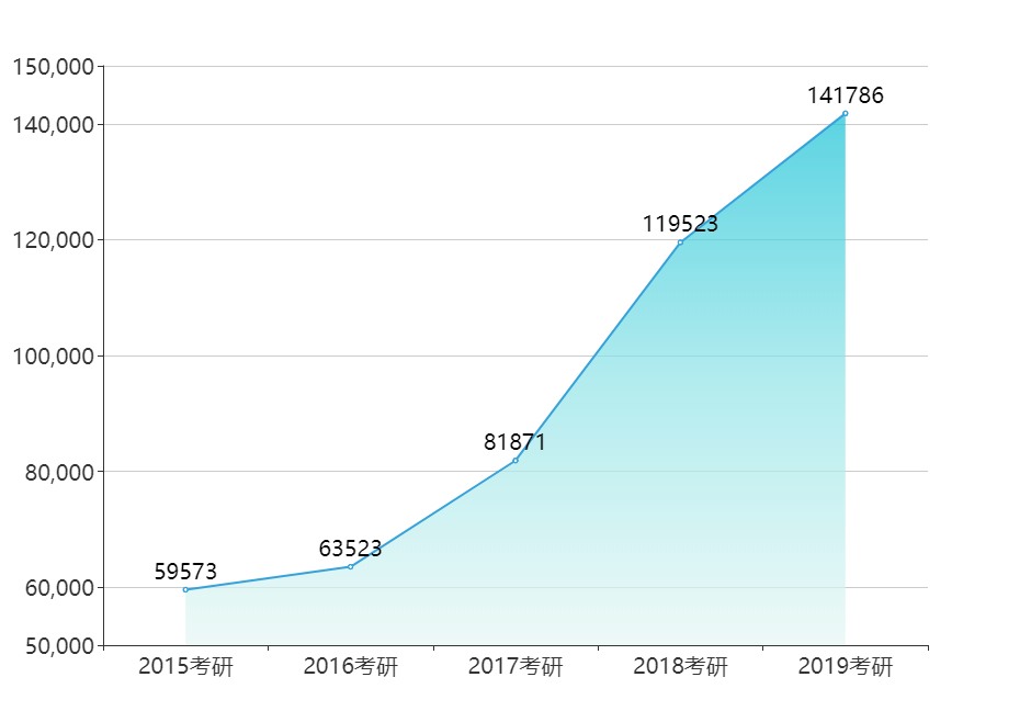
option = {
    xAxis: {
        type: 'category',
        boundaryGap: true, // 设置为false代表是零刻度开始,设置为true代表离零刻度间隔一段距离
        data: ['2015考研', '2016考研', '2017考研', '2018考研', '2019考研'],
        axisLabel: {  //配置X轴字体大小
            textStyle:{
                fontSize:'20'
            }
        }
    },
    yAxis: {
        type: 'value',
        min: 50000,
        max: 150000,
        axisLabel: {  //配置Y轴字体大小
            textStyle:{
                fontSize:'20'
            }
        }
    },
    series: [{
        data: [59573, 63523, 81871, 119523, 141786],
        type: 'line',
        areaStyle: { //配置渐变色
            normal: {
                color: new echarts.graphic.LinearGradient(
                        0, 0, 0, 1,
                        [
                            {offset: 0, color: '#14c2d6'}, //顶端颜色
                            {offset: 0.5, color: '#91e4e8'},  //中间颜色
                            {offset: 1, color: '#e8f7f4'}  //底部颜色
                        ]
                )
            }},
        label: { //配置数据标签
            normal: {
                show: true,
                color: 'black',
                textStyle:{
                    fontSize:'20'
                }
            },
        }
    }]
};
效果图


 351
351


 被折叠的 条评论
为什么被折叠?
被折叠的 条评论
为什么被折叠?
 到【灌水乐园】发言


