


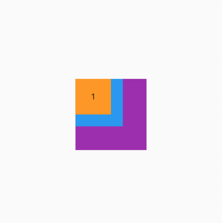
这里我们添加 3 个大小不同子项,看看他们是怎么排列的。
Stack(
children: [
getItem(3, width: 120, height: 120, color: Colors.purple),
getItem(2, width: 80, height: 80, color: Colors.blue),
getItem(1),
],
)
getItem
这里除 index 外,其他参数使用了选择参数
/// 获取子项目(这里使用了选择参数)
Widget getItem(int index,
{double? width = 60, double? height = 60, Color color = Colors.orange}) {
return Container(
// 宽高设置 60
width: width,
height: height,
// 设置背景色
color: color,
// 设置间隙
margin: EdgeInsets.all(2),
// 设置子项居中
alignment: Alignment.center,
// 设置子项
child: Text(’$index’),
);
}
看效果
alignment (对齐方式)
如果你看看源码可以看到这个参数的默认值是 AlignmentDirectional.topStart ,但是这里我们依然可以使用我们熟悉的 Alignment.topLeft 来进行参数设置,这是为什么呢?我们看看来看看 AlignmentDirectional 源码吧,Alignment 源码在前面的章节我们看过了
Stack(
// 居中对齐
alignment: Alignment.topLeft,
children: [
getItem(3, width: 120, height: 120, color: Colors.purple),
getItem(2, width: 80, height: 80, color: Colors.blue),
getItem(1),
],
)
Alignment 和 AlignmentDirectional 源码
// Alignment
class Alignment extends AlignmentGeometry {
/// Creates an alignment.
 最低0.47元/天 解锁文章


 4293
4293


 被折叠的 条评论
为什么被折叠?
被折叠的 条评论
为什么被折叠?
 到【灌水乐园】发言


