


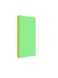
 本文介绍如何利用CSS3的3D转换特性,通过设置perspective、rotate和translate属性,实现一个立体书的视觉效果。示例代码展示了一个简单的HTML和CSS结构,通过变换front和left两个div元素的位置和角度,创造出3D翻页的感觉。
思路:利用CSS3中3D转换的perspective属性,通过左面和前面的旋转rotate、位移变化translate实现立体书的效果
具体可参考:HTML5+CSS3学习总结(完结)
该文章中的3D导航栏案例的思路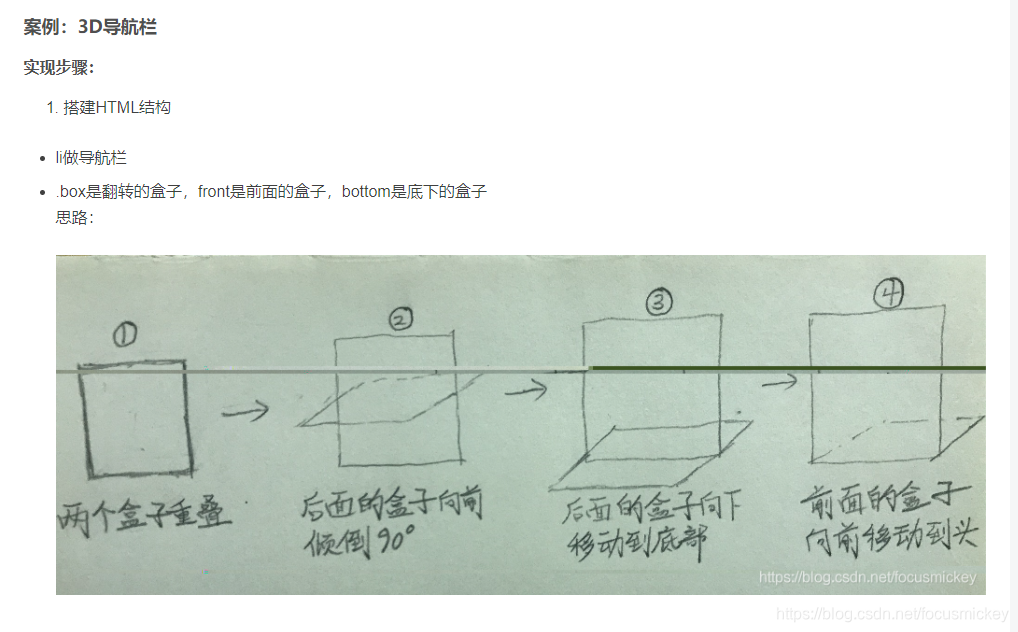
示例
<!DOCTYPE html>
<html lang="en">

<head>
    <meta charset="UTF-8">
    <meta name="viewport" content="width=device-width, initial-scale=1.0">
    <title>立体书</title>
    <style>
        .wrap{
            margin: 100px;
            width: 100px;
            height: 200px;
            perspective: 500px;
        }

        .box {
            position: relative;
            width: 100%;
            height: 100%;
            transition: all .5s;
            transform-style: preserve-3d;
            transform: rotateY(38deg);
        }

        .front,
        .left {
            position: absolute;
            top: 0;
            left: 0;
            line-height: 50px;
            text-align: center;
        }

        .front {
            width: 100%;
            height: 96%;
            background-color: lightgreen;
            transform: translateZ(23px);
        }

        .left {
            width: 20px;
            height: 100%;
            background-color: yellowgreen;
            transform: translateY(-4px) rotateY(-90deg);
        }
    </style>
</head>

<body>
    <div class="wrap">
        <div class="box">
            <div class="left"></div>
            <div class="front"></div>
        </div>
    </div>
</body>

</html>
效果如图


 扫一扫
扫一扫


 被折叠的 条评论
为什么被折叠?
被折叠的 条评论
为什么被折叠?
 到【灌水乐园】发言


