


4.BasicShapes
一旦在 <svg> 标签中建立了坐标系,您就可以开始绘图了。本章将介绍一些基本形状(basic shapes):线条(lines), 矩形(rectangles),
多边形(polygons), 圆(circles), 和椭圆(ellipses)。你可以使用这些基本形状,创建大多数绘画的主要元素。
Lines
SVG 允许你通过 <line> 元素绘制一条直线。 只需要指定线条端点的 x 轴和 y 轴坐标。坐标可以不指定单位,这种情况下,默认当作使用用户坐标(user coordinates)。
或是认为使用厘米(cm),或英尺(in)作为单位等。(如同 第 3 章中的 The Viewport 描述的那样)
<line x1="start-x" y1="start-y" x2="end-x" y2="end-y" />
样例4-1 中的SVG图像绘制了几条线条;图4-1 中你看到的参考网格不属于SVG中的一部分。
<svg width="200px" height="200px" viewBox="0 0 200 200"
xmlns="http://www.w3.org/2000/svg">
    <!-- horizontal line -->
    <line x1="40" y1="20" x2="80" y2="20" style="stroke: black;"/>
    <!-- vertical line -->
    <line x1="0.7cm" y1="1cm" x2="0.7cm" y2="2.0cm" style="stroke: black;"/>
    <!-- diagonal line -->
    <line x1="30" y1="30" x2="85" y2="85" style="stroke: black;"/>
</svg>

Stroke Characteristics
线条被认为是在画布上绘制的钢笔的笔触。笔划的大小(size), 颜色(color) 和样式(style) 是线条表示的一部分。因此,这些特征将放在 style 属性中。
stroke-width
如同第三章提到的那样,画布(canvas)的网格线(grid lines) 无限薄。 那么,线或笔画相对于网格落在何处?答案是网格线落在笔划的中心。例4-2 绘制
了一些线条,其中笔触宽度已设置为 10 个用户坐标,以示效果明显。结果,如图4-2所示,已绘制网格线,以便您可以清楚地看到效果。
Example 4-2. Demonstration of stroke-width
<svg width="200px" height="200px" viewBox="0 0 200 200"
xmlns="http://www.w3.org/2000/svg">
  <!-- horizontal line -->
  <line x1="30" y1="10" x2="80" y2="10" style="stroke-width: 10; stroke: black;"/>
  <!-- vertical line -->
  <line x1="10" y1="30" x2="10" y2="80" style="stroke-width: 10; stroke: black;"/>
  <!-- diagonal line -->
  <line x1="25" y1="25" x2="75" y2="75" style="stroke-width: 10; stroke: black;"/>
</svg>

注意:SVG 坐标网格可能无限薄,但您的计算机屏幕是由固定大小的像素组成的。当计算机将其转换为最近的像素块时,对角线可能看起来时锯齿状的。
这称为走样(aliasing)。或者,计算机可以使用抗锯齿来柔化边缘,模糊线条穿过的所有重叠部分的像素。
大部分 SVG 查看器默认使用反走样(anti-aliasing), 这有时会使 1像素 的黑线看起来像 2像素 的灰线,因为它的中心时两个像素之间的空间。
你可以通过 CSS style 属性中的 shape-rendering 来控制反走样(anti-aliasing)的使用。将这个属性的值设置为 crispEdges(对一个元素或SVG作
为一个整体)将会关闭反走样(anti-aliasing), 产生清晰的(有时是锯齿状的)线条。如果值设置为 geometricPrecision 将强调光滑(可能有时模糊)的边缘。
Stroke Color
你可以用各种各样的方法指定笔划的颜色:
-
一个基本的颜色关键字名称:aqua,black,blue,fuchsia,gray,green,lime,maroon,olive,purple,red,silver,teal,white,和 yellow。你也
可以使用 SVG 规范中的 4.2 章节中定义的颜色关键字。 -
形式为 #rrggbb 的6位十六进制指示符,rr 是红色分量(red component), gg 是绿色分量(gg component), bb 是蓝色分量(blue component)。 每个分量的取值范围是 00-ff。
-
三位数的十六进制指示符,格式为#rgb, r 是红色分量(red component), g 是绿色分量(g component), b 是蓝色分量(blue component)。 每个分量的取值范围是 0-f。
这是前面指定颜色方法的一种简写形式。为了和 6 位十六进制等效,每个简写形式的数字都要重复;因此,#d6e 和 #dd66ee 是相同的。 -
RGB 形式的 RGB说明符(red-value, green-value, blue-value), 他们的值如果是整数,取值范围是 0-255, 如果是百分比,取值范围是 0% 到 100%。
-
currentColor 关键字,它位元素使用计算出来的 CSS color 属性,color 属性在 SVG 中没有直接效果,它在 HTML 中用于设置文本颜色,并且由子元素继承。
在内联 SVG 图标中使用 currentColor(参考 Inline SVG in XHTML or HTML5 )可以让图标呈现与周围文本相同的颜色。
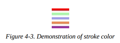
样式4-3 使用了所有这些方法(除了 currentColor 之外),如图4-3所示。
Example 4-3. Demonstration of stroke color
<svg width="200px" height="200px" viewBox="0 0 200 200"
xmlns="http://www.w3.org/2000/svg">
   <!-- red -->
   <line x1="10" y1="10" x2="50" y2="10" style="stroke: red; stroke-width: 5;"/>
   <!-- light green -->
   <line x1="10" y1="20" x2="50" y2="20" style="stroke: #9f9; stroke-width: 5;"/>
   <!-- light blue -->
   <line x1="10" y1="30" x2="50" y2="30" style="stroke: #9999ff; stroke-width: 5;"/>
   <!-- medium orange -->
   <line x1="10" y1="40" x2="50" y2="40" style="stroke: rgb(255, 128, 64); stroke-width: 5;"/>
   <!-- deep purple -->
   <line x1="10" y1="50" x2="50" y2="50" style="stroke: rgb(60%, 20%, 60%); stroke-width: 5;"/>
</svg>
还有更多的方法来指定颜色。它们采用于 CSS3 Color specification。 尽管在 web 浏览器中广泛支持, 它们并不是 SVG 1.1 规范的一部分, 其他SVG实现可能不支持;在写作本文时,例如,Apache Batik 和 Inkscape 都不支持它们。由三个新的颜色函数和一个新的关键字:
-
rgba() 指示符的形式为 rgb(red-value, green-value, blue-value, alpha-value),这里颜色值和 rgb() 函数的颜色值是一样的格式, alpha 值是十进制数,取值范围为 0 到 1。
-
hsl() 指示符的形式为 hsl(hue, saturation, lightness),其中 hue 是一个整数类型的角度,取值范围从 0 到 360, saturation 和 lightness 的取值,如果是整数类型,取值范围从 0 到 255。 如果是百分比,取值范围从 0% 到 100%。
-
hsla() 指示符,其中 hue, satuartion, 和 lightness 的值和 hsl 一样,alpha 的值和 rgba 中的 alpha 值一样。
-
transparent(完全透明的); 效果和 rgba(0, 0, 0, 0) 一样。
注意:如果你不指定笔划的颜色(stoke color),你将看不到任何线条;stroke 属性的默认值为 none。
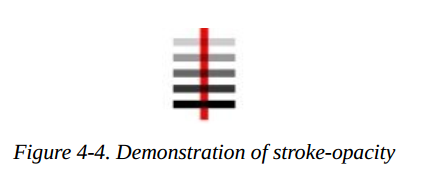
stroke-opacity
到目前为止,示例中的所有线条都是实心的,挡住了它们下面的任何东西。通过给定 stroke-opacity 一个从 0.0 到 1.0 的值,你可以控制线条的
不透明度(opacity: 是透明度 transparency 的反义词)。其中 0 表示完全的透明(completely transparent),而 1 表示完全的不透明(completely opaque)。
一个小于 0 的值将被改成为 0; 一个大于 1 的值将被改成 1。 样例4-4 将不透明度(opacity)的值从 0.2 改动到 1, 以 0.2 作为间隔值。结果如图4-4所示。
图中的红线可以让你更清楚地看到透明效果。
Example 4-4. Demonstration of stroke-opacity
<svg width="200px" height="200px" viewBox="0 0 200 200"
xmlns="http://www.w3.org/2000/svg">
    <line x1="30" y1="0" x2="30" y2="60" style="stroke:red; stroke-width: 5;"/>
    <line x1="10" y1="10" x2="50" y2="10" style="stroke-opacity: 0.2; stroke: black; stroke-width: 5;"/>
    <line x1="10" y1="20" x2="50" y2="20" style="stroke-opacity: 0.4; stroke: black; stroke-width: 5;"/>
    <line x1="10" y1="30" x2="50" y2="30" style="stroke-opacity: 0.6; stroke: black; stroke-width: 5;"/>
    <line x1="10" y1="40" x2="50" y2="40" style="stroke-opacity: 0.8; stroke: black; stroke-width: 5;"/>
    <line x1="10" y1="50" x2="50" y2="50" style="stroke-opacity: 1.0; stroke: black; stroke-width: 5;"/>
</svg>
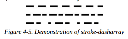
stroke-dasharray Attribute
如果你需要点线(dotted lines)或者虚线(dashed lines),使用 stroke-dasharray 属性,它的值由一组数字组成,由逗号或空格分隔,指定短横线(dash length) 和间隙(gaps) 的长度。这个 list 应该有偶数个条目, 但是如果你给了一个奇数个条目, SVG 将重复该列表,因此条目的总数是偶数。(查看样例4-5最后的实例。)
Example 4-5. Demonstration of stroke-dasharray
<svg width="200px" height="200px" viewBox="0 0 200 200"
xmlns="http://www.w3.org/2000/svg">
    <!-- 9-pixel dash, 5-pixel gap -->
    <line x1="10" y1="10" x2="100" y2="10" style="stroke-dasharray: 9, 5; stroke: black; stroke-width: 2;"/>
    <!-- 5-pixel dash, 3-pixel gap, 9-pixel dash, 2-pixel gap -->
    <line x1="10" y1="20" x2="100" y2="20" style="stroke-dasharray: 5, 3, 9, 2; stroke: black; stroke-width: 2;"/>
    <!-- Odd number of entries is duplicated; this is equivalent to:
         9-pixel dash, 3-pixel gap, 5-pixel dash,
         9-pixel gap, 3-pixel dash, 5-pixel gap -->
    <line x1="10" y1="30" x2="100" y2="30" style="stroke-dasharray: 9 3 5; stroke: black; stroke-width: 2;"/>
</svg>
图4-5 显示了结果,为了清晰起见,放大了。
Rectangles
矩形是基本形状中最简单的了。你通过 x 和 y 坐标值指定矩形的左上角(upper-left corner), 它的宽度(width), 和它的高度(height)。矩形的内部
用您指定的填充颜色填充。如果你没有指定一个填充颜色,形状内部将会使用黑色填充。填充颜色可以使用 Stroke Color 中描述的任何方法指定, 或者它
使用值 none, 使得形状内部无填充,因此是透明的。你可能也指定一个 fill-opacity 属性, 和你在 stroke-opacity 中式相同的格式。fill 和 fill-opacity
都是展示属性,它们都属于 style 属性。
在内部填充之后(如果有需要的话),用笔划绘制矩形的外框,这些特性你可以像指定线条属性的方式一样被指定。如果你不指定笔划(stroke), 假定值为 none,
就没有绘制边框。样例4-6 绘制了 <rect> 元素的几种变体。图4-6 显示了结果, 用网格提供对照。
Example 4-6. Demonstration of the rectangle element
<svg width="200px" height="200px" viewBox="0 0 200 200"
xmlns="http://www.w3.org/2000/svg">
    <!-- black interior, no outline -->
    <rect x="10" y="10" width="30" height="50"/>
    <!-- no interior, black outline -->
    <rect x="50" y="10" width="20" height="40" style="fill: none; stroke: black;"/>
    <!-- blue interior, thick semi-transparent red outline -->
    <rect x="10" y="70" width="25" height="30" style="fill: #0000ff; stroke: red; stroke-width: 7; stroke-opacity: 0.5;"/>
    <!-- semi-transparent yellow interior, dashed green outline -->
    <rect x="50" y="70" width="35" height="20" style="fill: yellow; fill-opacity: 0.5; stroke: green; stroke-width: 2; stroke-dasharray: 5 2"/>
</svg>

备注: 形成轮廓的笔划“跨越”抽象网格线。所以笔画将一半在形状内,一般在形状外。图4-7是样例4-6中绘制的半透明红色轮廓的特写,清楚地显示了这一点。

如果你不指定开始的 x 或 y 值,就假定它们的值为 0。如果你只指定了 width 或 height 中的一个值为 0,那么矩形不显示。为 width 或 height 提供
一个负值,是错误的做法。
Rounded Rectangles
如果你希望矩形有圆角(rounded corners), 可以通过 rx 和 ry 指定圆角的曲率。rx (x-radius) 的最大值是矩形宽度的一半,ry (y-radius) 的最大值
是矩形高度的一半。如果你只指定了 rx 或 ry 中的一个, 就假设它们是相等的。样例4-7 显示了 rx 和 ry 的各种组合。
Example 4-7. Demonstration of rounded rectangle
<svg width="200px" height="200px" viewBox="0 0 200 200"
xmlns="http://www.w3.org/2000/svg">
    <!-- rx and ry equal, increasing -->
    <rect x="10" y="10" width="20" height="40" rx="2" ry="2" style="stroke: black; fill: none;"/>
    <rect x="40" y="10" width="20" height="40" rx="5" style="stroke: black; fill: none;"/>
    <rect x="70" y="10" width="20" height="40" ry="10" style="stroke: black; fill: none;"/>
    <!-- rx and ry unequal -->
    <rect x="10" y="60" width="20" height="40" rx="10" ry="5" style="stroke: black; fill: none;"/>
    <rect x="40" y="60" width="20" height="40" rx="5" ry="10" style="stroke: black; fill: none;"/>
</svg>
图4-8 显示了结果,背景中的网格线是为了方便对照。

备注:如果你熟悉 CSS border-radius 属性,你可能知道把一个矩形转换为一个圆或者一个椭圆的技巧是设置 height 和 width 的拐角半径为 50%。尽管您可以使用百分比值指定 SVG 矩形的角半径,但它们将被解析为视图窗口(viewport)的 width(rx) 或 height(ry)。就像您使用百分比来设置矩形的 width 或 height 一样,而不是作为矩形本身的百分比。好在 SVG 有一种更简单的方法来创建圆和椭圆。
Circles and Ellipses
要绘制一个圆(circle), 使用 <circle> 元素通过 cx, cy 和 r 属性指定中心点的 x轴,y轴,和半径。就像矩形一样,圆形默认的填充颜色是黑色,
并且不会绘制外框,除非你指定 fill 和 stroke 的其他组合。
一个椭圆除了需要中心点 x坐标 和 y坐标之外, 同时需要 x半径(x-radius) 和 y半径(y-radius)。这些半径的属性被命名为 rx 和 ry。
在圆和椭圆中,如果省略了 cx 或者 cy, 就假设它的值为 0。 如果半径(radius)为 0,将不会显示任何图形;设置半径的值为负值,是一个错误的做法。
样例4-8绘制了一些圆和椭圆。结果如图4-9所示。
Example 4-8. Demonstration of circles and ellipses
<svg width="200px" height="200px" viewBox="0 0 200 200"
xmlns="http://www.w3.org/2000/svg">
   <circle cx="30" cy="30" r="20" style="stroke: black; fill: none;"/>
   <circle cx="80" cy="30" r="20" style="stroke-width: 5; stroke: black; fill: none;"/>
   <ellipse cx="30" cy="80" rx="10" ry="20" style="stroke: black; fill: none;"/>
   <ellipse cx="80" cy="80" rx="20" ry="10" style="stroke: black; fill: none;"/>
</svg>

The <polygon> Element
除了矩形(rectangles),圆形(circles), 和椭圆(ellipses)之外,你可能想绘制六边形(hexagons), 八边形(octagons), 五角星(stars),或任意闭合形状(arbitrary closed shapes)。<polygon> 元素让你指定一系列点,这些点描述了要填充和勾勒的集合区域,就像前面描述的那样。points 属性由一系列由逗号或空格分隔的 x 和 y 坐标组成。你所给出的一系列数字,必须是偶数对。你不必返回起始点(starting point);图形会自动闭合的。例4-9 使用 <polygon> 元素绘制了一个平行四边形(parallelogram),一个五角星(a star),和一个不规则的形状(an irregular shape)。
Example 4-9. Demonstration of the polygon element
<svg width="200px" height="200px" viewBox="0 0 200 200"
xmlns="http://www.w3.org/2000/svg">
    <!-- parallelogram -->
    <polygon points="15,10 55, 10 45, 20 5, 20" style="fill: red; stroke: black;"/>
    <!-- star -->
    <polygon points="35,37.5 37.9,46.1 46.9,46.1 39.7,51.5 42.3,60.1 35,55 27.7,60.1 30.3,51.5 23.1,46.1 32.1,46.1"
        style="fill: #ccffcc; stroke: green;"/>
    <!-- weird shape -->
    <polygon points="60 60, 65 72, 80 60, 90 90, 72 80, 72 85, 50 95" style="fill: yellow; fill-opacity: 0.5; stroke: black;
        stroke-width: 2;"/>
</svg>
结果如图4-10所示,背景中的网格线用作参考。

Filling Polygons That Have Intersecting Lines
对于目前显示的多边形,填充形状哼容易。形成多边形的线没有一条相互交叉,所以形状的内部很容易与形状的外部区分开来。然而,当线条相互交叉时,识别
多边形的内容并不容易。样例4-10中的 SVG 绘制了一个多边形(polygon)。在图4-11中,五角星的中间部分被认为时内部还是外部呢?
Example 4-10. Unfilled polygon with intersecting lines
<svg width="200px" height="200px" viewBox="0 0 200 200" xmlns="http://www.w3.org/2000/svg">
    <polygon points="48,16 16,96 96,48 0,48 80,96" style="stroke: black; fill: none;"/>
</svg>

SVG 有两套规则用来决定一个点(point)是在多边形的内部,还是在多边形的外部。fill-rule(填充规则, 这是演示文稿的一部分)具有 nonzero(默认值) 和evenodd 两种值。取决于您选择的规则, 你会得到一个不同的效果。样例4-11 使用不同的规则填充出两幅不同的星星。结果如图4-12显示的样子。
Example 4-11. Effect of different fill-rules
<svg width="200px" height="200px" viewBox="0 0 200 200" xmlns="http://www.w3.org/2000/svg">
    <polygon style="fill-rule: nonzero; fill: yellow; stroke: black;" points="48,16 16,96 96,48 0,48 80,96" />
    <polygon style="fill-rule: evenodd; fill: #00ff00; stroke: black;" points="148,16 116,96 196,48 100,48 180,96" />
</svg>
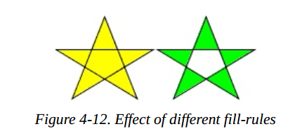
填充规则的解释
为了完整起见,以下是填充规则的工作方式,但请放心,您无需了解详细信息即可使用它们。非零规则(nonzero rule)通过从所讨论的点到无穷远处画一条
线来确定一个点是在多边形内部还是外部。它计算这条线与多边形线相交的次数,如果多边形线从右到左则加一,如果多边形线从左到右,则减一。如果总数为零,
这个店就在多边形的外部。如果总数不为零(由此得名),这个点就在多边形的内部。
奇偶规则(evenodd rule)也是从所讨论的点到无穷远处画一条线,但它只计算这条线穿过多边形的次数。如果交叉的总数为奇数,则该点在多边形里面。如果
交叉的点是偶数,则该点在多边形的外面。
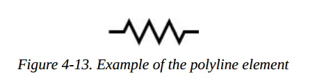
The <polyline> Element
最后,为了结束我们对基本形状的讨论,我们将回到直线(straight lines)。有时您需要一系列不构成封闭形状的线条。你可以使用多个 <line> 元素,
但是如果有很多线条,可能使用 <polyline> 元素要更容易一点。它拥有和 <polygon> 一样的 points 属性,唯一的区别是这个形状是不闭合的。
样例4-12绘制电阻器的符号。结果如图4-13所示。
Example 4-12. The polyline element
<svg width="100px" height="50px" viewBox="0 0 100 50"
xmlns="http://www.w3.org/2000/svg">
    <polyline points="5 20, 20 20, 25 10, 35 30, 45 10, 55 30, 65 10, 75 30, 80 20, 95 20"
    style="stroke: black; stroke-width: 3; fill: none;"/>
</svg>
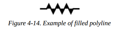
警告:当使用
<polyline>元素的时候,最好设置 fill 属性的值为 none, SVG 查看其伧俗填充这个形状,有时会导致如图4-14那样令人吃惊的结果。
Line Caps and Joins
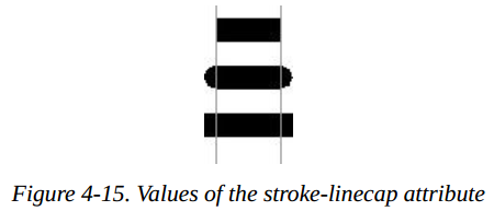
当绘制一个 <line> 或 <polyline>,您可以通过将 stroke-linecap 样式属性设置为一个值(butt, round, 或者 square)来指定线条端点的形状。样例 4-13 使用了这三个值,然后用灰色线条画出了线条的实际端点。在图4-15中,你能看到那个圆形和方形超出了末端坐标。
Example 4-13. Values of the stroke-linecap property
<line x1="10" y1="15" x2="50" y2="15"
style="stroke: black; stroke-linecap: butt; stroke-width: 15;"/>
<line x1="10" y1="45" x2="50" y2="45"
style="stroke: black; stroke-linecap: round; stroke-width: 15;"/>
<line x1="10" y1="75" x2="50" y2="75"
style="stroke: black; stroke-linecap: square; stroke-width: 15;"/>
<!-- guide lines -->
<line x1="10" y1="0" x2="10" y2="100" style="stroke: #999;"/>
<line x1="50" y1="0" x2="50" y2="100" style="stroke: #999;"/>
通过 stroke-linejoin 样式属性,你可以指定一个图形中线条在转角处的链接方式,可选的值有 miter(pointed),round, 或者 bevel(flat)。样例4-14产生如图4-16所示的结果。
Example 4-14. Values of the stroke-linejoin attribute
<polyline
style="stroke-linejoin: miter; stroke: black; stroke-width: 12;
fill: none;"
points="30 30, 45 15, 60 30"/>
<polyline
style="stroke-linejoin: round; stroke: black; stroke-width: 12;
fill: none;"
points="90 30, 105 15, 120 30"/>
<polyline
style="stroke-linejoin: bevel; stroke-width: 12; stroke: black;
fill: none;"
points="150 30, 165 15, 180 30"/>
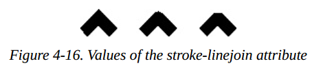
注意:如果你的线条在一个尖锐的角度有斜接的连接,这是可能的,为尖的部分延伸远远超过线的厚度。您可以使用 stroke-miterlimit s样式属性设置斜接与被链接线条的粗细比率,默认值是4.
Basic Shapes Reference Summary
下满的表格总结了 SVG 中 基本图形和它们的外观样式。
Shape Elements
表格4-1 总结了 SVG 中可用的基本图形。
Table4-1. Shape elements
| 形状 | 描述 |
|---|---|
<line x1="start-x" y1="start-y" x2="end-x" y2="end-y"/> | 以坐标点(start-x,start-y) 为起点画一条线到坐标点(end-x,end-y)。 |
<rect x="left-x" y="top-y" width="width", height="height"/> | 画一个矩形,它左上角的坐标在点(left-x,top-y),使用给定的 width 和 height. |
<circle cx="center-x" cy="center-y" r="radius"/> | 以给出的 radius 绘制一个圆,圆的中心点在(center-x,center-y) |
<ellipse cx="center-x" cy="center-y" rx="x-radius" ry="y-radius"/> | 以给出的 x-radius 和 y-radius 绘制一个椭圆,椭圆的中心点在(center-x, center-y)。 |
| `<polygon points= | |
| points-list/>` | 绘制一个任意闭合的多边形,多边形的边框通过一组点坐标 points-list 来描述。其中的点以 x轴坐标 和 y轴坐标组成的对指定。这些点坐标都只是用户坐标系;你可以不添加指定的长度单位。 |
<polyline points="points-list"/> | 根据 points-list 描述的点绘制一组任意链接线。这些点都是通过x坐标和y坐标指定的。它们都只是用户坐标系,你可以不添加指定的长度单位。 |
当你为一个属性指定了数字,就默认它是以用户坐标系衡量。除了表4-1的最后两个元素,你也可以添加一个长度单位标识符,例如 mm, pt, 等。例如:
<line x1="1cm" y1="30" x2="50" y2="10pt">
Specifying Colors
你可以用下面罗列的方式之一,来指定一个形状的填充色或者轮廓颜色:
- none, 表示不绘制轮廓或不填充形状。
- 一个基本的颜色名称,可以是 aqua, black, blue, fuchisa, gray, green, lime, maroon, navy, purple, red, silver, teal, white, 或者 yellow 中的一个。
- SVG 规范中扩展的颜色名称之一。
- 用六个十六进制字符表示,形式为 #rrggbb, 每一对表示 red, green, 和 blue 的值。
- 用三个十六进制字符表示,形式为 #rgb,描述 red,green,blue 的值。这是上一种方法的缩减版;十六进制数是重复的,所以 #rgh 等价于 #rrggbb.
- rgb(r,g,b),每个值的取值范围是0-255, 或者是 0% 到 100%。
- currentColor, 元素的计算(通常是继承)颜色属性值。
- 来自 CSS3 Color module 的规范之一(可能不是所有的SVG实现都支持它)。
Stroke and Fill Characteristics
为了看到线条或者图形的轮廓,你必须使用下面的属性,指定 stroke 的特征。一个形状的轮廓是在它的内部被填充后绘制的。所有的这些特征,总结如表4-2所示,表示为属性,然后作为 style 的一部分。
表格4-2. Stroke characteristics
| 属性 | 值 |
|---|---|
| stroke | stroke 颜色,就像指定颜色章节中描述的。默认是 none |
| stroke-width | stroke 的宽度,可能以用户坐标系的度量方式给出,或者通过一个长度标识符指定。stroke的宽度沿抽象网格线居中,默认值是 1 |
| stroke-opacity | 取值范围为 0.0 到 1.0 的数字; 0.0 表示完全透明, 1.0 表示完全不透明(默认值) |
| stroke-dasharray | 一组数字,用来表示划线时所用的破折号和间隙的长度。这些数字只能采用用户坐标系。默认的值是 none |
| stroke-linecap | 一个线条端点的形状;值是 butt(默认值),round, 或者 square 中的一个。 |
| stroke-linejoin | 一个多边形或者破折线转角处的形状;值是 miter(点,默认值), round, 或者 bevel(flat) 中的一个 |
| stroke-miterlimit | 斜接点的长度与所辉县的宽度的最大比例:默认值是4. |
您可以使用 表4-3 中显示的填充属性之一来控制形状内部的填充方式。形状是在绘制轮廓之前填充形状。
表格4-3. 填充特性
| 属性 | 值 |
|---|---|
| fill | 填充颜色,就像指定颜色中描述的那样,默认的颜色是黑色 |
| fill-opacity | 一个数字,范围从 0.0 到 1.0; 0.0 是完全透明的;1.0(默认值)是完全不透明的 |
| fill-rule | 这个属性的值可以是 nonzero(默认值) 或者 evenodd, 它应用不同的规则来确定一个点是在一个形状的内部还是外部。只有当形状中有相交的线或“洞”时,这些规则才会产生不同的效果。详细信息在本章前面的 Filling Polygons That Have Intersecting Lines中。 |
这只是可应用于 SVG 元素样式属性的一小部分示例。
在附录 B中,表格B-1,有一个完整的列表。
[6] Technically, the x value is the smaller of the x-coordinate values, and the y is the smaller of the y-coordinate values of
the rectangle’s sides in the current user coordinate system. Because you are not yet using transformations, which are
covered in Chapter 6, this is the moral equivalent of the upper-left corner.


 8252
8252


 被折叠的 条评论
为什么被折叠?
被折叠的 条评论
为什么被折叠?
 到【灌水乐园】发言


