


在实际开发中经常会用到自定义的形状,本文中借助网上优秀的博文,在根据自己平时所应用的,做一个系统的学习。
Learn from 开发者文档
shape是定义在xml中的一般形状(generic shape).
文件位置
res/drawable/filename.xml
filename会被作为资源的ID
资源引用
Java:R.drawable.filename
XML:@[package:]drawable/filename
语法讲解
具体语言见链接:开发者文档之Shape
shape是shape drawable的root结点
属性解释
xmlns:android
string.必须的。定义XML的命名空间,属性值为
http://schemas.android.com/apk/res/androidandroid:shape
Keyword.定义shape的类型。有效值是以下四种:有效值 描述 rectangle 矩形,默认图形,可以画出直角矩形、圆角矩形、弧形等 oval 椭圆形,可以画正圆 line 线性,可以画实线和虚线,需要stroke元素来定义线条的宽度 ring 环形,可以画环形进度条
rectangle
rectangle,shape默认的形状。一般用于文字、按钮、控件或者布局的背景。
solid:设置形状填充的颜色,只有android:color的一个属性。
- android:color填充的颜色
padding设置内容与形状边界的内间距,可分别设置左右上下的距离
gradient设置形状的渐变颜色,可以是线性渐变、辐射渐变和扫面性渐变
android:type 渐变的类型
- linear 线性渐变,默认渐变类型
- radial 放射渐变,设置该项时,android:gradientRadius也必须设置
- sweep 扫描性渐变
- android:startColor 渐变开始的颜色
- android:endColor 渐变结束的颜色
- android:centerColor 渐变中间的颜色
- android:angle 渐变的角度,线性渐变时才有效,必须是45的倍数,0表示从左到右,90表示从下到上
- android:centerX 渐变中心的相对X坐标,放射渐变时才有效,在0.0到1.0之间,默认为0.5,表示在正中间
android:centerY 渐变中心的相对X坐标,放射渐变时才有效,在0.0到1.0之间,默认为0.5,表示在正中间
corners设置圆角,只适用于rectangle类型,可分别设置四个角不同半径的圆角,当设置的圆角半径很大时,比如200dp,就可变成弧形边了。
stroke设置描边,可描成实线或者虚线
- android:color 描边的颜色
- android:width 描边的宽度
- android:dashWidth 设置虚线时的横线长度
android:dashGap 设置虚线时横线之间的距离
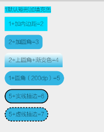
实例中所用到的属性如上所示,接下来显示图片中6_实线描边矩形代码。
文件命名为bg_rectangle_stroke.xml
 <shape xmlns:android="http://schemas.android.com/apk/res/android">
    <solid android:color="@android:color/holo_blue_light" />
    <padding
        android:bottom="10dp"
        android:left="10dp"
        android:right="10dp"
        android:top="10dp" />
    <corners android:radius="200dp" />
    <stroke
        android:width="2dp"
        android:color="@android:color/black"
        android:dashGap="3dp"
        android:dashWidth="4dp" />
</shape>
在TextView中brackground中进行引用
<TextView
        android:layout_width="wrap_content"
        android:layout_height="wrap_content"
        android:text="5+实线描边=6"
        android:layout_marginBottom="10dp"
        android:background="@drawable/bg_rectangle_stroke"/>
oval
oval用来画椭圆的,但是在实际中,更多的是用来画正圆,比如消息提示,圆形按钮等。
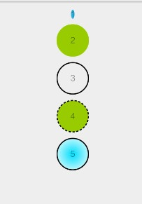
上图的效果分别使用了solid,stroke,gradient,size。
其中size是用来设置形状大小的。
size设置形状默认大小,可设置宽度和高度
- android:width 宽度
- android:height 高度
上图5中的实现方式如下,文件名定义为bg_oval_with_gradient.xml
<?xml version="1.0" encoding="utf-8"?>
<shape xmlns:android="http://schemas.android.com/apk/res/android"
    android:shape="oval">
    <solid android:color="@android:color/holo_blue_light" />
    <size
        android:width="60dp"
        android:height="60dp" />
    <stroke
        android:width="2dp"
        android:color="@android:color/black" />
    <gradient
        android:endColor="@android:color/white"
        android:gradientRadius="40dp"
        android:startColor="@android:color/holo_blue_bright"
        android:type="radial" />
</shape>
引用的代码如下:
<TextView
        android:layout_width="wrap_content"
        android:layout_height="wrap_content"
        android:layout_gravity="center"
        android:layout_marginBottom="10dp"
        android:background="@drawable/bg_oval_with_gradient"
        android:gravity="center"
        android:text="5" />
line
line主要用来画分割线,通过stroke和size的组合来实现的。实例如下所示。
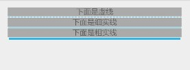
虚线代码实现如下所示。文件定义如下,bg_line_dash_shape.xml
<shape xmlns:android="http://schemas.android.com/apk/res/android"
    android:shape="line">
    <stroke
        android:width="1dp"
        android:color="@android:color/holo_blue_light"
        android:dashGap="2dp"
        android:dashWidth="4dp" />
    <size android:height="3dp" />
</shape>
资源代码引用如下:
 <TextView
        android:layout_width="match_parent"
        android:layout_height="wrap_content"
        android:background="@android:color/darker_gray"
        android:gravity="center"
        android:text="下面是虚线" />

    <View
        android:layout_width="match_parent"
        android:layout_height="3dp"
        android:background="@drawable/bg_line_shape"
        android:layerType="software"/>
注意点如下:
- 只能画水平线,不能画竖线
- 线的高度是通过stroke的android:width属性设置的
- size的android:height属性定义的是整个形状区域的高度
- size的height必须大于stroke的width,否则线无法显示
- 线左右两边留有空白空间,线越粗,空白越大
- 引用虚线时需要添加android:layerType=”software”,否则显示的是实线。
ring
shape根元素有些属性只适用于ring类型。
- android:innerRadius 内环的半径
- android:innerRadiusRatio 浮点型,以环的宽度比率来表示内环的半径。该值会被android:innerRadius覆盖。
即环的宽度(外环的直径)除以innerRadiusRatio的值等于内环的半径。假如innerRadiusRatio为2的话,内环和外环就会重合(前提是厚度为0)。默认值为9. - android:thickness 环的厚度
- android:thicknessRatio 浮点型,以环的宽度比率表示环的厚度,默认为3,表示环的厚度为环的宽度除以thicknessRatio的值。
具体实例如下:
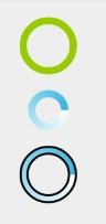
环1只添加了solid属性,环2添加了gradient,类型为sweep,环3添加了stroke和gradient的属性。
环3的代码如下,文件命名为bg_ring_gradient_stroke_shape.xml
<?xml version="1.0" encoding="utf-8"?>
<shape xmlns:android="http://schemas.android.com/apk/res/android"
    android:innerRadiusRatio="3"
    android:shape="ring"
    android:thicknessRatio="9"
    android:useLevel="false">
    <stroke
        android:width="2dp"
        android:color="@android:color/black" />
    <gradient
        android:endColor="@android:color/holo_blue_light"
        android:startColor="@android:color/white"
        android:type="sweep" />
</shape>
引用资源代码如下:
 <View
        android:layout_width="60dp"
        android:layout_height="60dp"
        android:background="@drawable/bg_ring_shape2" />
如果想把环旋变成进度条的形式,在shape外层包装一个rotate元素即可。
<?xml version="1.0" encoding="utf-8"?>
<rotate xmlns:android="http://schemas.android.com/apk/res/android"
    android:fromDegrees="0"
    android:pivotX="50%"
    android:pivotY="50%"
    android:toDegrees="1080.0">
<shape
    android:innerRadiusRatio="3"
    android:shape="ring"
    android:thicknessRatio="9"
    android:useLevel="false">
</shape>
</rotate>
代码引用如下:
 <ProgressBar
        android:layout_width="60dp"
        android:layout_height="60dp"
        android:indeterminate="false"
        android:background="@drawable/bg_ring_shape_rotate" />
参考链接:
Android样式的开发:shape篇(本文大多案例来自于该链接)
开发者文档之Shape


 2770
2770


 被折叠的 条评论
为什么被折叠?
被折叠的 条评论
为什么被折叠?
 到【灌水乐园】发言


