


flexBox语法
1.1
1.2 html
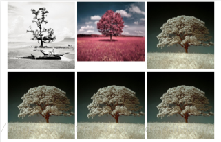
* <div id="box">
<div><img src="img/19_222949_10.jpg"/></div>
<div><img src="img/19_222949_6.jpg"/></div>
<div><img src="img/19_222949_9.jpg"/></div>
<div><img src="img/19_222949_9.jpg"/></div>
<div><img src="img/19_222949_9.jpg"/></div>
<div><img src="img/19_222949_9.jpg"/></div>
</div>
1.3 css
#box{
    display: flex;
    flex-wrap: wrap;
    flex-direction: row;
    justify-content: center;
    align-items: flex-start;
}
#box img{width:300px;}
#box div{margin: 5px;}
2.1
2.2 html
<div id="box2">
<div></div>
<div></div>
<div></div>
</div>
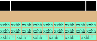
<div id="box3">
<div>xxhh</div>
<div>xxhh</div>
<div>xxhh</div>
<div>xxhh</div>
<div>xxhh</div>
<div>xxhh</div>
<div>xxhh</div>
<div>xxhh</div>
<div>xxhh</div>
<div>xxhh</div>
<div>xxhh</div>
<div>xxhh</div>
<div>xxhh</div>
<div>xxhh</div>
<div>xxhh</div>
<div>xxhh</div>
<div>xxhh</div>
<div>xxhh</div>
<div>xxhh</div>
<div>xxhh</div>
<div>xxhh</div>
<div>xxhh</div>
<div>xxhh</div>
<div>xxhh</div>
</div>2.3 css
#box2{
    display: flex;
    flex-wrap: wrap;
    justify-content: center;
}
#box2 div{margin: 5px;}
#box2 div:nth-child(1), #box2 div:nth-child(3){
    width:100px;
    background: black;
    height: auto;
}
#box2 div:nth-child(2){
    background-color: black;
    flex: 1;
    height: 100px;
}

#box3{
    display: flex;
    flex-wrap: wrap;
    height: 300px;
    /*justify-content: center;*/
    /*align-items: flex-start;*/
    /*align-content: flex-end;*/
    /*align-content: flex-start;*/
    /*align-content: center;*/
    align-content: flex-end;
    font-size: 3rem;
    background-color: burlywood;
}

#box3 div{
    background-color: aquamarine;
    flex: 1;
    margin: 5px;
}
3.1
3.2 html
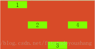
<div id="box4">
    <div>1</div>
    <div>2</div>
    <div>3</div>
    <div>4</div>
</div>
3.3 css
box4{
    display: flex;
    flex-wrap: wrap;
    font-size: 4rem;
    /*justify-content: center;*/
    height: 500px;
    justify-content: center;
    align-items: center;
    background-color: #D84B28;
}
#box4 div{
    /*flex: 1;*/
    width:200px;
    text-align: center;
    background-color: chartreuse;
    margin: 4px;
}

#box4 div:nth-child(1){
    align-self: flex-start;
}

#box4 div:nth-child(3){
    /*align-self: flex-end;*/
    align-self: flex-end;
}

#box4 div:nth-child(4){
    /*align-self: flex-end;*/
    align-self: center;
}


 1545
1545


 被折叠的 条评论
为什么被折叠?
被折叠的 条评论
为什么被折叠?
 到【灌水乐园】发言


