


文章目录
1. ConstraintLayout介绍
ConstraintLayout,约束布局。我们都知道 ConstraintLayout 是继传统三大布局容器(LinearLayout、RelativeLayout、FrameLayout)之后,谷歌又推出的一种扁平化布局容器。相比传统三大布局容器,它有着扁平化、灵活约束等特点。
2. 高级用法
2.1 Gone Margin
我们知道View之间的间距用 layout_margin 来定义,但是 ConstraintLayout 除了layout_margin,还有
layout_goneMargin。
从名字可以大概猜出,layout_goneMargin 的作用是: 当目标View隐藏(Gone)之后,该 margin 才会生效。
具体的属性有:
layout_goneMarginStart
layout_goneMarginEnd
layout_goneMarginLeft
layout_goneMarginTop
layout_goneMarginRight
layout_goneMarginBottom
有什么实际用途呢?举个例子🌰,就明白了💡。
- 问题场景
比如,界面中有A、B两个View左右相邻排列,中间没有margin,但是A marginLeft=20dp,且在运行中A可能会隐藏(Gone)。隐藏后,B会很自然的往左顶替A的位置,但由于B上没有设置marginLeft,B会紧靠最左边。而我们想要的效果是,B这时会像A一样距离左边20dp。那么该怎么办呢?
如果是在代码中控制,也可以实现:在A隐藏时,给B设置上marginLeft,但这也太麻烦了,还要去设置修改layoutParams。 - 用 layout_goneMargin解决
layout_goneMarginLeft 就是为了解决这种问题的。有了它,只需要在xml中给B设置layout_goneMarginLeft=20dp就OK了,在A显示时,它的margin是不生效的,B还是紧贴着A;当A隐藏(Gone)时,它的margin就生效了,这时B顶替了A的位置,且marginLeft=20dp
2.2 偏移
layout_constraintHorizontal_bias 水平偏移
layout_constraintVertical_bias 垂直偏移
两个属性的取值范围在 0-1。
在水平偏移中,0 表示最左,1 表示最右;
在垂直偏移,0 表示最上,1 表示最下;0.5 表示中间
着两个不算常用,但见到了要知道什么意思。
2.3 居中
让一个View居中,可太常见了,如何居中呢?
- 在传统的RelativeLayout中
通常是使用以下三个属性layout_centerInParent 中间居中 layout_centerHorizontal 水平居中 layout_centerVertical 垂直居中 - 在 ConstraintLayout 中
在左右、上下添加约束便可以实现某一方向的居中。
水平居中: layout_constraintLeft_toLeftOf + layout_constraintRight_toRightOf
垂直居中: layout_constraintTop_toTopOf + layout_constraintBottom_toBottomOf
中间居中: 水平居中 + 垂直居中
2.4 尺寸约束
如果想限制某个View的最大宽高、最小宽高,可以用以下属性
layout_constraintWidth_min 最小宽度
layout_constraintHeight_min 最小高度
layout_constraintWidth_max 最大宽度
layout_constraintHeight_max 最大高度
layout_constraintWidth_percent 宽度占 parent 的百分比
layout_constraintHeight_percent 高度占 parent 的百分比
2.5 链
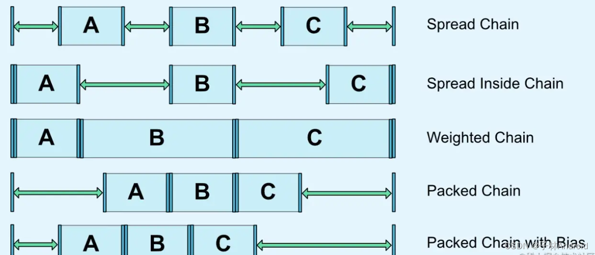
在 ConstraintLayout 的使用中,尤其是Android studio的面板视图里,你肯定见过 Chain 这个东西,它就是链。
链是在水平或者垂直方向对一组View提供一种分布行为(平均分布、紧凑分布等)。要想形成链,有个条件是:多个view在水平或垂直方向相互约束,并且最终与 parent 约束。
横向链最左边第一个View,垂直链最顶边第一个View称为链头,可以通过下面两个属性对链头统设置,定义一条链的样式。
layout_constraintHorizontal_chainStyle //水平方向链式
layout_constraintVertical_chainStyle //垂直方向链式
取值有:
- Spread Chain 展开平均分布样式(默认)
- Spread Inside Chain 两边靠近两边,中间居中
- Weighted chain 对于宽高设置为0的View,填充剩余空间,可配合 layout_constraintHorizontal_weight=”1” 使用
- Packed Chain 抱团 (打包) 样式,控件抱团到一起,默认居中,可通过偏移 bias可以改变 packed 元素的位置。
2.6 角度定位(圆形定位)
角度定位指的是可以用一个角度和一个距离来约束两个空间的中心。举个例子🌰:
<TextView
    android:id="@+id/TextView1"
    android:layout_width="wrap_content"
    android:layout_height="wrap_content" />

<TextView
    android:id="@+id/TextView2"
    android:layout_width="wrap_content"
    android:layout_height="wrap_content"
    app:layout_constraintCircle="@+id/TextView1"
    app:layout_constraintCircleAngle="120"
    app:layout_constraintCircleRadius="150dp" />
上面例子中的 TextView2 用到了 3 个属性:
app:layout_constraintCircle="@+id/TextView1"
app:layout_constraintCircleAngle="120"(角度)
app:layout_constraintCircleRadius="150dp"(距离)
指的是 TextView2 的中心在 TextView1 的中心的 120 度,距离为 150dp
另外, margin 设置负值在 ConstraintLayout 是没有效果的。 可以通过 Space 来间接实现 view 重叠效果。
/**
 * Space is a lightweight View subclass that may be used to create gaps between components
 * in general purpose layouts.
 */
public final class Space extends View {...}
3. 工具类
3.1 Guideline(参考线)
参考线可以为我们在布局时提供距离参考,实际不会在界面上显示。
参考线有水平和垂直两种,通过 orientation 来定义,对应值为 vertical 和 horizontal。
layout_constraintGuide_begin 从左边或顶部指定具体的距离
layout_constraintGuide_end 从右边或底部指定具体的距离
layout_constraintGuide_percent 按宽度或高度的百分比来指定具体距离
3.2 Barrier(栅栏)
Barrier ,相当于一道栏杆,被引用的View被分割到栏杆的一侧,当View尺寸变化时,栏杆也会跟随移动。依赖于栏杆的View也会随着栏杆的移动而移动。
比如,一个登录界面,右边的 EditText 总是希望与左右所有 TextView 的最长边缘靠齐。
如果两个 TextView 其中一个变得更长,EditText 的位置都会跟这变化,这比使用 RelativeLayout 灵活很多。
<?xml version="1.0" encoding="utf-8"?>
<androidx.constraintlayout.widget.ConstraintLayout xmlns:android="http://schemas.android.com/apk/res/android"
    xmlns:android="http://schemas.android.com/apk/res/android"
    xmlns:app="http://schemas.android.com/apk/res-auto"
    xmlns:app="http://schemas.android.com/apk/res-auto"
    android:layout_width="match_parent"
    android:layout_height="match_parent">

    <androidx.constraintlayout.widget.Barrier
        android:id="@+id/barrier"
        android:layout_width="wrap_content"
        android:layout_height="wrap_content"
        app:barrierDirection="right"
        app:constraint_referenced_ids="tvPhone,tvPassword" />

    <TextView
        android:id="@+id/tvPhone"
        android:layout_width="wrap_content"
        android:layout_height="50dp"
        android:gravity="center_vertical|left"
        android:padding="10dp"
        android:text="手机号码"
        app:layout_constraintStart_toStartOf="parent"
        app:layout_constraintTop_toTopOf="parent" />

    <TextView
        android:id="@+id/tvPassword"
        android:layout_width="wrap_content"
        android:layout_height="wrap_content"
        android:gravity="center_vertical|left"
        android:padding="10dp"
        android:text="密码"
        app:layout_constraintStart_toStartOf="parent"
        app:layout_constraintTop_toBottomOf="@id/tvPhone" />

    <EditText
        android:id="@+id/etPassword"
        android:layout_width="wrap_content"
        android:layout_height="wrap_content"
        android:hint="输入手机号码"
        app:layout_constraintLeft_toLeftOf="@id/barrier" />

    <EditText
        android:layout_width="wrap_content"
        android:layout_height="wrap_content"
        android:hint="输入密码"
        app:layout_constraintLeft_toLeftOf="@id/barrier"
        app:layout_constraintTop_toBottomOf="@id/etPassword" />
</androidx.constraintlayout.widget.ConstraintLayout>
app:barrierDirection 所引用控件对齐的位置,可设置的值有:bottom、end、left、right、start、top.constraint_referenced_ids 为所引用的控件,例如这里的 tvPhone,tvPasswrod。
3.3 Group(组)
用来控制一组 view 的可见性,如果 view 被多个 Group 控制,则以最后的 Group 定义的可见性为主。
<androidx.constraintlayout.widget.Group
    android:layout_height="wrap_content"
    android:layout_width="wrap_content"
    android:visibility="visible"
    app:constraint_referenced_ids="textView3,textView2,textView1" />
3.4 Placeholder(占位符)
一个 view 占位的占位符,当指定 Placeholder 的 content 属性为另一个 view 的 id 时,该 view 会移动到 Placeholder 的位置。
<androidx.constraintlayout.widget.Placeholder
     android:id="@+id/place_holder"
     android:layout_height="60dp"
     android:layout_width="100dp"
     app:layout_constraintEnd_toEndOf="parent"
     app:layout_constraintTop_toTopOf="@+id/guideline2"
     app:content="@id/textView3"/>
也可以通过代码调用的方式移动 view 到 PlaceHolder,如下:
placeholder.setContentId(R.id.textView3);
3.5 Optimizer
当ConstrainLayout中的View宽高设置为0时,ConstraintLayout 将对控件进行 2 次测量,ConstraintLayout 在 1.1 中可以通过设置 layout_optimizationLevel 进行优化,可设置的值有:
none:无优化
standard:仅优化直接约束和屏障约束(默认)
direct:优化直接约束
barrier:优化屏障约束
chain:优化链约束
dimensions:优化尺寸测量
3.6 Layer
它把一些控件组合在一起,当作一个图层,该图层自动计算边界,也是 View 的子类,但是功能不是完整的,Layer 并不会增加 view 的层级,这一点是解决过度嵌套的好帮手~
支持的操作:
 - 设置背景色
 - 支持 elevation 属性
 - 设置可见性 支持补间动画(alpha 是 layer动,scale,rotation,transaction 是其中的每个控件同时动)
 - 多个图层同时包含同一个控件
 - 图层本身支持事件点击
 - 支持padding、不支持 margin、不支持大小
4. Constraintlayout 2.0 新增 / 少见的用法
4.1 Flow 流式布局
<androidx.constraintlayout.helper.widget.Flow
        android:id="@+id/flow_test"
        android:layout_height="wrap_content"
        android:layout_width="wrap_content"
        app:constraint_referenced_ids="tvA,tvB,tvC,tvD,tvE,tvF,tvG"
        app:flow_firstHorizontalStyle="spread"
        app:flow_horizontalGap="30dp"
        app:flow_lastHorizontalStyle="packed"
        app:flow_maxElementsWrap="4"
        app:flow_verticalGap="30dp"
        app:flow_wrapMode="chain"
        app:layout_constraintEnd_toEndOf="parent"
        app:layout_constraintStart_toStartOf="parent"
       ...
flow_wrapMode 属性一共有四种值:
none: 所有引用的 view 形成一条链,水平居中,超出屏幕两侧的 view 不可见.
chain: 所引用的 View 形成一条链,超出部分会自动换行,同行的 View 会平分宽度,中间排列。
aligned: 所引用的 View 形成一条链,超出部分会自动换行,同行的 View 会优先左侧排列。
chain2: 所引用的 View 形成一条链,超出部分会自动换行,同行的 View 会平分宽度。但会导致 app:flow_maxElementsWrap 属性失效
其他属性:
app:flow_maxElementsWrap="4" 一行几个元素
app:flow_verticalGap="10dp" 竖直间距
app:flow_horizontalGap="10dp" 横向间距
android:orientation="horizontal"水平方向的流式还是竖直方向的流式
app:flow_verticalAlign ="top" 值有 top,bottom,center,baseline。每一行元素的对齐方式
app:flow_horizontalStyle = "spread | spread_inside | packed" 当 wrapMode 为 chain 或 ALIGNED 时生效
app:flow_horizontalBias = "float" low 的 bias 偏移,只在 style 为 packed 时生效
4.2 ImageFilterView
ImageFilterView 继承自 ImageView,可以轻松实现圆角、图片色彩调节等
<androidx.constraintlayout.utils.widget.ImageFilterView
    android:id="@+id/imageFilterView"
    android:layout_height="50dp"
    android:layout_width="50dp"
    app:altSrc="@mipmap/ic_launcher"
    app:brightness="1"
    app:contrast="4"
    app:crossfade="0.5"
    app:round="20dp"
    app:roundPercent="1"
    app:srcCompat="@drawable/test_logo"
    app:warmth="1" />
roundPercent 取值在 0-1,由正方形向圆形过渡。
但是以下情况可能圆角会失效:
- layout_width 或 layout_height 为 wrapcontent 时,圆角失效。
- 设置了 layout_constraintHorizontal_weight,且 layout_width 为 0dp 时,圆角失效
其他属性:
- app:altSrc="@mipmap/ic_launcher"
- altSrc 和 src 属性是一样的概念,altSrc 提供的资源将会和 src 提供的资源通过 crossfade 属性形成- 交叉淡化效果。默认情况下, crossfade=0,altSrc 所引用的资源不可见, 取值在 0-1
- warmth 色温:1=neutral 自然, 2=warm 暖色, 0.5=cold 冷色
- brightness 亮度:0 = black 暗色, 1 = original 原始, 2 = twice as bright 两倍亮度;
- saturation 饱和度:0 = grayscale 灰色, 1 = original 原始, 2 = hyper saturated 超饱和;
- contrast 对比度:1 = unchanged 原始, 0 = gray 暗淡, 2 = high contrast 高对比;
4.3 ImageFilterButton
ImageFilterView 与 ImageFilterButton 的属性一模一样,只是它两继承的父类不一样,一些操作也就不一样。
ImageFilterButton 继承自 AppCompatImageButton, 也就是 ImageButtion。而 ImageFilterView 继承自 ImageView。
4.4 MockView
MockView 能简单的帮助构建 UI 界面,通过对角线形成的矩形 + 标签,就像一些原型设计示意图一样。例如:
<androidx.constraintlayout.utils.widget.MockView
       android:id="@+id/first"
       android:layout_width="100dp"
       android:layout_height="100dp"
	   android:layout_margin="30dp"
       app:layout_constraintLeft_toLeftOf="parent"
       app:layout_constraintTop_toTopOf="parent" />

4.5 关键帧动画
在 ConstraintLayout 中,可以使用 ConstraintSet 和 TransitionManager 为尺寸和位置元素的变化添加动画效果。
ConstraintLayout 2.0 还增加了 ConstraintProperties 类用于通过 api(代码) 更新 ConstraintLayout 子视图,ConstraintsChangedListener 监听,更多用法可看官方API解释。
5. 总结
ConstraintLayout 功能十分丰富,本文介绍了它一些比较高级的用法,可能并不常用,但一旦用到那将会给我们带来事半功倍的效果。
以上就是全部内容了,感谢支持!


 2万+
2万+


 被折叠的 条评论
为什么被折叠?
被折叠的 条评论
为什么被折叠?
 到【灌水乐园】发言


