


声明:代码的运行环境为Python3。Python3与Python2在一些细节上会有所不同,希望广大读者注意。本博客以代码为主,代码中会有详细的注释。相关文章将会发布在我的个人博客专栏《Python从入门到深度学习》,欢迎大家关注。
目录
五、Python机器学习基础之Matplotlib库的使用
Matplotlib库是Python最著名的绘图库,他提供了一整套和MATLAB相似的命令API,十分适合交互式的进行制图。而且也可以方便的将它作为绘图控件,嵌入GUI应用程序中。下面开始我们的第五讲:Python机器学习基础之Matplotlib库的使用。
一、图例与标签
一个图形可以直观的展示给使用者,与其图例和标签是分不开的,所以弄懂图形的图例和标签就显得尤为重要了。我们从一个简单的例子开始说起。
# 导入需要的包
import matplotlib.pyplot as plt
#数据点
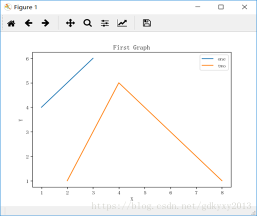
x = [1, 2, 3]
y = [4, 5, 6]
x2, y2 = [2, 4, 8], [1, 5, 1]
# 画图
plt.plot(x, y, label='one')
plt.plot(x2, y2, label='two')
plt.xlabel('X')
plt.ylabel('Y')
plt.title('First Graph')
plt.legend()
plt.show()
如上例所示,调用pyplot中的plot()方法可以进行绘图,但是需要注意的是它只是在后台进行绘图,如果想要将图形显示在屏幕上,需要调用show()方法。上例中,plot()方法中的label参数指的是为当前的图像指定名称,可以在图例中显示出来;xlabel()和ylabel()方法指的是分别对X轴和Y轴创建标签;title()方法可以创建图像的标题;legend()方法可以生成默认的图例。在PyCharm中输入上例中的代码,得到的结果如下图所示。
注意:本文中以例子讲解几种图形的画法,结果不予展示。本文附录会有几个相应的示例及示例结果。
二、条形图和直方图
总体来说,直方图与条形图是非常相像的,但直方图更倾向于将某个区段的数据组合在一起显示分布。下面我们队条形图和直方图的做法分别进行介绍。
1.条形图
首先来看条形图,bar()方法可以创建条形图,如下例所示:
#数据点
x = [2, 4, 6, 8, 10]
y = [4, 5, 6, 2, 9]
x2, y2 = [1, 3, 5, 7, 9], [1, 5, 1, 4, 8]

# 画图
plt.bar(x, y, label='one', color='b')
plt.bar(x2, y2, label='two', color='r')
plt.xlabel('X')
plt.ylabel('Y')
plt.title('Bar Graph')
plt.legend()
plt.show()
其中color参数可以指定颜色,例如常用的颜色:b代表蓝色、y代表黄色、g代表绿色、r代表红色。当然除此之外,也可以使用十六进制(如#181465)颜色代码等等。
2.直方图
hist()方法用于创建直方图,代码如下:
#数据点
x = [2, 4, 6, 8, 10, 12, 45, 36, 28, 19, 44 ,12, 23]
y = [10, 20, 30, 40, 50]

# 画图
plt.hist(x, y, rwidth=0.5, color='b')
plt.xlabel('X')
plt.ylabel('Y')
plt.title('Hist Graph')
plt.legend()
plt.show()
上例中,x为数据,y是自己定义的区段,rwidth参数用来设置条形的宽度。
三、堆叠图和饼图
堆叠图与饼图类似,这里放到一起进行讨论,不同的是,堆叠图用于显示数据随时间的变化关系,而饼图是位于某个时间点。
1.堆叠图
stackplot()函数用于绘制堆叠图,代码如下:
# 数据
holiday = [1, 2, 3, 4, 5, 6, 7]
walking = [2, 5, 4, 3, 2, 1, 2]
driving = [2, 4, 3, 2, 6, 2, 1]
sleeping = [7, 8, 8, 6, 4, 9, 7]

# 画图
plt.stackplot(holiday, walking, driving, sleeping, colors=['m', 'y', 'b'], labels=['walking', 'driving', 'sleeping'])
plt.xlabel('X')
plt.ylabel('Y')
plt.title('Stackplot Graph')
plt.legend()
plt.show()
上例中,函数内一开始放置的参数是x轴变量,随后的一系列参数都是需要堆叠的数据,参数colors和labels与之前的参数color和label作用是相同的,值得注意的是,当设置的变量有多个时,要用参数的复数形式。
2.饼图
饼图通常用于显示部分对于整体的占比情况。pie()方法用于绘制饼图,代码如下:
# 数据
walking = [2, 5, 4, 3, 2, 1, 2]
driving = [2, 4, 3, 2, 6, 2, 1]
sleeping = [7, 8, 8, 6, 4, 9, 7]
relaxing = [13, 7, 9, 13, 12, 12, 14]

slices = [2, 1, 7, 14]
labels = ['walking', 'driving', 'sleeping', 'relaxing']
colors = ['m', 'y', 'b', 'r']

# 画图
plt.pie(slices,
        labels=labels,
        colors=colors,
        startangle=90,
        shadow=True,
        explode=(0.1, 0, 0, 0),
        autopct='%1.1f%%')
plt.title('Pie Graph')
plt.legend()
plt.show()
上例中,首先我们需要在函数内指定切片,这是每组数据的相对大小。参数startangle指定起始的角度,参数shadow用于指定是否显示阴影,参数explode指定拉出某个切片,参数autopct指定将百分比放置到切片上。
四、散点图
散点图通常用于两个变量之间寻找某种关系,如线性关系。scatter()函数用于创建散点图,代码如下:
# 数据
x = [1, 2, 3, 4, 5, 6, 7, 8, 9]
y = [2, 5, 4, 6, 5, 4, 7, 8, 2]

# 画图
plt.scatter(x, y, label='scatter', color='k', s=25, marker='o'),
plt.xlabel('X')
plt.ylabel('Y')
plt.title('Scatter Graph')
plt.legend()
plt.show()
上例中,参数s用于指定使用标记的大小,参数marker用于指定使用的标记的类型。
五、从文件中加载数据
在利用Matplotlib包进行绘图的时候,大多数的数据都是来自于文件的,所以学会从文件中读取数据并展示出来就显得尤为重要了。我们将使用两个方法分别对文件中的数据进行加载并通过图形将数据展示出来。
1.使用NumPy库进行加载
使用NumPy库中的loadtxt()方法可以将数据加载出来,这也是一种相对简单的方法。NumPy加载数据在3.1.6中已经做出了介绍,加载及绘图过程如下例所示:
# 导入需要的包
import matplotlib.pyplot as plt
import numpy as np

#加载数据
x, y = np.loadtxt('file', delimiter=',', unpack=True)

# 画图
plt.plot(x, y, label='file data')
plt.xlabel('X')
plt.ylabel('Y')
plt.title('LoadFile Graph')
plt.legend()
plt.show()
2.使用csv模块加载
csv模块是Python自带的一个模块,可以利用open()函数将要读入的文件打开,然后通过csv模块进行相关处理,代码如下:
# 导入需要的包
import matplotlib.pyplot as plt
import csv

# 数据
x = []
y = []

with open('file', 'r') as csvfile:
    data = csv.reader(csvfile, delimiter=',')
    for i in data:
        x.append(int(i[0]))
        y.append(int(i[1]))

# 画图
plt.plot(x, y, label='file data')
plt.xlabel('X')
plt.ylabel('Y')
plt.title('LoadFile Graph')
plt.legend()
plt.show()
上例中,open()函数中参数delimiter是指文件中的分隔符。
六、附录
【调用help方法,查看相关的命令】
'''
机器学习基础之matplotlib模块的简单使用
'''

# 导入需要的包
import matplotlib.pyplot as plt
import numpy as np

help(plt.plot)
【结果】
Help on function plot in module matplotlib.pyplot:

plot(*args, **kwargs)
    Plot lines and/or markers to the
    :class:`~matplotlib.axes.Axes`.  *args* is a variable length
    argument, allowing for multiple *x*, *y* pairs with an
    optional format string.  For example, each of the following is
    legal::

        plot(x, y)        # plot x and y using default line style and color
        plot(x, y, 'bo')  # plot x and y using blue circle markers
        plot(y)           # plot y using x as index array 0..N-1
        plot(y, 'r+')     # ditto, but with red plusses

    If *x* and/or *y* is 2-dimensional, then the corresponding columns
    will be plotted.

    If used with labeled data, make sure that the color spec is not
    included as an element in data, as otherwise the last case
    ``plot("v","r", data={"v":..., "r":...)``
    can be interpreted as the first case which would do ``plot(v, r)``
    using the default line style and color.

    If not used with labeled data (i.e., without a data argument),
    an arbitrary number of *x*, *y*, *fmt* groups can be specified, as in::

        a.plot(x1, y1, 'g^', x2, y2, 'g-')

    Return value is a list of lines that were added.

    By default, each line is assigned a different style specified by a
    'style cycle'.  To change this behavior, you can edit the
    axes.prop_cycle rcParam.

    The following format string characters are accepted to control
    the line style or marker:

    ================    ===============================
    character           description
    ================    ===============================
    ``'-'``             solid line style
    ``'--'``            dashed line style
    ``'-.'``            dash-dot line style
    ``':'``             dotted line style
    ``'.'``             point marker
    ``','``             pixel marker
    ``'o'``             circle marker
    ``'v'``             triangle_down marker
    ``'^'``             triangle_up marker
    ``'<'``             triangle_left marker
    ``'>'``             triangle_right marker
    ``'1'``             tri_down marker
    ``'2'``             tri_up marker
    ``'3'``             tri_left marker
    ``'4'``             tri_right marker
    ``'s'``             square marker
    ``'p'``             pentagon marker
    ``'*'``             star marker
    ``'h'``             hexagon1 marker
    ``'H'``             hexagon2 marker
    ``'+'``             plus marker
    ``'x'``             x marker
    ``'D'``             diamond marker
    ``'d'``             thin_diamond marker
    ``'|'``             vline marker
    ``'_'``             hline marker
    ================    ===============================


    The following color abbreviations are supported:

    ==========  ========
    character   color
    ==========  ========
    'b'         blue
    'g'         green
    'r'         red
    'c'         cyan
    'm'         magenta
    'y'         yellow
    'k'         black
    'w'         white
    ==========  ========

    In addition, you can specify colors in many weird and
    wonderful ways, including full names (``'green'``), hex
    strings (``'#008000'``), RGB or RGBA tuples (``(0,1,0,1)``) or
    grayscale intensities as a string (``'0.8'``).  Of these, the
    string specifications can be used in place of a ``fmt`` group,
    but the tuple forms can be used only as ``kwargs``.

    Line styles and colors are combined in a single format string, as in
    ``'bo'`` for blue circles.

    The *kwargs* can be used to set line properties (any property that has
    a ``set_*`` method).  You can use this to set a line label (for auto
    legends), linewidth, anitialising, marker face color, etc.  Here is an
    example::

        plot([1,2,3], [1,2,3], 'go-', label='line 1', linewidth=2)
        plot([1,2,3], [1,4,9], 'rs',  label='line 2')
        axis([0, 4, 0, 10])
        legend()

    If you make multiple lines with one plot command, the kwargs
    apply to all those lines, e.g.::

        plot(x1, y1, x2, y2, antialiased=False)

    Neither line will be antialiased.

    You do not need to use format strings, which are just
    abbreviations.  All of the line properties can be controlled
    by keyword arguments.  For example, you can set the color,
    marker, linestyle, and markercolor with::

        plot(x, y, color='green', linestyle='dashed', marker='o',
             markerfacecolor='blue', markersize=12).

    See :class:`~matplotlib.lines.Line2D` for details.

    The kwargs are :class:`~matplotlib.lines.Line2D` properties:

      agg_filter: unknown
      alpha: float (0.0 transparent through 1.0 opaque)
      animated: [True | False]
      antialiased or aa: [True | False]
      clip_box: a :class:`matplotlib.transforms.Bbox` instance
      clip_on: [True | False]
      clip_path: [ (:class:`~matplotlib.path.Path`, :class:`~matplotlib.transforms.Transform`) | :class:`~matplotlib.patches.Patch` | None ]
      color or c: any matplotlib color
      contains: a callable function
      dash_capstyle: ['butt' | 'round' | 'projecting']
      dash_joinstyle: ['miter' | 'round' | 'bevel']
      dashes: sequence of on/off ink in points
      drawstyle: ['default' | 'steps' | 'steps-pre' | 'steps-mid' | 'steps-post']
      figure: a :class:`matplotlib.figure.Figure` instance
      fillstyle: ['full' | 'left' | 'right' | 'bottom' | 'top' | 'none']
      gid: an id string
      label: string or anything printable with '%s' conversion.
      linestyle or ls: ['solid' | 'dashed', 'dashdot', 'dotted' | (offset, on-off-dash-seq) | ``'-'`` | ``'--'`` | ``'-.'`` | ``':'`` | ``'None'`` | ``' '`` | ``''``]
      linewidth or lw: float value in points
      marker: :mod:`A valid marker style <matplotlib.markers>`
      markeredgecolor or mec: any matplotlib color
      markeredgewidth or mew: float value in points
      markerfacecolor or mfc: any matplotlib color
      markerfacecoloralt or mfcalt: any matplotlib color
      markersize or ms: float
      markevery: [None | int | length-2 tuple of int | slice | list/array of int | float | length-2 tuple of float]
      path_effects: unknown
      picker: float distance in points or callable pick function ``fn(artist, event)``
      pickradius: float distance in points
      rasterized: [True | False | None]
      sketch_params: unknown
      snap: unknown
      solid_capstyle: ['butt' | 'round' |  'projecting']
      solid_joinstyle: ['miter' | 'round' | 'bevel']
      transform: a :class:`matplotlib.transforms.Transform` instance
      url: a url string
      visible: [True | False]
      xdata: 1D array
      ydata: 1D array
      zorder: any number

    kwargs *scalex* and *scaley*, if defined, are passed on to
    :meth:`~matplotlib.axes.Axes.autoscale_view` to determine
    whether the *x* and *y* axes are autoscaled; the default is
    *True*.

    .. note::
        In addition to the above described arguments, this function can take a
        **data** keyword argument. If such a **data** argument is given, the
        following arguments are replaced by **data[<arg>]**:

        * All arguments with the following names: 'x', 'y'.
【示例一】
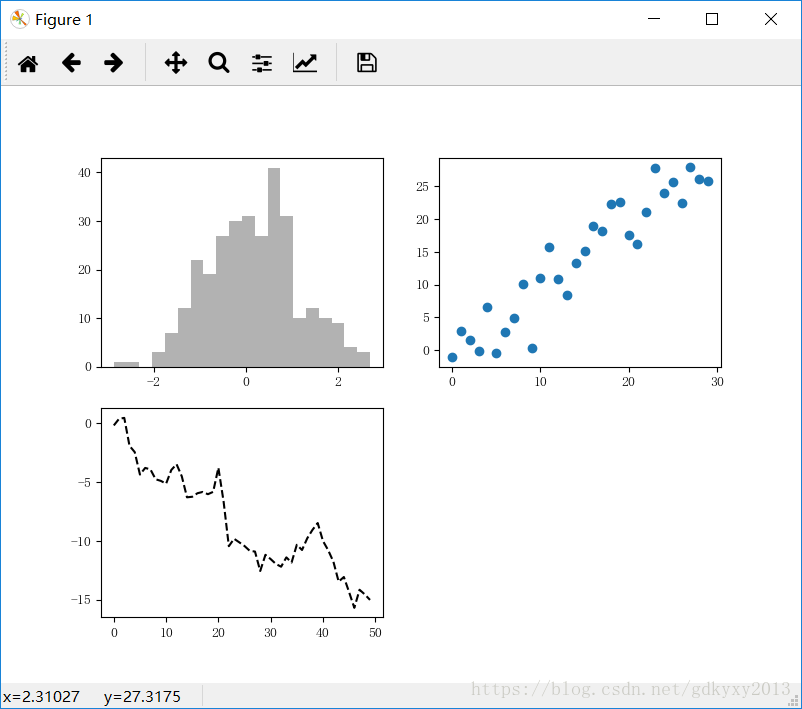
# Figure和Subplot:matplotlib的图像都位于Figure对象中,Figure对象下创建一个或多个subplot对象(即axes)用于绘制图表

# 示例一
# 设置中文和‘-’负号显示问题
from pylab import mpl
mpl.rcParams['font.sans-serif'] = ['FangSong']
mpl.rcParams['axes.unicode_minus'] = False
# 获得figure对象
fig = plt.figure(figsize=(8, 6))
# 在Figure对象上创建axes对象
ax1 = fig.add_subplot(2, 2, 1)
ax2 = fig.add_subplot(2, 2, 2)
ax3 = fig.add_subplot(2, 2, 3)
# 在当前axes上绘制曲线图(ax3)
plt.plot(np.random.randn(50).cumsum(), 'k--')
# 在ax1上绘制柱状图
ax1.hist(np.random.randn(300), bins=20, color='k', alpha=0.3)
# 在ax2上绘制散点图
ax2.scatter(np.arange(30), np.arange(30) + 3 * np.random.randn(30))
plt.show()
【结果】
【示例二】
# 示例二
# 设置中文和‘-’负号显示问题
from pylab import mpl
mpl.rcParams['font.sans-serif'] = ['FangSong']
mpl.rcParams['axes.unicode_minus'] = False
# 画图
fig, axes = plt.subplots(2, 2, sharex=True, sharey=True)
print(axes)
for i in range(2):
    for j in range(2):
        axes[i, j].hist(np.random.randn(500), bins=10, color='k', alpha=0.5)
plt.subplots_adjust(wspace=0, hspace=0)
plt.show()
【结果】

【示例三】
# matplotlib曲线图

# 示例三
# 设置中文和‘-’负号显示问题
from pylab import mpl
mpl.rcParams['font.sans-serif'] = ['FangSong']
mpl.rcParams['axes.unicode_minus'] = False
x = np.linspace(0, 10, 1000)
y = np.sin(x)
z = np.cos(x ** 2)
# 创建一个绘图对象,并且指定宽8英寸,高4英寸
plt.figure(figsize=(8, 4))
# label:给所绘制的曲线一个名字,此名字在图示(legend)中显示。
# 只要在字符串前后添加“$”符号,matplotlib就会使用其内嵌的latex引擎绘制的数学公式。
# color指定曲线颜色,linewidth曲线宽度,“b--”指定曲线的颜色和线型
plt.plot(x, y, label='$sin(x)$', color='red', linewidth=2)
plt.plot(x, z, 'b--', label='$cos(x^2)$')
plt.xlabel("Time(s)")  # 设置x轴标题
plt.ylabel("Volt")  # 设置y轴标题
plt.title("PyPlot First Example")  # 设置图标标题
plt.ylim(-1.2, 1.2)  # 设置x轴范围
plt.legend()  # 显示图示说明
plt.grid(True)  # 显示虚线框
plt.show()  # 展示图表
【结果】

【示例四】
# matplotlib绘制散点图

# 示例四
# 设置中文和‘-’负号显示问题
from pylab import mpl
mpl.rcParams['font.sans-serif'] = ['FangSong']
mpl.rcParams['axes.unicode_minus'] = False

plt.axis([0, 5, 0, 20])
plt.title('My First Chart', fontsize=20, fontname='Time New Roman')
plt.xlabel('Counting', color='gray')
plt.ylabel('Square values', color='gray')
plt.text(1, 1.5, 'First')
plt.text(2, 4.5, 'Second')
plt.text(3, 9.5, 'Third')
plt.text(4, 16.5, 'Fourth')
plt.text(1, 11.5, r'$y=x^2$', fontsize=20, bbox={'facecolor': 'yellow', 'alpha': 0.2})
plt.grid(True)
plt.plot([1, 2, 3, 4], [1, 4, 9, 16], 'ro')
plt.plot([1, 2, 3, 4], [0.8, 3.5, 8, 15], 'g^')
plt.plot([1, 2, 3, 4], [0.5, 2.5, 5.4, 12], 'b*')
plt.legend(['First series', 'Second series', 'Third series'], loc=2)
# 将图表保存到文件
plt.savefig('my_chart.png')
plt.show()
【结果】

【示例五】
# 颜色、标记和线型

# 示例五
# 设置中文和‘-’负号显示问题
from pylab import mpl
mpl.rcParams['font.sans-serif'] = ['FangSong']
mpl.rcParams['axes.unicode_minus'] = False

x = np.arange(-5, 5)
y = np.sin(np.arange(-5, 5))
plt.axis([-5, 5, -5, 5])
plt.plot(x, y, color='g', linestyle='dashed', marker='o')
plt.text(-3, 3, '$y=sin(x)$', fontsize=20, bbox={'facecolor': 'yellow', 'alpha': 0.2})
plt.show()
【结果】

【示例六】
# 刻度、标签和图例
# 1、xlim、ylim控制图表的范围
# 2、xticks、yticks控制图表刻度位置
# 3、xtickslabels、ytickslabels控制图表刻度标签

# 示例六
months = ['Jan', 'Feb', 'Mar', 'Apr', 'May', 'Jun', 'Jul', 'Aug', 'Sep', 'Oct', 'Nov', 'Dec']
mean_sales = [2323, 1566, 2356, 1223, 5645, 1256, 8945, 1234, 4567, 7896, 8956, 4556]
np_months = np.array([i+1 for i, _ in enumerate(months)])
np_mean_sales = np.array(mean_sales)
plt.figure(figsize=(15, 8))
plt.bar(np_months, np_mean_sales, width=1, facecolor='yellowgreen', edgecolor='white')
plt.xlim(0.5, 13)
plt.xlabel(u"月份")
plt.ylabel(u"月均销售额")
for x, y in zip(np_months, np_mean_sales):
    plt.text(x, y, y, ha="center", va="bottom")
plt.show()
【结果】

你们在此过程中遇到了什么问题,欢迎留言,让我看看你们都遇到了哪些问题。


 2244
2244


 被折叠的 条评论
为什么被折叠?
被折叠的 条评论
为什么被折叠?
 到【灌水乐园】发言


