


ItemsControl: 'L' is for Lookless (a.k.a., "Styles, Templates, andTriggers… Oh My!")
在这片文章中,我们将研究WPF控件如何通过样式和模板获取可视化展示。然后我们将看看这些技术是如何应用到ItemsControl类型的控件上。
这篇文章相当长,并且覆盖很多重要的信息,包括以下话题:
l 无外观空间模型
l 关于Style
l 关于控件模板
l 关于触发器
l 模板化ItemsControl
花时间理解这些概念绝对是值得的。我同样鼓励你使用kaxaml验证你学习到的样式和模板。
1. 无外观控件模型
当开发者开始学习WPF的时候,他们会非常惊讶WPF控件没有包含一个硬编码的外观。而且默认的外观是在不同于控件定义程序集的程序集中定义的。这种代码的逻辑和外观的隔离使得WPF控件模型非常强大。我们指这种方法为“无外观控件”。
为什么,或许你会问,这种模型比传统的将可视元素作为控件一部分的模型更好吗?我给你两个强大的理由:设计和重用性。
如果你学习过WPF和silverlight,你很可能听说过新的开发者/设计者的工作流程。开发者和设计者可以并行工作来创建强大的应用程序,每个人都能发挥自己的最大优势。开发人员在实现应用程序的逻辑,同事设计者可以创建引用程序的外观。在很大程度上,这都是无外观控件模型的功劳。
第二个重要的理由是隔离设计和控件逻辑提高了可用性。在过去,如果你想一个按钮有两种不同的可视外观,你必须创建两个单独的按钮类,每个按钮类都要有正确的render代码。每个类都包含有相同的按钮逻辑,唯一不同的是两个按钮的呈现逻辑。
通过将外观转移到XAML中,我们允许一个按钮在支持点击的同时,可以有任意多个不同的外观。开发人员不需要参与到呈现代码外观的过程之中。
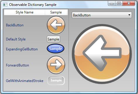
一个复用性的例子如下,这是一个ListView,每一行都包含了一个样式名和一个按钮。每个按钮间唯一不同的区别是定义按钮外观的style。
2. 关于样式
WPF样式包含一个集合的属性值,这些属性值可以被应用到一个框架元素(通过设置她的style属性,或者通过隐式样式,样式的key使用框架元素的默认样式key)。一个简单的例子如下:
<Style TargetType="{x:Type Rectangle}">
<Setter Property="Width"Value="50" />
<Setter Property="Height"Value="50" />
</Style>
那么我们如何使用这个样式呢?通常我们将它添加到元素的资源字典中。然后你就可以使用资源键来为子树中的元素指定样式了。这是一个例子:
<Grid xmlns="http://schemas.microsoft.com/winfx/2006/xaml/presentation"
xmlns:x="http://schemas.microsoft.com/winfx/2006/xaml">
<Grid.Resources>
<Style x:Key="MyRectangleStyle"
TargetType="{x:Type Rectangle}">
<Setter Property="Width" Value="50" />
<Setter Property="Height" Value="50" />
</Style>
</Grid.Resources>
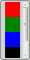
<StackPanel Orientation="Horizontal">
<Rectangle Style="{StaticResource MyRectangleStyle}" Fill="Red" />
<Rectangle Style="{StaticResource MyRectangleStyle}" Fill="Green" />
<Rectangle Style="{StaticResource MyRectangleStyle}" Fill="Blue" />
<Rectangle Style="{StaticResource MyRectangleStyle}" Fill="Black" />
</StackPanel>
</Grid>

如果我们想隐式设置样式,那么把x:Key属性从样式声明中去掉就可以了。如下所示:
<Grid xmlns="http://schemas.microsoft.com/winfx/2006/xaml/presentation"
xmlns:x="http://schemas.microsoft.com/winfx/2006/xaml">
<Grid.Resources>
<Style TargetType="{x:Type Rectangle}">
<Setter Property="Width" Value="50" />
<Setter Property="Height" Value="50" />
</Style>
</Grid.Resources>
<StackPanel Orientation="Horizontal">
<Rectangle Fill="Red" />
<Rectangle Fill="Green" />
<Rectangle Fill="Blue" />
<Rectangle Fill="Black" />
</StackPanel>
</Grid>
你可能感到惊奇这些样式是如何应用到rectangle元素中的。答案隐藏在框架对资源字典的解析路径上。如果没有为style指定键,那么解析器使用样式的TargetType作为他的默认键。所以上述样式等同于以下样式:
<Style x:Key="{x:Type Rectangle}" TargetType="{x:Type Rectangle}">
<Setter Property="Width" Value="50" />
<Setter Property="Height" Value="50" />
</Style>
这是WPF的一个约定。现在让我们看看这些样式特性,甚至一些最有经验的设计者都不可能知道。
上述样式可以应用到rectangle上,我们能不能创建一个更通用的样式,将其应用到任何framework元素上呢?我们只是简单的不去设置TargetType属性,就可以创建这么一个一般样式。当然这会带来一些模糊性,因为我们还不知道对象的类型,WPF不知道如何理解这些属性,为了去除这种模糊性,我们必须在setter中指定对象类型,如下:
<Style x:Key="SharedStyle">
<Setter Property="FrameworkElement.Width" Value="50" />
<Setter Property="FrameworkElement.Height" Value="50" />
<Setter Property="Button.IsDefault" Value="True" />
</Style>
现在style可以被应用在不同类型的元素了。实际上,一般性的样式给了我们设置并不在不同类型元素间共享的属性,例如,上述样式可以同时被应用到按钮和rectangle中。甚至样式中包含Button.IsDefault属性的Setter。如下所示:
<Grid xmlns="http://schemas.microsoft.com/winfx/2006/xaml/presentation"
xmlns:x="http://schemas.microsoft.com/winfx/2006/xaml">
<Grid.Resources>
<Style x:Key="SharedStyle">
<Setter Property="FrameworkElement.Width" Value="50" />
<Setter Property="FrameworkElement.Height" Value="50" />
<Setter Property="Button.IsDefault" Value="True" />
</Style>
</Grid.Resources>
<StackPanel Orientation="Horizontal">
<Rectangle Style="{StaticResource SharedStyle}" Fill="Red" />
<Button Style="{StaticResource SharedStyle}">Click Me</Button>
</StackPanel>
</Grid>

3. 关于控件模板
我们已经学习了数据模板和面板模板,下面我们看一下第三种类型的模板-控件模板。
顾名思义,ControlTemplate用来为控件定义外观。所有的WPF控件在每个Windows 主题下都有一个默认的控件模板。这些模板给予了控件默认的外观。
无外观控件模型的好处是我们对控件外观有着完全的控制。我们可以接受默认的控件外观,也可以定义我们自己的ControlTemplate。下面就是ListBox一个ControlTemplate的例子:
<ControlTemplate x:Key="MyListBoxTemplate" TargetType="{x:Type ListBox}">
<Border Background="White"BorderBrush="Black"
BorderThickness="1" CornerRadius="6">
<ScrollViewer Margin="4">
<ItemsPresenter />
</ScrollViewer>
</Border>
</ControlTemplate>
(此控件模板非常简单,不再详述)
与style类似,ControlTemplate也有一个TargetType属性。这个属性必须被设置。如果你发现你的模板不能按照你希望的方法展示,确保你设置了ControlTemplate的TargetType属性。
现在我们来应用ListBox的自定义模板,将其指定为ListBox的Template属性值,如下:
<ListBox Width="80" Height="200"
Template="{StaticResource MyListBoxTemplate}">
<Rectangle Width="50" Height="50" Fill="Red" />
<Rectangle Width="50" Height="50" Fill="Green" />
<Rectangle Width="50" Height="50" Fill="Blue" />
<Rectangle Width="50" Height="50" Fill="Black" />
</ListBox>

前面的例子中,我们使用Template属性设置ListBox的模板,这不是常用的方式。模板通常作为样式的一部分出现。
样式包含一个Setter对象的集合。对于一个控件样式,应该包含一个Setter用来设置她的Template属性,一个简单的ListBox样式如下:
<Style TargetType="{x:Type ListBox}">
<Setter Property="Background"Value="LightGray" />
<Setter Property="BorderThickness"Value="2" />
<Setter Property="HorizontalContentAlignment"Value="Center" />
<Setter Property="Padding"Value="5" />
<Setter Property="Template">
<Setter.Value>
<ControlTemplate TargetType="{x:Type ListBox}">
<Border Background="White"BorderBrush="Black"
BorderThickness="1" CornerRadius="6">
<ScrollViewer Margin="4">
<ItemsPresenter />
</ScrollViewer>
</Border>
</ControlTemplate>
</Setter.Value>
</Setter>
</Style>
假定我们将以上样式添加到应用程序资源中,那么所有的应用程序中所有的ListBox都能隐士使用我们的控件模板。所以现在我们可以添加如下ListBox到我们的UI中:
<ListBox Width="100" Height="200">
<Rectangle Width="50" Height="50" Fill="Red" />
<Rectangle Width="50" Height="50" Fill="Green" />
<Rectangle Width="50" Height="50" Fill="Blue" />
<Rectangle Width="50" Height="50" Fill="Black" />
</ListBox>

在我们的例子中有一个问题,就是一些属性值是硬编码的。其他属性也没有绑定到模板内的元素属性。我们需要使用TemplateBinding来解决这个问题。
TemplateBinding是一个轻量级绑定,用来把控件属性值连接到控件模板内元素的属性上。在我们的ListBox示例中,我们可以添加这样的绑定,如下所示:
<Style TargetType="{x:Type ListBox}">
<Setter Property="Background"Value="LightGray" />
<Setter Property="BorderThickness"Value="2" />
<Setter Property="HorizontalContentAlignment"Value="Center" />
<Setter Property="Padding"Value="5" />
<Setter Property="Template">
<Setter.Value>
<ControlTemplate TargetType="{x:Type ListBox}">
<Border Background="{TemplateBinding Background}"
BorderBrush="{TemplateBinding BorderBrush}"
BorderThickness="{TemplateBinding BorderThickness}"
CornerRadius="6">
<ScrollViewer Margin="{TemplateBinding Padding}">
<ItemsPresenter />
</ScrollViewer>
</Border>
</ControlTemplate>
</Setter.Value>
</Setter>
</Style>
现在所有的属性都被连接到模板内元素的属性。因此这些属性真是反映了控件的外观展示。
4. 关于触发器
触发器就是当给定条件满足的时候应用一个集合的Setter对象。WPF包含三种类型的Trigger(也可以说是属性Trigger),DataTrigger和EventTrigger。也可以使用MultiTrigger和MultiDataTrigger来响应多个条件。
每个Style,ControlTemplate,DataTemplate都有一个Trigger集合,FrameworkElement也有一个Trigger集合,但是只能添加EventTrigger。让我们看一个简单的示例,下面是一个Button的style
<Style TargetType="{x:Type Button}">
<Style.Triggers>
<Trigger Property="IsMouseOver"Value="True">
<Setter Property="Opacity"Value="0.7" />
<Setter Property="TextBlock.FontWeight"Value="Bold" />
</Trigger>
</Style.Triggers>
</Style>
(样式非常简单,不再解释)
由上述样式看出,trigger非常直观。你通过阅读标记就可以了解大概的情况。所以,我们不用花太多时间来解释它的用法。我们只在不同的场景里看看它复杂的地方。
DataTrigger允许你通过绑定在一个数据项属性变化时引发。这在DataTemplate中用的非常普遍。但是不要小看DataTrigger在其他场景中的应用。例如,有另外一个对象的属性引发一个触发器也是非常有用的,如下:
<DataTemplate x:Key="MyItemTemplate">
<Border x:Name="root"BorderThickness="2" CornerRadius="6">
<TextBlock Margin="4" Text="{Binding XPath=@First}" />
</Border>
<DataTemplate.Triggers>
<DataTrigger Value="True"Binding="{Binding Path=IsSelected,
RelativeSource={RelativeSource AncestorType={x:Type ListBoxItem}}}">
<Setter TargetName="root"Property="BorderBrush" Value="Pink" />
</DataTrigger>
</DataTemplate.Triggers>
</DataTemplate>
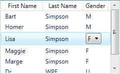
在这个例子,我们创建了DataTrigger,但是很大程度上,它类似于属性触发器。我们通过FindAncester绑定来查找触发源。当项在被选择的时候,会显示一个粉色的边框。如果我们想为一个女性项被选择的时候显示粉色边框,而男性项被选择的时候显示一个蓝色的边框,我们可以添加第二个Trigger,如下:
<DataTemplate x:Key="MyItemTemplate">
<Border x:Name="root"BorderThickness="2" CornerRadius="6">
<TextBlock Margin="4" Text="{Binding XPath=@First}" />
</Border>
<DataTemplate.Triggers>
<DataTrigger Value="True"Binding="{Binding Path=IsSelected,
RelativeSource={RelativeSource AncestorType={x:Type ListBoxItem}}}">
<Setter TargetName="root"Property="BorderBrush" Value="Pink" />
</DataTrigger>
<MultiDataTrigger>
<MultiDataTrigger.Conditions>
<Condition Binding="{Binding XPath=@Gender}" Value="Male" />
<Condition Value="True"Binding="{Binding Path=IsSelected,
RelativeSource={RelativeSource AncestorType={x:Type ListBoxItem}}}" />
</MultiDataTrigger.Conditions>
<Setter TargetName="root"Property="BorderBrush" Value="Blue" />
</MultiDataTrigger>
</DataTemplate.Triggers>
</DataTemplate>
上例说明了触发器的另个重要的特点,触发器中setter对象的顺序非常重要。当多个触发器都被触发是,所有的setter都被应用,而且以他们在Triggers集合中显示的顺序所应用。换句话说,如果多个setter都有相同的目标属性,那么最后一个setter才会赢。
最后一点要说是,如何通过MultiDataTrigger联合属性触发器和数据触发器。有时候,这非常方便,不过人们通常会忘记使用DataTrigger可以被当作Property trigger使用。
还有一个trigger是EventTrigger,事件触发器通常被用于在事件发生时引发一个响应动作。下面是一个使用事件触发器的按钮,当button第一次load的时候,会对透明度做一个动画效果。
<Canvas xmlns="http://schemas.microsoft.com/winfx/2006/xaml/presentation"
xmlns:x="http://schemas.microsoft.com/winfx/2006/xaml">
<Button Opacity="0" Content="My Button">
<Button.Triggers>
<EventTrigger RoutedEvent="FrameworkElement.Loaded">
<BeginStoryboard Name="MyBeginAction">
<Storyboard>
<DoubleAnimation Storyboard.TargetProperty="Opacity"
Duration="0:0:1"BeginTime="0:0:0.25" To="1.0" />
</Storyboard>
</BeginStoryboard>
</EventTrigger>
</Button.Triggers>
</Button>
</Canvas>
再一次说明,FrameworkElement的触发器集合只能添加EventTrigger,如果要使用其他两种触发器,那么就必须通过样式或者模板使用。
注意,你不能对标准的CLR事件使用触发器,因为事件触发器需要WPF事件路由引擎的支持。
当使用属性触发器或者数据触发器的时候,条件变化引发触发器对目标值的设置。所以,当条件满足的时候,setter对象被应用到目标属性上,当条件不满足的时候,目标值将会恢复到trigger之前的值。但是事件触发器没有这样的概念。事件是瞬时的,所以EventTrigger没有包含一个Setter集合。而是包含了响应事件的动作。该动作允许你控制动画的执行。
如果你仍然希望通过事件触发器来设置属性值。即使你没有setter你同样可以做到这个。使用对象动画的DiscreteObjectKeyFrame即可,如下:
<Grid xmlns="http://schemas.microsoft.com/winfx/2006/xaml/presentation"
xmlns:x="http://schemas.microsoft.com/winfx/2006/xaml"
xmlns:sys="clr-namespace:System;assembly=mscorlib">
<Grid.Triggers>
<EventTrigger RoutedEvent="CheckBox.Checked">
<EventTrigger.Actions>
<BeginStoryboard>
<Storyboard>
<ObjectAnimationUsingKeyFrames Storyboard.TargetName="tb"
Storyboard.TargetProperty="Text" Duration="0:0:0.1">
<DiscreteObjectKeyFrame Value="Thanks!
Thatfelt great!!" />
</ObjectAnimationUsingKeyFrames>
</Storyboard>
</BeginStoryboard>
</EventTrigger.Actions>
</EventTrigger>
<EventTrigger RoutedEvent="CheckBox.Unchecked">
<EventTrigger.Actions>
<BeginStoryboard>
<Storyboard>
<ObjectAnimationUsingKeyFrames Duration="0:0:0.1"
Storyboard.TargetName="tb"
Storyboard.TargetProperty="Text">
<DiscreteObjectKeyFrame Value="Ohyeah!
I'm outta here!" />
</ObjectAnimationUsingKeyFrames>
<ObjectAnimationUsingKeyFrames Duration="0:0:0.1"
Storyboard.TargetProperty="IsHitTestVisible">
<DiscreteObjectKeyFrame>
<DiscreteObjectKeyFrame.Value>
<sys:Boolean>False</sys:Boolean>
</DiscreteObjectKeyFrame.Value>
</DiscreteObjectKeyFrame>
</ObjectAnimationUsingKeyFrames>
<DoubleAnimation Duration="0:0:0.5"To="0"
Storyboard.TargetProperty="Opacity"
BeginTime="0:0:2"/>
</Storyboard>
</BeginStoryboard>
</EventTrigger.Actions>
</EventTrigger>
</Grid.Triggers>
<ToggleButton Width="100"Height="100">
<TextBlock x:Name="tb" Text="Toggle Me, Please!"
TextAlignment="Center" TextWrapping="Wrap" />
</ToggleButton>
</Grid>
备注:使用离散动画帧设置属性非常有用。特别是在silverlight中,因为silverlight不支持数据触发器和属性触发器。
值得注意的是,DataTrigger和Tigger也可以启动一个动画。你只需要设置他们的EnterActions和ExitActions。如下所示:
<StackPanel Orientation="Horizontal"
xmlns="http://schemas.microsoft.com/winfx/2006/xaml/presentation"
xmlns:x="http://schemas.microsoft.com/winfx/2006/xaml">
<StackPanel.Resources>
<Style TargetType="{x:Type TextBox}">
<Setter Property="Template">
<Setter.Value>
<ControlTemplate TargetType="{x:Type TextBoxBase}">
<Grid>
<Rectangle Margin="1" Fill="#FFF" />
<Rectangle Name="DisabledBackground" Margin="1"
Fill="#CCC" RenderTransformOrigin="1,0.5">
<Rectangle.RenderTransform>
<ScaleTransform ScaleX="0"/>
</Rectangle.RenderTransform>
</Rectangle>
<Border Name="Border" CornerRadius="2" Padding="2"
BorderThickness="1" BorderBrush="#888">
<ScrollViewer Margin="0" x:Name="PART_ContentHost" />
</Border>
</Grid>
<ControlTemplate.Triggers>
<Trigger Property="IsEnabled" Value="False">
<Setter TargetName="Border" Property="BorderBrush" Value="#AAA"/>
<Setter Property="Foreground" Value="#888"/>
<Trigger.EnterActions>
<BeginStoryboard>
<Storyboard TargetName="DisabledBackground"
TargetProperty="RenderTransform.ScaleX">
<DoubleAnimation To="1" Duration="0:0:0.7"
DecelerationRatio="0.5" />
</Storyboard>
</BeginStoryboard>
</Trigger.EnterActions>
<Trigger.ExitActions>
<BeginStoryboard>
<Storyboard TargetName="DisabledBackground"
TargetProperty="RenderTransform.ScaleX">
<DoubleAnimation To="0" Duration="0:0:0.7"
DecelerationRatio="0.5" />
</Storyboard>
</BeginStoryboard>
</Trigger.ExitActions>
</Trigger>
</ControlTemplate.Triggers>
</ControlTemplate>
</Setter.Value>
</Setter>
</Style>
</StackPanel.Resources>
<CheckBox Name="MyCheckBox"FontWeight="Bold" Margin="0,6,4,0"
VerticalAlignment="Top" Content="Print To File:" />
<TextBox VerticalAlignment="Top"Margin="0,3,0,0" Text="C:\MyFile.prn"
Width="200" IsEnabled="{Binding IsChecked, ElementName=MyCheckBox}" />
</StackPanel>
为了了解无外观模式是如何工作的,我推荐你花点时间来查看一下WPF本地控件的样式和模板。他们与Windows SDK和Blend一起发布。当安装SDK的时候,你必须选择安装.NET Framework3.0示例。那么你可以在下面的目录中找到他:%ProgramFiles%\MicrosoftSDKs\Windows\v6.0 \Samples\WPFSamples.zip. 如果安装了Blend ,可在如下目录中找到: “%ProgramFiles%\MicrosoftExpression\Blend <version>\SystemThemes”.
5. 模板化ItemsControl
这是一个ItemsControl系列,所以我们需要一点时间来研究ItemsControl的无外观本性。不过下面的概念也可以应用到其他控件。
从无外观课程中学到的
在介绍无外观模型的时候,我有一个必须要说的故事…
早期的WPF平台包含了一个ItemsControl但是没来没有发布。它是RadioButtonList,从名字可以了解,这是一个互斥项列表,每个选项都是一个radiobutton。第一眼看上去,这是一个非常有用的控件,是吗?我们也是这么想的。不过当我们在POC上宣传的时候,有人指出,我们已经有了一个互斥项选择控件,那就是单选项的ListBox。
无外观控件的精神需要我们去适应。很明显,即使是这个模式的架构师有时候也不能完全领会。
下面是的ListBox作为RadioButtonList样式:
<Window Title="RadioButtonList Sample" Width="500" Height="180"
xmlns="http://schemas.microsoft.com/winfx/2006/xaml/presentation"
xmlns:x="http://schemas.microsoft.com/winfx/2006/xaml"
xmlns:sys="clr-namespace:System;assembly=mscorlib"
Topmost="{Binding SelectedItem, ElementName=TopmostSelector}"
WindowStyle="{Binding SelectedItem, ElementName=WindowStyleSelector}">
<Window.Resources>
<ObjectDataProvider x:Key="WindowStyles"MethodName="GetValues"
ObjectType="{x:Type sys:Enum}" >
<ObjectDataProvider.MethodParameters>
<x:Type TypeName="WindowStyle"/>
</ObjectDataProvider.MethodParameters>
</ObjectDataProvider>
<Style x:Key="RadioButtonList"TargetType="{x:Type ListBox}">
<Setter Property="BorderBrush"Value="{x:Null}" />
<Setter Property="BorderThickness"Value="0" />
<Setter Property="Tag"Value="Vertical" />
<Setter Property="ItemsPanel">
<Setter.Value>
<ItemsPanelTemplate>
<StackPanel Orientation="{Binding Tag,
RelativeSource={RelativeSource AncestorType={x:Type ListBox}}}" />
</ItemsPanelTemplate>
</Setter.Value>
</Setter>
<Setter Property="ItemContainerStyle">
<Setter.Value>
<Style TargetType="{x:Type ListBoxItem}">
<Setter Property="Margin"Value="6,2" />
<Setter Property="Template">
<Setter.Value>
<ControlTemplate TargetType="{x:Type ListBoxItem}">
<Border Background="Transparent">
<RadioButton Focusable="False"
IsHitTestVisible="False"
IsChecked="{TemplateBinding IsSelected}">
<ContentPresenter />
</RadioButton>
</Border>
</ControlTemplate>
</Setter.Value>
</Setter>
</Style>
</Setter.Value>
</Setter>
</Style>
</Window.Resources>
<StackPanel Margin="10">
<TextBlock FontWeight="Bold">Topmost:</TextBlock>
<ListBox Name="TopmostSelector"SelectedIndex="1" Margin="10,0,0,20"
Style="{StaticResource RadioButtonList}" Tag="Vertical">
<sys:Boolean>True</sys:Boolean>
<sys:Boolean>False</sys:Boolean>
</ListBox>
<TextBlock FontWeight="Bold">WindowStyle:</TextBlock>
<ListBox Name="WindowStyleSelector"SelectedIndex="1" Margin="10,0,0,0"
Style="{StaticResource RadioButtonList}" Tag="Horizontal"
ItemsSource="{Binding Source={StaticResource WindowStyles}}" />
</StackPanel>
</Window>
下面是一些ListBox的图片示例:

自然,ListBox也可以显示一个RadioButton的列表:
在P是面板中介绍的那个非常酷的自定义面板,联合ListBox可以用来研究实体关系:

有一个TreeGraph控件也是使用ListBox,他从ListBox继承并添加了额外的功能:
值得注意的是,ListView也是从ListBox继承的,ListView其实是一个多列的ListBox:
无外观模式应该用来创建更好的用户体验,我看多很多次有人在视频中演示旋转的按钮,这应该避免。
项面板
你总是能在ItemsControl中发现ItemsPresenter。前面,我们学到了ItemsPresenter保留了项宿主的状态。通过在控件模板中包含ItemsPresenter并且在样式中指定ItemsPanelTemplate属性,我们不同重新定义控件模板就可以切换面板。ItemsPanelTemplate将会在ItemsPresenter中被展开成一个面板用来容纳项容器。而使用IsItemsHost是不推荐的。
ToolBar控件就是一个使用IsItemsHost的例子。不过,我认为从ItemsControl继承并且依赖一些特定的已知模板元素是可以的。不过,作为一个控件开发者,你需要完整的记录你的控件需求,虽然这样做降低了无外观模式的能力。设计者也需要在设计的时候关注到这些限制。
其他已知部分[TemplatePart]
有时候ItemsControl会依赖其他元素,让我们以ComboBox为例:
ComboBox是一个单选控件,整个列表显示在一个下拉列表中。ComboBox的模板包含一个TextBox和一个Popup。你可能会像,TextBox显示选择项,而Popup包含ItemsPresenter,所以他能展示所有可用项。
ComboBox包含了针对Popup控件的专门逻辑。虽然使用“template part”降低了控件的无外观性,但是只要你完整记录的需求,那么也是允许的。
这自然引发一个问题,ComboBox是如何知道在模板里有一个Popup呢?一个方法就是在可视树中查找。这不是一个好方法,为了更好的处理这种情况,framework使用了一个命名决定。就是对模板中的已知控件用PART_前缀来命名。对于ComboBox中的Popup来说,这个Popup就是“PART_Popup”。如下:
<Popup Name="PART_Popup" AllowsTransparency="True" Placement="Bottom">
...
</Popup>
虽然有了名字,但是我们怎么使用它呢?framework提供了一个方法让我们能够找到它。通过重写OnApplyTemplate方法,当一个模板被展开的时候,控件可以获得通知。通过调用GetTemplateChild方法,可以获得模板中指定名称的控件,如下:
public override void OnApplyTemplate()
{
base.OnApplyTemplate();
_popup = GetTemplateChild("PART_Popup")as Popup;
}
这么做,显然让设计者变得困难。所以framework提供了TemplatePart自定义属性来装饰你的控件类。用来提示设计者模板控件中必须有什么样的元素存在。如下所示:
[TemplatePart(Name="PART_EditableTextBox",Type=typeof(TextBox))]
[TemplatePart(Name="PART_Popup",Type=typeof(Popup))]
public class ComboBox : Selector
{
...
}
这种工作方式对framework中的所有控件都是有效的。设计者在设计控件外观的时候,他们需要了解这些TemplatePart。
保持松耦合
我对自定义控件作者的一点建议就是在控件和模板之间保持一个松的契约。这意味着当有的元素没有在模板中出现的时候,控件不会崩溃。进一步讲,控件可以优雅的降级。ItemsControl就是这么做的。如果你重新定义了ItemsControl的模板并且遗失了ItemsPresenter,ItemsControl不会报错,它只是什么也不显示。测试一下你的控件是不是也在元素丢失的时候还能正常工作,能够得知你的控件是不是真的支持无外观模式。


 2797
2797

 被折叠的 条评论
为什么被折叠?
被折叠的 条评论
为什么被折叠?
 到【灌水乐园】发言


