


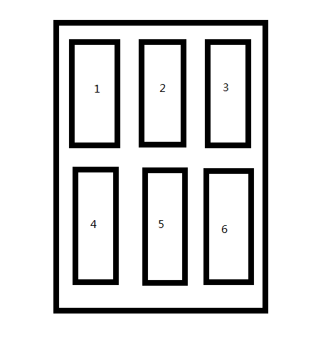
问题
要实现如下的布局。有几种方案可以选择呢?
方案一
css中前”世纪”的布局方式-table,这种布局方式不利于SEO,代码量比较大。
<style type="text/css">
    .content{width: 960px;margin: auto;}
    .content-list{width: 300px;background-color: #4598BF;height: 300px;vertical-align: top;}
    .content-pad{width: 30px;background-color: #7ACE2D;height: 300px;}
    .middle-pad{width: 100%;height: 20px;}

</style>
<body>
<table class="content">
    <tr>
        <td class="content-list">1</td>
        <td class="content-pad"></td>
        <td class="content-list">2</td>
        <td class="content-pad"></td>
        <td class="content-list">3</td>
    </tr>
    <tr class="middle-pad"></tr>
    <tr>
        <td class="content-list">4</td>
        <td class="content-pad"></td>
        <td class="content-list">5</td>
        <td class="content-pad"></td>
        <td class="content-list">6</td>
    </tr>
</table>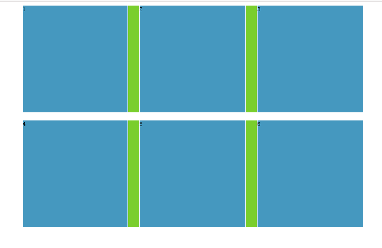
方案二
css中经典布局div+float,使用float后。会使该标签脱离文档流(不按照正常的显示方式显示),后果就是父元素不能自适应高度。需要清楚子元素浮动.
ul{list-style:none;}
ul li{float: left;}
.content{width: 960px;margin: auto;}
.content li{width: 300px;margin-left: 20px;background-color: #7ACE2D;margin-bottom: 30px;height: 300px;}
.clearfix:after{content: ".";clear: both;height: 0;visibility: hidden;display: block;}
/*.clearfix{overflow: hidden;}*/
/*.clearfix{clear: both;}*/
</style>
<body>
    <ul class="content clearfix">
        <li>1</li>
        <li>2</li>
        <li>3</li>
    </ul>
    <ul class="content clearfix">
        <li>4</li>
        <li>5</li>
        <li>6</li>
    </ul>
</body>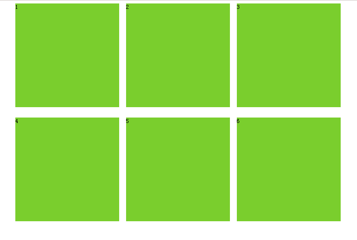
方案三
使用inline-block,行内块布局。会造成元素间距,具体的解决方案
去除inline-block元素间间距的N种方法
<style type="text/css">
/*ul li{margin: 0px;padding: 0px;}*/
/* * {margin: 0px;padding: 0px;}*/
ul li{display: inline-block;}
.content{width: 960px;margin: auto;}
.content li{width: 300px;margin-left: 20px;background-color: #7ACE2D;margin-bottom: 30px;height: 300px;}
</style>
<body>
    <ul class="content">
        <li>1
        <li>2
        <li>3</li>
    </ul>
</body>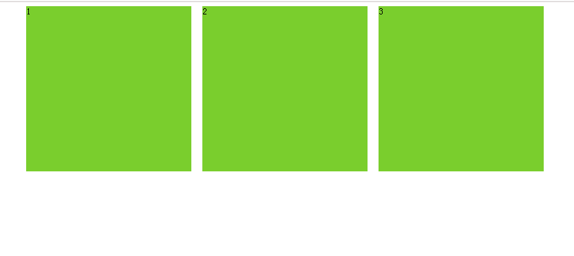
方案四
使用css3中的盒布局,盒布局能解决使用float或者position属性时左右两栏或多栏不能对其的问题。
<body>
<style type="text/css">
ul{list-style:none;}
.content{display: -moz-box;display: -webkit-box;width: 960px;margin: auto;}
.content li{width: 300px;margin-left: 20px; }
.content li:nth-child(1){background-color: #7ACE2D;}
.content li:nth-child(2){background-color: #4559BF;}
.content li:nth-child(3){background-color: #D62B5F;}

</style>
<ul class="content">
    <li>gglinux,gglinux,gglinux
        gglinux,gglinux,gglinux
        gglinux,gglinux,gglinux
        gglinux,gglinux,gglinux</li>
    <li>2</li>
    <li>3</li>
</ul>
</body>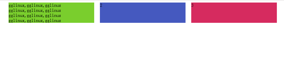
就这样吧,css3中还有两种布局方式。
多栏布局:可以将一个元素中的内容分成多栏显示,并且确保各栏中的内容底部对齐。
弹性盒布局:可以保证容器的高度和宽度与浏览器的自适应性。


 6613
6613

 被折叠的 条评论
为什么被折叠?
被折叠的 条评论
为什么被折叠?
 到【灌水乐园】发言


