


 本文介绍如何使用CSS的border-radius属性绘制圆形、椭圆及各种不规则形状,包括四分之一圆、半椭圆和菱形等,并展示了通过不同属性设置实现形状变化的方法。
画四分之一圆的时候,是画出一个圆并且结合overflow等实现,但是其实可以直接画出半圆或者四分之一圆,之前忽略了几个属性。
圆的画法:先画相应矩形,在用border-radius
1.画出圆
{
  width:100px;
  height:100px;
  border-radius:50px;
}
2.画出方向四个不同的本圆
.top
{
  width: 100px;
  height: 50px;
  border-radius: 50px 50px 0 0;
}
.right {
  height: 100px;
  width: 50px;
  border-radius: 0 50px 50px 0;
}
.bottom {
  width: 100px;
  height: 50px;
  border-radius: 0 0 50px 50px;
}
.left {
  width: 50px;
  height: 100px;
  border-radius: 50px 0 0 50px;
}
3.画出四分之一个圆方法:
{
  width:50px;
  height:50px;
  border-radius:50px 0 0 0;
}
4.椭圆
<div class="ellipse">
</div>
 .ellipse{
    width: 200px;
    height: 100px;
    border-radius: 50%;
    background: black;
}
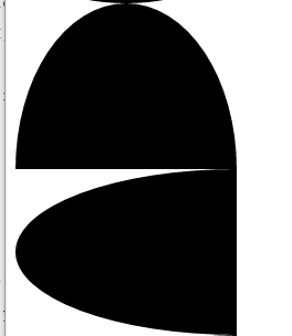
5.沿横轴、纵轴劈开的半椭圆
<div class="x-ellipse">
</div>
<div class="y-ellipse">
</div>

.x-ellipse{
    width: 200px;
    height: 150px;
    border-radius: 50%/ 100% 100% 0 0;
    /*相当于50% 50% 50% 50%/ 100% 100% 0 0;*/
    background: black;
}
.y-ellipse{
    width: 200px;
    height: 150px;
    border-radius: 100% 0 0 100%/50%;
    background: black;
} 
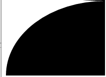
6.四分之一椭圆
<div class="quarter-ellipse">
</div>
.quarter-ellipse{
    width: 200px;
    height: 150px;
    border-radius: 100% 0 0 0;
    background: black;
}
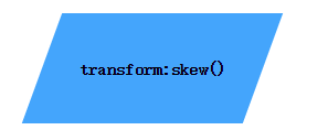
7.菱形
如果想让形状变形,但是里边的字体不变形
思路:
变形之后,再让里边内容旋转回来
<div class="paralle"><p>transform:skew()</p></div>

.paralle {
    position: relative;
    left: 100px;
    width:200px;
    height: 100px;
    background:#44a5fc;

    line-height: 100px;
    text-align: center;
    font-weight: bolder;

    transform: skew(-20deg);
}
.paralle p{
    transform: skew(20deg);
}
8.三角形
#triangle-up {
    width: 0;
    height: 0;
    border-left: 50px solid transparent;
    border-right: 50px solid transparent;
    border-bottom: 100px solid lightblue;
}
#triangle-down {
    width: 0;
    height: 0;
    border-left: 50px solid transparent;
    border-right: 50px solid transparent;
    border-top: 100px solid lightblue;
}

#triangle-left {
    width: 0;
    height: 0;
    border-top: 50px solid transparent;
    border-right: 100px solid lightblue;
    border-bottom: 50px solid transparent;
}
#triangle-right {
    width: 0;
    height: 0;
    border-top: 50px solid transparent;
    border-left: 100px solid lightblue;
    border-bottom: 50px solid transparent;
}
#triangle-topleft {
    width: 0;
    height: 0;
    border-top: 100px solid lightblue;
    border-right: 100px solid transparent;
}
#triangle-topright {
    width: 0;
    height: 0;
    border-top: 100px solid lightblue;
    border-left: 100px solid transparent;
}
#triangle-bottomleft {
    width: 0;
    height: 0;
    border-bottom: 100px solid lightblue;
    border-right: 100px solid transparent;
}
#triangle-bottomright {
    width: 0;
    height: 0;
    border-bottom: 100px solid lightblue;
    border-left: 100px solid transparent;
}
9.一些属性的说明
border-radius:50px 0 0 0
等价于将border-raduis属性分成四个属性来设置,把一个圆分成上左,上右,下右,下左4份
border-top-left-radius:
border-top-right-radius:
border-bottom-right-radius:
border-bottom-left-radius:
首选需要了解border-radius
border-radius可以是元素也可是百分比。
border-radius:border-top-left-radius,border-top-right-radius,
border-bottom-right-radius,border-bottom-left-radius;
不仅仅可以为四个角分别设置值,甚至可以给每个角提供水平和垂直半径
方法是在斜杠前指定 1~4 个值,在斜杠后指定另外 1~4 个值
举例来说,
当 border-radius 的值为10px / 5px 20px 时,
其效果相当于 10px 10px 10px 10px / 5px 20px 5px 20px 。


 扫一扫
扫一扫


 被折叠的 条评论
为什么被折叠?
被折叠的 条评论
为什么被折叠?
 到【灌水乐园】发言


