


不重要的前言
为什么说是再次相识,曾经很早之前看着文档,把环境配置起来,运行起来helloWord之后就再也没看过,曾经各种借口以逃避:
- 不会JS
- 不会HTML5
- RN的开发工具不够智能不能自动提示
- RN的是个小众的语言没多人用
- 等等
于是环境配置起来就算认识了RN,其实太可笑了!
直到前些日子,半夜微信发布微信小程序内测,以及现在原生APP搭载原生的开发越来越主流,于是上面的那些借口是不是应该都抛弃,而重新审视下自己的技术宽度,我们Android程序员假如只会原生的话,未来的一两年内,是个什么样的状态,微信在国内对人们的影响力如此重大,微信小程序的套路和Facebook的RN 差不多,所以掌握前端的知识非常必要,所以二次相识了RN!
我个人本身也是不会JS和H5但是又不想枯燥的去从头学习JS的语法和表达式什么的,毕竟你已经做了几年Android开发了,语法都是相同的,就是标示形式不一样而已,所以就默默的直接打开了RN的官方文档,跟着文档走有坑自己填!
- 配置RN开发环境,这里说一点,网络好真的很重要,VPN不是必须的,反正我配置的和init第一个helloWord的时候是全程没挂VPN
- RN的官方地址:http://reactnative.cn/docs/0.31/getting-started.html#content
- 配置环境的时候要下载很多插件支持,具体看文档一定要等终端的命令处理完毕再下一步,时间有的特别长请不要终止掉
废话了几句后,看下今天这篇我们要用RN熟悉的几个控件,以及一个Android程序员的理解
直接上图:
- 学习布局属性的基本使用
- 学习Text的使用
- 学习InputText的
- 学习Image的加载本地图片和网络图片
官网的helloWord代码如下:
import React, { Component } from 'react';
import { AppRegistry, Text } from 'react-native';
//个人见解
class HelloWorldApp extends Component {
  render() {
    return (
        // 这里的return相当于我们activity中的setContentView(参数是一个View)
        // 我们平时都是在setContentView中放一个layout.xml的R.id,现在直接返回一个TextView,
      <Text>Hello world!</Text>
    );
  }
}

// 注意,这里用引号括起来的'HelloWorldApp'必须和你init创建的项目名一致
AppRegistry.registerComponent('HelloWorldApp', () => HelloWorldApp);
稍微修改下外面套一层rootview
import React, { Component } from 'react';
import { AppRegistry, Text } from 'react-native';

class HelloWorldApp extends Component {
  render() {
    return (
        // 这块可以看做是rootview就是你放进activity中的layout布局,他默认的是vertical的,就是flex属性中的column,如果需要水平的话,需要加入style,修改flexDirection 为row 相当于Android中的horizontal
        <View>
                // 下面就是默认vertical排列两个text
                  <Text>Hello world!</Text>
                  <Text>Hello world!</Text>

        </View>
    );
  }
}

// 注意,这里用引号括起来的'HelloWorldApp'必须和你init创建的项目名一致
AppRegistry.registerComponent('HelloWorldApp', () => HelloWorldApp);
flex的最基本的认识:
这个我理解的是RN的布局属性,作用于view上,类似于我们的LinerLayout和RelativeLayout的,用来约束布局的,
flexDirection
官网解释:
在组件的style中指定flexDirection可以决定布局的主轴。子元素是应该沿着水平轴(row)方向排列,还是沿着竖直轴(column)方向排列呢?默认值是竖直轴(column)方向。大白话解释:对比Android的理解:把父布局看做LinerLayout,flexDir相当于我们的orientation,默认是垂直方向的,如果想变成水平的,需要显示的修改flex的值为row,RN中的horizontal
justifyContent
官网解释:在组件的style中指定justifyContent可以决定其子元素沿着主轴的排列方式。大白话解释:对比Android的理解:LinerLayout中的gravity属性,约束子元素的位置,比如flexDire是column,那么justifyContent,就是垂直居中,如果是row就是水平居中
alignItems
官网解释:在组件的style中指定alignItems可以决定其子元素沿着次轴(与主轴垂直的轴,比如若主轴方向为row,则次轴方向为column)的排列方式大白话:比如规定了布局的水平方向,那么这个属性就是让view在布局中垂直方向约束,反之则在不居中水平方向中约束
flex的属性,
这个比较简单了,类似于Android的weight权重
结合上面几个属性看个简单的布局排列
//指定父布局的方向是垂直的flexDirection的值是column
 <View style={{height:300,flexDirection:'column',marginTop:10}}>
            // 子view的权重是3,下面依次复制布局需改flex的值
          <View style={{flex:3,backgroundColor:'green',justifyContent:'center',alignItems:'center'}}>
              <Text style={{fontSize:18,color:'red'}}>
                  测试Flex位置属性,weight=3
              </Text>
          </View>
          <View style={{flex:1,backgroundColor:'blue',justifyContent:'center',alignItems:'center'}}>
               <Text style={{fontSize:16,color:'red'}}>
                  测试Flex位置属性,weight=2
              </Text>
          </View>
          <View style={{flex:1,backgroundColor:'yellow',justifyContent:'center',alignItems:'center'}}>
               <Text style={{fontSize:14,color:'red'}}>
                  测试Flex位置属性,weight=1
              </Text>
          </View>
        </View>
效果如下:
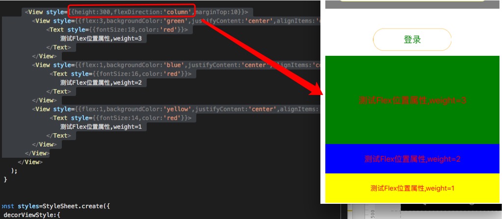
是不是和我们的LinerLayout很相似,orivatiation是垂直的 然后weight分别是3:2:1
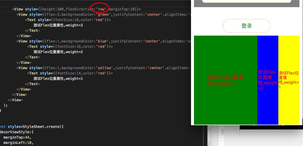
然后我们需改其中一行的属性,就是flexDirection 为row
然后就是这样的效果了:
RN中的Text理解:
我们Android中的textview是一个view,他是个控件,但是我用RN的时候把一些控件的属性比如在父布局居中会有警告,模拟器黄色的提示说,这个属性是View的属性,不能怎么怎么地的bb了一大推,净说些没用的,也不告诉我怎么做!
但是我们给RN中的text加其他的修饰属性又能生效,比如color,比如fontSize,比如字体,等等,有没有找到我们Android中的相似的东西?????
没错就是SpannableString.我们在Android中textview总的文字加颜色的时候,比如第一个字和后面的字颜色不一样或者加点其他东西是不是用这个东西就能解决了!
在RN中的Text我感觉就和我们的SpannableString一样,但是他和我们不一样的是,你单独在JS中写一个Text他能显示,我们的那个就是丰富的字符串而已,但是要用一些位置属性的时候,外面需要包裹一层View
下面看下RN中这个圆角的登录按钮如何写:
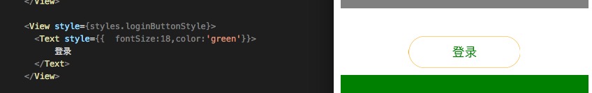
效果大概就是这样,下面是代码:
//这里不同于Android中用style的是,这里对登录按钮位置属性的限制是写到父布局上的可以理解为linearlayout中用gravity属性控制子view的位置
 <View style={styles.loginButtonStyle}>
         // 这里可以对RN中的text添加文字属性比如大小颜色等
          <Text style={{  fontSize:18,color:'green'}}>
              登录
          </Text>
        </View>
// 这里style,类似于我们Android中的style提取,比如封装一个app的basetextstyle然后大家写textview的时候除啦宽和高自己写以外剩下的颜色圆角等等直接引用style就行了
const styles=StyleSheet.create({
loginButtonStyle:{
//布局的方向,垂直或者水平
flexDirection:'column',
//自己是否居中
alignSelf:'center',
//沿着布局主轴约束居中
justifyContent:'center',
//沿着布局主轴约束的次轴居中
alignItems:'center',
//类似于Android中的边距属性
marginTop:40,
// 类似于Android中的shape文件radius,圆角
borderRadius:23,
// 类似于Android中的shape文件strok,描边属性
borderColor:'orange',
height:46,
width:160,
// 类似于Android中的shape文件stokeWidth属性描边的宽度
borderWidth:0.5
}
})下面看下RN中的Image
RN中的Image加载网络图片比加载本地图片要简单,最起码我看文档官网先给的是加载网络的,然后才是加载本地的,
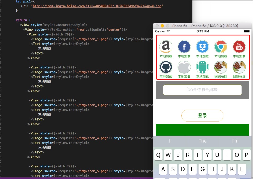
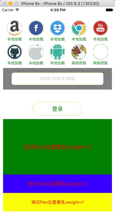
结合刚才提到的flex属性以及现在的Image我们做一个这样的导航,
在Android中我们用RecyclerView 结合layoutmanager即可实现,但是毕竟是刚看RN还没看那么高端的组件,我们就普通的拼接布局来实现一下这个效果!
RN中Image的基本使用
加载网络图片
const styles=StyleSheet.create({
// 封装image的属性,类似于Android的style提取
  imageStyle :{
    alignSelf:"center",
    width:50,
    height:50,
    borderRadius:25,
    borderColor:'green',
    borderWidth:0.5,
  }
 }
接下来就是定义网络图片的URL;
      //类似于安卓中是声明变量,注意作用域
      // 这个let是传说中的ES6的语法,什么鬼我也不知道,因为我也没从基础学过JS直接看的RN反正对比安卓就是这里声明了一个变量
      // private String pic ="xxxxxxxx";
    let pic = {
      uri: 'https://upload.wikimedia.org/wikipedia/commons/d/de/Bananavarieties.jpg'
    };
然后就是RN加载这uri对应的网络图片,
<Image source={pic} style={styles.imageStyle}/>
没错就是这么简单,给image一个source属性写上声明的URL就行了,style里面的约束就是我们第一步提取的image的style属性
加载本地图片看下官网的解释,
静态图片资源
从0.14版本开始,React Native提供了一个统一的方式来管理iOS和Android应用中的图片。要往App中添加一个静态图片,只需把图片文件放在代码文件夹中某处,然后像下面这样去引用它
<Image source={require('./my-icon.png')} />理解这句话我蒙圈的地方就是icon应该放置的位置,我擦类,目测是项目根目录下
因为的我的环境是拿iOS项目测试的嘛,就把icon拷贝到了iOS的根目录:
然后报错说找不见这个图片资源,我擦,忽然一想这个RN是跨平台的开发的项目和资源是两个平台同步开发的,于是就把图片copy到了整个RNProject的根目录,
总结直接看应该放到哪里即可:
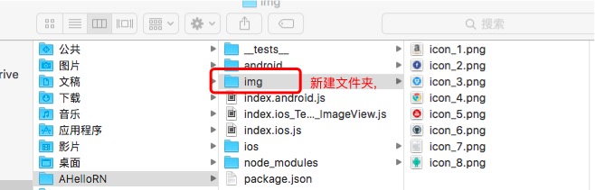
注意当你init一个RN项目后他的目录结构就是这样的,除啦我红色圈的IMG文件夹,这是我新建的一个本地文件夹放ICON的,加载本地图片的时候不要copy到ios或者Android目录,
官网也有加载各个平台内部目录的方法,比如我们Android中的mipmap目录和iOS也有
建立好资源icon的目录后就是加载本地的文件了,
          // 原来网络地址source中是一个变量网络地址,现在是require小括号中指向的RN项目根目录下的img文件中的png,注意后缀名,这个小括号什么鬼,目测是不是又是ES6的表达方式,慢慢学吧,
            <Image source={require('./img/icon_4.png')} style={styles.imageStyle}/>
现在把加载网络和加载本地图都基本了解了一下,然后我们把刚才那个UI大概实现下:
- 在RN根布局中写两个同层的View父布局
- 每个View父布局flex属性改成row 默认是垂直的
- 在每个View中放置五个居中的Image
好吧我承认这种方式确实比不上我们Android中的RecylerView但是我当年学安卓的时候好像也是这么过来的,先忍忍吧,高端的我也不会啊
 <View style={{flexDirection:'row',alignSelf:'center'}}>
          <View style={{width:70}}>
            <Image source={require('./img/icon_1.png')} style={styles.imageStyle}/>
            <Text style={styles.textStyle}>
                本地加载
            </Text>
          </View>

           <View style={{width:70}}>
            <Image source={require('./img/icon_2.png')} style={styles.imageStyle}/>
            <Text style={styles.textStyle}>
                本地加载
            </Text>
          </View>

           <View style={{width:70}}>
            <Image source={require('./img/icon_3.png')} style={styles.imageStyle}/>
            <Text style={styles.textStyle}>
                本地加载
            </Text>
          </View>

           <View style={{width:70}}>
            <Image source={require('./img/icon_4.png')} style={styles.imageStyle}/>
            <Text style={styles.textStyle}>
                本地加载
            </Text>
          </View>

           <View style={{width:70}}>
            <Image source={require('./img/icon_5.png')} style={styles.imageStyle}/>
            <Text style={styles.textStyle}>
                本地加载
            </Text>
          </View>
        </View>

         <View style={{flexDirection:'row',alignSelf:"center",marginTop:10}}>
          <View style={{width:70}}>
            <Image source={require('./img/icon_6.png')} style={styles.imageStyle}/>
            <Text style={styles.textStyle}>
                本地加载
            </Text>
          </View>

           <View style={{width:70}}>
            <Image source={require('./img/icon_7.png')} style={styles.imageStyle}/>
            <Text style={styles.textStyle}>
                 本地加载
            </Text>
          </View>

           <View style={{width:70}}>
            <Image source={require('./img/icon_8.png')} style={styles.imageStyle}/>
            <Text style={styles.textStyle}>
                本地加载
            </Text>
          </View>

           <View style={{width:70}}>
            <Image source={pic} style={styles.imageStyle}/>
            <Text style={styles.textStyle}>
                网络获取
            </Text>
          </View>

           <View style={{width:70}}>
            <Image source={pic} style={styles.imageStyle}/>
            <Text style={styles.textStyle}>
                网络获取
            </Text>
          </View>

        </View>
剩下的就是InputText的了解
这个控件的和我们的Editex及其的相似,获取焦点啊,文字的变化回调啊,还有限制输入类型,以及hint的等等
 <View style={{marginTop:10,backgroundColor:'gray',height:70,flexDirection:'column', justifyContent:'center',alignItems:'center',}}>
            <TextInput style={styles.textInputStyle}
                // 安卓中的hint属性
                placeholder='QQ号/手机号/邮箱'
                // maxline属性
                numberOfLines={1}
                // .....找不见呵呵
                autoFocus={true}
                // 貌似这属性是针对Android平台的
                underlineColorAndroid={'transparent'}
                >
            </TextInput>
        </View>
//提取的Editext的style
textInputStyle:{
alignSelf:'center',
height:40,
width:300,
borderRadius:8,
borderWidth:0.5,
borderColor:'yellow',
backgroundColor:'white',
fontSize:14,
textAlign:'center'
}如下图
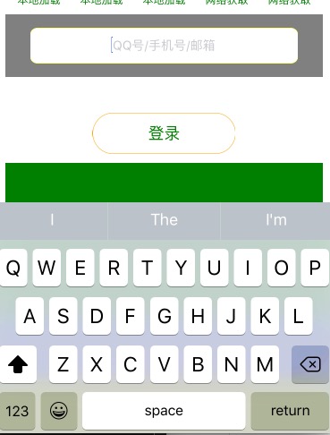
这个圆角的Editext就这样出来了,很多对比下原生开发还是能猜到什么意思的
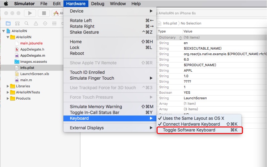
还有个一Tips就是iOS模拟器记得把软键盘的权限打开,不然键盘弹不出来,
到此这个hello RN就写完了,还是有时间了解下JS这样学的会快一点,一点点建议!
完整的项目就不传了,我把iOS.js文件代码全部放到文章末尾,大家init好第一个RN项目后,替换掉里面的iOS.js里面的内容就行了,
完整的iOS.js代码:
/**
 * Sample React Native App
 * https://github.com/facebook/react-native
 * @flow
 */

import React, { Component } from 'react';
import {
  AppRegistry,
  StyleSheet,
  Text,
  Image,
  TextInput,
  View
} from 'react-native';

export default class AHelloRN extends Component {
  render() {
    {/*
      类似于安卓中是声明变量,注意作用域
       */}
    let pic = {
      uri: 'https://upload.wikimedia.org/wikipedia/commons/d/de/Bananavarieties.jpg'
    };
    let pic1={
       uri: 'http://img4.imgtn.bdimg.com/it/u=4050684637,870783349&fm=21&gp=0.jpg'
    }

    return (
      <View style={styles.decorViewStyle}>
        <View style={{flexDirection:'row',alignSelf:'center'}}>
          <View style={{width:70}}>
            <Image source={require('./img/icon_1.png')} style={styles.imageStyle}/>
            <Text style={styles.textStyle}>
                本地加载
            </Text>
          </View>

           <View style={{width:70}}>
            <Image source={require('./img/icon_2.png')} style={styles.imageStyle}/>
            <Text style={styles.textStyle}>
                本地加载
            </Text>
          </View>

           <View style={{width:70}}>
            <Image source={require('./img/icon_3.png')} style={styles.imageStyle}/>
            <Text style={styles.textStyle}>
                本地加载
            </Text>
          </View>

           <View style={{width:70}}>
            <Image source={require('./img/icon_4.png')} style={styles.imageStyle}/>
            <Text style={styles.textStyle}>
                本地加载
            </Text>
          </View>

           <View style={{width:70}}>
            <Image source={require('./img/icon_5.png')} style={styles.imageStyle}/>
            <Text style={styles.textStyle}>
                本地加载
            </Text>
          </View>
        </View>

         <View style={{flexDirection:'row',alignSelf:"center",marginTop:10}}>
          <View style={{width:70}}>
            <Image source={require('./img/icon_6.png')} style={styles.imageStyle}/>
            <Text style={styles.textStyle}>
                本地加载
            </Text>
          </View>

           <View style={{width:70}}>
            <Image source={require('./img/icon_7.png')} style={styles.imageStyle}/>
            <Text style={styles.textStyle}>
                 本地加载
            </Text>
          </View>

           <View style={{width:70}}>
            <Image source={require('./img/icon_8.png')} style={styles.imageStyle}/>
            <Text style={styles.textStyle}>
                本地加载
            </Text>
          </View>

           <View style={{width:70}}>
            <Image source={pic} style={styles.imageStyle}/>
            <Text style={styles.textStyle}>
                网络获取
            </Text>
          </View>

           <View style={{width:70}}>
            <Image source={pic} style={styles.imageStyle}/>
            <Text style={styles.textStyle}>
                网络获取
            </Text>
          </View>

        </View>

         <View style={{marginTop:10,backgroundColor:'gray',height:70,flexDirection:'column', justifyContent:'center',alignItems:'center',}}>
            <TextInput style={styles.textInputStyle}
                placeholder='QQ号/手机号/邮箱'
                numberOfLines={1}
                autoFocus={true}
                underlineColorAndroid={'transparent'}
                >
            </TextInput>
        </View>

        <View style={styles.loginButtonStyle}>
          <Text style={{  fontSize:18,color:'green'}}>
              登录
          </Text>
        </View>

        {
          /*
           flexDirection此属性类似于安卓中的Linearlayout中的垂直或者水平,是父布局的主题方向
           justifyContent是根据父布局的主题方向,确定子view在父布局中的位置,如果,flexDirection 是垂直,那么这个属性就是垂直居中
           如果flexDir是水平的那么这个是主轴的水平居中
           alignItems则是次轴就是主轴相对的一面
           flex属性类似于我们安卓中的weight属性权重,他可以根据比例来分父布局的大小
           */
        }

        <View style={{height:300,flexDirection:'column',marginTop:10}}>
          <View style={{flex:3,backgroundColor:'green',justifyContent:'center',alignItems:'center'}}>
              <Text style={{fontSize:18,color:'red'}}>
                  测试Flex位置属性,weight=3
              </Text>
          </View>
          <View style={{flex:1,backgroundColor:'blue',justifyContent:'center',alignItems:'center'}}>
               <Text style={{fontSize:16,color:'red'}}>
                  测试Flex位置属性,weight=2
              </Text>
          </View>
          <View style={{flex:1,backgroundColor:'yellow',justifyContent:'center',alignItems:'center'}}>
               <Text style={{fontSize:14,color:'red'}}>
                  测试Flex位置属性,weight=1
              </Text>
          </View>
        </View>
      </View>
    );
  }
}

const styles=StyleSheet.create({
  decorViewStyle:{
    marginTop:44,
    marginLeft:10,
    marginRight:10
  },
  imageStyle :{
    alignSelf:"center",
    width:50,
    height:50,
    borderRadius:25,
    borderColor:'green',
    borderWidth:0.5,
  },
  textStyle:{
    marginTop:5,
    textAlign:'center',
    fontSize:12,
    color:'green'
  },
  loginButtonStyle:{
    flexDirection:'column',
    alignSelf:'center',
    justifyContent:'center',
    alignItems:'center',
    marginTop:40,
    borderRadius:23,
    borderColor:'orange',
    height:46,
    width:160,
    borderWidth:0.5
  },
  textInputStyle:{
    alignSelf:'center',
    height:40,
    width:300,
    borderRadius:8,
    borderWidth:0.5,
    borderColor:'yellow',
    backgroundColor:'white',
    fontSize:14,
    textAlign:'center'
  }
})

AppRegistry.registerComponent('AHelloRN', () => AHelloRN);


 1302
1302

 被折叠的 条评论
为什么被折叠?
被折叠的 条评论
为什么被折叠?
 到【灌水乐园】发言


