


概述
目前css布局方案中,网格布局可以算得上是最强大的布局方案了。它可以将网页分为一个个网格,然后利用这些网格组合做出各种各样的布局。
基本概念
在学习grid布局之前,我们需要了解一些基本概念
1.容器和项目
采用网格布局的区域,称为“容器”。容器内部的采用网格定位的子元素称为“项目”
    <div class="wrapper">
        <div class="item">1</div>
        <div class="item">2</div>
        <div class="item">3</div>
    </div>
上面的代码中,wrapper就是容器,item就是项目
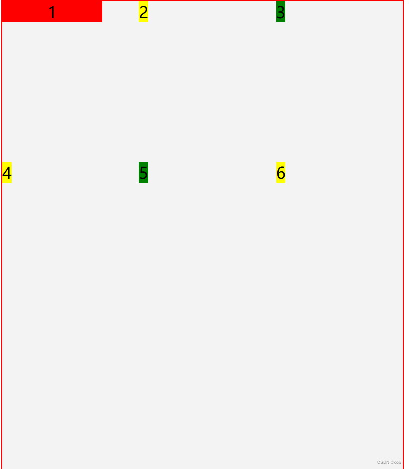
1.1 行、列和单元格
容器里面的水平区域称为“行”,垂直区域称为“列”,行列重叠出来的空间组成单元格

1.2 网格线
划分网格的线,称为”网格线“
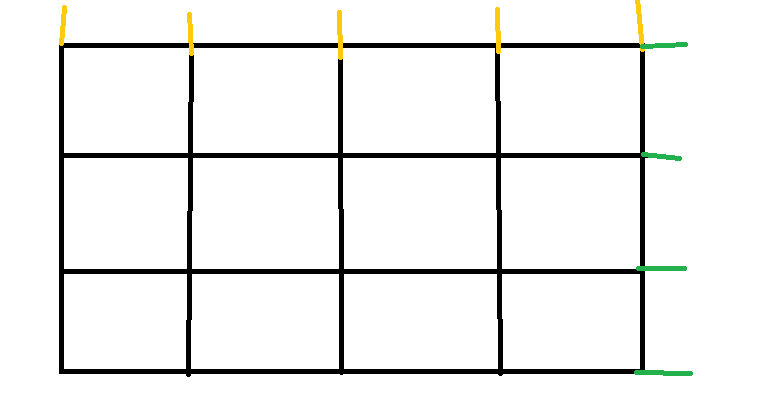
黄色的代表是列的网格线,绿色代表的是行的网格线
Grid和flex类似,布局的属性都是分为两类,一类定义在容器上,称为容器属性,一类定义在项目上,称为项目属性
2 容器属性
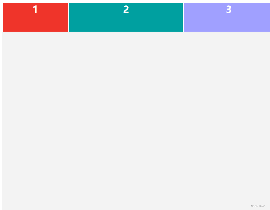
2.1 display属性
display:grid指定一个容器为网格布局
完整代码(复制过去就可以使用)
<!DOCTYPE html>
<html lang="en">

<head>
    <meta charset="UTF-8">
    <meta name="viewport" content="width=device-width, initial-scale=1.0">
    <title>Document</title>
    <style>
        .wrapper {
            width: 450px;
            background: #f3f3f3;
            text-align: center;
            /* 定义属性 */
+            display: grid;
            /* 设置列的宽度 */
+            grid-template-columns: 110px 190px 150px;
            /* 设置行的高度 */
+            grid-template-rows: 50px 150px 150px
        }

        .item {
            text-align: center;
            border: 1px solid #fff;
            color: #fff;
            font-weight: bold;
            /* line-height: 150px; */
        }

        .item:first-of-type {
            background: #ef342a
        }

        .item:nth-of-type(2) {
            background: #00a0a0;
        }

        .item:nth-of-type(3) {
            background: #a0a0ff;
        }
    </style>
</head>

<body>
    <div class="wrapper">
        <div class="item">1</div>
        <div class="item">2</div>
        <div class="item">3</div>
    </div>
</body>

</html>
在这里我定义的三个网格都是宽高为150px
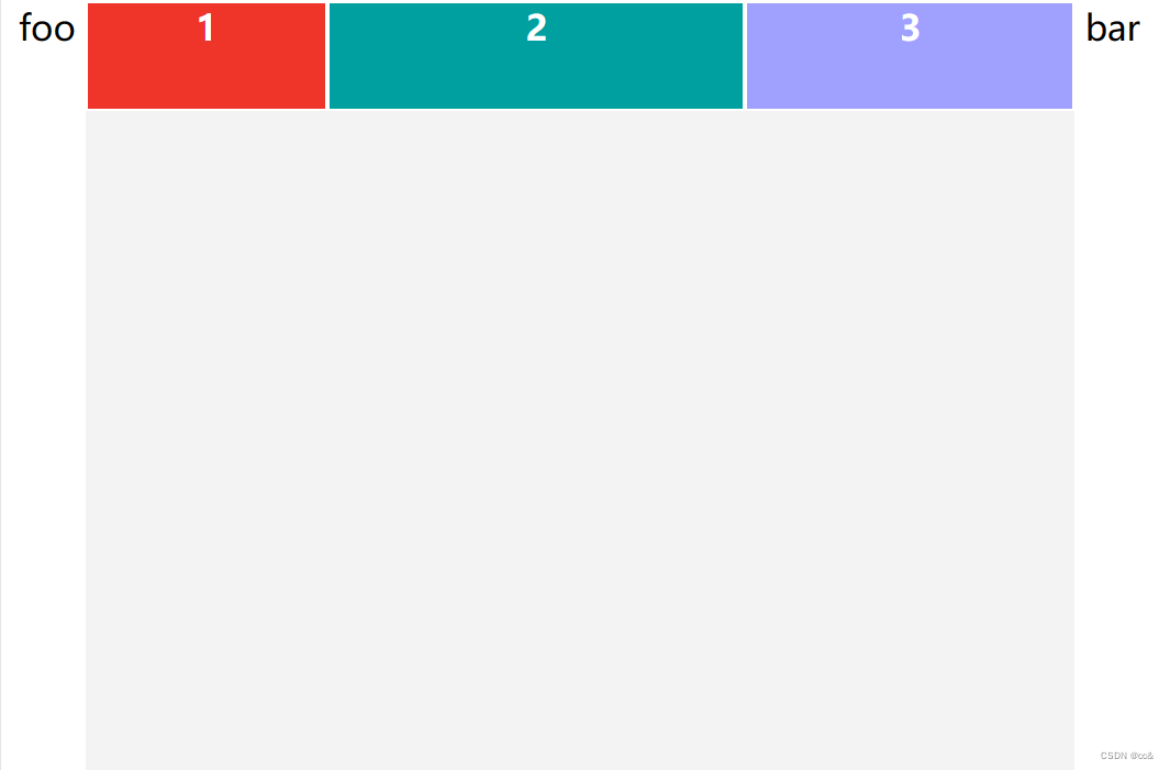
当然啦,我们也可以把它定义为行内元素,该元素内部就采用网格布局
2.2 display:inline-grid效果
grid效果
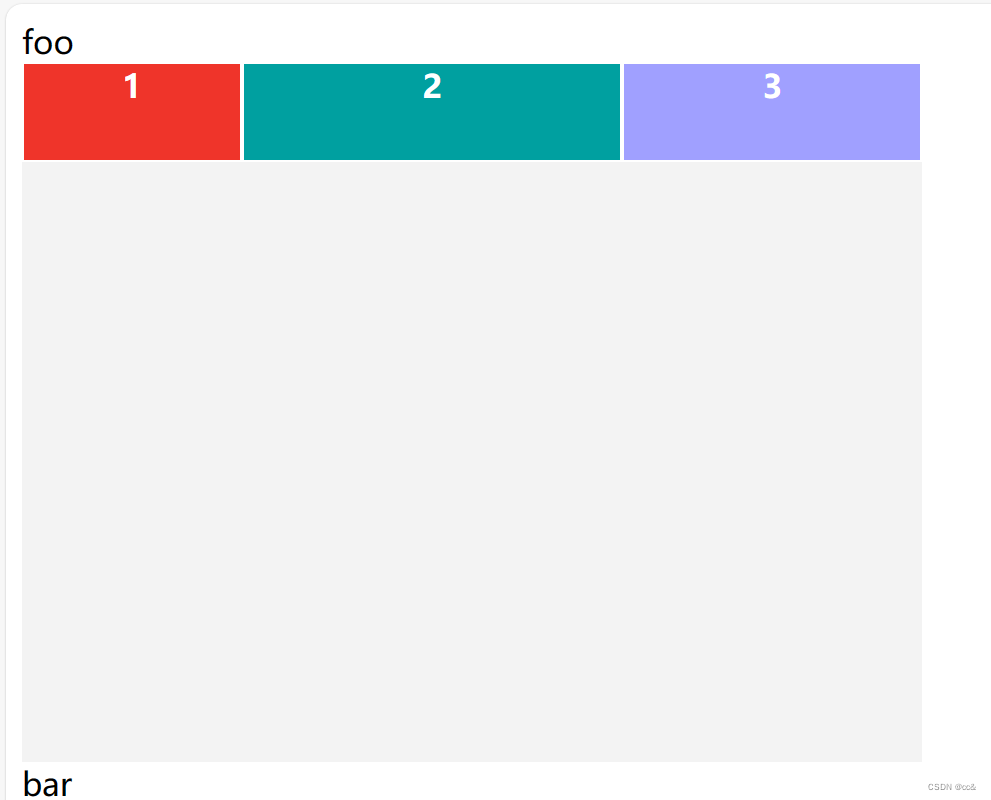
inline-grid效果
完整代码
<!DOCTYPE html>
<html lang="en">

<head>
    <meta charset="UTF-8">
    <meta name="viewport" content="width=device-width, initial-scale=1.0">
    <title>Document</title>
    <style>
        .wrapper {
            width: 450px;
            background: #f3f3f3;
            text-align: center;
            /* 定义属性 */
-            /* display: grid; */
+           display: inline-grid;
            /* 设置列的宽度 */
           grid-template-columns: 110px 190px 150px;
            /* 设置行的高度 */
            grid-template-rows: 50px 150px 150px
        }

        .item {
            text-align: center;
            border: 1px solid #fff;
            color: #fff;
            font-weight: bold;
            /* line-height: 150px; */
        }

        .item:first-of-type {
            background: #ef342a
        }

        .item:nth-of-type(2) {
            background: #00a0a0;
        }

        .item:nth-of-type(3) {
            background: #a0a0ff;
        }
    </style>
</head>

<body>
+    <span>foo</span>
    <div class="wrapper">
        <div class="item">1</div>
        <div class="item">2</div>
        <div class="item">3</div>
    </div>
+    <span>bar</span>
</body>

</html>
3 grid-template-columns和 grid-template-rows(行and列的比例)
grid-template-columns:用来指定行的宽度
grid-template-rows:用来指定行的高度
.wrapper{
            width:450px;
            background: #e5e5e5;
            text-align:center;
            display: inline-grid;
            grid-template-columns: 150px 150px 150px;
            grid-template-rows: 150px 150px 150px
        }
上面这段代码指定的宽高各为150px
当然来,出来能指定具体的数值之外,也可以使用百分比来表示
.wrapper {
display: grid;
grid-template-columns: 33.33% 33.33% 33.33%;
grid-template-rows: 33.33% 33.33% 33.33%;
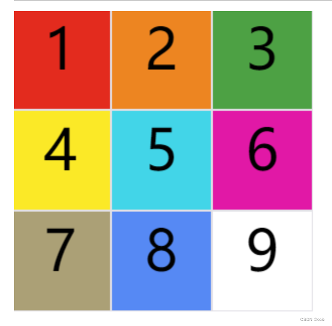
}3.1 repeat
有时候,重复写同样的值非常麻烦,尤其网格很多时。这时,可以使用repeat()函数,简化重复的值。上面的代码用repeat()改写如下
.wrapper {
  display: grid;
  grid-template-columns: repeat(3, 33.33%);
  grid-template-rows: repeat(3, 33.33%);
}
repeat接受两个参数:第一个数重复的次数(上面的例子是重复3次),第二个是重复的值(上面例子是33.33%)
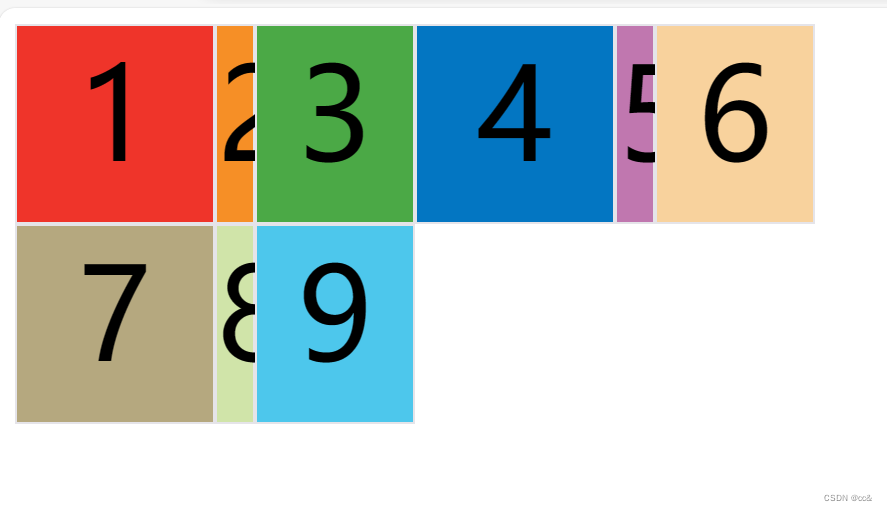
repeat也可以是重复某种模式,例如下面的例子就是一直重复100px,20px,80px
完整代码(复制可直接用)
<!DOCTYPE html>
<html lang="en">

<head>
    <meta charset="UTF-8">
    <meta name="viewport" content="width=device-width, initial-scale=1.0">
    <title>Document</title>
    <style>
        #wrapper {
            display: grid;
            grid-template-columns: repeat(2, 100px 20px 80px);
            grid-template-rows: repeat(3, 100px);
        }

        .item {
            font-size: 4em;
            text-align: center;
            border: 1px solid #e5e4e9;
        }

        .item-1 {
            background-color: #ef342a;
        }

        .item-2 {
            background-color: #f68f26;
        }

        .item-3 {
            background-color: #4ba946;
        }

        .item-4 {
            background-color: #0376c2;
        }

        .item-5 {
            background-color: #c077af;
        }

        .item-6 {
            background-color: #f8d29d;
        }

        .item-7 {
            background-color: #b5a87f;
        }

        .item-8 {
            background-color: #d0e4a9;
        }

        .item-9 {
            background-color: #4dc7ec;
        }
    </style>
</head>

<body>
    <div id="wrapper">
        <div class="item item-1">1</div>
        <div class="item item-2">2</div>
        <div class="item item-3">3</div>
        <div class="item item-4">4</div>
        <div class="item item-5">5</div>
        <div class="item item-6">6</div>
        <div class="item item-7">7</div>
        <div class="item item-8">8</div>
        <div class="item item-9">9</div>
    </div>
</body>

</html>
效果图
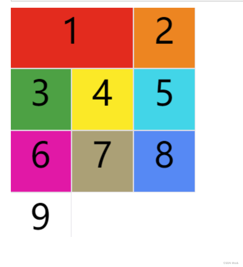
3.2 auto-fill
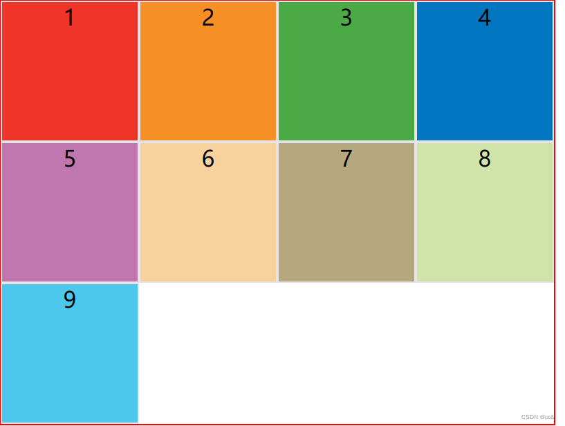
有时候单元格的大小是固定的,但是容器的大小不确定。如果希望每一行或则每一列都尽可能的容纳更多的单元格,我们就可以使用auto-fill来自动填充
.wrapper{
  display:grid;
  grid-template-columns: repeat(auto-fill, 100px)
}
全部代码(复制可以直接使用)
<!DOCTYPE html>
<html lang="en">

<head>
    <meta charset="UTF-8">
    <meta name="viewport" content="width=device-width, initial-scale=1.0">
    <title>Document</title>
    <style>
        #wrapper {
            border: 1px solid red;
            width: 400px;
            display: grid;
+            grid-template-columns: repeat(auto-fill, 100px);

        }

        .item {
            /* font-size: 4em; */
            height: 100px;
            text-align: center;
            border: 1px solid #e5e4e9;
        }

        .item-1 {
            background-color: #ef342a;
        }

        .item-2 {
            background-color: #f68f26;
        }

        .item-3 {
            background-color: #4ba946;
        }

        .item-4 {
            background-color: #0376c2;
        }

        .item-5 {
            background-color: #c077af;
        }

        .item-6 {
            background-color: #f8d29d;
        }

        .item-7 {
            background-color: #b5a87f;
        }

        .item-8 {
            background-color: #d0e4a9;
        }

        .item-9 {
            background-color: #4dc7ec;
        }
    </style>
</head>

<body>
    <div id="wrapper">
        <div class="item item-1">1</div>
        <div class="item item-2">2</div>
        <div class="item item-3">3</div>
        <div class="item item-4">4</div>
        <div class="item item-5">5</div>
        <div class="item item-6">6</div>
        <div class="item item-7">7</div>
        <div class="item item-8">8</div>
        <div class="item item-9">9</div>
    </div>
</body>

</html>
效果图
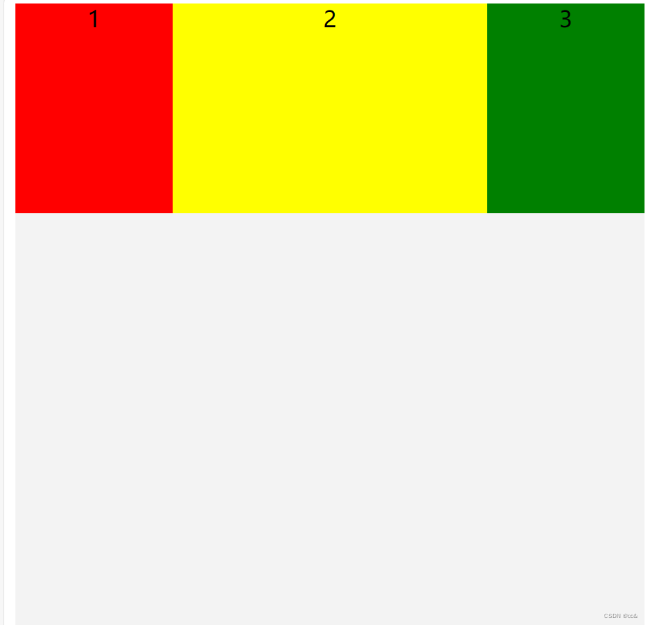
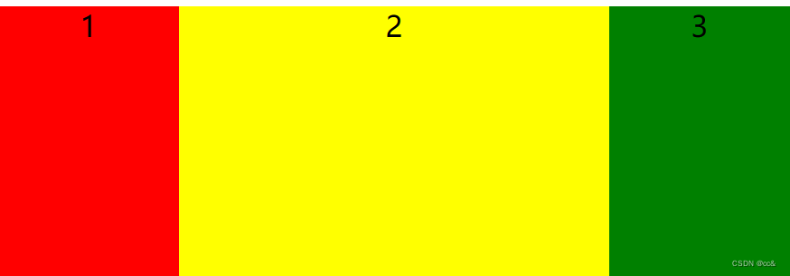
3.3 fr
为了方便表示比例关系,网格提供了fr关键字(fraction的缩写,意为“片段”),如果两列的宽度分别为1fr和2fr,就表示后者是前者的2倍
全部代码(复制可以直接使用)
<!DOCTYPE html>
<html lang="en">

<head>
    <meta charset="UTF-8">
    <meta name="viewport" content="width=device-width, initial-scale=1.0">
    <title>Document</title>
    <style>
        .wrapper {
            width: 450px;
            background: #f3f3f3;
            text-align: center;
            display: grid;
+            grid-template-columns: 1fr 2fr 1fr;
            grid-template-rows: 150px 150px 150px
        }

        .item:first-child {
            background-color: red;
        }

        .item:nth-child(2) {
            background-color: yellow;
        }

        .item:nth-child(3) {
            background-color: green;
        }
    </style>
</head>

<body>
    <div class="wrapper">
        <div class="item">1</div>
        <div class="item">2</div>
        <div class="item">3</div>
    </div>
</body>

</html>
效果图
fr可以和绝对长度相结合一起使用
 .wrapper {
        display: grid;
        grid-template-columns: 150px 1fr 2fr;

      }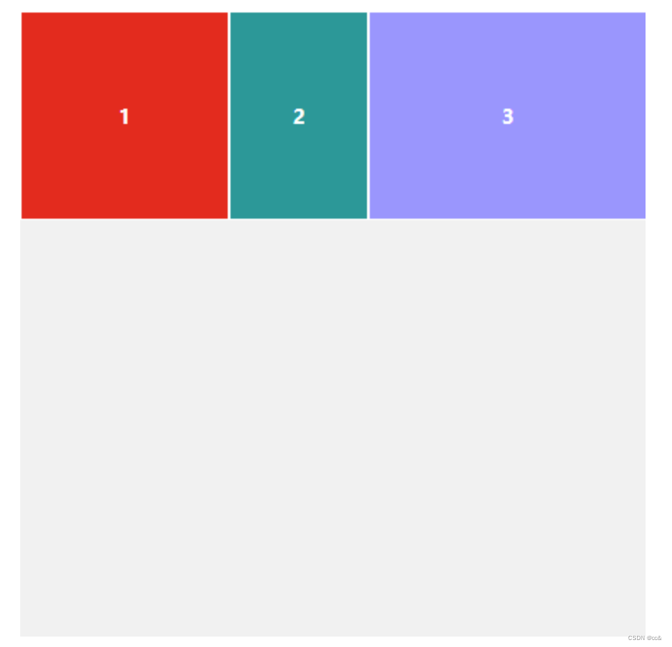
3.4 minmax
minmax() 产生一个长度范围,表示长度就在这个范围之中,它接受两个参数,分别为最小值和最大值
.wrapper{
grid-template-columns: 1fr 1fr minmax(100px,1fr);
}
上面代码(minmax(100px,1fr))表示列宽不小于100px,不大于1fr
全部代码
<!DOCTYPE html>
<html lang="en">

<head>
    <meta charset="UTF-8">
    <meta name="viewport" content="width=device-width, initial-scale=1.0">
    <title>Document</title>
    <style>
        .wrapper {
            width: 100%;
            background: #f3f3f3;
            text-align: center;
            display: grid;
            grid-template-columns: 1fr 1fr minmax(100px, 2fr);
            grid-template-rows: 150px 150px 150px
        }

        .item:first-child {
            background-color: red;
        }

        .item:nth-child(2) {
            background-color: yellow;
        }

        .item:nth-child(3) {
            background-color: green;
        }
    </style>
</head>

<body>
    <div class="wrapper">
        <div class="item">1</div>
        <div class="item">2</div>
        <div class="item">3</div>
    </div>
</body>

</html>
3.5 auto关键字
表示浏览器自己决定宽度
grid-template-columns: 100px auto 100px;上面代码中,第二列的宽度,基本上等于该列单元格的最大宽度,除非单元格内容设置了min-width,且这个值大于最大宽度
全部代码(复制可用,鼠标拖动浏览器,通过浏览器宽度变化查看列宽度的变化)
<!DOCTYPE html>
<html lang="en">

<head>
    <meta charset="UTF-8">
    <meta name="viewport" content="width=device-width, initial-scale=1.0">
    <title>Document</title>
    <style>
        .wrapper {
            width: 100%;
            background: #f3f3f3;
            text-align: center;
            display: grid;
+            grid-template-columns: 100px auto 100px;
            grid-template-rows: 150px 150px 150px
        }

        .item:first-child {
            background-color: red;
        }

        .item:nth-child(2) {
            background-color: yellow;
        }

        .item:nth-child(3) {
            background-color: green;
        }
    </style>
</head>

<body>
    <div class="wrapper">
        <div class="item">1</div>
        <div class="item">2</div>
        <div class="item">3</div>
    </div>
</body>

</html>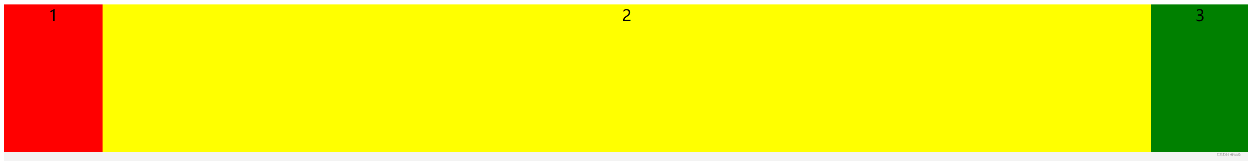
4 grid-row-gap和grid-colunm-gap属性 (行and列的间隔)
grid-row-gap:设置行与行之间的间隔
grid-colunm-gap:设置列于列之间的间隔
.wrapper {
  grid-row-gap: 10px;
  grid-column-gap: 10px;
}
全部代码(复制可用)
<!DOCTYPE html>
<html lang="en">

<head>
    <meta charset="UTF-8">
    <meta name="viewport" content="width=device-width, initial-scale=1.0">
    <title>Document</title>
    <style>
        .wrapper {
            width: 400px;
            background: #f3f3f3;
            text-align: center;
            border: 1px solid red;
            display: grid;
            grid-template-columns: 1fr 1fr 1fr;
            grid-template-rows: 150px 150px;
+            grid-row-gap: 10px;
+            grid-column-gap: 10px;
        }

        .item:first-child {
            background-color: red;
        }

        .item:nth-child(2) {
            background-color: yellow;
        }

        .item:nth-child(3) {
            background-color: green;
        }

        .item:nth-child(4) {
            background-color: yellow;
        }

        .item:nth-child(5) {
            background-color: green;
        }

        .item:nth-child(6) {
            background-color: yellow;
        }
    </style>
</head>

<body>
    <div class="wrapper">
        <div class="item">1</div>
        <div class="item">2</div>
        <div class="item">3</div>
        <div class="item">1</div>
        <div class="item">2</div>
        <div class="item">3</div>
    </div>
</body>

</html>
grid-row-gap和grid-colunms-gap合并简写的话,格式为grid-gap
.wrapper{
grid-gap: 10px 10px;
}
如果省略第二个值的话,那么就默认第二个值等于第一个值
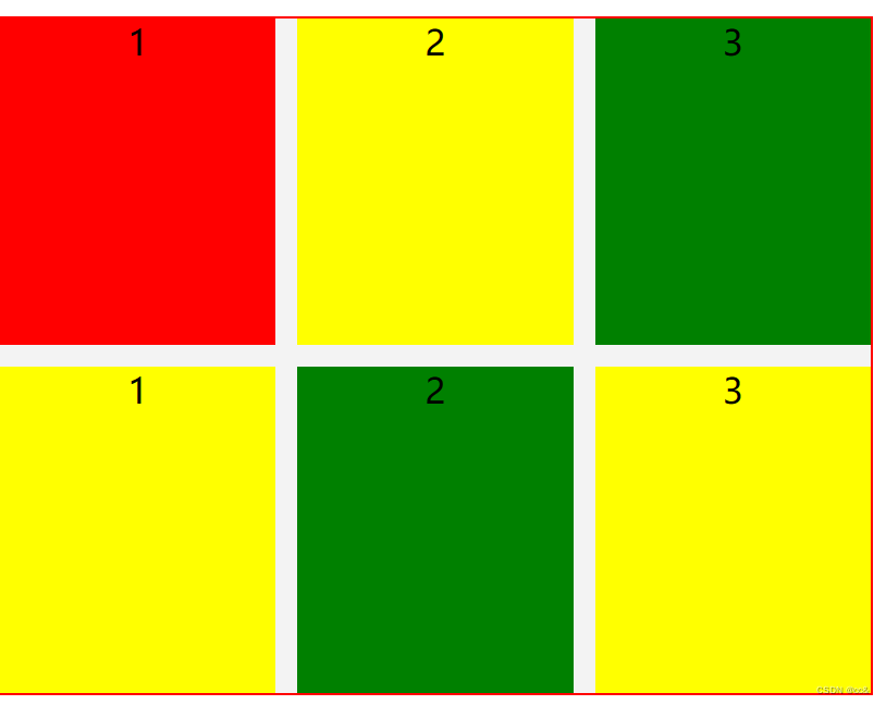
5 grid-auto-flow 元素排序
划分网格,容器的子元素排序是按照“先行后列”来排的通过该属性我们可以自定义排列的顺序
.wrapper{
  grid-auto-flow:colunm;
}
全部代码(复制可用)
<!DOCTYPE html>
<html lang="en">

<head>
    <meta charset="UTF-8">
    <meta name="viewport" content="width=device-width, initial-scale=1.0">
    <title>Document</title>
    <style>
        .wrapper {
            width: 400px;
            background: #f3f3f3;
            text-align: center;
            border: 1px solid red;
            display: grid;
            grid-template-columns: 1fr 1fr 1fr;
            grid-template-rows: 150px 150px 150px;
            grid-row-gap: 10px;
            grid-column-gap: 10px;
+            grid-auto-flow: column;
        }

        .item:first-child {
            background-color: red;
        }

        .item:nth-child(2) {
            background-color: yellow;
        }

        .item:nth-child(3) {
            background-color: green;
        }

        .item:nth-child(4) {
            background-color: yellow;
        }

        .item:nth-child(5) {
            background-color: green;
        }

        .item:nth-child(6) {
            background-color: yellow;
        }
    </style>
</head>

<body>
    <div class="wrapper">
        <div class="item">1</div>
        <div class="item">2</div>
        <div class="item">3</div>
        <div class="item">4</div>
        <div class="item">5</div>
        <div class="item">6</div>
    </div>
</body>

</html>
6.内容的位置
6 .1 justify-items、align-items和place-items属性
justify-items属性设置单元格内容的水平位置,align-items设置单元格内容的垂直位置
.wrapper {
  justify-items: start | end | center | stretch;
  align-items: start | end | center | stretch;
}
这两个属性的取值是完全一样的
- start:对齐单元格的起始边缘。
- end:对齐单元格的结束边缘。
- center:单元格内部居中。
- stretch:拉伸,占满单元格的整个宽度(默认值)
 全部代码(复制可用)
<!DOCTYPE html>
<html lang="en">

<head>
    <meta charset="UTF-8">
    <meta name="viewport" content="width=device-width, initial-scale=1.0">
    <title>Document</title>
    <style>
        .wrapper {
            width: 400px;
            background: #f3f3f3;
            text-align: center;
            border: 1px solid red;
            display: grid;
            grid-template-columns: 1fr 1fr 1fr;
            grid-template-rows: 150px 150px 150px;
            grid-row-gap: 10px;
            grid-column-gap: 10px;
+            justify-items: start;
+            align-items: start;
        }

        .item:first-child {
            width: 100px;
            background-color: red;
        }

        .item:nth-child(2) {
            background-color: yellow;
        }

        .item:nth-child(3) {
            background-color: green;
        }

        .item:nth-child(4) {
            background-color: yellow;
        }

        .item:nth-child(5) {
            background-color: green;
        }

        .item:nth-child(6) {
            background-color: yellow;
        }
    </style>
</head>

<body>
    <div class="wrapper">
        <div class="item">1</div>
        <div class="item">2</div>
        <div class="item">3</div>
        <div class="item">4</div>
        <div class="item">5</div>
        <div class="item">6</div>
    </div>
</body>

</html>
这个是在单元中内居中
place-item是两者的合并写法 place-items: start end;
6.2 justify-content属性、align-content属性和place-content属性(针对的整体)
justify-content属性是整个内容区域在容器里面的水平位置,align-content属性是整个内容区域在容器里面的垂直位置
.wrapper {
  justify-content: start | end | center | stretch | space-around | space-between | space-evenly;
  align-content: start | end | center | stretch | space-around | space-between | space-evenly;
}
整体代码(复制可用)
<!DOCTYPE html>
<html lang="en">

<head>
    <meta charset="UTF-8">
    <meta name="viewport" content="width=device-width, initial-scale=1.0">
    <title>Document</title>
    <style>
        .wrapper {
            width: 400px;
            height: 400px;
            background: #f3f3f3;
            text-align: center;
            border: 1px solid red;
            display: grid;
            grid-template-columns: 100px 100px 100px;
            grid-template-rows: 150px 150px;
            grid-row-gap: 10px;
            grid-column-gap: 10px;
+            justify-content: start;
+            align-content: center;
        }

        .item:first-child {
            width: 100px;
            height: 20px;
            background-color: red;
        }

        .item:nth-child(2) {
            background-color: yellow;
        }

        .item:nth-child(3) {
            background-color: green;
        }

        .item:nth-child(4) {
            background-color: yellow;
        }

        .item:nth-child(5) {
            background-color: green;
        }

        .item:nth-child(6) {
            background-color: yellow;
        }
    </style>
</head>

<body>
    <div class="wrapper">
        <div class="item">1</div>
        <div class="item">2</div>
        <div class="item">3</div>
        <div class="item">4</div>
        <div class="item">5</div>
        <div class="item">6</div>
    </div>
</body>

</html>
7.项目属性
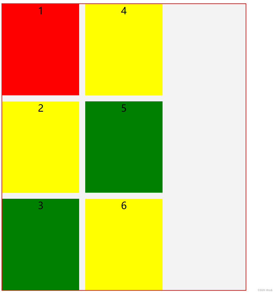
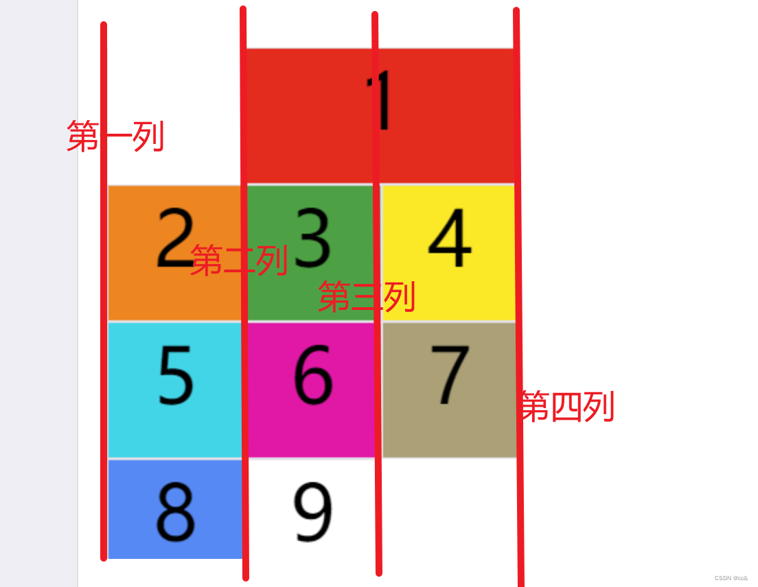
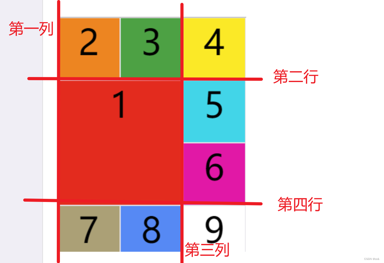
7.1 grid-colunm-start属性、grid-colunm-end属性、grid-row-start属性\grid-row-end属性
项目的位置是可以指定的,具体方法就是指定项目的边框,分别定位在哪根网格线
grid-column-start属性:左边框所在的垂直网格线grid-column-end属性:右边框所在的垂直网格线grid-row-start属性:上边框所在的水平网格线grid-row-end属性:下边框所在的水平网格
.item-1 {
第二列线到第四列线条
  grid-column-start: 2;
  grid-column-end: 4;
}
.item-1 {
  grid-column-start: 1;
  grid-column-end: 3;
  grid-row-start: 2;
  grid-row-end: 4;
} 
除了这个四个属性的值之外,我们还可以使用span关键字,表示占几个网格,类似table的colspan和rowspan
.item-1 {
  grid-column-start: span 2;
}
7.2 grid-column和grid-row属性
grid -column属性是grid-column-start和grid-column-end的合并写法,grid-row是grid-row-start和grid-row-end的合并写法
.item-1 {
  grid-column: 1 / 3;
  grid-row: 1 / 2;
}
/* 等同于 */
.item-1 {
  grid-column-start: 1;
  grid-column-end: 3;
  grid-row-start: 1;
  grid-row-end: 2;
}
这两个属性也可以使用span关键字,表示跨越多少个网格
.item-1 {
  background: #b03532;
  grid-column: 1 / 3;
  grid-row: 1 / 3;
}
/* 等同于 */
.item-1 {
  background: #b03532;
  grid-column: 1 / span 2;
  grid-row: 1 / span 2;
}
斜杠及后面的部分可以被省略,默认跨越一个网格
.item-1 {
  grid-column: 1;
  grid-row: 1;
}
7的全部代码(复制可用,需要修改)
<!DOCTYPE html>
<html lang="en">

<head>
    <meta charset="UTF-8">
    <meta name="viewport" content="width=device-width, initial-scale=1.0">
    <title>Document</title>
    <style>
        .wrapper {
            width: 400px;
            background: #f3f3f3;
            text-align: center;
            border: 1px solid red;
            display: grid;
            grid-template-columns: 1fr 1fr 1fr;
            grid-template-rows: 100px 100px 100px 100px;
            grid-row-gap: 10px;
            grid-column-gap: 10px;

        }

        .item:first-child {
            grid-column-start: 2;
            grid-column-end: 4;
            background-color: red;
        }

        .item:nth-child(2) {
            background-color: yellow;
        }

        .item:nth-child(3) {
            background-color: green;
        }

        .item:nth-child(4) {
            background-color: yellow;
        }

        .item:nth-child(5) {
            background-color: green;
        }

        .item:nth-child(6) {
            background-color: yellow;
        }

        .item:nth-child(7) {
            background-color: yellow;
        }

        .item:nth-child(8) {
            background-color: green;
        }

        .item:nth-child(9) {
            background-color: yellow;
        }
    </style>
</head>

<body>
    <div class="wrapper">
        <div class="item">1</div>
        <div class="item">2</div>
        <div class="item">3</div>
        <div class="item">4</div>
        <div class="item">5</div>
        <div class="item">6</div>
        <div class="item">7</div>
        <div class="item">8</div>
        <div class="item">9</div>
    </div>
</body>

</html>


 2621
2621

 被折叠的 条评论
为什么被折叠?
被折叠的 条评论
为什么被折叠?
 到【灌水乐园】发言


