


1. 概述
iPadOS引入了多任务分屏功能,使用户能够同时在一个屏幕上使用多个应用程序。这为用户提供了更高效的工作环境,可以在同一时间处理多个任务。
iPad多任务分屏有两种常见的模式:1/2分屏和Slide Over(滑动覆盖)。1/2分屏将屏幕均分为两个应用程序,而Slide Over模式则允许一个应用程序以较窄的宽度覆盖在另一个应用程序上方。
2. 配置App项目以支持多任务
要使你的App项目支持多任务分屏,需要进行以下配置,在app info文件中:
-
不能配置`Requires Full Screen`,或者配置为NO。
-
配置`Supported interface orientations (iPad)`支持4个方向。
-
配置`Application Scene Manifest`项,并将其下的`Enable Multiple Windows`设置为`yes`。
这样,你的App就会被配置为支持多任务分屏。
3. 屏幕区分和获取屏幕size
在SwiftUI中,你可以使用@Environment属性包装器来获取屏幕的大小。以下是一个示例代码:
import SwiftUI
struct ContentView: View {
@Environment(\.horizontalSizeClass) var horizontalSizeClass
var body: some View {
if horizontalSizeClass == .compact {
// ...
} else {
// ...
}
}
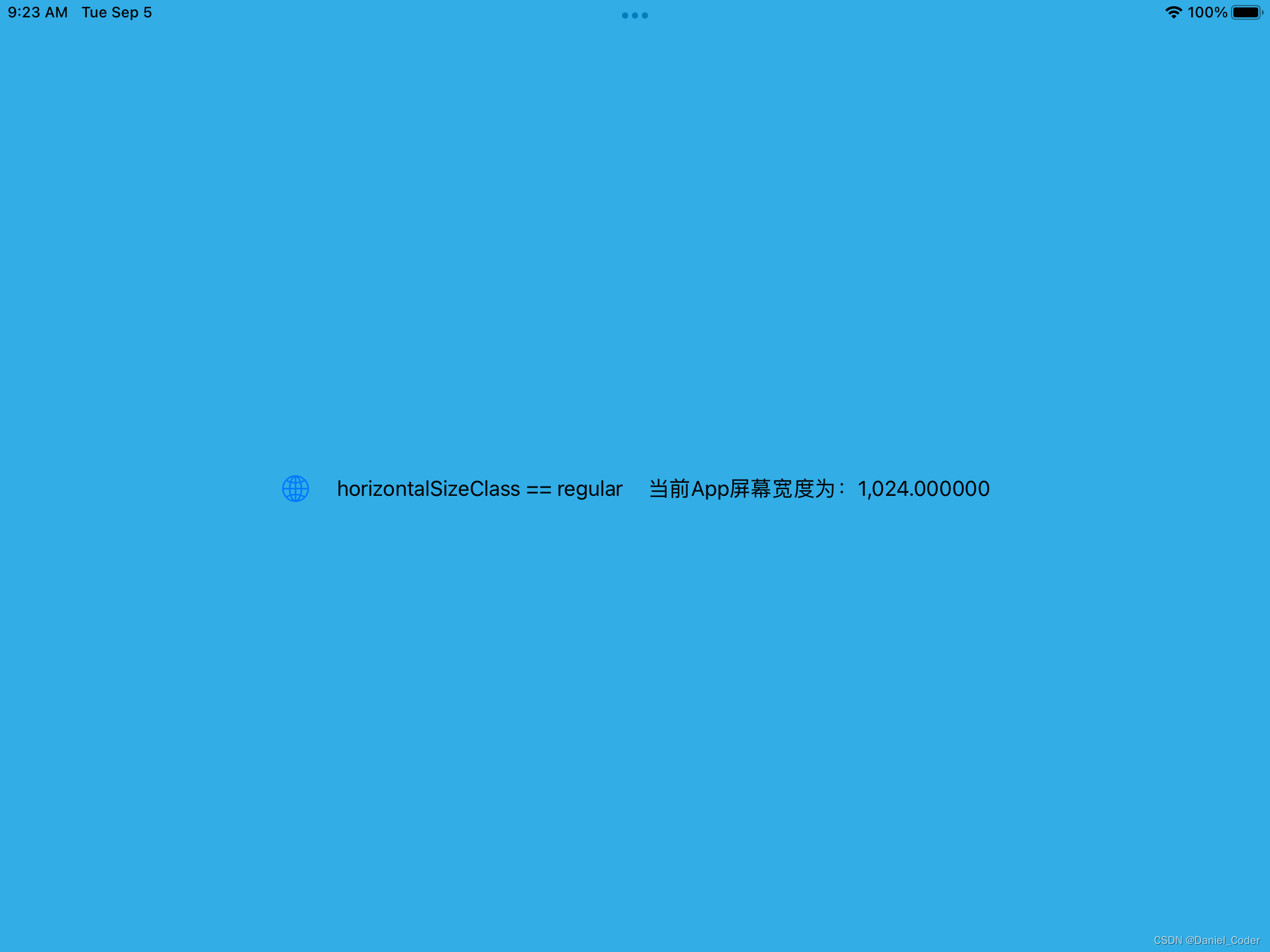
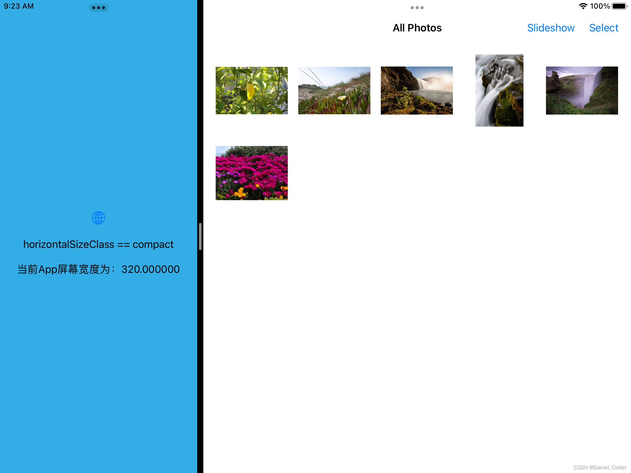
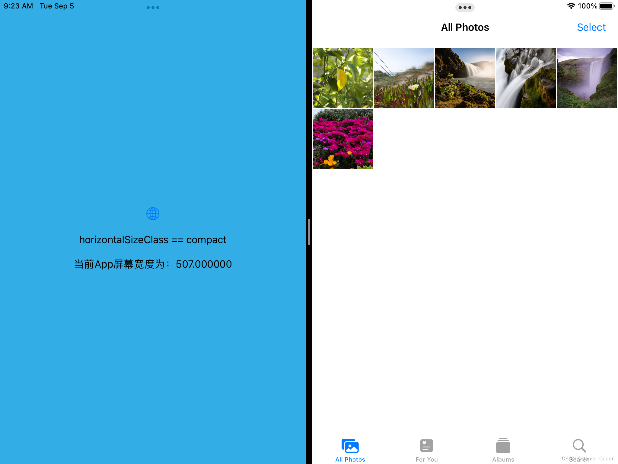
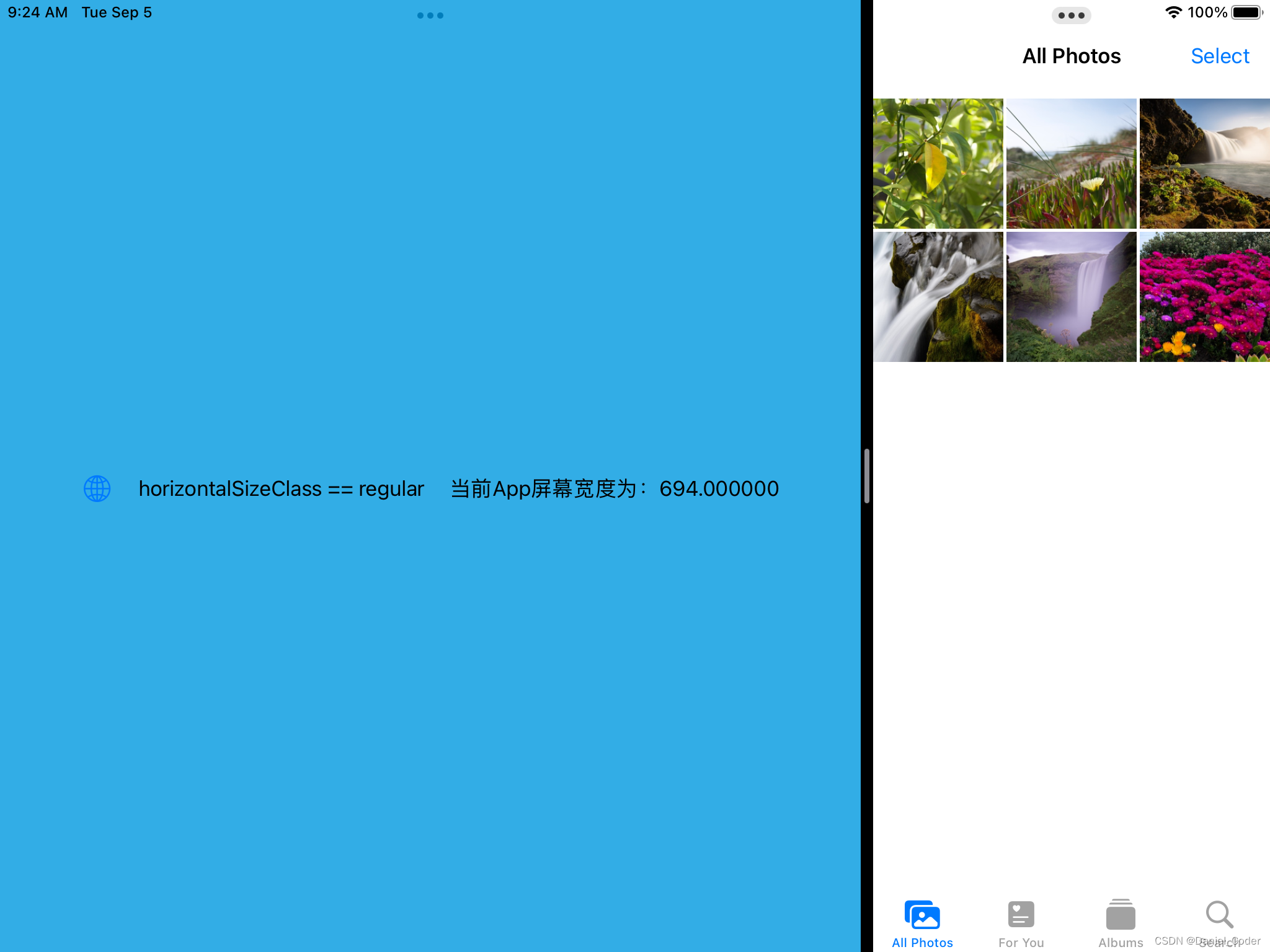
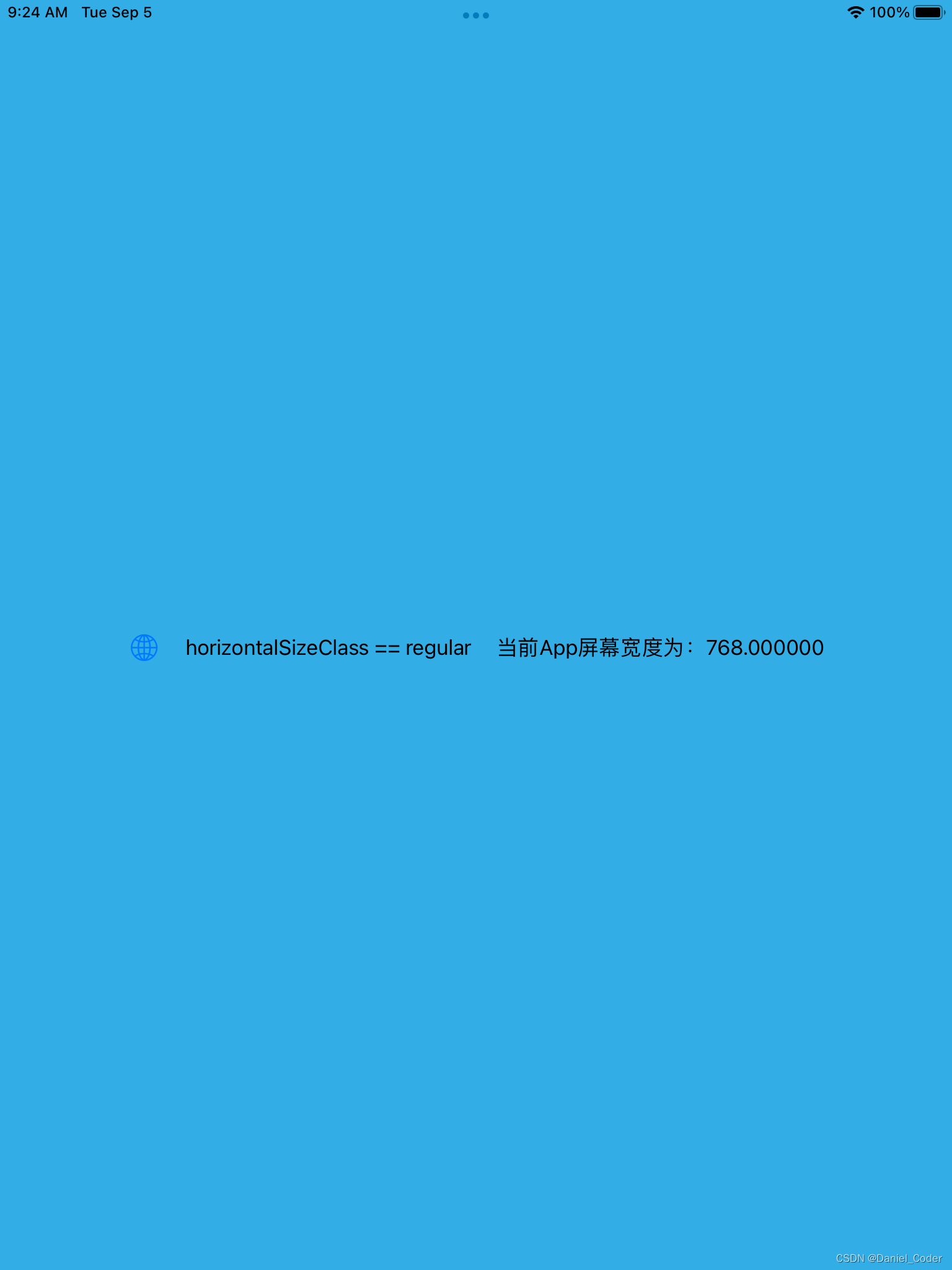
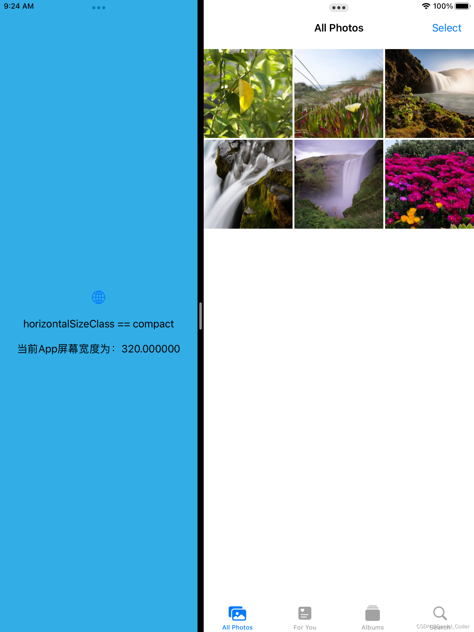
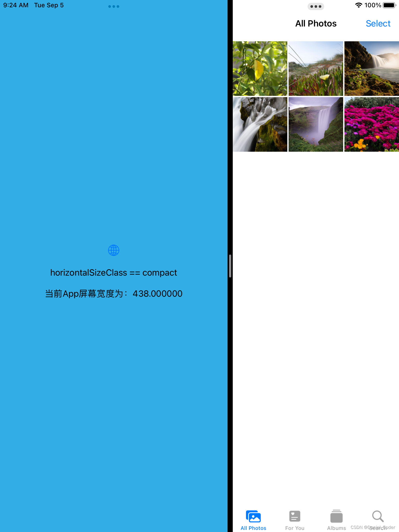
}在上面的代码中,我们使用`@Environment(\.horizontalSizeClass) varhorizontalSizeClass`来获取水平尺寸类别,具体如下:
- 当iPad横屏时:
- app全屏或者占屏幕宽度2/3时,为regular。
- app占屏幕宽度1/3或者1/2时,为compact。
- 当iPad竖屏时:
- app全屏幕宽度时,为regular。
- app非全屏幕宽度时,为compact。
那么如何获取到分屏后的App屏幕宽度呢?就需要用到下面这个组件了。
GeometryReader
将GeometryReader包裹在组件的外部,在屏幕变化是即可得到分屏后的宽度。如下面示例代码:
var body: some View {
    GeometryReader { geometry in
      VStack {
        Spacer()
        if horizontalSizeClass == .compact {
          VStack(alignment: .center, spacing: 20) {
            Image(systemName: "globe")
              .imageScale(.large)
              .foregroundColor(.accentColor)
            Text("horizontalSizeClass == compact")
            Text("当前App屏幕宽度为:\(geometry.size.width)")
          }
          .padding()
          .frame(width: geometry.size.width)
        } else {
          HStack(alignment: .center, spacing: 20) {
            Image(systemName: "globe")
              .imageScale(.large)
              .foregroundColor(.accentColor)
            Text("horizontalSizeClass == regular")
            Text("当前App屏幕宽度为:\(geometry.size.width)")
          }
          .padding()
          .frame(width: geometry.size.width)
        }
        Spacer()
      }
    }
  }
运行结果如下:
这种判断类型还是不够严谨,比如横屏是的1/3或者1/2分屏,都是compact,1/3时我们可以使用iPhone的布局,但是1/2时也使用iPhone的布局的话,界面元素的尺寸会很大,显示内容比较少。为了解决这个问题,下面提供了一个新的方法,来将分屏后的类型进行细分:
calculateSplitRatio方法
enum SplitRatio {
  case fullScreen
  case half
  case oneThird
  case twoThirds
}

func calculateSplitRatio(width: CGFloat) -> SplitRatio {

    let screenWidth = UIScreen.main.bounds.width
    let screenHeight = UIScreen.main.bounds.height

    if abs(width - screenWidth) <= 10 {
      return .fullScreen
    }

    if screenWidth > screenHeight {
      let halfWidth = screenWidth / 2
      let oneThirdWidth = screenWidth / 3
      let twoThirdsWidth = oneThirdWidth * 2

      let diffToHalf = abs(width - halfWidth)
      let diffToOneThird = abs(width - oneThirdWidth)
      let diffToTwoThirds = abs(width - twoThirdsWidth)

      if diffToHalf <= diffToOneThird && diffToHalf <= diffToTwoThirds {
          return .half
      } else if diffToOneThird <= diffToHalf && diffToOneThird <= diffToTwoThirds {
          return .oneThird
      } else {
          return .twoThirds
      }
    } else {
      let halfWidth = screenWidth / 2
      if width > halfWidth {
         return .half
      } else {
         return .oneThird
      }
    }
  }
上面的代码中定义了`SplitRatio`枚举 ,包含了4中类型。在calculateSplitRatio方法中,我们只需要传入分屏后的宽度即可。
这里需要重点说一下的是在iPad竖屏分屏时,如果分屏线在左侧,则认为左侧宽度为1/3,右侧为1/2,如果分屏线在右侧,则左侧宽度为1/2,右侧1/3.这样做,我们能在代码上更好的布局。示例代码如下:
var body: some View {
    GeometryReader { geometry in
      let splitRatio = calculateSplitRatio(width: geometry.size.width)
      VStack {
        if splitRatio == .oneThird {

        } else if splitRatio == .half {

        } else if splitRatio == .twoThirds {

        } else {

        }
      }
      .background(Color.cyan)
    }
  }
4. SwiftUI代码注意事项
在编写SwiftUI代码时,有一些注意事项需要考虑:
- 使用适当的布局容器:SwiftUI提供了多种布局容器,如VStack、HStack和ZStack等。根据你的布局需求,选择适当的容器来组织和排列你的视图元素,尽量不使用固定的尺寸布局。
- 使用合适的布局修饰符:SwiftUI提供了许多布局修饰符,如padding、spacing和alignment等。使用这些修饰符可以调整视图元素之间的间距、对齐方式等,以获得所需的布局效果。
- 考虑不同屏幕尺寸和方向:SwiftUI可以自动适应不同的屏幕尺寸和方向。使用自适应布局和动态尺寸来确保你的界面在不同设备上都能正确显示,并且能够适应横竖屏切换。
如果觉得文章对你有用,不妨给个赞,关注一下,更多好用文章还在继续更新中。
本篇文章出自https://blog.csdn.net/guoyongming925的博客,如需转载,还请标明出处。


 扫一扫
扫一扫


 8173
8173

 被折叠的 条评论
为什么被折叠?
被折叠的 条评论
为什么被折叠?
 到【灌水乐园】发言


