


同事问了一个关于css的问题,如何实现浏览器内容左侧固定宽度,右侧宽度随浏览器改变而改变,这类需求个人觉得在管理系统经常遇到,顶部导航栏,左侧菜单栏,剩下的就是内容。
1、首先,左侧div需要给定一个固定宽度,并且左浮动。
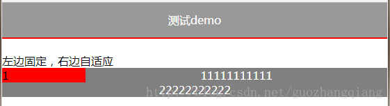
2、右侧div不要右浮动了,设置overflow:hidden即可(不设置overflow:hidden见下文效果)
<!DOCTYPE html>
<html lang="en">
<head>
    <meta charset="UTF-8">
    <title>测试demo</title>
    <style>
    	*{
    		margin: 0;
    		padding: 0;
    	}
    	#title{
    		width: 100%;
    		height: 50px;
    		line-height: 50px;
    		text-align: center;
    		color: white;
    		background: rgba(0,0,0,0.4);
    	}
    	#box{
    		width: 100%;
    		height: auto;
    		border-top: 1px solid red;
    		border-bottom: 1px solid red;
    	}
    </style>
</head>
<body>
<div id="title">测试demo</div>
<div id="box">

</div>
<br>
<p>左边固定,右边自适应</p>
<div style="float: left;width: 120px;background: red">1</div>
<div style="background: grey;color: white;overflow: hidden;">
	<p style="text-align:center">11111111111</p>
    <p style="text-align:center">22222222222</p>
</div>
<script>
</script>
</body>
</html>
PS:各位小伙伴不要写行内样式哈,这里方便测试才写的行内样式(* ̄︶ ̄)
效果图:
1、设置overflow:hidden
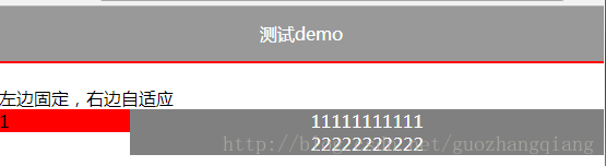
2、不设置overflow:hidden


 984
984


 被折叠的 条评论
为什么被折叠?
被折叠的 条评论
为什么被折叠?
 到【灌水乐园】发言


