


你的app包含一个Drawer吗?你想在5分钟之内拥有它吗?你想你的drawer遵循安卓设计规范吗?你想拥有概要图片(profiles)吗?你想有更好的适应性吗?谷歌的design support 是不是功能不够强大?你想有一个简单易懂的API吗?
MaterialDrawer适合你!
别在浪费你的时间了,Materialdrawer提供了一个最简单的navigation drawe的实现。这里有带着扼要信息的头布局,AccountHeader,一个为表格的MiniDrawer ,并且提供了用户自定义DrawerItems,自定义颜色,自定义主题。。。。。可以随意改变。
1 概要
1.1 Demo
你可以在
Google Play在这里查看,或者是看一看这个例子
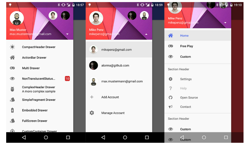
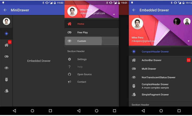
1.2 截屏
2 步骤
2.1 提供gradle依赖
compile('com.mikepenz:materialdrawer:5.6.0@aar') {
    transitive = true
}
2.2 添加你的drawer
new DrawerBuilder().withActivity(this).build();好的,你的drawer已经可以用了
3 额外的步骤
3.1 添加条目和一些功能
//如果你想过一会去更新这些条目,建议你把它以变量的形式保存
PrimaryDrawerItem item1 = new PrimaryDrawerItem().withIdentifier(1).withName(R.string.drawer_item_home);
SecondaryDrawerItem item2 = new SecondaryDrawerItem().withIdentifier(2).withName(R.string.drawer_item_settings);

//创建drawer,并且基础它的返回值
Drawer result = new DrawerBuilder()
    .withActivity(this)
    .withToolbar(toolbar)
    .addDrawerItems(
        item1,
        new DividerDrawerItem(),
        item2,
        new SecondaryDrawerItem().withName(R.string.drawer_item_settings)
    )
    .withOnDrawerItemClickListener(new Drawer.OnDrawerItemClickListener() {
        @Override
        public boolean onItemClick(View view, int position, IDrawerItem drawerItem) {
            // do something with the clicked item :D
        }
    })
    .build();
3.2 选择一个条目
//通过id选择
result.setSelection(1);
//通过对象选择
result.setSelection(item2);
//选择条目,并且触发onItemClick
result.setSelection(1, true);
默认的,如果一个条目被点击,它就会变成新的被选中的条目,如果这不是你所期待的,你可以让它不能被选择
new SecondaryDrawerItem().withName(R.string.drawer_item_dialog).withSelectable(false)3.3 更改条目
//更改一个条目
item1.withName("A new name for this drawerItem").withBadge("19").withBadgeStyle(new BadgeStyle().withTextColor(Color.WHITE).withColorRes(R.color.md_red_700));
//通知drawer有条目更新,它会帮你处理好的
result.updateItem(item1);

//只更新名字、微章、图标
result.updateName(1, "A new name");

//结果对象也允许你添加新的条目,移除条目,增加页脚..
result.addItem(new DividerDrawerItem());
result.addStickyFooterItem(new PrimaryDrawerItem().withName("StickyFooterItem"));

//移除条目
result.removeItem(2);

//打开/关闭
result.openDrawer();
result.closeDrawer();

//获取DrawerLayout自身的引用
result.getDrawerLayout();
3.4 在AccountHeader里显示概要介绍
// 创建一个 AccountHeader
AccountHeader headerResult = new AccountHeaderBuilder()
    .withActivity(this)
    .withHeaderBackground(R.drawable.header)
    .addProfiles(
        new ProfileDrawerItem().withName("Mike Penz").withEmail("mikepenz@gmail.com").withIcon(getResources().getDrawable(R.drawable.profile))
    )
    .withOnAccountHeaderListener(new AccountHeader.OnAccountHeaderListener() {
        @Override
        public boolean onProfileChanged(View view, IProfile profile, boolean currentProfile) {
            return false;
        }
    })
    .build();

//把headerResult传递到你的DeawerBulider
new DrawerBuilder()
    .withAccountHeader(headerResult)
    //additional Drawer setup as shown above
    ...
    .build();
3.5 使用包含的图标和字体
MaterialDrawer 源自 Android-Iconics 核心库,这允许你创建自己的带有图标和任何字体DrawerItems
选择你需要的字体字体
添加依赖
compile 'com.mikepenz:google-material-typeface:x.y.z@aar' //Google Material Icons
compile 'com.mikepenz:fontawesome-typeface:x.y.z@aar'     //FontAwesome
java代码
//now you can simply use any icon of the Google Material Icons font
new PrimaryDrawerItem().withIcon(GoogleMaterial.Icon.gmd_wb_sunny)
//Or an icon from FontAwesome
new SecondaryDrawerItem().withIcon(FontAwesome.Icon.faw_github)
4 高级功能
4.1 带有ActionBar的Activity
new DrawerBuilder()
    .withActivity(this)
    .withTranslucentStatusBar(false)
    .withActionBarDrawerToggle(false)
    .addDrawerItems(
        //pass your items here
    )
    .build();
4.2 带有多个Drawer的Activity
Drawer result = new DrawerBuilder()
    .withActivity(this)
    .withToolbar(toolbar)
    .addDrawerItems(
        //pass your items here
    )
    .build();

new DrawerBuilder()
    .withActivity(this)
    .addDrawerItems(
        //pass your items here
    )
    .withDrawerGravity(Gravity.END)
    .append(result);
4.3 在返回箭头和汉堡图鉴中进行切换
如果你打算在返回箭头和菜单选择的图表中进行切换,你应该这样做(顺序很重要)
选择返回箭头
result.getActionBarDrawerToggle().setDrawerIndicatorEnabled(false);
getSupportActionBar().setDisplayHomeAsUpEnabled(true);
汉堡图标
getSupportActionBar().setDisplayHomeAsUpEnabled(false);
result.getActionBarDrawerToggle().setDrawerIndicatorEnabled(true);
4.4清单文件
MaterialDrawer 需要一个AppCompat 主题或者是派生的主题比如说MaterialDrawerThemes 作为基本主题。强烈的建议使用一下提供的主题,他们都把AppCompat 作为副主题,并且定义了drawer的颜色。
注意:有没有ActionBar的状态跟Appcompat的样式是一样的
- MaterialDrawerTheme (extends Theme.AppCompat.NoActionBar)
- MaterialDrawerTheme.TranslucentStatus
MaterialDrawerTheme.ActionBar (extends Theme.AppCompat) - MaterialDrawerTheme.ActionBar.TranslucentStatus
MaterialDrawerTheme.Light (extends Theme.AppCompat.Light.NoActionBar) - MaterialDrawerTheme.Light.TranslucentStatus
MaterialDrawerTheme.Light.ActionBar (extends Theme.AppCompat.Light) - MaterialDrawerTheme.Light.ActionBar.TranslucentStatus
MaterialDrawerTheme.Light.DarkToolbar (extends — Theme.AppCompat.DarkActionBar) (disabled the ActionBar)
MaterialDrawerTheme.Light.DarkToolbar.TranslucentStatus
- MaterialDrawerTheme.Light.DarkToolbar.ActionBar (extends Theme.AppCompat.DarkActionBar)
- MaterialDrawerTheme.Light.DarkToolbar.ActionBar.TranslucentStatus
4.5更改drawer的样式
如果说你不打算用上面提供的样式,你就需要自己把样式的值加到你的样式文件中,下面是一截简单等例子,这个跟父样式是”Theme.AppCompat.Light.DarkActionBar”都是一样的道理。
下面是继承已有样式进行修改的例子
<style name="CustomTheme" parent="MaterialDrawerTheme">
        <!-- ...and here we setting appcompat’s color theming attrs -->
        <item name="colorPrimary">@color/material_drawer_primary</item>
        <item name="colorPrimaryDark">@color/material_drawer_primary_dark</item>
        <item name="colorAccent">@color/material_drawer_accent</item>

        <!-- MaterialDrawer specific values -->
        <item name="material_drawer_background">@color/material_drawer_background</item>
        <item name="material_drawer_primary_text">@color/material_drawer_primary_text</item>
        <item name="material_drawer_primary_icon">@color/material_drawer_primary_icon</item>
        <item name="material_drawer_secondary_text">@color/material_drawer_secondary_text</item>
        <item name="material_drawer_hint_text">@color/material_drawer_hint_text</item>
        <item name="material_drawer_divider">@color/material_drawer_divider</item>
        <item name="material_drawer_selected">@color/material_drawer_selected</item>
        <item name="material_drawer_selected_text">@color/material_drawer_selected_text</item>
        <item name="material_drawer_header_selection_text">@color/material_drawer_header_selection_text</item>
    </style>
如果说你想要自己全新的样式,只要把颜色设置成自己的就行
<!-- Material DEFAULT colors -->
    <color name="material_drawer_primary">#2196F3</color>
    <color name="material_drawer_primary_dark">#1976D2</color>
    <color name="material_drawer_primary_light">#BBDEFB</color>
    <color name="material_drawer_accent">#FF4081</color>

    <!-- OVERWRITE THESE COLORS FOR A LIGHT THEME -->
    <!-- MaterialDrawer DEFAULT colors -->
    <color name="material_drawer_background">#F9F9F9</color>
    <!-- Material DEFAULT text / items colors -->
    <color name="material_drawer_primary_text">#DE000000</color>
    <color name="material_drawer_primary_icon">#8A000000</color>
    <color name="material_drawer_secondary_text">#8A000000</color>
    <color name="material_drawer_hint_text">#42000000</color>
    <color name="material_drawer_divider">#1F000000</color>
    <!-- Material DEFAULT drawer colors -->
    <color name="material_drawer_selected">#E8E8E8</color>
    <color name="material_drawer_selected_text">#2196F3</color>
    <color name="material_drawer_header_selection_text">#FFF</color>

    <!-- OVERWRITE THESE COLORS FOR A DARK THEME -->
    <!-- MaterialDrawer DEFAULT DARK colors -->
    <color name="material_drawer_dark_background">#303030</color>
    <!-- MaterialDrawer DEFAULT DARK text / items colors -->
    <color name="material_drawer_dark_primary_text">#DEFFFFFF</color>
    <color name="material_drawer_dark_primary_icon">#8AFFFFFF</color>
    <color name="material_drawer_dark_secondary_text">#8AFFFFFF</color>
    <color name="material_drawer_dark_hint_text">#42FFFFFF</color>
    <color name="material_drawer_dark_divider">#1FFFFFFF</color>
    <!-- MaterialDrawer DEFAULT DARK drawer colors -->
    <color name="material_drawer_dark_selected">#202020</color>
    <color name="material_drawer_dark_selected_text">@color/material_drawer_primary</color>
    <color name="material_drawer_dark_header_selection_text">#FFF</color>


 扫一扫
扫一扫
 686
686

 被折叠的 条评论
为什么被折叠?
被折叠的 条评论
为什么被折叠?
 到【灌水乐园】发言


