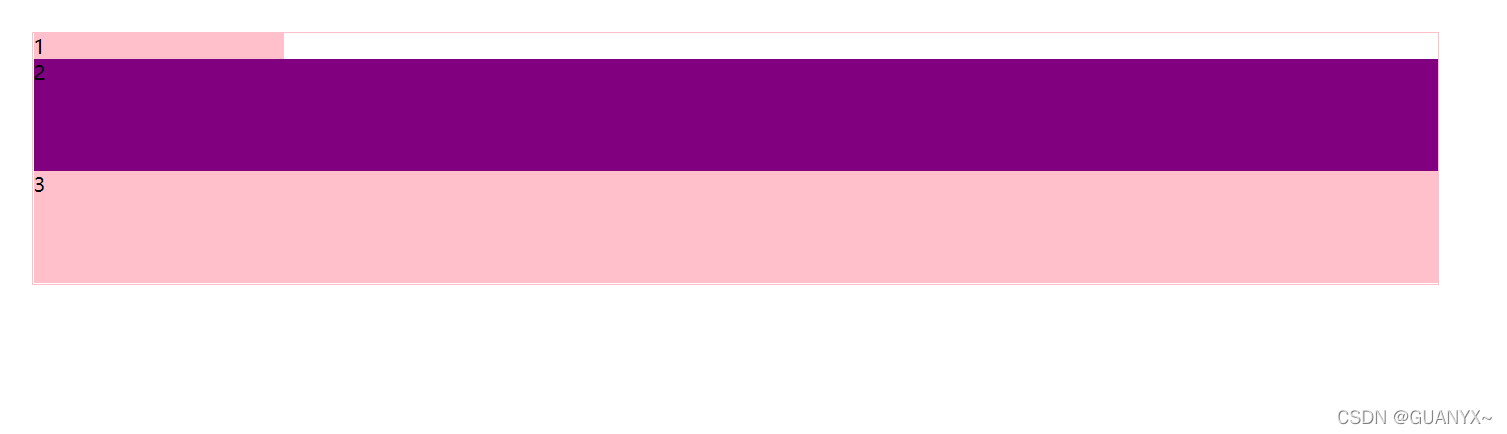
一、效果
二、代码
<!DOCTYPE html>
<html>
<head>
<meta charset="utf-8">
<title></title>
<style type="text/css">
section {
width: 80%;
height: 200px;
border: 1px solid pink;
margin: 100px auto;
display: flex;
min-width: 500px;
flex-direction: column;
}
section div:nth-child(1) {
background-color: pink;
width: 200px;
}
section div:nth-child(2) {
background-color: purple;
flex: 1;
}
section div:nth-child(3) {
background-color: pink;
flex: 1;
}
</style>
</head>
<body>
<section>
<div>1</div>
<div>2</div>
<div>3</div>
</section>
</body>
</html>


 4913
4913


 被折叠的 条评论
为什么被折叠?
被折叠的 条评论
为什么被折叠?
 到【灌水乐园】发言


