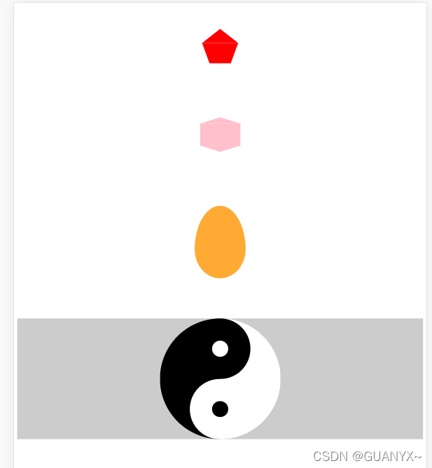
一、效果
二、代码
<!DOCTYPE html>
<html>
<head>
<meta charset="utf-8">
<title></title>
<style type="text/css">
#wubian {
margin: 100px auto;
width: 54px;
height: 0px;
border-top: 50px solid red;
border-left: 18px solid transparent;
border-right: 18px solid transparent;
position: relative;
}
#wubian::before {
content: '';
position: absolute;
height: 0px;
width: 0px;
border-bottom: 35px solid red ;
border-left: 45px solid transparent ;
border-right: 45px solid transparent ;
top: -85px;
left: -18px;
}
#liubian {
margin: 150px auto;
width: 100px;
height: 55px;
background-color: pink;
position: relative;
}
#liubian::before {
content: '';
height: 0px;
width: 0px;
border-bottom: 15px solid pink;
border-left: 50px solid transparent;
border-right: 50px solid transparent;
position: absolute;
top: -15px;
}
#liubian::after {
content: '';
height: 0px;
width: 0px;
border-top: 15px solid pink;
border-left: 50px solid transparent;
border-right: 50px solid transparent;
position: absolute;
bottom: -15px;
}
#egg {
width: 126px;
height: 180px;
background-color: #FA3;
margin: 100px auto;
border-radius: 50% 50% 50% 50% / 60% 60% 40% 40%;
}
#taiji {
background-color: #ccc;
}
#tj {
width: 300px;
height: 300px;
margin: 20px auto;
border-radius:50% ;
background-color: #fff;
border-left: 150px solid black;
box-sizing: border-box;
position: relative;
}
#tj::before {
content: '';
width: 40px;
height: 40px;
border-radius: 50%;
background-color: #fff;
position: absolute;
left: -75px;
border: 55px solid black;
}
#tj::after {
content: '';
width: 40px;
height: 40px;
border-radius: 50%;
background-color: black;
position: absolute;
left: -75px;
bottom: 0px;
border: 55px solid white;
}
</style>
</head>
<body>
<div id="wubian"></div>
<div id="liubian">
</div>
<div id="egg">
</div>
<div id="taiji">
<div id="tj">
</div>
</div>
</body>
</html>


 233
233


 被折叠的 条评论
为什么被折叠?
被折叠的 条评论
为什么被折叠?
 到【灌水乐园】发言


