


顾名思义,before,after是往某个标签前部,后部插“值”的。且这“值”可以是文字,图片,链接,border图形,图标,清除浮动after(较为常用clear属性以最老无包裹属性父类为边界)等…。且before和after必须要有个属性值content,否则他们就罢工了。此外要注意这两个家伙默认是内联元素(也称行内元素)简单描述
用法:
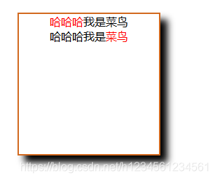
文字`
<!DOCTYPE html>
<html>
	<head>
		<meta charset="utf-8">
		<title>test_words</title>
		<style>
			*{
				margin: 0px;
				padding: 0px;
			}

			.example{
				margin: 100px auto;
				height: 200px;
				width: 200px;
				text-align: center;
				border: 2px solid chocolate;
				box-shadow: 10px 10px 10px #000000;
				}

			.test1::before{
				color: red;
				content: "哈哈哈";
			}

			.test2::after{
				color: red;
				content: "菜鸟";
			}
		</style>
	</head>
	<body>
		<div class="example">
			<div class="test1">我是菜鸟</div>
			<div class="test2">哈哈哈我是</div>
		</div>
	</body>
</html>
`截图:
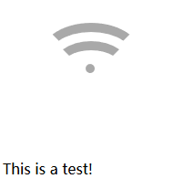
图片
<!DOCTYPE html>
<html>
	<head>
		<meta charset="utf-8">
		<title>test_image</title>
		<style>
			ul li::before{
				height: 30px;
				width: 30px;
				display:inline-block;
				content: url(img/timg.jpg);
			}
		</style>
	</head>
	<body>
		<div>
			<ul>
				<li>This is a test1!</li>
				<li>This is a test2!</li>
			</ul>
		</div>
	</body>
</html>
``
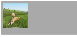
截图:

注意:其content内容尺寸不可改变(将before,after改变为块级元素也无效),为此我们可以将图片设置为background来进行尺寸控制
代码:
<!DOCTYPE html>
<html>
	<head>
		<meta charset="utf-8">
		<title>test_image</title>
		<style>
			li{
				list-style: none;
			}
			ul li::before{
				position: relative;
				top: 10px;
				height: 30px;
				width: 30px;
				content: "";
				display: inline-block;
				background: url(img/timg.jpg) no-repeat;
				background-size: 100%;
			}
		</style>
	</head>
	<body>
		<div>
			<ul>
				<li>This is a test1!</li>
				<li>This is a test2!</li>
			</ul>
		</div>
	</body>
</html>
截图:

border图形
<!DOCTYPE html>
<html>
	<head>
		<meta charset="utf-8">
		<title>test_border-shape</title>
		<style>
			.wifi{
				margin: 7% 6.75%;
				height: 10px;
				width: 10px;
			  background-color: darkgray;
				border-radius: 100%;
			}
			.wifi::before,
			.wifi::after{
				position: absolute;/* 强制改为块级元素,也可使用display来改变为块级元素 */
				content: "";
				border-width: 10px;
				border-style: solid;
				border-radius: 100%;
				border-color: darkgray transparent transparent transparent;
			}
			.wifi::before{
				top: 50px;
				left: 50px;
				height: 50px;
				width: 90px;
			}
			.wifi::after{
				top: 70px;
				left: 65px;
				height: 30px;
				width: 60px;
			}
		</style>
	</head>
	<body>
		<div class="wifi"></div><label>This is a test!</label>
	</body>
</html>
截图
在这里推荐一个border网站给大家:http://fontello.com/小图标制作案例
;https://css-tricks.com/很不错的一个前端学习网站。
attract()用法:
<!DOCTYPE html>
<html>
	<head>
		<meta charset="utf-8">
		<title>test_attr</title>
		<style>
			li{
				list-style: none;
			}
			ul li::before{
				content:attr(id);
				color: red;
			}
		</style>
	</head>
	<body>
		<div>
			<ul>
				<li id="1">This is a test1!</li>
				<li id="2">This is a test2!</li>
				<li user_id="3">This is a test3!</li><!-- 因为它的属性名不为id,所以没有出来 -->
			</ul>
		</div>
	</body>
</html>
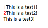
截图
未清除浮动
<!DOCTYPE html>
<html lang="en">
<head>
    <meta charset="UTF-8">
    <title>test_clearfix</title>
    <style>
        .example{
            padding: 30px;
            background: darkgray;
        }
		img{
			float: left;
			height: 100px;
			width: 100px;
			}
       .example::after{
		   clear: both;
		   content: "";
	   }
    </style>
</head>
<body>
    <div class="example">
		<img src="img/timg.jpg" />
	</div>
</body>
</html> ``
截图
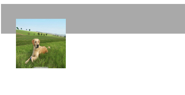
一般不含包裹属性(例如position:absolute; display:inline-block; float:left; overflow:hidden)的div内部有浮动元素的话,那么这个浮动元素会让此div的高度塌陷。
清除代码:
<!DOCTYPE html>
<html lang="en">
<head>
    <meta charset="UTF-8">
    <title>test_clearfix</title>
    <style>
        .example{
            padding: 10px;
            background: darkgray;
        }
		img{
			float: left;
			height: 100px;
			width: 100px;
			}
       .example::after{
		   clear: both;
		   content: "clear";/* 清除浮动 */
		   visibility: hidden;/* 隐藏content内容 */
		   overflow: hidden;/* 伪类部分超出隐藏 */
		   display: block; /* 改为块级元素 */
	   }
    </style>
</head>
<body>
    <div class="example">
		<img src="img/timg.jpg" />
	</div>
</body>
</html>
截图:
总的来说,伪类元素(对单标签无效)是个比较“偷懒‘的东西,挺实用的!!!


 1179
1179


 被折叠的 条评论
为什么被折叠?
被折叠的 条评论
为什么被折叠?
 到【灌水乐园】发言


