


Toolbar简介
Toolbar使应用的标准工具栏,可以说是Actionbar的升级版。和Actionbar相比,Toolbar最明显的变化是自由,方便定制。
Toolbar的使用
因为只要有Toolbar,所以需要把原本的 ActionBar 隐藏起来。在style文件设定主题
    <!-- Base application theme. -->
    <style name="AppTheme" parent="Theme.AppCompat.Light.NoActionBar">
        <!-- Customize your theme here. -->
        <item name="colorPrimary">@color/colorPrimary</item>
        <item name="colorPrimaryDark">@color/colorPrimaryDark</item>
        <item name="colorAccent">@color/colorAccent</item>
    </style>
布局文件
<?xml version="1.0" encoding="utf-8"?>
<android.support.v7.widget.Toolbar xmlns:android="http://schemas.android.com/apk/res/android"
    android:id="@+id/toolbar"
    android:background="?attr/colorPrimary"
    android:layout_width="match_parent"
    android:layout_height="wrap_content">

</android.support.v7.widget.Toolbar>
再来添加一个抽屉效果
<?xml version="1.0" encoding="utf-8"?>
<LinearLayout xmlns:android="http://schemas.android.com/apk/res/android"
    android:layout_width="match_parent"
    android:layout_height="match_parent"
    android:orientation="vertical">

    <include layout="@layout/include_toolbar"/>

    <android.support.v4.widget.DrawerLayout
        android:id="@+id/main_drawlayout"
        android:layout_width="match_parent"
        android:layout_height="match_parent">

        <!-- menu部分-->
        <FrameLayout
            android:layout_width="180dp"
            android:layout_height="match_parent"
            android:background="#72f076"
            android:layout_gravity="left"></FrameLayout>
        <!-- 内容部分-->
        <FrameLayout
            android:layout_width="180dp"
            android:layout_height="match_parent"
            android:background="#6a706a"></FrameLayout>
    </android.support.v4.widget.DrawerLayout>

</LinearLayout>
然后在我们的Activity中初始化即可:
Toolbar toolbar = (Toolbar) findViewById(R.id.toolbar);
        setSupportActionBar(toolbar);
Toolbar toolbar = (Toolbar) findViewById(R.id.toolbar);
setSupportActionBar(toolbar);
DrawerLayout drawerLayout = (DrawerLayout) findViewById(R.id.main_drawlayout);
ActionBarDrawerToggle toggle = new ActionBarDrawerToggle(this,drawerLayout,toolbar,R.string.open,R.string.close);
drawerLayout.setDrawerListener(toggle);
//同步状态
toggle.syncState();
让我们来瞅瞅效果
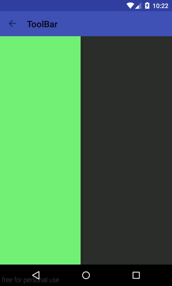
等等,这丑暴了的标题颜色是怎么回事(背景颜色请无视。。)
我们来修改下修改Toolbar文字颜色和修改Toolbar popup menu样式
在AppBase中添加一行代码
    <!-- Base application theme. -->
    <style name="AppTheme" parent="Theme.AppCompat.Light.NoActionBar">
        <!-- Customize your theme here. -->
        <item name="colorPrimary">@color/colorPrimary</item>
        <item name="colorPrimaryDark">@color/colorPrimaryDark</item>
        <item name="colorAccent">@color/colorAccent</item>
        <item name="android:textColorPrimary">@android:color/white</item>
    </style>
再添加一个菜单样式
    <!-- toolbar菜单样式 -->
    <style name="ToolbarTheme" parent="@style/ThemeOverlay.AppCompat.ActionBar">
        <item name="actionMenuTextColor">@android:color/white</item>
    </style>
给toolbar即可
app:theme="@style/ToolbarTheme"更多资料:
Android Toolbar样式定制详解


 1691
1691


 被折叠的 条评论
为什么被折叠?
被折叠的 条评论
为什么被折叠?
 到【灌水乐园】发言


