


实现元素垂直居中的方式
1.将line-height设置为和height一样的值即可(只适用于单行文本)
line-height:100px;
height:100px;
<style>
.box1{
width: 100px;
height: 100px;
line-height: 100px;
background-color: yellowgreen;
position: absolute;
}
</style>
</head>
<body>
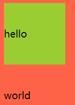
<div class="box1">
hello<br>
world
</div>
</body>
</html>
实现效果:只有第一行的文字才能实现垂直居中
2.将父元素的display设置为table-cell,同时vertical-align设置为middle
//父元素
display:table-cel;//将元素设置为单元格
vertical-align:middle;
   <style>
        .outer{
            width: 300px;
            height: 300px;
            background-color: tomato;
            display: table-cell;
            vertical-align: middle;
        }
        .box1{
            width: 100px;
            height: 100px;
            background-color: yellowgreen;
        }
    </style>
</head>
<body>
<div class="outer">
    <div class="box1">
    </div>
</div>
</body>
</html>
实现的效果:

3.子元素使用绝对定位方式, 以及height:固定值;top:0;bottom:0;margin: auto 0;父元素开启定位
// 子元素
height:100px
top:0;
bottom:0;
margin: auto 0;
position:absolute;
//父元素
position:relative;
<style>
        .outer{
            width: 300px;
            height: 300px;
            background-color: tomato;
            position: relative;
        }
        .box1{
            width: 100px;
            height: 100px;
            top: 0;
            bottom:0;
            margin:auto 0;
            position: absolute;
            background-color: yellowgreen;
        }
    </style>
</head>
<body>
<div class="outer">
    <div class="box1">
    </div>
</div>
</body>
</html>
实现效果同上。
4.子元素开启决定定位, top:50%,transform:translateY(-50%),父元素开启定位
// 子元素
position:absolute;
top:50%;
transform:translateY(-50%);
//父元素
position:relative;
<style>
        .outer{
            width: 300px;
            height: 300px;
            background-color: tomato;
            position: relative;
        }
        .box1{
            width: 100px;
            height: 100px;
            background-color: yellowgreen;
            position:absolute;
            top: 50%;
            transform: translateY(-50%);
        }
    </style>
</head>
<body>
<div class="outer">
    <div class="box1">
    </div>
</div>
</body>
</html>
实现效果同上。
5.父元素开启flex 并设置align-items:center;
//父元素
display:flex;
align-items:center;
<style>
        .outer{
            width: 300px;
            height: 300px;
            background-color: tomato;
            display: flex;
            align-items: center;
        }
        .box1{
            width: 100px;
            height: 100px;
            background-color: yellowgreen;

        }
    </style>
</head>
<body>
<div class="outer">
    <div class="box1">
    </div>
</div>
</body>
</html>
实现效果同上。
实现元素水平居中的方式
1.设置父元素的text-align为center(只对文本有效)
// 父元素
text-align:center;
//
<style>
        .outer{
            width: 300px;
            height: 300px;
            background-color: tomato;
            text-align: center;
        }
        .box1{
            width: 100px;
            height: 100px;
            background-color: yellowgreen;
        }
    </style>
</head>
<body>
<div class="outer">
    <div class="box1">
        hello<br>
        world
    </div>
</div>
</body>
</html>
实现的效果:只有文本实现了居中的效果

2.子元素宽度为固定值,margin:auto 0;
//子元素
width:100px;
marigin:auto 0;
<style>
        .outer{
            width: 300px;
            height: 300px;
            background-color: tomato;
        }
        .box1{
            width: 100px;
            height: 100px;
            background-color: yellowgreen;
            margin: 0 auto;
        }
    </style>
</head>
<body>
<div class="outer">
    <div class="box1">
    </div>
</div>
</body>
</html>
实现效果:

3.子元素使用绝对定位方式, 以及width:固定;left:0;right:0;margin:0 auto;父元素开启定位
// 子元素
width: 100px;
left:0;
right:0;
margin: 0 auto;
position:absolute;
//父元素
position:relative;
 <style>
        .outer{
            width: 300px;
            height: 300px;
            background-color: tomato;
            position: relative;
        }
        .box1{
            width: 100px;
            height: 100px;
            background-color: yellowgreen;
            position: absolute;
            left: 0;
            right: 0;
            margin: 0 auto;

        }
    </style>
</head>
<body>
<div class="outer">
    <div class="box1">
    </div>
</div>
</body>
</html>
实现效果同上。
4.子元素开启定位,left:50%,transform:translateX(-50%)
// 子元素
position:absolute;
left:50%;
transform:translateX(-50%);
//父元素
position:relative;
<style>
        .outer{
            width: 300px;
            height: 300px;
            background-color: tomato;
            position: relative;
        }
        .box1{
            width: 100px;
            height: 100px;
            background-color: yellowgreen;
            position: absolute;
            left: 50%;
            transform: translateX(-50%);
        }
    </style>
</head>
<body>
<div class="outer">
    <div class="box1">
    </div>
</div>
</body>
</html>
实现效果同上。
5.父元素开启flex 并设置justify-content:center;
// 父元素
display:flex;
justify-content:center;
<style>
        .outer{
            width: 300px;
            height: 300px;
            background-color: tomato;
            display: flex;
            justify-content: center;
        }
        .box1{
            width: 100px;
            height: 100px;
            background-color: yellowgreen;
        }
    </style>
</head>
<body>
<div class="outer">
    <div class="box1">
    </div>
</div>
</body>
</html>
实现效果同上。


 1863
1863


 被折叠的 条评论
为什么被折叠?
被折叠的 条评论
为什么被折叠?
 到【灌水乐园】发言


