


<!DOCTYPE html>
<html lang="en">

<head>
    <meta charset="UTF-8">
    <!-- 视口设置 -->
    <meta name="viewport" content="width=device-width, initial-scale=1.0">
    <title>京东移动端</title>
    <link rel="stylesheet" href="./mycss/jd-index.css">
</head>

<body>
    <div class="jd-container">
        <!-- 京东搜索框 -->
        <div class="jd-header">
            <!-- 搜索框 100% 自适应 -->
            <div class="header-inner">
                <!-- 搜索框盒子 -->
                <div class="search-bar">
                    <form action="#">
                        <input type="text" placeholder="牛奶">
                    </form>
                </div>
                <!-- 京东图标 -->
                <div class="search-bar-img">
                    <img src="./img/2.png" alt="">
                </div>
                <span>|</span>
                <!-- 放大镜图标 -->
                <div class="fdj"></div>
            </div>
            <!-- 菜单按钮 -->
            <div class="menu">
                <span class="sprites_menu"></span>
            </div>
            <!-- 登录按钮 -->
            <div class="login-box">
                <span>登录</span>
            </div>
        </div>
        <!-- 轮播图 -->
        <div class="box">
            <!-- 相框 -->
            <div class="picbox">
                <!-- 相片条 -->
                <ul>
                    <li>
                        <a href="#"><img src="./img/4.jpg" alt=""></a>
                        <a href="#"><img src="./img/4.jpg" alt=""></a>
                        <a href="#"><img src="./img/4.jpg" alt=""></a>
                        <a href="#"><img src="./img/4.jpg" alt=""></a>
                        <a href="#"><img src="./img/4.jpg" alt=""></a>
                    </li>
                </ul>
                <div class="circle">
                    <div class="item"></div>
                    <div class="item"></div>
                    <div class="item"></div>
                    <div class="item"></div>
                    <div class="item"></div>
                    <div class="item"></div>
                    <div class="item"></div>
                </div>
            </div>
        </div>
        <!-- 白色模块 -->
        <div class="box1">
            <ul>
                <li><a href="#"><img src="./img/a.png" alt=""><span>京东超市</span></a></li>
                <li><a href="#"><img src="./img/b.png" alt=""><span>数码电器</span></a></li>
                <li><a href="#"><img src="./img/c.png" alt=""><span>京东服饰</span></a></li>
                <li><a href="#"><img src="./img/d.png" alt=""><span>京东生鲜</span></a></li>
                <li><a href="#"><img src="./img/e.png" alt=""><span>京东到家</span></a></li>
                <li><a href="#"><img src="./img/f.png" alt=""><span>充值缴费</span></a></li>
                <li><a href="#"><img src="./img/g.png" alt=""><span>9.9元拼</span></a></li>
                <li><a href="#"><img src="./img/h.png" alt=""><span>领券</span></a></li>
                <li><a href="#"><img src="./img/i.png" alt=""><span>赚钱</span></a></li>
                <li><a href="#"><img src="./img/k.png" alt=""><span>会员</span></a></li>
            </ul>
        </div>
</body>

</html>
样式如下,用less写的
@import "jd-commom.less";
.jd-container {
    width: 100%;
    max-width: 640px;
    margin: 0px auto;
    height: auto;
}
// 流式布局 宽度+最大最小宽度
// 头部样式开始
.jd-header {
    position: fixed;
    top: 0;
    left: 0;
    width: 100%;
    min-width: 320px;
    max-width: 640px;
    height: 44px;
    background-color: transparent;
    .header-inner {
        width: 100%;
        height: 44px;
        padding: 7px 40px ;
        .search-bar {
            width: 100%;
            border-radius: 20px;
            height: 30px;
            overflow: hidden;
            form {
                input {
                    width: 100%;
                    height: 30px;
                    padding-left: 70px;
                }
            }
        }
        .search-bar-img {
            position: absolute;
            top: 14px;
            left: 50px;
            img {
                width: 20px;
                height: 15px;
            }
        }
        span {
            position: absolute;
            top: 13px;
            left: 75px;
            color: #e0e0e0;
        }
        .fdj {
            position: absolute;
            top: 14px;
            left: 85px;
            width: 17px;
            height: 15px;
            background: url(../img/3.png) no-repeat;
            // 精灵图的距离减小一半
            background-position: -122px 0px;
            // 整张精灵图的大小缩小一倍
            background-size: 200px 200px;
        }
    }
    .menu {
        position: absolute;
        left: 0;
        top: 0;
        width: 40px;
        height: 44px;
        .sprites_menu {
            display: inline-block;
            width: 20px;
            height: 16px;
            background: url(../img/1.png) no-repeat;
            // 原尺寸 40px*32px 一半 20*16px
            background-size: 20px 16px;
            margin: 14px 0px 0px 10px;
        }
    }
    .login-box {
        position: absolute;
        right: 0;
        top: 0;
        width: 40px;
        height: 44px;
        font-size: 14px;
        color: #fff;
        line-height: 44px;
        text-align: center;
    }
}
// 头部样式结束
// 轮播图开始
.picbox {
    // 设置隐藏是为了不让他平铺
    overflow: hidden;
    width: 100%;
    height: 200px;
    ul {
        li {
            a {
                img {
                    width: 100%;
                    height:200px;
                }
            }
        }
    }
    .circle {
        position: absolute;
        top: 150px;
        left: 105px;
        width: 50%;
        height: 50px;
        text-align: center;
        line-height: 50px;
        .item {
            display: inline-block;
            background-color: transparent;
            width: 8px;
            height: 8px;
            border: 1px solid #fff;
            border-radius: 50%;
            margin-right: 6px;
        }
    }
}
// 轮播图结束

// 白色模块
.box1 {
    width: 100%;
    height: 185px;
    position: absolute;
    top: 190px;
    background-color: #fff;
    border-top-left-radius: 10px;
    border-top-right-radius: 10px;
    ul {
        width: 100%;
        display: flex;
        flex-direction: row;
        flex-wrap: wrap;

        li {
            width: 20%;
            // border: 1px solid red;
            margin-top: 15px;

            a {
                display: flex;
                flex-direction: column;
                align-items: center;
                justify-content: center;
                img {
                    width: 46px;
                    height: 46px;
                    margin-bottom: 5px;
                }
                span {
                    color: #898989;
                }
            }

        }
    }
}
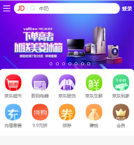
效果图片,感觉less比css简单,代码量少,布局采用的弹性布局


 3548
3548


 被折叠的 条评论
为什么被折叠?
被折叠的 条评论
为什么被折叠?
 到【灌水乐园】发言


