


使用CSS很容易创建透明的图像。
注意:CSS Opacity属性是W3C的CSS3建议的一部分。
实例1 - 创建一个透明图像
CSS3中属性的透明度是 opacity.
img
{
opacity:0.4;
filter:alpha(opacity=40); /* For IE8 and earlier */
}
IE9,Firefox,Chrome,Opera,和Safari浏览器使用透明度属性可以将图像变的不透明。 Opacity属性值从0.0 - 1.0。值越小,使得元素更加透明。
IE8和早期版本使用滤镜:alpha(opacity= x)。 x可以采取的值是从0 - 100。较低的值,使得元素更加透明
实例2 - 图像的透明度 - 悬停效果
img
{
opacity:0.4;
filter:alpha(opacity=40); /* For IE8 and earlier */
}
img:hover
{
opacity:1.0;
filter:alpha(opacity=100); /* For IE8 and earlier */
}
第一个CSS块是和例1中的代码类似。此外,我们还增加了当用户将鼠标悬停在其中一个图像上时发生什么。在这种情况下,当用户将鼠标悬停在图像上时,我们希望图片是清晰的。
此CSS是:opacity=1.
IE8和更早版本使用: filter:alpha(opacity=100).
当鼠标指针远离图像时,图像将重新具有透明度。
实例3 - 透明的盒子中的文字
<html>
<head>
<style>
div.background
{
width:500px;
height:250px;
background:url(klematis.jpg) repeat;
border:2px solid black;
}
div.transbox
{
width:400px;
height:180px;
margin:30px 50px;
background-color:#ffffff;
border:1px solid black;
opacity:0.6;
filter:alpha(opacity=60); /* For IE8 and earlier */
}
div.transbox p
{
margin:30px 40px;
font-weight:bold;
color:#000000;
}
</style>
</head>
<body>
<div class="background">
<div class="transbox">
<p>This is some text that is placed in the transparent box.
This is some text that is placed in the transparent box.
This is some text that is placed in the transparent box.
This is some text that is placed in the transparent box.
This is some text that is placed in the transparent box.
</p>
</div>
</div>
</body>
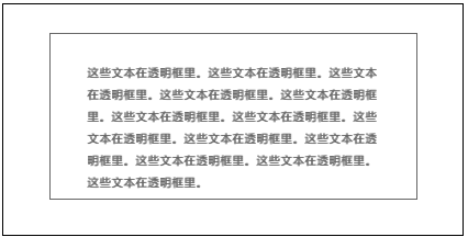
</html>首先,我们创建一个固定的高度和宽度的div元素,带有一个背景图片和边框。然后我们在第一个div内部创建一个较小的div元素。 这个div也有一个固定的宽度,背景颜色,边框 - 而且它是透明的。透明的div里面,我们在P元素内部添加一些文本。


 被折叠的 条评论
为什么被折叠?
被折叠的 条评论
为什么被折叠?
 到【灌水乐园】发言


