


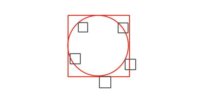
效果图:

完整代码(复制粘贴即可):
<template>
  <div class="about-view">
    <ul class="items">
      <li class="item" :style="`background:${item.bgColor};left:${item.rotLeft};top:${item.rotTop}`" v-for="item in arr" :key="item.id"></li>
    </ul>
  </div>
</template>

<script>
export default {
  data() {
    return {
      arr: [
        { itemname: "防守1", id: 1 ,bgColor:"#111111"},
        { itemname: "防守2", id: 2 ,bgColor:"#222222"},
        { itemname: "防守3", id: 3 ,bgColor:"#333333"},
        { itemname: "防守4", id: 4 ,bgColor:"#444444"},
        { itemname: "防守5", id: 5 ,bgColor:"#555555"},
      ],
    };
  },
  created() {
    let angle=360/this.arr.length
    let radian=angle*Math.PI/180
    this.arr.forEach((item, index) => {
      this.$set(item, "rotLeft", (Math.sin((radian*index))*250+150).toFixed(0)+"px");
      this.$set(item, "rotTop", (Math.cos((radian*index))*250+150).toFixed(0)+"px");
    });
    console.log(this.arr)
  },
};
</script>

<style lang="scss">
.about-view {
  height: 100%;
  width: 100%;
  .items {
    background-color: cadetblue;
    height: 500px;
    width: 500px;
    margin: 200px;
    border-radius: 50%;
    position: relative;
    .item {
      height: 200px;
      width: 200px;
      position: absolute;
      list-style: none;
    }
  }
}
</style>
解释一下(解释的很细,不我这么笨的都可以不用看,呜呜):
首先回想一下3个初中(不是初中就是高中)学过的数学公式:
1、求1个元素所占的角度: 360÷元素个数
2、根据角度求弧度: 角度×π÷180
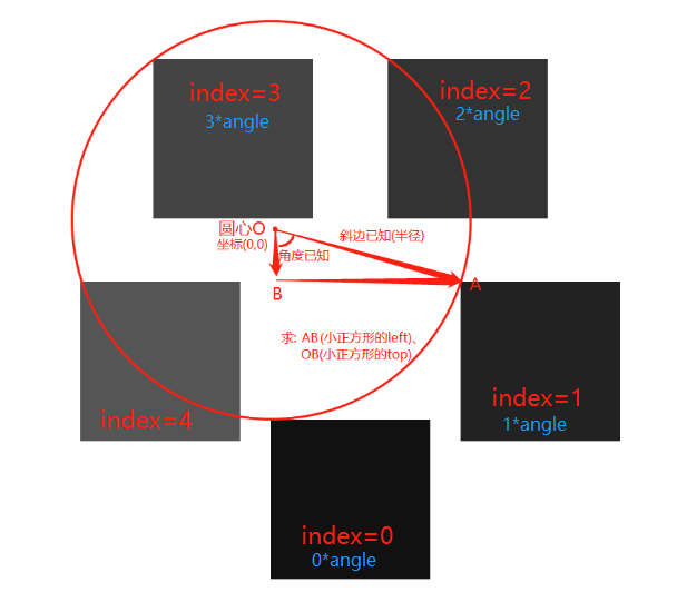
3、根据弧度求坐标 : y=y0+rsin弧度 x=x0+rcos弧度
公式1:获取1个元素所占的角度

公式2:获取1个元素所占角度的弧度

公式3:根据角度和弧度获取两个直角边的长度
因为每个元素的角度不同,所以乘index, radian*index ====> angle*index*Math.PI/180
下面代码没有像公式中一样在乘250之后加上x0和y0,是因为我们的圆心坐标就是(0,0) 加了等于没加
this.arr.forEach((item, index) => {
      this.$set(item, "rotLeft", (Math.sin((radian*index))*250).toFixed(0)+"px");
      this.$set(item, "rotTop", (Math.cos((radian*index))*250).toFixed(0)+"px");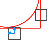
});看这个图就懂了,上方公式3中的y就是图中OB的长度,x就是图中OA的长度,求出x和y也就有了小矩形左上角的相对于圆心O的left和top值(不知道为啥绝对定位时top和left是左上角的位置请留言)
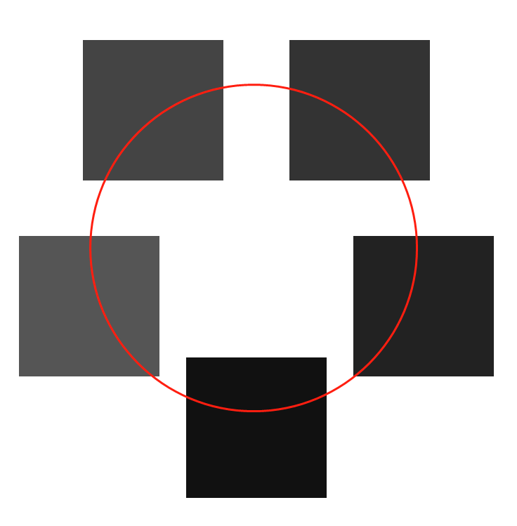
这个时候问题来了,有人问"你这很明显就偏了 应该让小矩形骑在线上啊"
我知道,你说的是这样 ↓
但我上边提到了左上角,你看一下那个图是不是所有的小矩形左上角都已经在在圆线上了
如下图 要知道一个当我们说一个矩形的xy坐标时
默认最左上角也就是P才是那个起始点(0,0)
而不是q
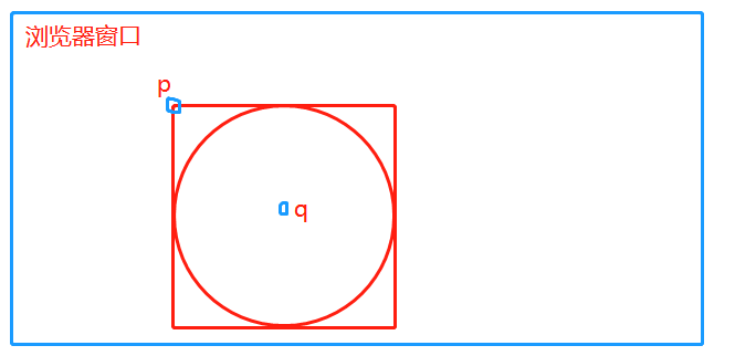
所以经过上述一系列操作后 你得到的样式↓,而你想要的是小矩形的中心穿过红线
你想要的样式 圆点在q 而实际默认圆点在p
所以q的坐标才应该是公式3中的x0和y0 而不是p(0,0)
q的坐标不就是大圆的这个元素的(宽度/2,高度/2)吗 (圆盒子的宽度肯定等于高度。。。)
这时你知道了 应该在sin弧度*250之后+250, cos弧度*250之后+250
this.arr.forEach((item, index) => {
this.$set(item, "rotLeft", (Math.sin((radian*index))*250+250).toFixed(0)+"px");
this.$set(item, "rotTop", (Math.cos((radian*index))*250+250).toFixed(0)+"px");
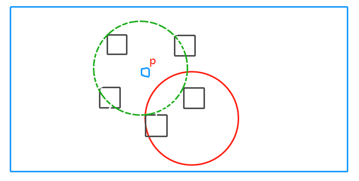
});这时你得到下图 可是小矩形形仍旧没有骑在圆线上,
你意识到top加多了 left也加多了
top应该再减掉小正方形的高度的一半
left应该再减掉小正方形的宽度的一半
所以最终我们
在sin弧度*250之后加的 是(大圆宽度/2-小矩形宽度/2)==>(大圆宽度-小矩形宽度)/2
在cos弧度*250之后加的 是(大圆高度/2-小矩形高度/2)==>(大圆高度-小矩形高度)/2
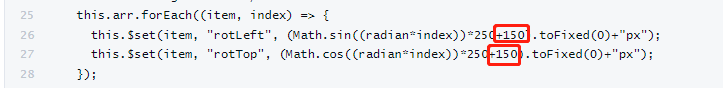
所以这就是完整代码中我为加150的原因


 3604
3604


 被折叠的 条评论
为什么被折叠?
被折叠的 条评论
为什么被折叠?
 到【灌水乐园】发言


