


<button>确定</button>
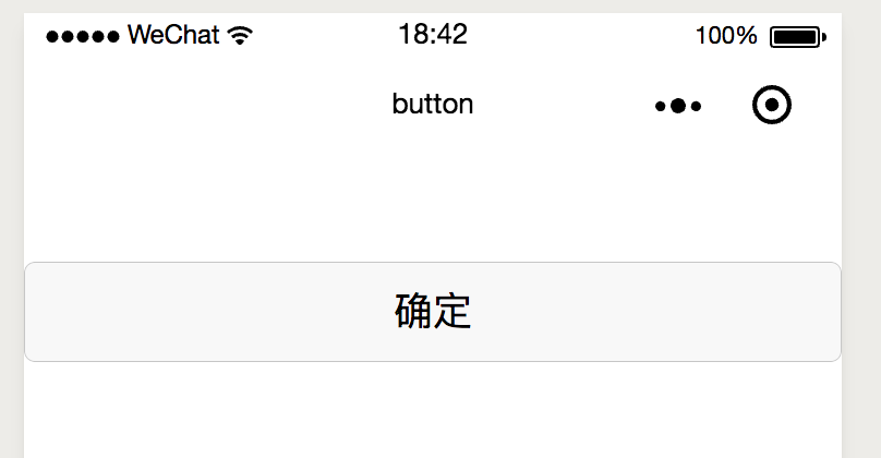
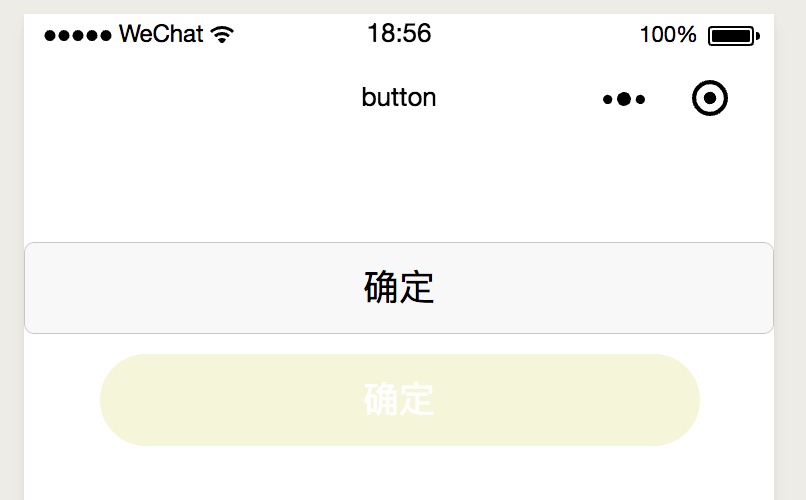
此时,各项值均为默认值,效果如下:有边框以及圆角
设置其css如下:背景颜色background-color文字颜色color,设置type为primary是背景色为微信绿,无法设置背景颜色
.btn1 {
  width: 80%;
  margin-top: 20rpx;
  background-color: beige;
  color: white;
}
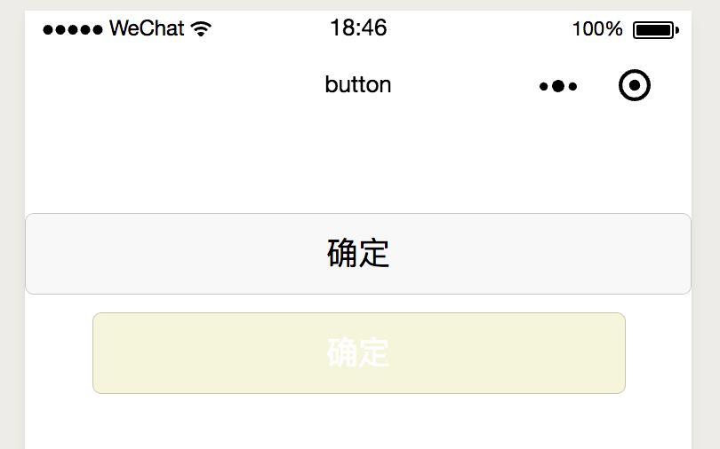
修改圆角:
.btn1 {
  width: 80%;
  margin-top: 20rpx;
  background-color: beige;
  color: white;
  border-radius: 98rpx;
}
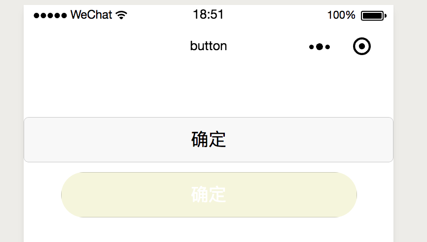
效果并不好,此时增加
.btn1::after {
  border-radius: 98rpx;
}
效果图如下:
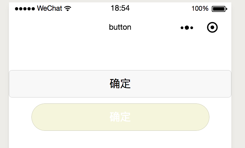
如果需要取消边框,在::after中增加border: 0;
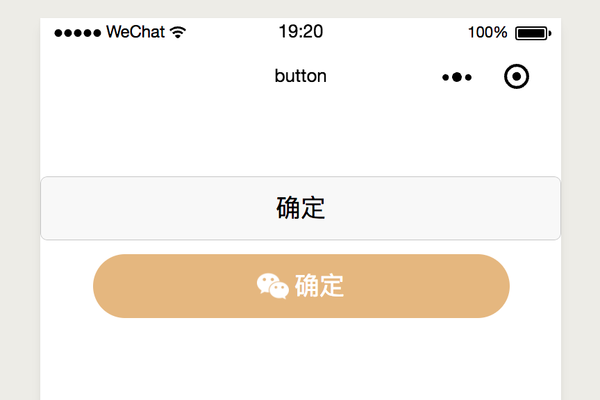
这样子的button是达不到UI的要求的,我们还需要添加图片,开始直接在button里面加了张图片,可是就是对不齐
 <button class='btn1' open-type='openSetting'>
    <image class='btnImg' src='../../images/wechat.png'></image>
    <view>确定</view>
 </button>
.btn1 {
  width: 80%;
  margin-top: 20rpx;
  background-color: burlywood;
  color: white;
  border-radius: 98rpx;
  display: flex;
  flex-direction: row;
  align-items: center;
  justify-content: center;
}

.btnImg {
  margin-right: 8rpx;
  width: 46rpx;
  height: 46rpx;
}

.btn1::after {
  border-radius: 98rpx;
  border: 0;
}
效果图如下:
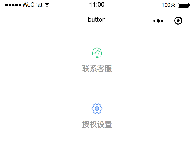
还有上图下字效果:
 <button class='btn1' open-type='contact'>
    <image class='btnImg' src='../../images/客服.png'></image>
    <view>联系客服</view>
 </button>

  <button class='btn2' open-type='openSetting'>
    <image class='btnImg' src='../../images/设置.png'></image>
    <view>授权设置</view>
 </button>
.btn1{
  width: 200rpx;
  height: 200rpx;
  margin-top: 20rpx;
  background-color: white;
  color: #999999;
  border-radius: 0rpx;
  display: flex;
  flex-direction: column;
  align-items: center;
  justify-content: center;
  font-size: 30rpx;
}

.btnImg {
  width: 50rpx;
  height: 50rpx;
}

.btn1::after {
  border: 0;
}

 .btn2 {
       width: 200rpx;
  height: 200rpx;
  margin-top: 20rpx;
  background-color: white;
  color: #999999;
  border-radius: 0rpx;
  display: flex;
  flex-direction: column;
  align-items: center;
  justify-content: center;
  font-size: 30rpx;
 }

 .btn2::after {
  border: 0;
}
效果图如下:
点击高亮状态
    //设置none则无高亮状态
    hover-class="none"
    //可以绑定一个class,到css中设置高亮样式
禁止点击状态
disable="true"
此时按钮状态由系统决定,无法改变,但是有时我们又需要自定义,所以
<button class='{{canSubmit ? "submit": "submitDis"}}' hover-class="none">确定</button>
根据是否可点击状态分别绑定不同的class,最后在点击事件回调中中判断,如果是禁止点击的则直接return
同时,hover-class也可以绑定为一个样式和一个"none",在可点击时,有点击效果,这样比较好的模拟了disable状态,又自定义了效果。


 2194
2194


 被折叠的 条评论
为什么被折叠?
被折叠的 条评论
为什么被折叠?
 到【灌水乐园】发言


