


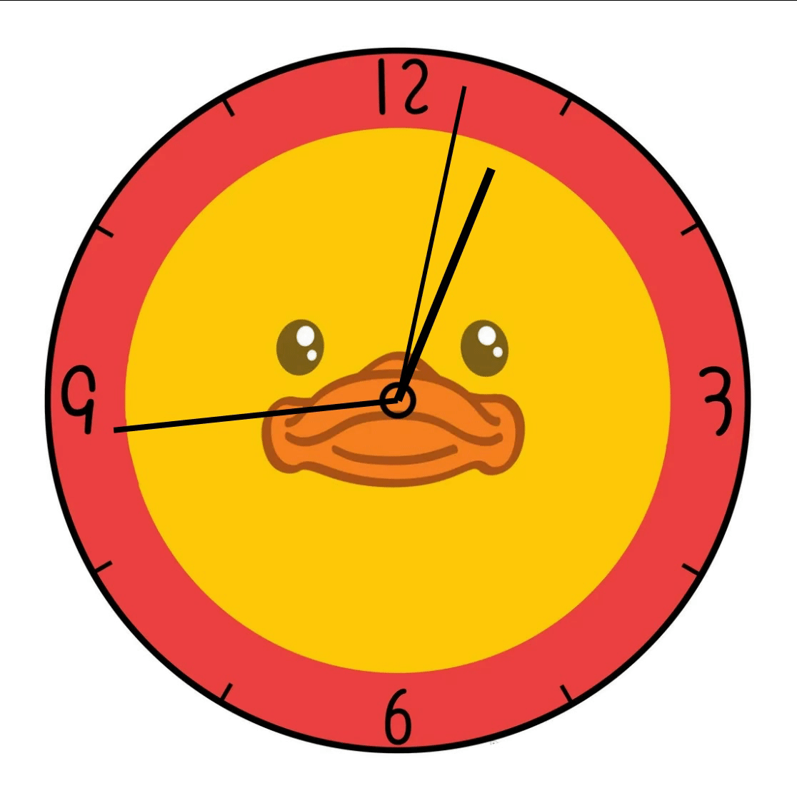
1、效果展示
2、HTML结构
<body>
<!-- 创建表的容器 -->
<div class="clock">
<!-- 创建时针 -->
<div class="hour_Wraps">
<div class="hour"></div>
</div>
<!-- 创建秒 -->
<div class="min_Wraps">
<div class="min"></div>
</div>
<!-- 创建秒 -->
<div class="sec_Wraps">
<div class="sec"></div>
</div>
</div>
</body>
3、CSS样式编写
<style>
* {
margin: 0;
padding: 0;
}
/* 设置表的样式 */
.clock {
width: 500px;
height: 500px;
background-image: url(./img/1.jpg);
background-size: cover;
margin: 0 auto;
margin-top: 100px;
border-radius: 50%;
position: relative;
}
.clock>div{
position: absolute;
left: 0;
right: 0;
top: 0;
bottom: 0;
margin: auto;
}
/* 设置时针 */
.hour_Wraps{
height: 70%;
width: 70%;
animation: run 43200s linear infinite;
}
.hour{
height: 50%;
width: 6px;
background-color: black;
margin: 0 auto;
}
/* 设置分针 */
.min_Wraps{
height: 80%;
width: 80%;
animation: run 3600s steps(60) infinite;
}
.min{
height: 50%;
width: 4px;
background-color: black;
margin: 0 auto;
}
/* 设置秒针 */
.sec_Wraps {
height: 90%;
width: 90%;
animation: run 60s steps(60) infinite;
}
.sec {
height: 50%;
width: 3px;
background-color: black;
margin: 0 auto;
}
/* 设置关键帧 */
@keyframes run {
from {
transform: rotateZ(0);
}
to {
transform: rotateZ(360deg);
}
}
</style>


 317
317


 被折叠的 条评论
为什么被折叠?
被折叠的 条评论
为什么被折叠?
 到【灌水乐园】发言


