


动画下划线
- 要点:用
::after、::before、calc(100% + 40px)、animation - 在线预览https://codepen.io/
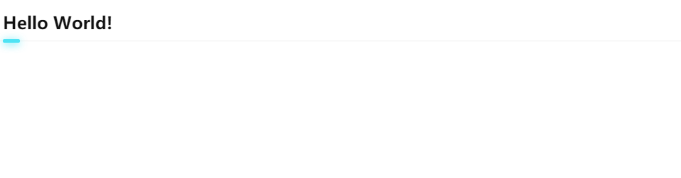
具体实现:
    <h2>基础内容</h2>
    /* 分割线与hover */
    h2 {
      font-size: 1.5em;
      position: relative;
      padding-bottom: 10px;
      color: #111;
      margin: 20px 0;
    }
    h2::before {
      content: "";
      width: calc(100% + 40px);
      border-bottom: 1px solid #eee;
      position: absolute;
      bottom: -1px;
      left: -20px;
    }
    h2::after {
      transition: all .35s;
      content: "";
      position: absolute;
      background: rgba(48,223,243,0.85);
      width: 1em;
      height: 5px;
      bottom: -3px;
      left: 0;
      border-radius: 6px;
      box-shadow: 0 2px 12px rgba(43,223,243,0.85);
    }
    h2:hover::after {
      width: 100vw;
    }
分割线
- 要点:设置
div为display:flex,用::before和::after设置伪元素flex:1自动撑开两边 - 在线预览https://codepen.io/

具体实现:
<h3>前端</h3>
  h3 {
    display: flex;
    align-items: center;
    font-size: 18px;
    color: #999;
  }
  h3::before,h3::after{
    content: '';
    flex: 1;
    height: 1px;
    background: #ccc;
  }
  h3::before{
      margin-right: 10px;
  }
  h3::after{
      margin-left: 10px;
  }
提示框三角形
- 要点:主要是用
border结合::after和::before画出 - 在线预览https://codepen.io/
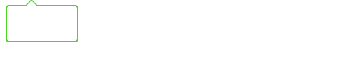
<div class="triangle"></div>
 .triangle {
    position: relative;
    width: 100px;
    height: 50px;
    border: 2px solid #4ed621;
    border-radius: 5px;
}

.triangle:before {
    position: absolute;
    content: "";
    top: -10px;
    left: 25px;
    border-left: 10px solid transparent;
    border-right: 10px solid transparent;
    border-bottom: 10px solid #4ed621;
}
.triangle:after {
    position: absolute;
    content: "";
    top: -8px;
    left: 25px;
    border-left: 10px solid transparent;
    border-right: 10px solid transparent;
    border-bottom: 10px solid #fff;
}


 3325
3325


 被折叠的 条评论
为什么被折叠?
被折叠的 条评论
为什么被折叠?
 到【灌水乐园】发言


