


用matplotlib画图
1.绘制折线图
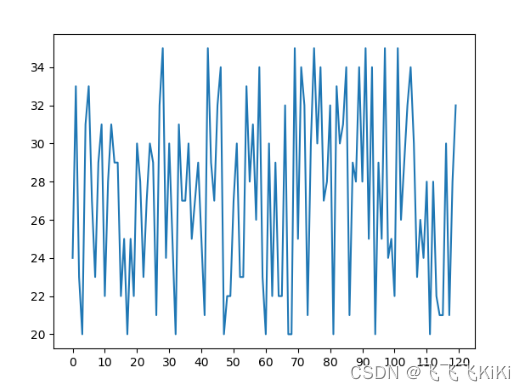
import random
from matplotlib import pyplot as plt
x = range(120)
y = [random.randint(20,35) for i in range(120)
plt.plot(x,y)
plt.show()
更换图片质量
plt.figure(figsize=(20,8),dpi=80)
更换横纵坐标
plt.xticks(range(0,121,10))
保存
plt.savefig("fig1.png")
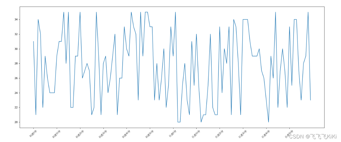
横坐标字符串形式
由于matpotlib不支持中文格式,会导致乱码问题,采用系统自带的字体。
my_font = font_manager.FontProperties(fname="C:/Windows/Fonts/STSONG.TTF")
#更换横纵坐标
_x = list(x)[::10]
_xtick_lables = ["10点{}分".format(i) for i in range(60)]
_xtick_lables += ["11点{}分".format(i) for i in range(60)]
plt.xticks(_x,_xtick_lables[::10],rotation=45,fontproperties=my_font) #斜着字体,步长为10
添加描述信息
#添加描述信息
plt.xlabel("时间",fontproperties=my_font)
plt.ylabel("温度 单位('C)",fontproperties=my_font)
绘制网格
#绘制网格
plt.grid()
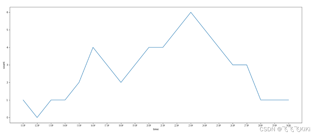
一个小例子
from matplotlib import pyplot as plt, font_manager
my_font = font_manager.FontProperties(fname="C:/Windows/Fonts/STSONG.TTF")
x = range(11,31)
y = [1,0,1,1,2,4,3,2,3,4,4,5,6,5,4,3,3,1,1,1]
plt.figure(figsize=(20,8),dpi=80)
_xlables = ["{}岁".format(i) for i in range(11,31)]
plt.xticks(list(x),_xlables,fontproperties=my_font)
plt.xlabel("time")
plt.ylabel("count")
plt.plot(x,y)
plt.show()
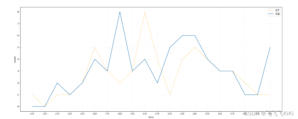
添加图例
plt.legend(prop=my_font)
from matplotlib import pyplot as plt, font_manager

my_font = font_manager.FontProperties(fname="C:/Windows/Fonts/STSONG.TTF")
x = range(11,31)
y1 = [1,0,1,1,2,5,3,2,3,8,4,1,4,5,4,3,3,2,1,1]
y2 = [0,0,2,1,2,4,3,8,3,4,2,5,6,6,4,3,3,1,1,5]
plt.figure(figsize=(20,8),dpi=80)
#绘制网格
plt.grid(alpha=0.1)
plt.plot(x,y1,label="自己",color="orange",linestyle=":")
plt.plot(x,y2,label="同桌")
#添加图例
plt.legend(prop=my_font)
_xlables = ["{}岁".format(i) for i in range(11,31)]
plt.xticks(list(x),_xlables,fontproperties=my_font)
plt.xlabel("time")
plt.ylabel("count")
plt.show()
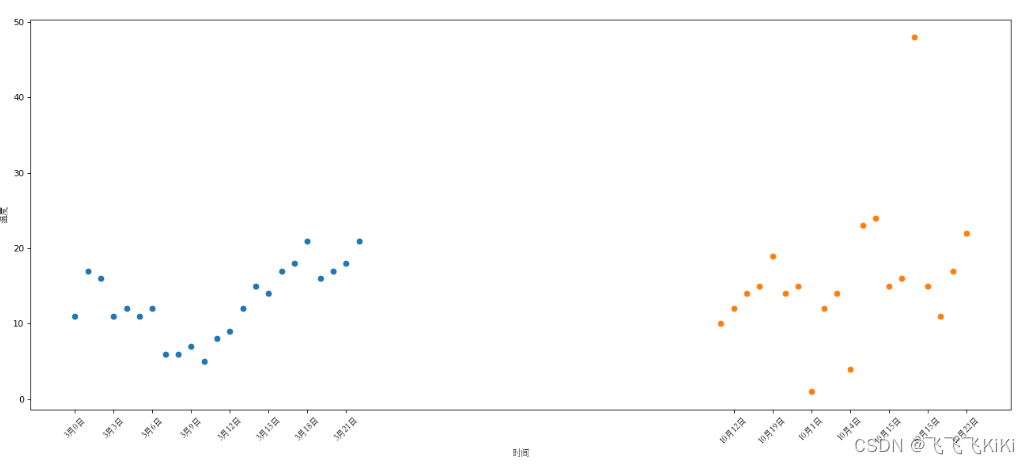
2.绘制散点图
主要变化为scatter()这个函数
from matplotlib import pyplot as plt
from matplotlib import font_manager
my_font = font_manager.FontProperties(fname="C:/Windows/Fonts/STSONG.TTF")
y_3 = [11,17,16,11,12,11,12,6,6,7,5,8,9,12,15,14,17,18,21,16,17,18,21]
y_10 = [10,12,14,15,19,14,15,1,12,14,4,23,24,15,16,48,15,11,17,22]
x = range(0,23)
x2 = range(50,70)
plt.figure(figsize=(20,8),dpi=80)
plt.scatter(x,y_3)
plt.scatter(x2,y_10)
#调整x轴的刻度
_x = list(x)+list(x2)
_xlabels = ["3月{}日".format(i) for i in x]
_xlabels += ["10月{}日".format(j) for j in y_10]
plt.xticks(_x[::3],_xlabels[::3],fontproperties=my_font,rotation=45)
#添加描述信息
plt.ylabel("温度",fontproperties=my_font)
plt.xlabel("时间",fontproperties=my_font)
plt.show()
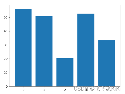
3.绘制条形图
a = [1, 2, 3, 4, 5]
b = [56.2,50.8,20.5,52.6,33.4]
plt.bar(range(len(a)),b)
plt.show()
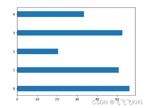
from matplotlib import pyplot as plt
from matplotlib import font_manager
my_font = font_manager.FontProperties(fname="C:/Windows/Fonts/STSONG.TTF")

a = [1, 2, 3, 4, 5]
b = [56.2,50.8,20.5,52.6,33.4]
plt.barh(range(len(a)),b,height=0.3)
plt.show()
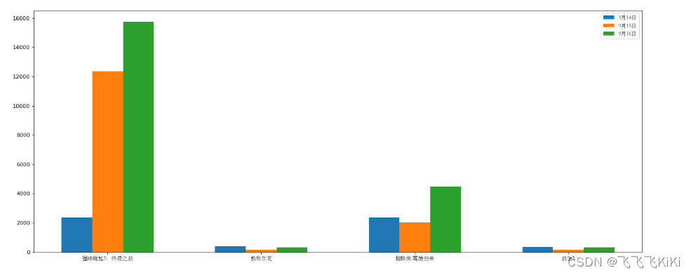
绘制条形图的小例子
from matplotlib import pyplot as plt
from matplotlib import font_manager
my_font = font_manager.FontProperties(fname="C:/Windows/Fonts/STSONG.TTF")

a = ["猩球崛起3:终极之战","敦刻尔克","蜘蛛侠:英雄归来","战狼2"]
b_16 = [15746,312,4497,319]
b_15 = [12357,156,2045,168]
b_14 = [2358,399,2358,362]
y = list(range(len(a)))
#设置图形大小
plt.figure(figsize=(20,8),dpi = 80)
plt.bar(range(len(a)),b_14,width=0.2,label="9月14日")
plt.bar([i + 0.2 for i in y],b_15,width=0.2,label="9月15日")
plt.bar([i+0.4 for i in y],b_16,width=0.2,label="9月16日")

plt.xticks([i + 0.2 for i in y],a,fontproperties=my_font)
#添加图例
plt.legend(prop=my_font)
plt.show()


 658
658


 被折叠的 条评论
为什么被折叠?
被折叠的 条评论
为什么被折叠?
 到【灌水乐园】发言


