


🎯 本文是TTS-Web-Vue系列的第十篇文章,重点介绍项目在移动端用户引导体验方面的深度优化。通过精心设计的响应式布局和交互逻辑,我们显著提升了移动端用户的首次使用体验,让用户能够更直观地了解和使用应用的各项功能。
📖 系列文章导航
- TTS-Web-Vue系列:打造最便捷的微软语音合成Web工具 - 项目介绍与整体架构
- TTS-Web-Vue系列:批量转换功能的实现与优化 - 批量转换功能详解
- TTS-Web-Vue系列:现代化UI设计与用户体验优化 - 界面设计与交互优化
- TTS-Web-Vue系列:语音主播库扩充与本地化优化 - 语音主播扩充与名称本地化
- TTS-Web-Vue系列:语音主播头像与名称本地化增强 - 主播头像生成与名称本地化
- TTS-Web-Vue系列:抽屉式布局与交互体验优化 - 抽屉式设计与布局优化
- TTS-Web-Vue系列:免费TTS服务集成与额度管理 - 免费TTS服务与配额系统
- TTS-Web-Vue系列:交互式用户引导功能实现 - 交互式用户引导功能详解
- TTS-Web-Vue系列:语音转换加载组件优化 - 加载组件与状态反馈优化
- TTS-Web-Vue系列:移动端引导体验优化 - 移动端引导交互优化
- 更多文章持续更新中…
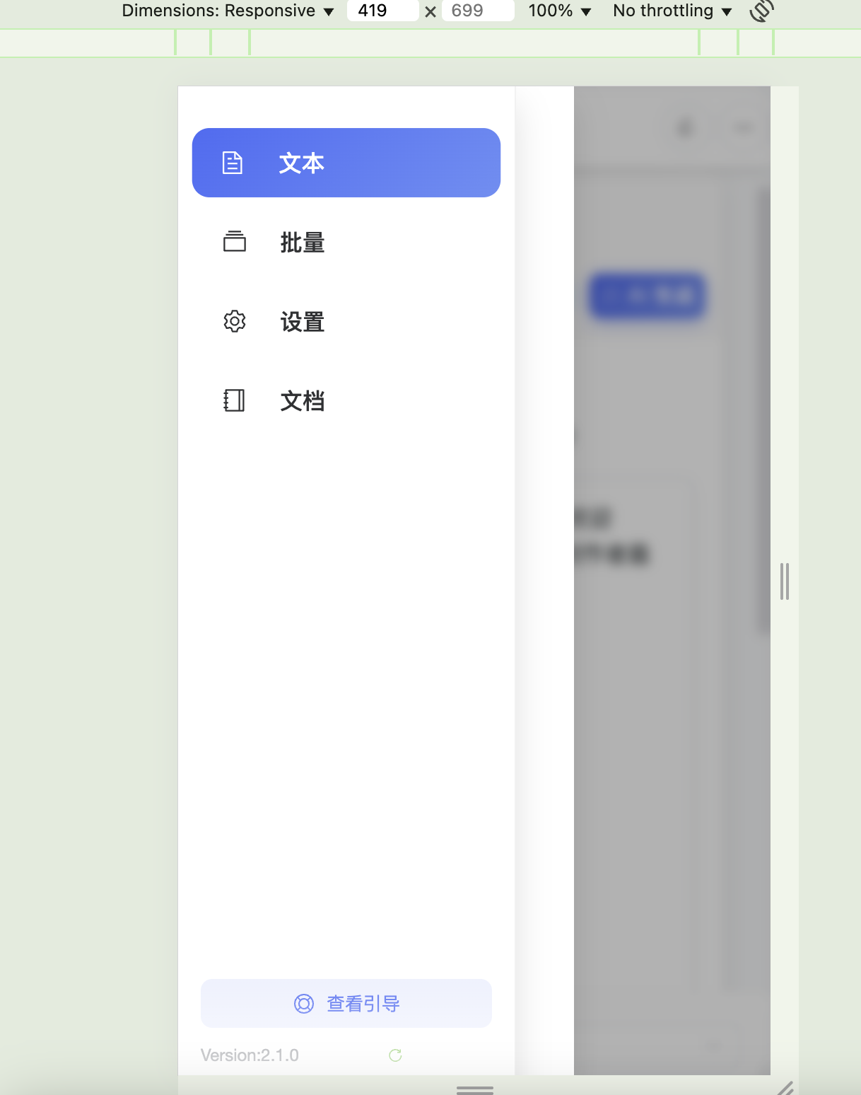
支持左滑手势弹出
🌟 移动端引导优化亮点
本次更新的移动端引导功能包含以下亮点:
- 自适应引导布局:针对移动端屏幕尺寸优化的引导卡片布局
- 智能侧边栏控制:自动处理移动端侧边栏的展开/收起状态
- 沉浸式引导体验:固定在屏幕底部的引导卡片,便于单手操作
- 流畅过渡动画:平滑的滑入滑出效果和状态切换动画
- 安全区域适配:完美支持全面屏设备的底部安全区域
- 深色模式兼容:优化的暗色主题视觉效果
💻 技术实现详解
引导步骤数据结构
我们设计了灵活的引导步骤数据结构,支持移动端特定的配置:
interface GuideStep {
element: string; // 目标元素选择器
title: string; // 步骤标题
content: string; // 步骤说明
hint?: string; // 额外提示
mobileElement?: string; // 移动端特定的目标元素
skipSidebarClose?: boolean; // 是否跳过侧边栏关闭
}
const guideSteps = ref<GuideStep[]>([
{
element: 'div.modern-aside',
title: '侧边栏导航',
content: '在这里切换不同的功能页面,例如文本转语音、批量处理等',
hint: '点击不同的菜单项可以访问不同的功能',
mobileElement: 'button.mobile-menu-button'
},
{
element: 'div.text-area-container',
title: '输入文本',
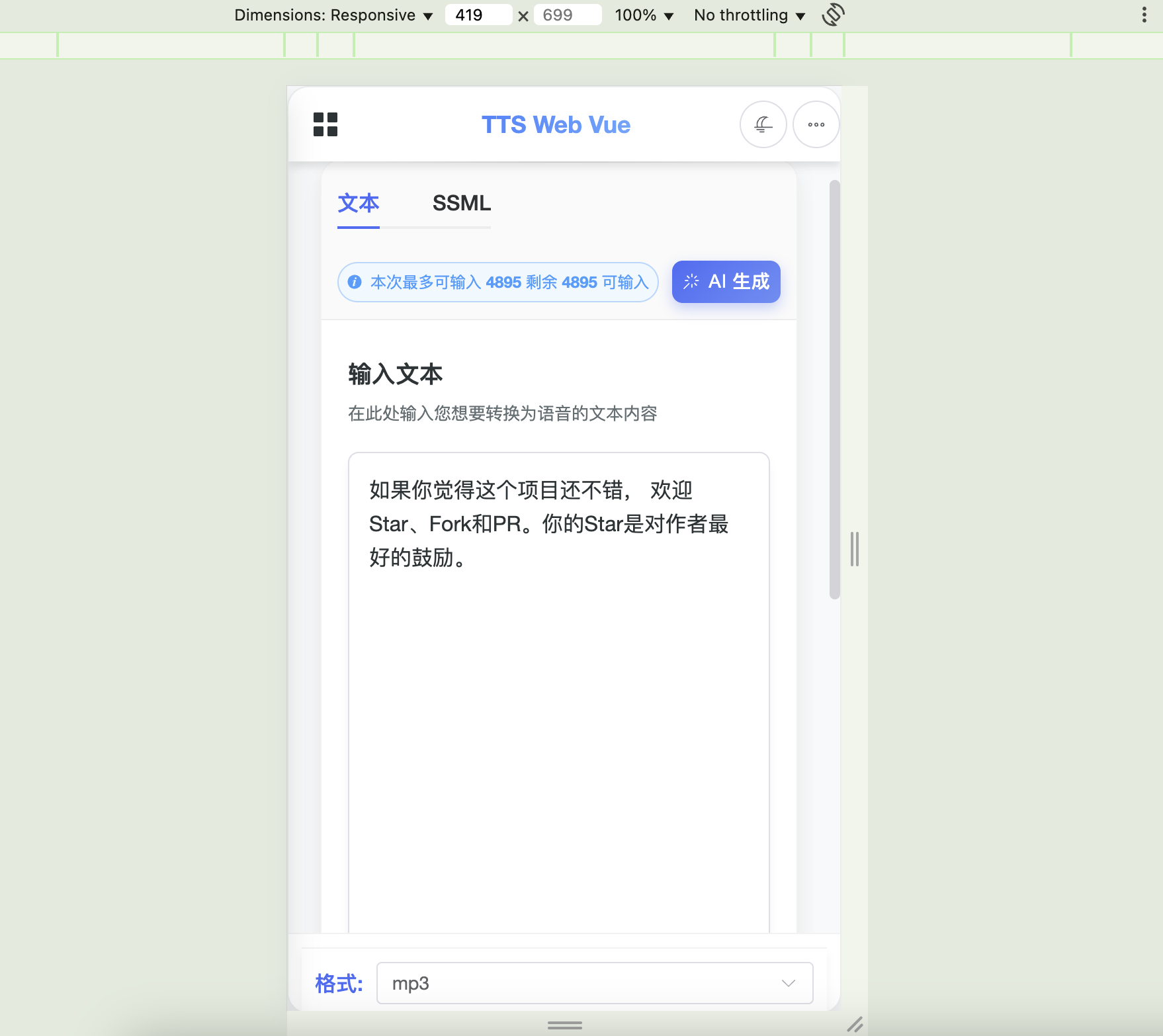
content: '在这里输入您想要转换为语音的文本内容',
hint: '您可以输入普通文本或使用SSML标记增强控制',
skipSidebarClose: true
},
// ... 其他步骤
]);
移动端视图检测
实现了响应式的移动端视图检测机制:
// 移动端视图状态
const isMobileView = ref(false);
const isSidebarCollapsed = ref(false);

// 检测移动端视图
const checkMobileView = () => {
  isMobileView.value = window.innerWidth <= 768;
  if (isMobileView.value) {
    // 在移动端默认收起侧边栏
    isSidebarCollapsed.value = true;
  } else {
    isSidebarCollapsed.value = false;
  }
};

// 监听窗口大小变化
onMounted(() => {
  checkMobileView();
  window.addEventListener('resize', checkMobileView);
});

onBeforeUnmount(() => {
  window.removeEventListener('resize', checkMobileView);
});
智能元素定位
针对移动端场景优化的元素查找和位置计算逻辑:
const findTargetElement = (selector: string) => {
  // 先尝试直接查找
  let element = document.querySelector(selector);

  if (!element) {
    // 尝试不同的选择器策略
    if (selector.startsWith('div.')) {
      element = document.querySelector(selector.substring(4));
    } else if (selector.startsWith('button.')) {
      element = document.querySelector(selector.substring(7));
    }

    // 尝试更宽松的选择器
    if (!element && selector.includes('.')) {
      const className = selector.split('.')[1];
      element = document.querySelector(`.${className}`);
    }
  }

  // 特殊处理移动端侧边栏
  if (selector === 'div.modern-aside' && isMobileView.value) {
    const sidebarElement = document.querySelector('.modern-aside');
    if (sidebarElement) {
      return {
        getBoundingClientRect: () => ({
          ...sidebarElement.getBoundingClientRect(),
          width: sidebarElement.getBoundingClientRect().width,
          height: window.innerHeight,
          top: 0,
          bottom: window.innerHeight
        })
      };
    }
  }

  return element;
};
引导位置更新逻辑
优化的引导位置计算和更新机制:
const updateGuidePosition = () => {
  if (!showUserGuide.value) return;

  const step = currentGuideStep.value;
  const currentStepData = guideSteps.value[step];
  let targetSelector = currentStepData.element;

  // 移动端特殊处理
  if (isMobileView.value && currentStepData.mobileElement && step !== 0) {
    targetSelector = currentStepData.mobileElement;
  }

  // 侧边栏状态控制
  if (isMobileView.value && !currentStepData.skipSidebarClose) {
    isSidebarCollapsed.value = false;
  } else if (isMobileView.value) {
    isSidebarCollapsed.value = true;
  }

  const targetElement = findTargetElement(targetSelector);

  if (!targetElement) {
    console.error('引导元素未找到:', { targetSelector });
    return;
  }

  const targetRect = targetElement.getBoundingClientRect();

  // 更新高亮区域样式
  highlightStyle.value = {
    top: `${targetRect.top}px`,
    left: `${targetRect.left}px`,
    width: `${targetRect.width}px`,
    height: `${targetRect.height}px`,
    borderRadius: isMobileView.value ? '12px' : '4px',
    ...(isMobileView.value && step === 0 ? {
      borderRadius: '0',
      borderLeft: 'none',
      borderTop: 'none',
      borderBottom: 'none'
    } : {})
  };
};
移动端样式优化
针对移动端的专门样式优化:
@media (max-width: 768px) {
  .guide-card {
    position: fixed;
    left: 16px !important;
    right: 16px !important;
    bottom: 20px !important;
    top: auto !important;
    width: auto !important;
    max-width: none !important;
    margin: 0;
    border-radius: 20px;
    box-shadow: 0 8px 24px rgba(0, 0, 0, 0.2);
    transform: translateY(0) !important;
    transition: transform 0.3s cubic-bezier(0.4, 0, 0.2, 1),
                opacity 0.3s ease !important;
  }

  .guide-card[style*="opacity: 0"] {
    transform: translateY(100%) !important;
  }

  .guide-card-header {
    padding: 16px;
    border-radius: 20px 20px 0 0;
  }

  .guide-card-content {
    padding: 16px;
    max-height: 40vh;
    overflow-y: auto;
  }

  .guide-indicators {
    position: absolute;
    top: -24px;
    left: 50%;
    transform: translateX(-50%);
    background: rgba(0, 0, 0, 0.2);
    padding: 4px 8px;
    border-radius: 12px;
    backdrop-filter: blur(4px);
  }

  /* 安全区域适配 */
  @supports(padding: max(0px)) {
    .guide-card {
      bottom: max(20px, env(safe-area-inset-bottom)) !important;
      padding-bottom: env(safe-area-inset-bottom);
    }
  }
}
🎨 交互体验优化
滑动手势支持
为移动端添加了滑动手势支持:
const touchStartX = ref(0);
const touchEndX = ref(0);
const MIN_SWIPE_DISTANCE = 70;

const handleTouchStart = (event: TouchEvent) => {
  touchStartX.value = event.touches[0].clientX;
};

const handleTouchEnd = (event: TouchEvent) => {
  touchEndX.value = event.changedTouches[0].clientX;
  const swipeDistance = touchEndX.value - touchStartX.value;

  if (swipeDistance > MIN_SWIPE_DISTANCE && isSidebarCollapsed.value) {
    isSidebarCollapsed.value = false;
  } else if (swipeDistance < -MIN_SWIPE_DISTANCE && !isSidebarCollapsed.value) {
    isSidebarCollapsed.value = true;
  }
};
动画过渡效果
优化的动画过渡处理:
// 监听引导步骤变化
watch(() => currentGuideStep.value, (newStep) => {
  nextTick(() => {
    // 确保DOM更新后再进行定位
    setTimeout(() => {
      updateGuidePosition();
    }, 300); // 给予足够的时间让过渡动画完成
  });
});

// 完成引导
const completeGuide = () => {
  // 首先淡出卡片
  const currentStyle = guideCardStyle.value;
  guideCardStyle.value = {
    ...currentStyle,
    opacity: '0'
  };

  // 延迟隐藏整个引导系统
  setTimeout(() => {
    showUserGuide.value = false;
    store.set("hasSeenGuide", true);

    // 重置样式
    highlightStyle.value = {
      top: '0px',
      left: '0px',
      width: '0px',
      height: '0px'
    };

    guideCardStyle.value = {
      top: '-9999px',
      left: '-9999px',
      transform: 'none',
      opacity: '0'
    };
  }, 300);
};
🔍 性能优化
渲染性能优化
为确保移动端的流畅体验,我们实施了以下优化:
- CSS变换优化:
.guide-card {
  transform: translateZ(0);
  backface-visibility: hidden;
  -webkit-font-smoothing: antialiased;
  will-change: transform, opacity;
}
- 动画性能优化:
.guide-card {
  transition: transform 0.3s cubic-bezier(0.4, 0, 0.2, 1),
              opacity 0.3s ease !important;
}

@media (prefers-reduced-motion: reduce) {
  .guide-card {
    transition: none !important;
  }
}
- DOM更新优化:
const updateGuidePosition = debounce(() => {
  // 位置更新逻辑
}, 16); // 约60fps的更新频率
内存管理
确保组件生命周期结束时正确清理资源:
onBeforeUnmount(() => {
  window.removeEventListener('resize', checkMobileView);
  document.removeEventListener('touchstart', handleTouchStart);
  document.removeEventListener('touchend', handleTouchEnd);

  // 清理定时器
  if (updateTimer) {
    clearTimeout(updateTimer);
  }
});
🔮 未来优化方向
基于当前的实现,我们计划在以下方面进行进一步优化:
-
手势交互增强:
- 添加更多手势操作支持
- 优化触摸反馈效果
-
性能优化:
- 实现虚拟滚动支持
- 优化大量DOM元素的渲染性能
-
可访问性改进:
- 添加屏幕阅读器支持
- 优化键盘导航体验
-
自定义主题:
- 支持自定义引导主题
- 添加多种动画效果选项
📝 总结
通过这次移动端引导优化,我们显著提升了TTS-Web-Vue在移动设备上的用户体验。通过精心设计的响应式布局、流畅的动画效果和智能的交互逻辑,让用户能够更轻松地了解和使用应用的各项功能。
这些优化不仅提升了产品的易用性,也为未来的功能扩展打下了坚实的基础。我们将继续收集用户反馈,不断改进和优化移动端的使用体验。
🔗 相关链接
注意:本文介绍的功能仅供学习和个人使用,请勿用于商业用途。如有问题或建议,欢迎在评论区讨论!


 扫一扫
扫一扫


 877
877

 被折叠的 条评论
为什么被折叠?
被折叠的 条评论
为什么被折叠?
 到【灌水乐园】发言


