<!DOCTYPE html>
<html lang="en">
<head>
<meta charset="UTF-8">
<title>Document</title>
<style>
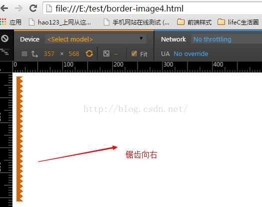
.bg{
width:300px;
height:250px;
background-image:-webkit-gradient(linear,14% 48%,35% 0%,
from(#d86707),
color-stop(.5,#d86707),
color-stop(.5,transparent),
to(transparent)
),
-webkit-gradient(linear,48% 0,62% 35%,
from(#d86707),
color-stop(.5,#d86707),
color-stop(.5,transparent),
to(transparent)
);
background-size: 19px 10px;
background-repeat:repeat-y;
background-position:0 100%;
}
</style>
</head>
<body>
<div class="bg"></div>
</body>
</html>
<!DOCTYPE html>
<html lang="en">
<head>
<meta charset="UTF-8">
<title>Document</title>
<style>
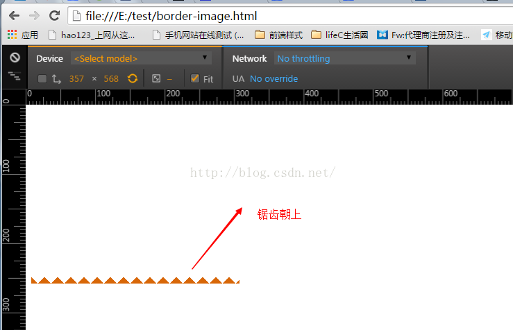
.bg{
width:300px;
height:250px;
background-image:-webkit-gradient(linear,50% 0,0 100%,
from(transparent),
color-stop(.5,transparent),
color-stop(.5,#d86707),
to(#d86707)
),
-webkit-gradient(linear,50% 0,100% 100%,
from(transparent),
color-stop(.5,transparent),
color-stop(.5,#d86707),
to(#d86707)
);
background-image:-moz-linear-gradient(50% 0,0 100%,
from(transparent),
color-stop(.5,transparent),
color-stop(.5,#d86707),
to(#d86707)
),
-moz-linear-gradient(50% 0,100% 100%,
from(transparent),
color-stop(.5,transparent),
color-stop(.5,#d86707),
to(#d86707)
);
background-size: 19px 10px;
background-repeat:repeat-x;
background-position:0 100%;
}
</style>
</head>
<body>
<div class="bg"></div>
</body>
</html>


 1259
1259


 被折叠的 条评论
为什么被折叠?
被折叠的 条评论
为什么被折叠?
 到【灌水乐园】发言


