


文字前、后自定义色块
colorBlock::before,
colorBlock::after {
  content: ""; // 必须有这个属性,否则不显示
  display: inline-block; // 必须有,因为是行内元素
  background-color: green;
  width: 6px;
  height: 14px;
}
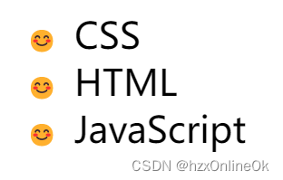
自定义列表图标
当我们使用有序(<ol>)和无序(<ul>)列表的时候,两者都会显示浏览器的默认样式。使用::before伪元素,我们则可以自定义显示样式,可以是图标或者其他的CSS样式都可以。
li::before {
  content: "😊";
}
switch动画滑动开关
切换开关用于在选中和未选中状态之间切换,所以在实现的过程中还要加上切换过程中的动画效果。
首先还是一样的给input标签增加相对定位;::before伪元素主要实现滑块的背景区域;::after主要实现滑块的圆形部分;通过input选中伪类:checked增加不同的样式并增加translate过渡动画。
input::before {
	background: #999;
	border-radius: 50px;
	content: "";
	height: 80%;
	position: absolute;
	top: 50%;
	transform: translate(4px, -50%);
	width: 88%;
}

input::after {
	background: #fff;
	border-radius: 50px;
	content: "";
	height: 25px;
	opacity: 0.6;
	position: absolute;
	top: 50%;
	transform: translate(7px, -50%);
	transition: all .4s;
	width: 25px;
}
选中后的样式:
input:checked::before {
  background: #409eff;
}
input:checked::after {
  opacity: 1;
  transform: translate(170%, -50%);
}

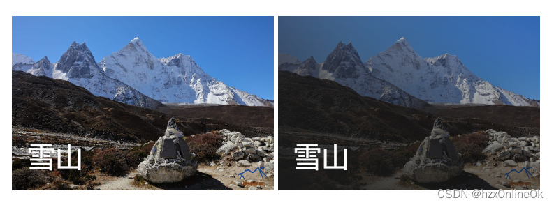
图片渐变叠加
有时候我们需要在图片上展示一些说明文字,提高图片的可读性。但是如果直接在图片上展示文字,会显得相对突兀,可以通过伪元素增加一个渐变的过程,可以让图片从渐变中显示出来
figure::before {
  background-image: linear-gradient(to top right, #1a1a1a, transparent);
  content: "";
  height: 100%;
  position: absolute;
  width: 100%;
}


 486
486


 被折叠的 条评论
为什么被折叠?
被折叠的 条评论
为什么被折叠?
 到【灌水乐园】发言


