


shape和selector是Android UI设计中经常用到的,比如我们要自定义一个圆角Button,点击Button有些效果的变化,就要用到shape和selector。可以这样说,shape和selector在美化控件中的作用是至关重要的。
在Android程序开发中,我们经常会去用到Shape这个东西去定义各种各样的形状,首先我们了解一下Shape下面有哪些标签,都代表什么意思:
solid:填充
android:color指定填充的颜色
gradient:渐变
android:startColor和android:endColor分别为起始和结束颜色,
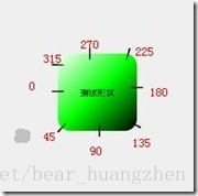
android:angle是渐变角度,必须为45的整数倍。
另外渐变默认的模式为android:type="linear",即线性渐变,
可以指定渐变为径向渐变,android:type="radial",径向渐变需要指定半径android:gradientRadius="50"。
angle值对应的位置如图:
stroke:描边
android:width="2dp" 描边的宽度,android:color 描边的颜色。
我们还可以把描边弄成虚线的形式,设置方式为:
android:dashWidth="5dp"
android:dashGap="3dp"
其中android:dashWidth表示'-'这样一个横线的宽度,android:dashGap表示之间隔开的距离
corners:圆角
android:radius为角的弧度,值越大角越圆。
我们还可以把四个角设定成不同的角度,
同时设置五个属性,则Radius属性无效
android:Radius="20dp" 设置四个角的半径
android:topLeftRadius="20dp" 设置左上角的半径
android:topRightRadius="20dp" 设置右上角的半径
android:bottomLeftRadius="20dp" 设置右下角的半径
android:bottomRightRadius="20dp" 设置左下角的半径
padding:间隔
可以设置上下左右四个方向的间隔
selector 类似 一种选择器,结合实例一看便明白:
首先在drawable下创建一个xml文件, 添加代码如下:
<?xml version="1.0" encoding="utf-8"?>
<selector xmlns:android="http://schemas.android.com/apk/res/android">
    <item android:state_pressed="true">
        <shape>

            <!-- 渐变 -->
            <gradient
                android:endColor="#FFFFFF"
                android:gradientRadius="50"
                android:startColor="#ff8c00"
                android:type="radial" />

            <!-- 描边 -->
            <stroke
                android:dashGap="3dp"
                android:dashWidth="5dp"
                android:width="2dp"
                android:color="#dcdcdc" />

            <!-- 圆角 -->
            <corners android:radius="5dp" />

            <!-- 间隔  -->
            <padding
                android:bottom="10dp"
                android:left="10dp"
                android:right="10dp"
                android:top="10dp" />

        </shape>
    </item>

    <item>
        <shape>

            <!--填充-->
            <solid android:color="#ff9d77"/>
            <!--锚边-->
            <stroke
                android:color="#fad3cf"
                android:width="2dp"/>
            <!--圆角-->
            <corners
                android:bottomLeftRadius="5dp"
                android:bottomRightRadius="5dp"
                android:topLeftRadius="5dp"
                android:topRightRadius="5dp"/>

            <!--间隔-->
            <padding
                android:bottom="10dp"
                android:left="10dp"
                android:right="10dp"
                android:top="10dp"/>


        </shape>
    </item>


</selector>
selector下有两个item, 一个是点击按钮时按钮显示的形状(由shape定义),一个未点击显示的形状。
修改layout布局文件:
<?xml version="1.0" encoding="utf-8"?>
<RelativeLayout xmlns:android="http://schemas.android.com/apk/res/android"
    xmlns:tools="http://schemas.android.com/tools"
    android:layout_width="match_parent"
    android:layout_height="match_parent"
    android:paddingBottom="@dimen/activity_vertical_margin"
    android:paddingLeft="@dimen/activity_horizontal_margin"
    android:paddingRight="@dimen/activity_horizontal_margin"
    android:paddingTop="@dimen/activity_vertical_margin"
    tools:context="com.example.keen.shapetest.ShapeTestMainActivity">

    <Button
        android:layout_width="wrap_content"
        android:layout_height="wrap_content"
        android:background="@drawable/button"
        android:text="TestShapeButton"/>
</RelativeLayout>
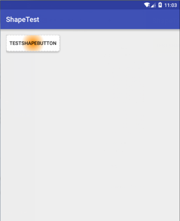
运行app,效果如下:
未点击按钮:

点击按钮:


 扫一扫
扫一扫
 764
764

 被折叠的 条评论
为什么被折叠?
被折叠的 条评论
为什么被折叠?
 到【灌水乐园】发言


