


遮罩(Mask)是一种非常强大的功能,它允许你定义一个元素的可见性。遮罩可以是任何形状或者图案,通过它,你可以控制元素的哪些部分应该是透明的,哪些部分应该是不透明的。
SVG遮罩基础
在SVG中,<mask>元素用来定义遮罩。你可以在<defs>元素内部定义一个遮罩,并通过mask属性在其他元素上引用它。遮罩内部可以包含各种形状和图案,这些形状和图案的颜色值将决定遮罩的透明度——白色代表完全不透明,黑色代表完全透明,灰色则表示半透明。
示例1:基本矩形遮罩
<svg width="200" height="200">
  <defs>
    <mask id="mask-basic" x="0" y="0" width="100%" height="100%">
      <rect x="50" y="50" width="100" height="100" fill="white"/>
    </mask>
  </defs>
  <rect x="0" y="0" width="200" height="200" fill="blue" mask="url(#mask-basic)"/>
</svg>
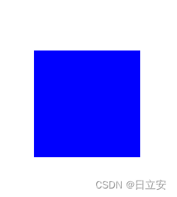
这个例子创建了一个基本的矩形遮罩。蓝色的矩形只在白色遮罩矩形区域内可见。
示例2:圆形遮罩
<svg width="200" height="200">
  <defs>
    <mask id="mask-circle" x="0" y="0" width="100%" height="100%">
      <circle cx="100" cy="100" r="50" fill="white"/>
    </mask>
  </defs>
  <rect x="0" y="0" width="200" height="200" fill="green" mask="url(#mask-circle)"/>
</svg>
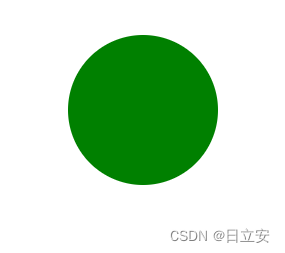
这个例子使用一个圆形作为遮罩,因此绿色的矩形只在圆形区域内可见。
示例3:渐变遮罩
<svg width="200" height="200">
  <defs>
    <linearGradient id="gradient-mask" x1="0%" y1="0%" x2="100%" y2="0%">
      <stop offset="0%" stop-color="white" stop-opacity="1"/>
      <stop offset="100%" stop-color="black" stop-opacity="1"/>
    </linearGradient>
    <mask id="mask-gradient" x="0" y="0" width="100%" height="100%">
      <rect x="0" y="0" width="200" height="200" fill="url(#gradient-mask)"/>
    </mask>
  </defs>
  <rect x="0" y="0" width="200" height="200" fill="red" mask="url(#mask-gradient)"/>
</svg>
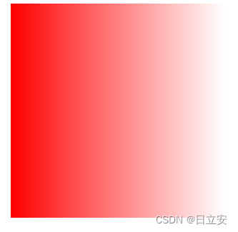
这个例子创建了一个渐变遮罩,红色矩形从左到右逐渐变透明。
示例4:文本遮罩
<svg width="200" height="200">
  <defs>
    <mask id="mask-text" x="0" y="0" width="100%" height="100%">
      <text x="10" y="30" font-size="20" fill="white">SVG Mask</text>
    </mask>
  </defs>
  <rect x="0" y="0" width="200" height="200" fill="orange" mask="url(#mask-text)"/>
</svg>
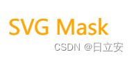
在这个例子中,文本“SVG Mask”定义了遮罩的形状,因此橙色矩形只在文本形状区域内可见。
示例5:图案遮罩
<svg width="200" height="200">
  <defs>
    <pattern id="pattern-stripe" width="4" height="4" patternUnits="userSpaceOnUse">
      <path d="M 0,0 L 4,4" stroke="white" stroke-width="1"/>
    </pattern>
    <mask id="mask-pattern" x="0" y="0" width="100%" height="100%">
      <rect x="0" y="0" width="200" height="200" fill="url(#pattern-stripe)"/>
    </mask>
  </defs>
  <rect x="0" y="0" width="200" height="200" fill="purple" mask="url(#mask-pattern)"/>
</svg>
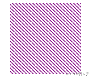
这个例子使用了一个条纹图案作为遮罩,因此紫色矩形在条纹图案区域内呈现出条纹效果。


 1510
1510


 被折叠的 条评论
为什么被折叠?
被折叠的 条评论
为什么被折叠?
 到【灌水乐园】发言


