


表格是个非常常用的组件,本文将介绍表格的基本属性和使用,如果不足之处,请指出。觉得不错可以帮我点赞
ElementUI 表格
前置工作: 安装好vue和elemetUI。如果是按需引入,请确保Table、TableColumn模块已经引入
示例:一个基本的表格
<template>
<el-table
          :data="tableData"
          stripe="true"
          style="width: 100%">
    <el-table-column
                     prop="name"
                     label="名称">
    </el-table-column>
    <el-table-column
                     prop="todayBuy"
                     label="日购买">
    </el-table-column>
    <el-table-column
                     prop="monthBuy"
                     label="月购买">
    </el-table-column>
    <el-table-column
                     prop="totalBuy"
                     label="总共购买">
    </el-table-column>
</el-table>
</template>
<script>
export default {
    name:"home",
    data(){
        return {
            tableData: [
            {
                name: 'oppo',
                todayBuy: 500,
                monthBuy: 3500,
                totalBuy: 22000
            },
            {
                name: 'vivo',
                todayBuy: 300,
                monthBuy: 2200,
                totalBuy: 24000
            }// ...
            ]
        }
    }
}
</script>

el-table的属性
| 属性 | 属性值 | 说明 |
|---|---|---|
| stripe | bool | 是否使用斑马纹 |
| border | bool | 是否使用边框 |
| height | 数值 | 固定表头。只要设置了属性,就会自动固定表头 |
| max-height | 数值 | 位表格设置最大高度 |
el-table-column的属性
| 属性 | 属性值 | 说明 |
|---|---|---|
| fixed | true(默认;左)|left|right | 固定栏,滚动的时候会浮动起来,可以选择浮在哪一边 |
带状态表格
如果我们希望通过行内的一些属性来对行做不同的显示,那么我们可以给el-table添加row-class-name属性。
row-class-name属性值是一个回调函数
// ...
<script>
export default {
  methods: {
      // 处理函数
    tableRowClassName({row, rowIndex}) {
      if (rowIndex === 1) {
        return 'warning-row';
      } else if (rowIndex === 3) {
        return 'success-row';
      }
      return '';
    }
 }
}
</script>
<style>
.el-table .warning-row {
  background: oldlace;
}
.el-table .success-row {
  background: #f0f9eb;
}
</style>
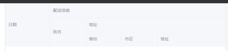
多级表头
通过<el-column>嵌套实现多级表头,数据更具prop进行遍历,看如下案例
<el-table
    :data="tableData"
    style="width: 100%">
    <el-table-column
      prop="date"
      label="日期"
      width="150">
    </el-table-column>
    <el-table-column label="配送信息">
      <el-table-column
        prop="name"
        label="姓名"
        width="120">
      </el-table-column>
        <!-- 地址没有家prop属性,所以不会对数据流影响 -->
      <el-table-column label="地址">
        <el-table-column
          prop="province"
          label="省份"
          width="120">
        </el-table-column>
        <el-table-column
          prop="city"
          label="市区"
          width="120">
        </el-table-column>
        <el-table-column
          prop="address"
          label="地址"
          width="300">
        </el-table-column>
        <el-table-column
          prop="zip"
          label="邮编"
          width="120">
        </el-table-column>
      </el-table-column>
    </el-table-column>
  </el-table>
效果如下
获取表格,重点说下!!!
js中如何获取表格?,通过给<el-table>添加ref属性为表格做唯一标识
<el-table highlight-current-row current-change="changerow" ref="signtable">
</el-table>
// ...
<script>
// ...
     methods: {
      setCurrent(row) {
          // 通过this.$refs.<表格ref值>
          // 设置表格的的二行为选中
        this.$refs.singleTable
      },
// ...
</script>
单选
只需要配置
highlight-current-row属性即可实现单选。之后由current-change事件来管理选中时触发的事件,它会传入currentRow,oldCurrentRow。如果需要显示索引,可以增加一列el-table-column,设置type属性为index即可显示从 1 开始的索引号
<el-table highlight-urrent-row current-change="changerow">
    <el-column prop="name" label="姓名"></el-column>
    <el-column prop="address" label="地址"></el-column>
    <el-column prop="email" label="邮箱"></el-column>
</el-table>
<script>
// ...
     methods: {
      setCurrent(row) {
          // 设置表格的的二行为选中
        this.$refs.singleTable.setCurrentRow(1);
      },
// ...
</script>
多选
手动添加一个<el-column>属性,添加type="selection",会调价一行多选按钮
<template>
      <!-- 使用 selection-change监听选项改变,传入一个函数名 -->
  <el-table
    ref="multipleTable"
    :data="tableData"
    tooltip-effect="dark"
    style="width: 100%"
    @selection-change="handleSelectionChange">
      <!-- type="selection" 生成多选 -->
    <el-table-column
      type="selection"
      width="55">
    </el-table-column>
    <el-table-column
      label="日期"
      width="120">
      <template slot-scope="scope">{{ scope.row.date }}</template>
    </el-table-column>
    <el-table-column
      prop="name"
      label="姓名"
      width="120">
    </el-table-column>
    <el-table-column
      prop="address"
      label="地址"
      show-overflow-tooltip>
    </el-table-column>
  </el-table>
</template>
<script>
    // 选中某一行,清除选项
</script>
使用js选中
<script>
    // this.$refs.<表单标识>.toggleRowSelection(row),row为tableData的一整行数据
    this.$refs.multipleTable.toggleRowSelection(row);
    // this.$refs.<表单标识>.clearSelection();全不选
	this.$refs.multipleTable.clearSelection();
</script>
排序
在表格中定义default-sort定义默认排序列和排序规则
通过给列添加srtotable属性赋予列排序功能
<template>
<!-- 在表格中设设置默认排序规则 -->
	<el-table
		:default-sort="{prop:'todayBuy',order:'descending'}">
        <el-table-column
                         prop="name"
                         label="名称">
    	</el-table-column>
        <el-table-column
                         prop="todayBuy"
                         label="日购买">
	    </el-table-column>
        <el-table-column
                         prop="monthBuy"
                         label="月购买">
    	</el-table-column>
        <!-- 在表格中添加srottable属性,会添加字段排序功能 -->
        <el-table-column
                         srottable
                         prop="totalBuy"
                         label="总共购买"
                         >
    	</el-table-column>
    </el-table>
    </el-table>
</template>
筛选
在列中定义:filters属性,值为一个[{ text: '', value: '' }] 的选项数组,提供给用户筛选。同时,指定处理的回调函数:filter-method,值为函数名。有三个参数,选中的值、遍历时候的行、遍历时候的列
<template>
<!-- ... 设置选项和处理函数-->
	<el-table-column
                 :filters="[{text:'300',value:'300'},{text:'800',value:'800'}]"
                 :filter-method="handleFilter"
                 prop="monthBuy"
                 label="月购买">
    </el-table-column>
<!-- ... -->
</template>
<script>

handleFilter(val,row){
	return row.todayBuy == val
}
</script>

自定义列
一般我们会添加一个操作列,如删除和编辑。那么我们可以不指定prop属性,然后为列添加其他内容如下案例。同时,我们可以通过列上定义slot-scope="scope",通过scope来获取列和行。一下直接使用官网案例
<template>
  <el-table
    :data="tableData"
    style="width: 100%">
    <el-table-column
      label="日期"
      width="180">
        <!-- 定义slot-scope="scope"后就可在scope中获取列和行数据了 -->
      <template slot-scope="scope">
        <i class="el-icon-time"></i>
        <span style="margin-left: 10px">{{ scope.row.date }}</span>
      </template>
    </el-table-column>
    <el-table-column
      label="姓名"
      width="180">
        <!-- 定义slot-scope="scope"后就可在scope中获取列和行数据了 -->
      <template slot-scope="scope">
        <el-popover trigger="hover" placement="top">
          <p>姓名: {{ scope.row.name }}</p>
          <p>住址: {{ scope.row.address }}</p>
          <div slot="reference" class="name-wrapper">
            <el-tag size="medium">{{ scope.row.name }}</el-tag>
          </div>
        </el-popover>
      </template>
    </el-table-column>
    <el-table-column label="操作">
        <!-- 定义slot-scope="scope"后就可在scope中获取列和行数据了 -->
      <template slot-scope="scope">
        <el-button
          size="mini"
          @click="handleEdit(scope.$index, scope.row)">编辑</el-button>
        <el-button
          size="mini"
          type="danger"
          @click="handleDelete(scope.$index, scope.row)">删除</el-button>
      </template>
    </el-table-column>
  </el-table>
</template>

<script>
  export default {
    data() {
      return {
        tableData: [{
          date: '2016-05-02',
          name: '王小虎',
          address: '上海市普陀区金沙江路 1518 弄'
        }, {
          date: '2016-05-04',
          name: '王小虎',
          address: '上海市普陀区金沙江路 1517 弄'
        }, {
          date: '2016-05-01',
          name: '王小虎',
          address: '上海市普陀区金沙江路 1519 弄'
        }, {
          date: '2016-05-03',
          name: '王小虎',
          address: '上海市普陀区金沙江路 1516 弄'
        }]
      }
    },
    methods: {
        // 按钮的点击函数
      handleEdit(index, row) {
        console.log(index, row);
      },
      handleDelete(index, row) {
        console.log(index, row);
      }
    }
  }
</script>
展开行
知识多又杂,一点点积累着,因为需求也是五花八门,用得上的。
在列(el-column)中添加属性 type="expand"就可设置为展开行,展开的内容定义在列标签内。属性的获取同样是通过slot-scope="scope"详情如下案例:
<template>
<el-table :data="tableData">
    <el-table-cloumn type="expand">
        <template slot-scope="scope">
			<el-card>
                <p>名称:{{scope.row.name }}</p>
                <p>地址:{{scope.row.address }}</p>
             </el-card>
        </template>
    </el-table-cloumn>
</el-table>
</template>
<script>
  export default {
    data() {
      return {
        tableData: [{
          id: '12987125',
          name: '好滋好味鸡蛋仔',
          category: '江浙小吃、小吃零食',
          desc: '荷兰优质淡奶,奶香浓而不腻',
          address: '上海市普陀区真北路',
          shop: '王小虎夫妻店',
          shopId: '10333'
        }, {
          id: '12987126',
          name: '好滋好味鸡蛋仔',
          category: '江浙小吃、小吃零食',
          desc: '荷兰优质淡奶,奶香浓而不腻',
          address: '上海市普陀区真北路',
          shop: '王小虎夫妻店',
          shopId: '10333'
        }]
      }
    }
  }
</script>


 7421
7421


 被折叠的 条评论
为什么被折叠?
被折叠的 条评论
为什么被折叠?
 到【灌水乐园】发言


