


颜色选择器的简单实现
使用渐变背景实现一个颜色选择器
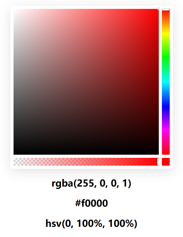
关键知识点
- HSV(Hue, Saturation, Value)
- 使用渐变色实现色相选择器
- 使用3个背景叠加实现Saturation(饱和度),Value(色调,纯度)的选择
关键代码
色相渐变背景
background: linear-gradient(180deg, red 0, #ff0 17%, #0f0 33%, #0ff 50%, #00f 67%, #f0f 83%, red);
饱和度色调背景
.color-picker-saturation-mask-white {


        background: linear-gradient(90deg, #fff, transparent));
}
.color-picker-saturation-mask-black {


        background: linear-gradient(0deg, #000, transparent);
}
完整代码
<!DOCTYPE html>
<html lang="zh">
  <head>
    <meta charset="UTF-8" />
    <meta
      name="viewport"
      content="width=device-width, initial-scale=1.0" />
    <title>使用渐变背景实现一个颜色选择器</title>
    <meta
      name="keywords"
      content="demo, js, css, color-picker" />
    <style>
      body {


        background-color: #fff;

        --alpha-bg-size: 10px;
      }

      .alpha-bg {


        background-color: #fff;
        background-image: linear-gradient(45deg, lightgray 25%, transparent 25%, transparent 75%, lightgray 75%),
          linear-gradient(45deg, lightgray 25%, transparent 25%, transparent 75%, lightgray 75%);
        background-position: 0 0, calc(var(--alpha-bg-size) / 2) calc(var(--alpha-bg-size) / 2);
        background-size: var(--alpha-bg-size) var(--alpha-bg-size);
      }

      .flex {


        display: flex;
      }

      .color-picker-container {


        margin: 0 auto;
        padding: 0.5rem;
        max-width: 90vw;
        width: 400px;
        height: fit-content;
        border-radius: 0.25rem;
        background-color: #fff;
        box-shadow: 0 7px 30px rgba(100, 100, 111, 0.2);
      }

      .color-picker-saturation-wrap {


        position: relative;
        flex: 1;
        margin-right: 0.5rem;
        padding-bottom: calc(100% - var(--alpha-bg-size) * 2 - 0.5rem);
      }

      .color-picker-saturation-mask {


        position: absolute;
        top: 0;
        left: 0;
        width: 100%;
        height: 100%;
        cursor: pointer;
      }

      .color-picker-saturation-mask-white {


        background: linear-gradient(90deg, #fff, transparent);
      }

      .color-picker-saturation-mask-black {


        background: linear-gradient(0deg, #000, transparent);
      }

      .color-picker-saturation-pointer {


        position: absolute;
        top: 0;
        left: 100%;
        width: 4px;
        height: 4px;
        border-radius: 50%;
        box-shadow: 0 0 0 1.5px #fff, inset 0 0 1px rgba(0, 0, 0, 0.3), 0 0 1px 2px rgba(0, 0, 0
最低0.47元/天 解锁文章


 扫一扫
扫一扫


 75
75

 被折叠的 条评论
为什么被折叠?
被折叠的 条评论
为什么被折叠?
 到【灌水乐园】发言


